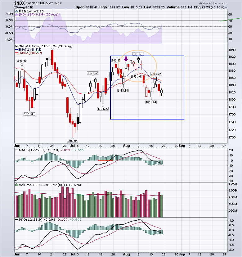
Back in 2010, I started plotting a box around the earnings month of July. I didn't have a plan, I didn't have a reason, but I started to plot the box on the $NDX. Here is the first plot I did.
In this particular case, I started the box on July 23rd, which is odd, but I was interested in the area circled. This chart is unmodified from how it started other than to zoom in on that time period.
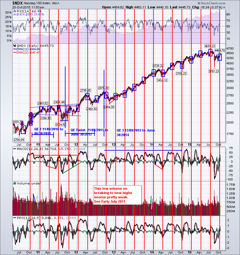
A few more quarters went by and I kept adding boxes. This is how it looked after 4 boxes had been added. Every box started at a different day of the month, and every box was a different size. Not telling me much, but the last two boxes interested me because QE was coming to an end and the boxes started to flat line. Interesting, but at this point nothing valuable. I started to add the red lines to mark the Options Expiration Day for earnings month.
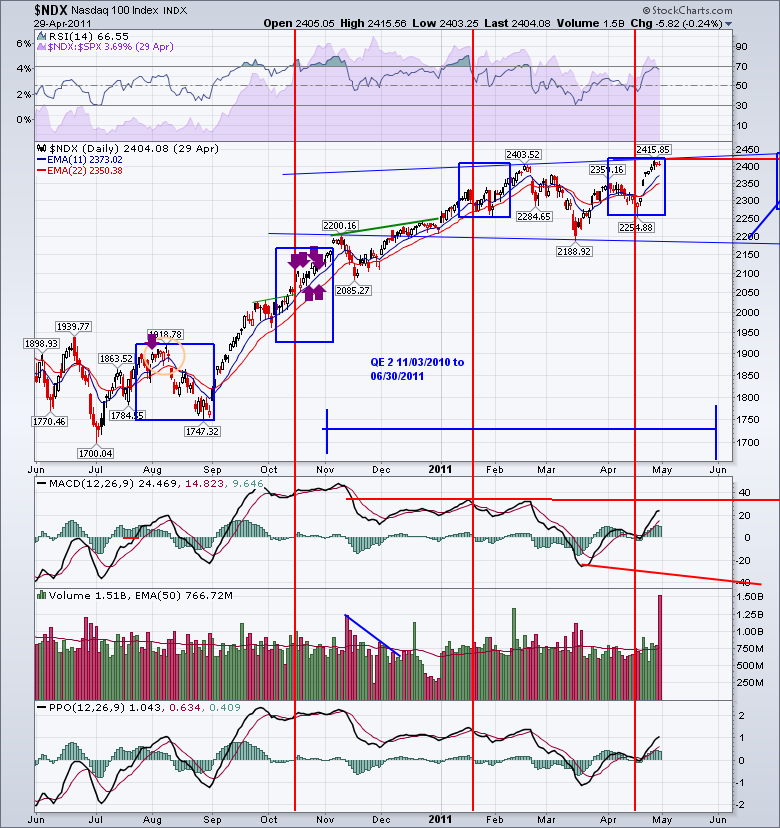
Another year of boxes came and went and I was starting to get less fussy. I was just copying last months box and adding it on the first of the month. Then, I would slightly adjust the size to fit the price action from the beginning of the month to the end of the month. It was starting to show me a range for the price during the month of earnings, and I found I was not adjusting the box size much anymore. I was enamored by the 5 quarters in a row that the earnings stayed in a tight range. Every quarter, they would dip in the middle of the month before, rise into earnings and roll over near the end of the month. Interesting that the market would just keep trading in the range for 5 quarters. Then suddenly, from December 2011 to March of 2012, a light switch turned on and the market exploded higher to a new range. What was going on?
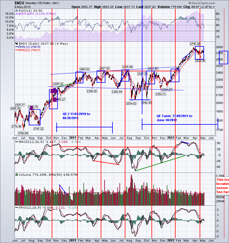
You can see I was adding QE data to overlay on the chart. The QE stuff was added in 2014 and I went back to add it on the chart. But you can see that the boxes were now the same size for the last 7 and it seems to cover the extremes of the highs and lows for the earnings month. I also started to notice that the Options Expiration day was having a large effect. Not necessarily to the day but it seemed to be a few days either side that were important to watch. This sideways pattern of 5 boxes had set in again. It was a little more wobbly than the first 5 boxes, but I still didn't have a reason or a consistent method for placing the box.
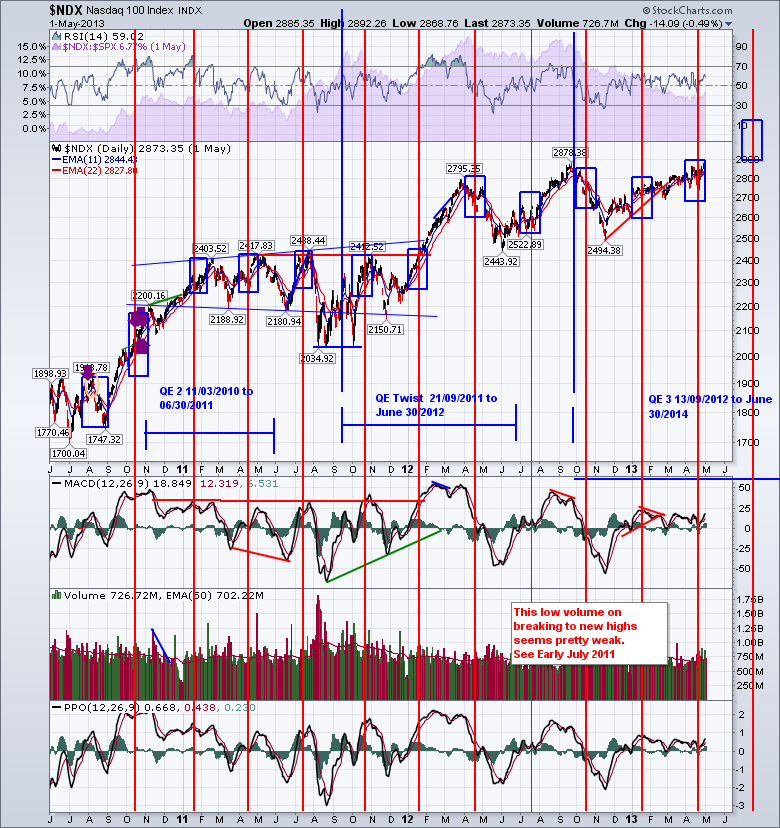
So here is the picture up to October 2015. You can see we rallied right up to the July quarter and this is the first time that more than 1/2 the box is below the previous box. Interesting, nothing more than that.
Let's zoom in on the last year of the boxes so you can understand how I place the box now and if there are other learnings. First of all, I just copy the box from quarter to quarter, moving it forward. The log scale on the side seems to take care of the vertical height and the box width is one month. On the first day of the month, you don't know if the market is going to move up or down. This month it felt like it was going to be a bounce up so I placed the price action coming into the box in line with the bottom left-hand corner. I can always move it a week later if it doesn't work. We can see in July the box height was perfect. January and April were more subdued and the box was more than adequate for encompassing the range. October 16, 2014, marked the low and the price spent one day outside the box and jumped back in. I think that was the first month that the range did not hold up. So why is this important now. Well, I discussed it on the Commodities Countdown webinar of October 8th and many people were intrigued enough to ask me to write a timeless blog about it. So that is the purpose of this article. I am explaining how the chart came to be, and I would still say it is in beta testing.
Analyzing the last box specifically, I would also suggest that this decline in the earnings cycle is showing up in the price action. The highs we are hitting today seem to be testing the range of the box. We'll see if the box holds, but it is more important to recognize this was also the September high and that resistance level is important. I think the change in earnings is the big news. The change is significant enough that the market is not bouncing back up into the previous range which is what we saw back in 2010, 2011, 2012.
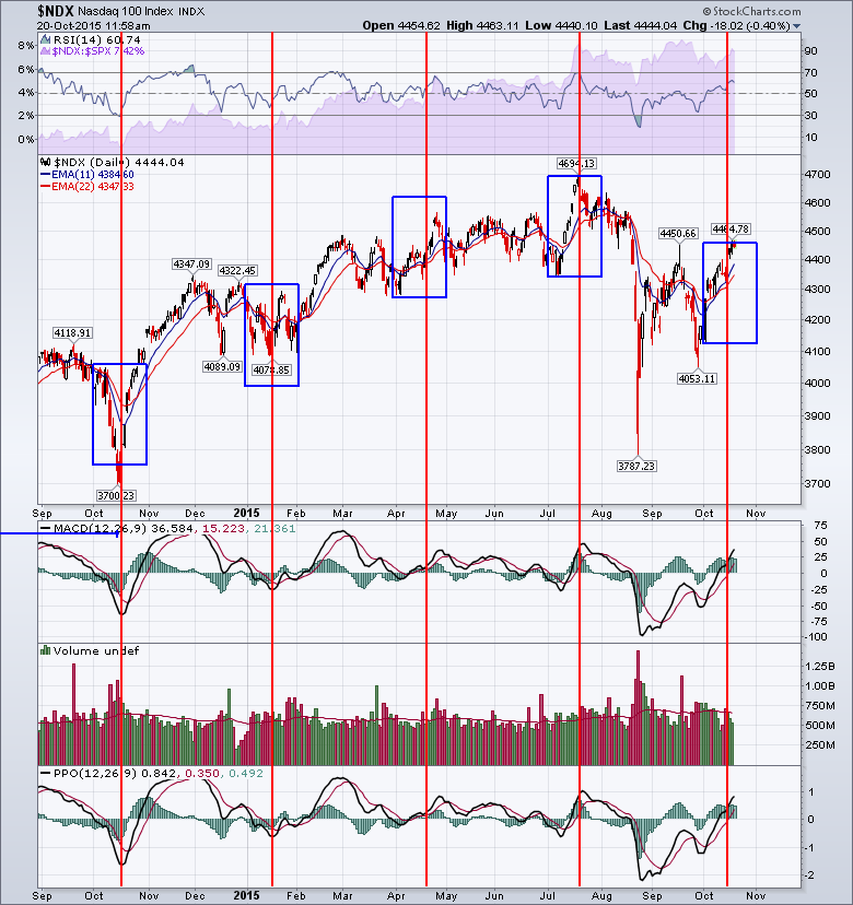
How we use the chart going forward is yet to be determined. Based on how well the box has framed the price action historically, I would be very cautious about adding to long positions, especially after the Options Expiration on Friday. The volume seems to be getting lighter as we reach these previous resistance levels. The indicators are not telling me much about this level. I think the indexes could still move up 1% more before they hit firm resistance that goes back multiple months.
If you click on the chart, that will take you to the live chart. Click on annotations before trying to save it. Add a box or something just to make another annotation. Then you can save it complete with my annotations into your own chart lists. After that delete whatever you feel is clutter. It will be in your chartlist and then you can continue to massage it every quarter. It takes almost a minute to copy and paste the box, move the line etc. Who knows how this beta chart will work out, but every quarter I find it pretty interesting and it helps me think of areas to watch for reversals. I don't have a fancy title for the 'blue box red line' chart. It encompasses the price range during earnings so perhaps it is the 'beta earnings volatility' chart. If you like it that is great. If not, hopefully, you can see the value of chart annotations and saving them over time.
Regards,
Greg Schnell, CMT
