Hello Fellow ChartWatchers!
The rally-that-just-won't-end continues. The S&P 500 is up over 8% for the year. It is up over 40% since the start of 2013. It is up over 58% since the start of 2012. Etc., etc., etc.
And speaking of rallies, did you know that Large Cap stocks have outperformed Small Caps by over 7.5% since the start of the year? And that's no fluke - over the past year, Large Caps are up 5.5% more than Small Caps. In fact, you have to go back to May 2nd, 2013 in order to find a point where Small Caps outperformed both Large and Mid Caps. Assute ChartWatchers can use our "S&P Market Capitalization" PerfChart to see these relationships. Here's an example where I've set the baseline to be the S&P 600, meaning that the red and blue bars show how much the Large and Mid Caps have outperformed the Small Caps since the start of the year:
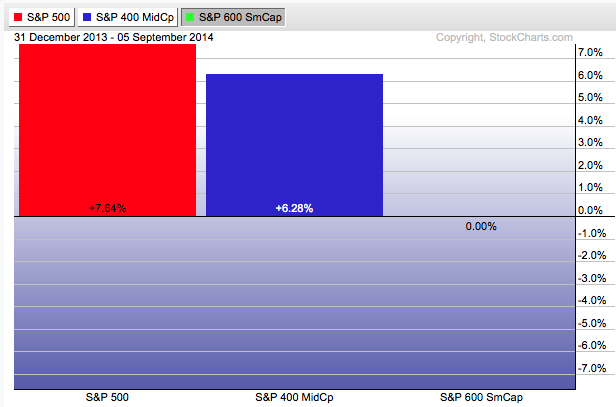
(And, thanks to our new "Linkable Version" feature, you can now click on the PerfChart above to see a live version of the chart with those exact settings!)
New Industry Certification Gives ChartWatchers More Reasons to Improve
One of the great things that happended at ChartCon 2014 last month was the official announcement of the TSAA Certification Exam for Individual Investors. The Technical Securities Analysts Association (TSAA) is the oldest technical analysis organizations in the United States. Their mission includes helping others learn and apply effective techniques for identifying and forecasting trends in the market and for effectively controlling investment risk. Those goals significantly overlap our goals here at StockCharts and so it was only natural that we partner up at some point.
Last February, I met with several members of the TSAA board and discussed with them the possibility of creating an industry-backed certification program for non-professional technicians. As you may know, the Market Technician Association (MTA) has had a professional certification program for decades (the Certified Market Technician (CMT) program) but there are significant barriers to entry with that program (cost, time, effort, etc.). In fact, the MTA has had been asked on numerous occasions to create an "CMT-lite" exam for non-professionals, but they have decided to remain focused on their professional program instead. Given that - and after consulting with the MTA - we decided to work with the TSAA to create this new, non-professional certification program.
"But wait Chip. I thought StockCharts already had a certification program. What are you talking about now?" Yes, that is correct. We have the "SCU Certified ChartWatchers" program for StockCharts.com members. That program still exists and provides great benefits to StockCharts users. The new program however is tool independent, more comprehensive, and backed by an industry organization (the TSAA) with a long track record of supporting and providing high-quality technical analysis education.
 Annouced at ChartCon 2014, the TSAA Certification Exam was created by industry experts and is administered by the TSAA. Its industry-wide recognition will continue to grow over time and its non-professional focus means that anyone with an interest in Technical Analysis can participate.
I strongly encourage everyone reading this article to check out this new certification and take the time to learn the material in their Study Guide. Even if you don't decide to take the certification exam itself, studying the information in their Study Guide will make you a better investor.
As with our own certification program, having a goal such as this can inspire you to expand your knowledge and doing that should improve your investing results. And who knows? After completing the StockCharts certification and then the TSAA certification, you would be perfectly positioned to tackle the MTA's CMT certification too!
Regardless of how far you progress, I wish you all the best on your educational journey towards these certifications.
- Chip
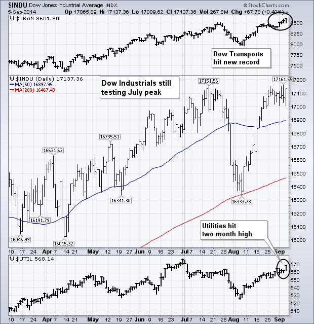
My Wednesday message showed the Dow Industrials and Transports testing their summer highs. The bars on top of Chart 7 show that the Dow Transports have hit new highs (led by rails and truckers). The Dow Industrials, however, are still testing their July peak. The Industrials need to hit a new high to confirm the upside breakout in the Transports. Odds for an upside breakout appear pretty good however. It's usually a good sign for the industrials when the more economically-sensitive transports are leading it higher. The bars below Chart 8 show the Dow Utilities ending the week at a two-month high. That means that all three Dow Averages are rising together, which is normally a good sign.
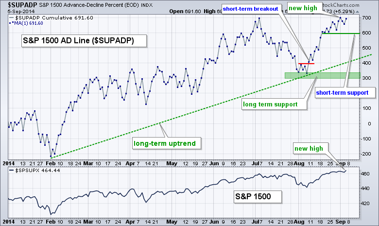
The S&P 1500 AD Line ($SUPADP) and the S&P 1500 AD Volume Line ($SUPUDP) hit new highs to confirm the overall uptrend. This is significant for two reasons. First, a bearish divergence is not possible. A bearish divergence forms when the indicators fail to confirm a new high and turn lower. Second, new highs signal broad internal strength within the S&P 1500. Keep in mind that the S&P 1500 consists of the S&P Small-Cap 600, S&P MidCap 400 and S&P 500. This makes the S&P 1500 a very broad and balanced index that represents the "stock market". Even though the S&P Small-Cap 600 is lagging, the S&P MidCap 400 and S&P 500 are pulling enough weight to keep these indicators strong. In short, the breadth cup is half full, not half empty.
The first chart shows the AD Line forming a higher low in early August and edging above its early July high on Monday. This new high confirms the new high in the S&P 1500 and breadth shows broad internal strength. In other words, majority of stocks are participating in this advance.
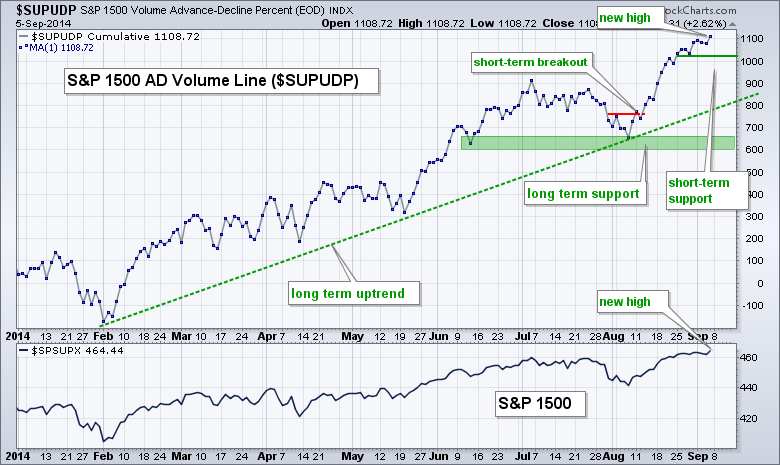
The second chart shows the AD Volume Line also hitting a new high to affirm the long-term uptrend. In fact, notice that this uptrend is steeper and the indicator hit a new high well before the AD Line. The AD Volume Line is like a money flow indicator because it is a cumulative measure of net advancing volume (advancing volume less declining volume). Also note that large-caps have higher volume than small and mid caps, and this makes the AD Volume Line a large-cap indicator.
Good trading and good weekend!
Arthur Hill CMT
$NATGAS - WILL IT BE DIFFERENT THIS TIME?
by Greg Schnell | The Canadian Technician
Natural Gas ($NATGAS) is the heartbeat of Western Canada's economy and a huge part of the US Energy supply. Earlier in the spring, I felt $NATGAS might just be the biggest momentum trade of the year. After having a parabolic spike and a pullback, natural gas is sending off chart signals that duplicate the price action before the last downslide. Can it reverse the trend?
First of all, the RSI is near the bottom of the range where we would expect it to bounce from. It needs to get back above 50. The two red lines on the chart from from 2005 and 2012 have the same slope. They both finished in parabolic style. What concerns me is the 2005 line saw the price of $NATGAS fall in 1/2 from the trend line break. It went from $8 down to $4.63. Analyzing the green lines, they all have very similar slopes. So here we sit at the green line and we are not bouncing off it the way we would like to see it bounce which is sharply!
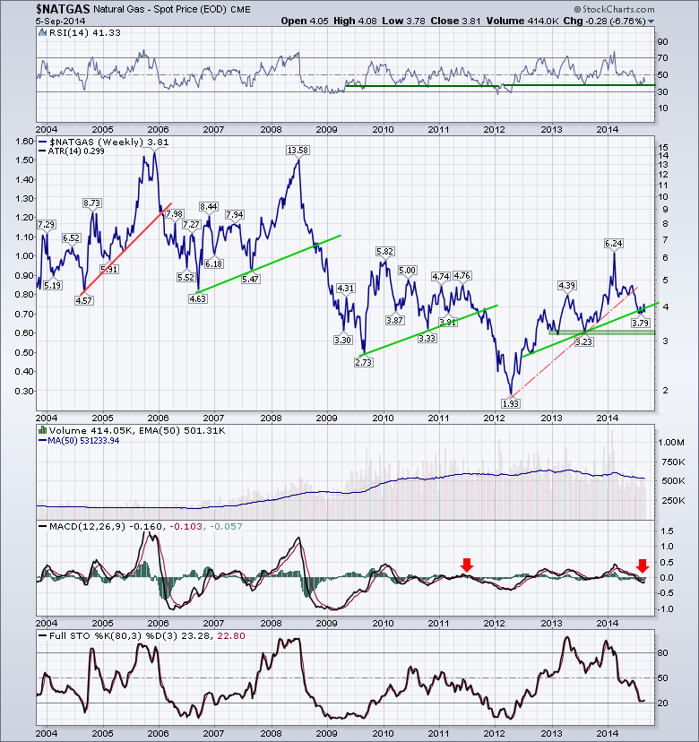
The Volume is starting to wane as you can see on the 50 Day Moving Average of Volume. The MACD moving below zero is not good. The Full Stochastics indicator is near the 20 zone. Looking left on that indicator, it usually stays down for a long period of time. The exception would be the 2004 spike down. At this point, the chart looks pretty negative. Lets zoom in on the last five years.
We can see the RSI is trying to stay above the green line to remain in bullish mode. The price action is particularly twinning in my assessment. By zooming in on the chart, we can see there was also a red line with the same slope back in 2011. It was just much shorter. The yellow boxes highlight the similar price action since breaking the red line, complete with the oscillations around the green trend line levels. We closed the week back below the trend line, so this is particularly worrisome. Horizontal support looks to be down at $3.25 or 15% below here. The two blue lines laying on the price plot but at the very bottom are indicative of the time span between the previous trend line touch and the trend line break down. They match almost exactly. We can see in 2011, we rallied into an October high and then failed big time.
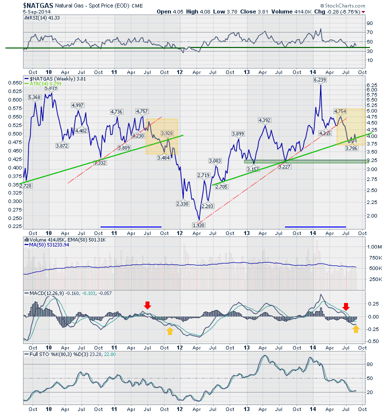
Looking at the zoomed in version of the indicators gives us some hope with the selling momentum weakening as the indicators are flat after moving down hard.
It would appear to be a very important time for $NATGAS related stocks. If this up trend starts now, that would be a big relief. If the $NATGAS market continues to trade weak and sloppy, it is not a good place to stubbornly hold $NATGAS related positions. One extremely bullish interpretation lies on the far left of the second chart in September 2009. After a small oscillation in September, the price of $NATGAS more than doubled from $2.72 to $5.81. It doesn't feel as bullish if you saw Chart 1 which shows the price falling like a pressure gauge after a major leak.
Good trading,
Greg Schnell, CMT
Central Gold Trust (GTU) is a closed-end mutual fund, which means that it trades like a stock on the NYSE. The fund owns only gold -- the metal, not stocks. Closed-end funds trade based upon the bid and ask, without regard to their net asset value (NAV). Because of this, they can trade at a price that is at a "premium" or "discount" to their NAV. By tracking the premium or discount we can get an idea of bullish or bearish sentiment regarding gold.
Currently and for over a year, GTU has been selling at a substantial discount. In simple terms, they are having trouble getting buyers so they are lowering the cost of shares. What we need and want to see in preparation for a gold rally, would be for GTU to start lowering the discount rate and then begin selling at a premium (green bars).
With most sentiment indicators, when the market is extremely bearish, that's when we see a rally. In the case of GTU and Gold, we can see that bearish sentiment can hang on for months. Note also in 2009 when the premiums got ridiculously high (over 25%), it was not the harbinger of a correction in the price of gold, it actually was an initiation to higher prices.
A closer look at this chart and we can identify numerous areas of overhead resistance that gold will need to break through on a rally. On the other side, there is one significant area of support drawn along the 2013 lows. The weekly PMO just had a negative crossover below the zero line which is extremely bearish.
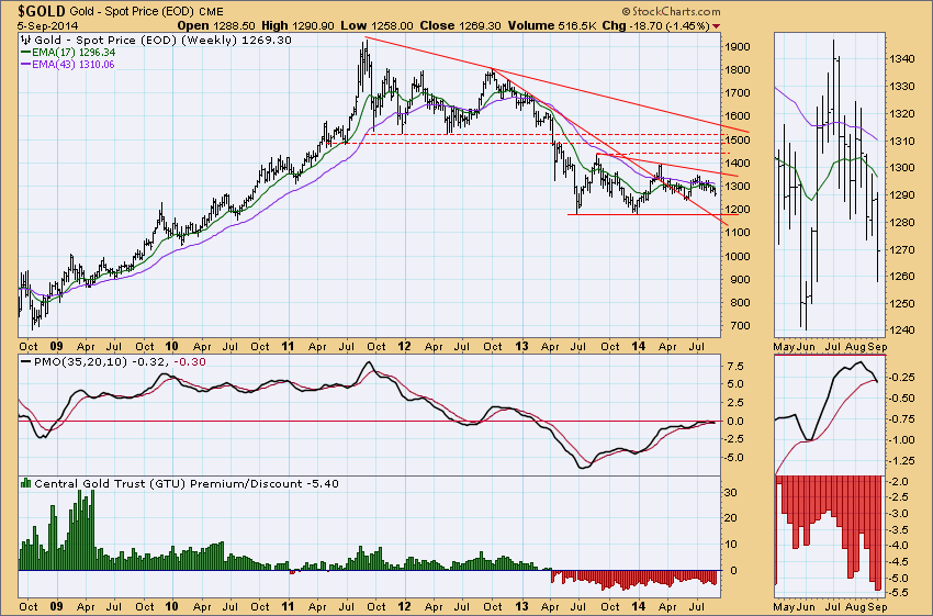
We also track the premium/discount for the Central Fund of Canada, however, they hold silver, some cash and other net assets in their portfolio. It does follow quite closely to GTU's premium/discounts. The symbol is !CEFPREM and can easily be added to the bottom of your chart using the same settings I used in the above chart for GTU.
Happy Charting!
Erin
TRADING GAPS
by Tom Bowley | InvestEd Central
Identifying a tradable gap can be quite profitable, but also frustrating at times. Awful news hits the wires and a stock gaps lower. The immediate question becomes "Should I sell at the open?" Well, conventional wisdom may suggest that you sell and your emotions may suggest it as well, but just keep in mind that when supply is strong on the sell side, market makers are on the other side, gladly buying all the shares you want to unload. And market makers rarely lose money. So what does that tell you? It should tell you that the highest probability after a gap lower is a recovery to "fill the gap".
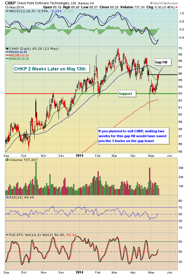
Let's take Check Point Software Technologies (CHKP) as an example after they disappointed with their quarterly earnings report in April 2014. Here's how the stock looked the day that traders received the news:
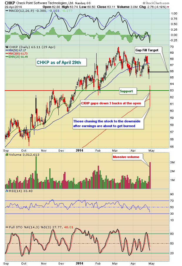
Note first that CHKP opened very close to key price support. Many times, stocks will do just that - gravitate at the open to either key price support or key price resistance. In this case, CHKP found support at the open. It sold off hard intraday on very heavy volume as emotions ran high among sellers. By the end of the day, however, CHKP had recovered back to price support.
What happened next is so typical in the stock market and is referred to as the "gap fill". Most gaps do fill. Sometimes that gap fill will be almost immediate, while other times it can take a few days to even a few months. Check out the chart on CHKP two weeks later:
Personally, I try to "guesstimate" where a stock might open or close prior to big announcements like earnings. I'm not a fan of trading into earnings because it can be so volatile, but for those that do like this volatility, consider the recent action in DSW, Inc. (DSW). On August 25th, one day prior to its earnings announcement, I sent out this chart:
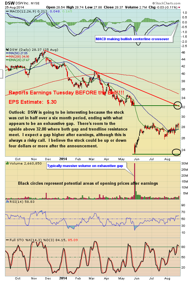
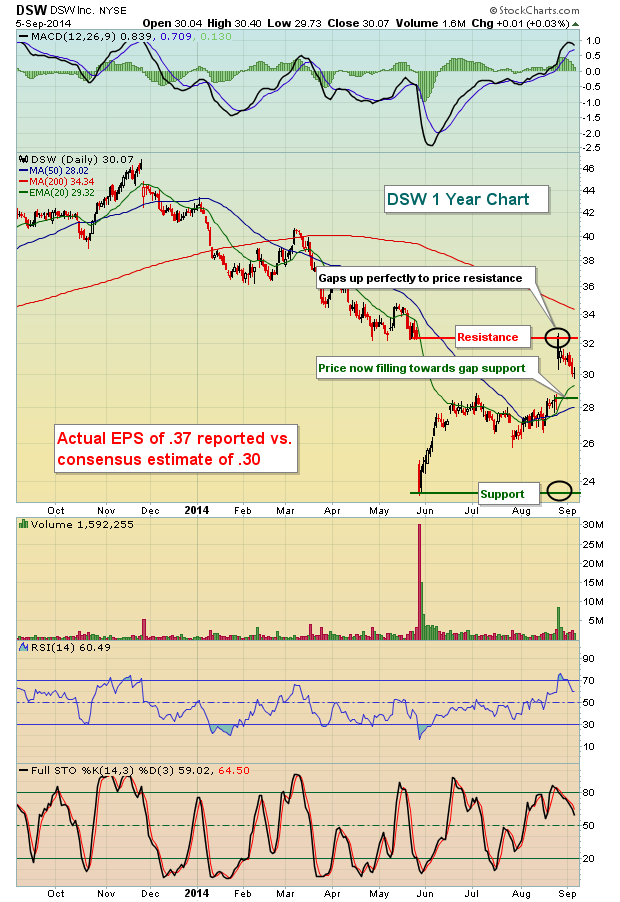
I simply pointed out the key area of price support and price resistance that I was watching. If the earnings news veered too far from what was expected (EPS of $.30), I felt there was a decent chance we'd see one of the levels identified with black circles tested. Sure enough, the earnings news was better than expected and check out where DWS opened the next day:
These "EB Earnings Previews" are a FREE service that you can register for simply by providing your e-mail address. I'll be unveiling my next EB Earnings Preview on Monday morning. For more information, CLICK HERE.
Happy trading!
Tom Bowley
Chief Market Strategist/Chief Equities Strategist
Invested Central/EarningsBeats.com
I have two things in common with Richard Sherman, the Seattle Seahawks' Super Bowl star. We both graduated from the same university and we both have two personalities. Sherman articulated that fact nicely the other day when he explained to the press corps that he has his game face for interviews, team functions and on-field athletic efforts. His game face is how he makes his...
Read More

 Annouced at ChartCon 2014, the TSAA Certification Exam was created by industry experts and is administered by the TSAA. Its industry-wide recognition will continue to grow over time and its non-professional focus means that anyone with an interest in Technical Analysis can participate.


 I have two things in common with Richard Sherman, the Seattle Seahawks' Super Bowl star. We both graduated from the same university and we both have two personalities. Sherman articulated that fact nicely the other day when he explained to the press corps that he has his game face for interviews, team functions and on-field athletic efforts. His game face is how he makes his...