 The goal of this article is to make you stop and think, nothing more. I cannot recall seeing someone’s chart purporting to divine the market that did not have at least one trendline drawn on it. The ubiquitous trendline is prevalent in almost everyone’s work, so much so, that even the talking heads on financial television are drawing them on charts. Clearly they believe that connecting two points is sufficient to generate information. Over the years I received a lot of chart analysis sent to me by many I do not know seeking my opinion on their analysis. It is clear that many have no idea what the goal is by drawing a trendline on a price chart. However, I cannot be overly critical because for the first 20+ years as a young technical analyst, I did the same thing. Being an engineer, I remember insisting on placing them on the chart with great exactness. In this article simply entitled “On Trendlines,” I’m going to offer my opinion on which trendlines work best for me, how to draw them, how to use them, and many of the downsides that they can cause, in addition to showing how often they are used totally incorrectly. The goal here is to offend as few of you as possible however, if I can convince only a few to take a hard look at how they use trendlines, then it was worth it.
Chart A below is an example of trendline extravaganza. I see this often, with the advent of computerized charting, more so than in the “old” days. Slap a bunch of trendlines on a chart and by golly, one of them is bound to work, however, this is all hindsight analysis, which always works. Hindsight is a wonderful tool for learning, but it has no place in analysis that involves real money; that process takes place at the extreme right-hand edge of the chart. Trust me on this; as I used to do this ----- back when I didn’t have a trading account. Once I began managing real money (including my own), I realized that technical analysis needed to become a process of reasonable analysis accompanied by a healthy dose of discipline. While I adamantly state that technical analysis is an art and not a science; that does not mean one cannot use a scientific process in their analysis. Okay, test time! Would the trendlines on Chart A change if the data was plotted in semi-log format instead of linear as shown? Clearly one could draw them across the same points, but would they cross at the same points later in time?
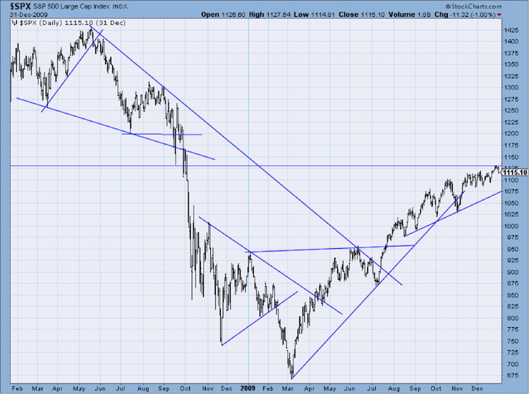
Chart A
I have not used angled trendlines in years (maybe decades) as I found that I would never make a buy, sell, or hold decision from them; I always wanted supporting information. In other words, because they are so subjective, I did not have confidence in them even when it appeared that prices bounced off them many times. So, would the next approach to the trendline be a bounce or a crossing; if so, by how much? I had to have more convincing data. Incidentally, that is a heuristic of human behavior known as confirmation bias where we interpret evidence to support our prior beliefs and, if all else fails, we ignore evidence that contradicts it. Many newsletter writers and TV experts do this. They have found something that causes them to have a belief on what the market is about to do, and then search for supporting evidence to enhance their forecast, ignoring the analysis that does not support it. It is a normal human frailty; sad but true.
Note: I do occasionally draw angled trendlines to make a point about market or indicator direction but never for support of resistance analysis – see previous article entitled “Why Market Breadth is So Important.” In that article I drew trendlines merely to show the divergence of price and breadth.
http://stockcharts.com/articles/dancing/2014/09/why-market-breadth-is-so-important.html
I only use horizontal trendlines, those that are represented or defined by price. And to offer full disclosure I rarely use them for anything other than understanding where the market is, relative to where it was. In my opinion some of the subjectivity (not all) is removed when you use price for a trendline. This leads me to why I use horizontal trendlines in the first place. I strongly believe the market pricing mechanism is a function of supply and demand where the instantaneous view of that supply and demand relationship is the price of a traded security. Read that sentence again. Hence, the horizontal trendline is excellent at identifying levels of supply and demand, and hence, support and resistance. One of the main reasons this works is another of the human frailties called anchoring. An investor or trader likes to recall the price in which they made a trade, then anchor on it. I could spend a lot of time writing about it, but Dan Ariely who wrote a great book entitled, “Predictably Irrational,” also wrote this article about anchoring.
http://www.washingtonpost.com/wp-dyn/content/article/2008/03/14/AR2008031403389.html
I recommend the book but the article is much shorter and focused on the subject of anchoring.
Notice that at this point I have talked about angled trendlines and horizontal price-based trendlines and have yet to show you more than one chart. While I’m writing this for StockCharts.com (my favorite charting website), this may seem odd, but once someone shows a chart, it creates a wrath of challenges from readers who see it differently, which can easily cause them to miss the message, and the message is why I write this blog. All I want to do is offer an opinion on how I believe is the best way to use trendlines. The next area to consider when using trendlines, price-based of course, is what time frame should be considered. Personally, I only use daily price data, and occasionally weekly price data. If you agree that horizontal trendlines work well because of support and resistance created by supply and demand and supported (sic) by the heuristic called anchoring, then you probably will agree that there is an amount of time in which the anchoring affect and the supply demand support resistance effect slowly wears off. I don’t think anyone can ever know the answer to this or why, but I suspect the dynamics of the market constantly offering so many other things to think about causes them to fade away, slowly for some, quickly for others. For those who let that price fade away quickly, it is probably because they bought at that price and they were correct as prices rose so it is easy to focus on a new price level. The ones who can’t turn loose of a price probably are holding at a loss and only want it to get back up to that level so they can sell and feed their ego at not having a losing trade – this is the sadder of the two. The bottom line is no one knows why others buy or sell and there is no way to find out. Again, the beauty of technical analysis, and in this case price analysis, is the result of all those buy and sell decisions wrapped up over time by a single number – simply price, providing an instantaneous view of supply and demand.
Let me give you an example of a long term trendline based upon price and offer a solution to overcome the time erosion of its effect on you and your analysis. I have often said that trendlines should be drawn with a crayon or large marker and not with a sharp point pen or pencil. Over time, the effect of the trendline will fade, but we cannot measure it, so why not assume the trendline gets fatter over time and represented by the dashed lines in Chart B. The fatness (can I say that?) of a trendline merely is an attempt to represent its fading value, a compounding degree of error. The first red circle shows the 2007 market top. If you were using just the horizontal trendline (solid blue) you probably assumed the market had broken out to the upside – and you would have been correct – for a little while anyway – and then terribly wrong. Had you used ever-expanding trendlines you might have challenged the breakout as I have clearly shown by drawing trendlines that perfectly support my point. Writing articles in a blog is the only time it works. The second and smaller red circle shows the period of time when the market was approaching the trendline area defined by the two dashed lines. This is where your faith in expanding trendlines is challenged; do you use the dashed line or the solid line? The red box is the next area where decisions need to be made. Do you buy at one of the dashed lines, the solid line, or how long do you wait after it goes above the top dashed line to buy? Folks, I don’t have answers to these questions because I don’t trade on chart analysis, but am aware that often these many decisions are totally overlooked by some analysts. Analysts, by the way, that probably don’t trade. My purpose here is to get you to thinking about all the issues that can arise when trading from trendlines.
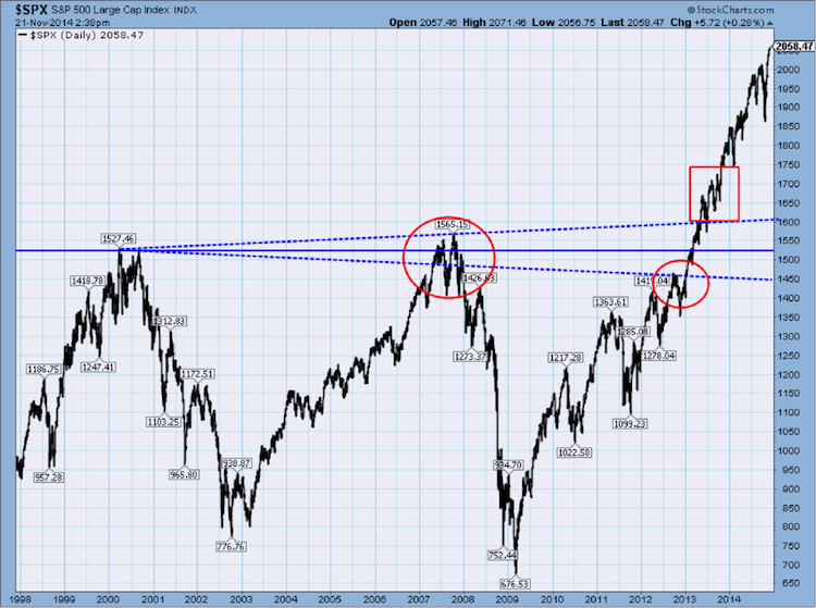
Chart B
Here are some decisions you need to make when drawing trendlines, especially angled ones.
• Do you scale the price arithmetically or semi-logarithmically?
o Angled trendlines will be different on semi-log
o Price based trendlines will not be affected.
• How thick do you draw the trendline?
• Do you use my recommended expanding trendline?
• Do you need supporting evidence to make a trade when a trendline comes into play?
I could go on and on but you hopefully see my point.
Okay, now for the offensive section of this article. I see this all the time and by those who should know better. It is well covered in many technical analysis books but often the point is not dwelled upon enough. Chart C below shows data with a trendline and an exponential moving average. At first glance one might say that once the data crosses below the moving average and then the trendline it is a clear sell signal. So what is wrong with this analysis? Look at the chart and think about it before reading further, the answer is clearly there as I have already mentioned it a number of times in this article.
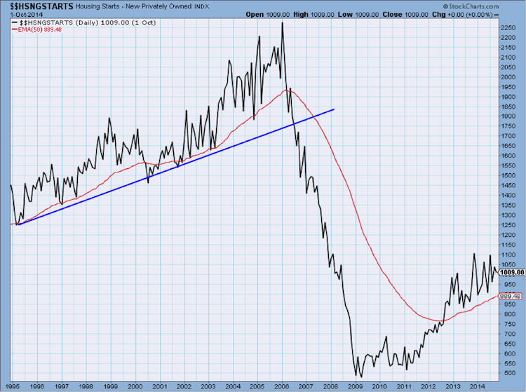
Chart C
Chart C is a chart of US Housing Starts. US Housing starts DOES NOT TRADE. It is only a data series and it isn’t price data as determined by investors making buy and sell decisions. If you believe US Housing Starts is price, then I’m sorry; it is only data that has been collected from various sources. Remember, much of technical analysis works because it is the analysis of PRICE, the price set by the instantaneous result of buying and selling, and ONLY those who are doing it with real money. How can something that does not trade have support and resistance? While a trendline might be used to simplify the data’s direction, it certainly does not imply anything when the data moves through it. Unless, of course, you have something to benefit from by convincing someone to sell all of their stocks related to the housing industry. I have not checked, but I doubt there is much of a correlation to that type of analysis. Does the Baltic Dry Index trade? How about the NYSE Advance Decline Line? Please keep this in mind when doing chart analysis – stick to the analysis of price; price as determined directly by buyers and sellers.
And finally, how about placing trendlines on technical indicators? Let’s answer that by asking a few more questions. Are technical indicators actually traded? Or are they derivatives of price action? Are technical indicators that are range bound (Stochastics, RSI, etc.) different than those that are not range bound (AD Line, OBV, Momentum, etc.)? Can a technical indicator, say momentum, have support and resistance? Chart D is an example of some trendlines drawn on technical indicators. I did not spend a lot time doing this as want to convey a message, not analyze a chart. Often I see this in an attempt to identify divergence; again a perfect example of showing what has already happened. The real problem I have is that trendlines, if you believe they are used to represent levels of support and resistance of trader activity, are misused if placed on indicators that are calculations using price, or volume for that matter. Trust me, I have heard all of the arguments in favor of this, but I have never met anyone who manages money that does it. And I apologize, as that is a straw man argument since I can’t possibly know how everyone trades or invests.
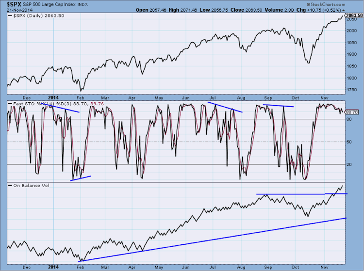
Chart D
Okay, one more, even though it isn’t about trendlines, it is related to the message. Can a moving average provide support or resistance? Many believe it can. In addition to the fact that a moving average is a derivative of price action as explained (beat to death) earlier, I do not believe they provide support or resistance simply because of the giant percentage of time it does not work. The argument that many traders watch the 200 day moving average does not mean they trade off of it. Don’t shoot the messenger, and as I always say, if it works for you, go for it. Remember, the real beauty of technical analysis is that you never have to ask “why.” Study technical analysis to gain knowledge. Knowledge is knowing a tomato is a fruit; wisdom is not putting one in a fruit salad. Wisdom comes with experience.
Greg Morris