 Welcome to 2017! For those of use born in the 1940s or earlier, we’re delighted to be here. In the US Equity markets, there were 3 fairly big pullbacks. They stand out in the performance chart of the S&P 500, Dow Industrials, Nasdaq Composite, Russell 2000. Looking at the data over the full year instead of just the final numbers can give you a clearer understanding; in the case of 2016, without the rally in the last 2 months, it would not have been a very good year. Returns would have been in the 2-3% range instead of the annual returns shown on the right scale.
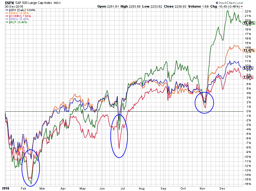 Chart A
Looking at Gold, Silver, Bonds, Real Estate, and Managed Futures shows returns all over the place. Would you have known this last January? Of course not. With the always perfect 20/20 hindsight, even these would have been much better if exiting in the late summer. Again, the message is look at the charts, not the final numbers that the media spews.
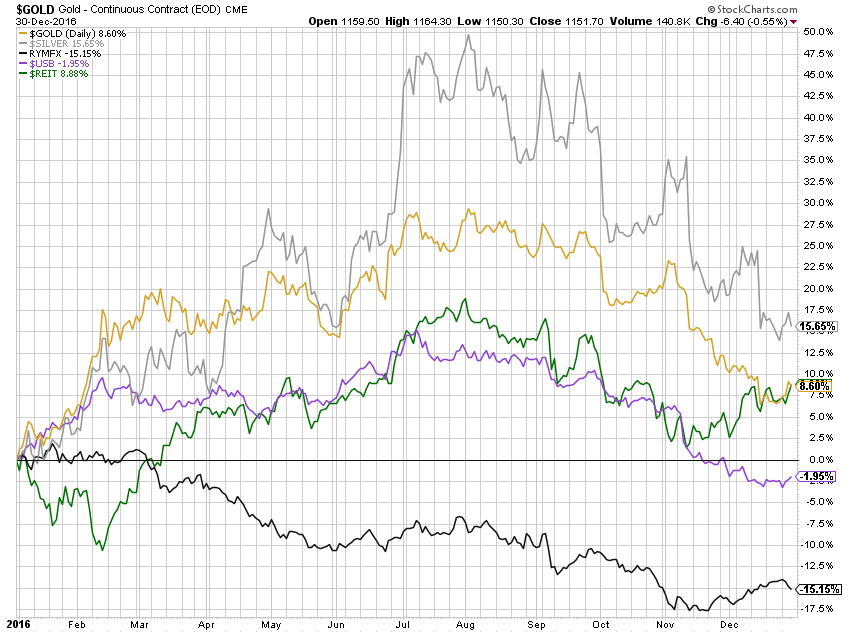 Chart B
My old friend Ron Griess has given me permission to use a few of the wonderful charts he produces each week at www.thechartstore.com. Chart C shows the rolling 10 year returns on the S&P 500 Index. To understand this data, take any point on the chart and that is the annualized return for the previous 10-year period. You cannot see it on the chart but the last data point on 12/31/2016 is 4.67%, which is the annualized return in the past 10 years. Note: the numbers and dates on the chart are for significant peaks and troughs in the data.
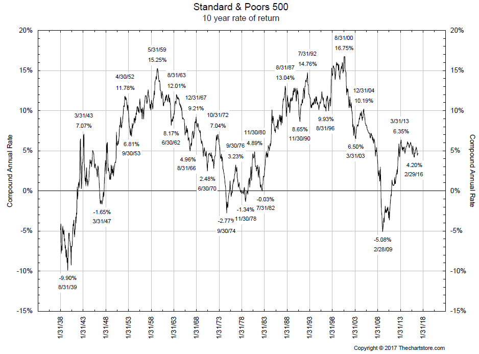 Chart C
Now keep in mind that market technicians are only concerned about price action, however, when measuring performance, you should use returns. And I have always said, if you are going to use total returns, then you have to also adjust the data for inflation. Often those two will almost cancel each other out, but it is a thorough method of measuring actual returns. I could also bring up the problem of how the government measures inflation but that is an entirely different article. The 10-year rolling return of the S&P 500 total return (including dividends) and adjusted for inflation is 5.05%. Again, you cannot actually see this number. Ron does provide a full table showing all the numbers in the series and that is where I’m pulling it from. Bottom line of all this is as follows. If you believe the government’s measurement of inflation is valid and you bought and held the S&P 500 index and received the dividends paid by each of the component stocks, your annualized return over the past 10 years is just a little over 5%; 5.05% to be exact. It’s difficult for me to use the word exact when we are adjusting for inflation.
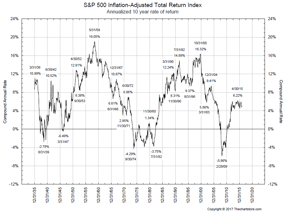 Chart D
For decades, I have stated that the masses have about 20 years in which to sock money away for retirement. Most don’t get serious about it during the child rearing, materialistic stages of their lives and are usually in their 40s before they get serious about retirement. Therefore Chart E and Chart F are the same data as shown in Chart C and Chart D respectively, only using a rolling 20-year period instead of 10. The 20-year rolling return of the S&P 500 price is 5.69%.
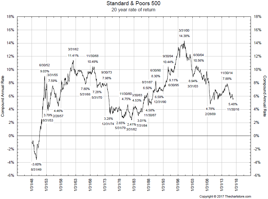 Chart E
The 20-year rolling return of the S&P 500 total return adjusted for inflation is 5.44%.
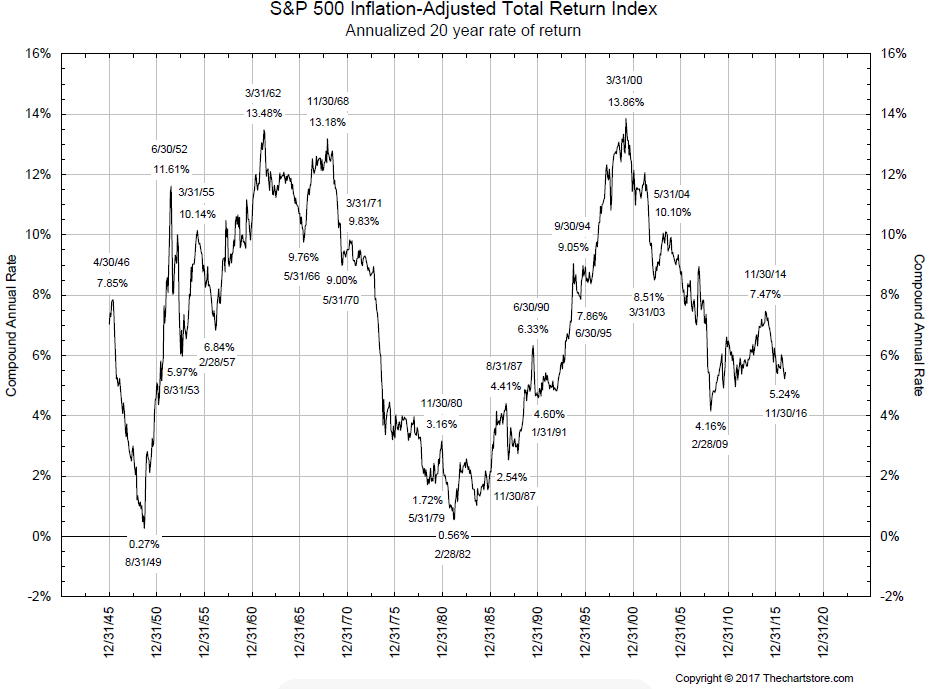 Chart F
Charts will serve a great purpose if you use them; and you should. Looking at published numbers for year-end analysis will not help much. The rolling return data has a message. Lots of things are helpful based upon when you were born. Take the person who was born in about 1940; when he was 40 years old and he stuck his money into the market, he would have had a return of 13.86% when he was 60 years old (see chart F – the last peak). Notice that the total return adjusted for inflation is less than what is shown in Chart E with just the price of the S&P 500. Look closely at the two charts and you can see that the lows in the inflation adjusted one are much lower than the price-based one. Dividends will always add to price for total returns and inflation will strip away returns of price data. Since the S&P 500 price and the total return inflation adjusted are close, it somewhat shows what I said; total returns and inflation adjustment often cancel each other. As a technical analyst, stick with price only for analysis, but total returns adjusted for inflation for performance analysis.
Dance with the Trend,
Greg Morris