 Welcome to 2019! I was born in the 1940s and am delighted to be here. If you were a trend follower with reasonable stop placement, 2018 was a tough year. If you were a trend follower without reasonable stop placement, you are scared, if not panicky. If you were a buy and hold investor in most stocks, then 2018 was a somewhat lousy year. If you were a market timer and always trying to guess the tops and bottoms, 2018 probably wasn’t so great either. I realize there are many other successful categories of traders and investors, but hopefully my message is succinct. Chart A shows the Nasdaq Composite (red), the Dow Industrial Average (orange), the S&P 500 Index (blue), and the Russell 2000 (green). The first four months of 2018 were wild and crazy. Then we had a reasonable up move for the next 4-5 months with the Nasdaq Composite leading, followed by the Russell 2000, then S&P 500, and Dow Industrial Average. In other words, a good rally led by smaller capitalization stocks. All that ended in October with the Nasdaq ending the year as the best performer and the small cap Russell 2000 hit fairly hard.
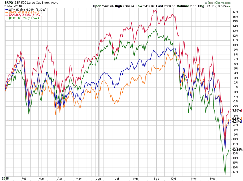 Chart A
Chart B shows the PerfChart of the S&P Sector ETFs including Real Estate. Health Care and Utilities were the top performers as during times of great uncertainty these two are usually the strongest performers. Energy, Materials, Industrials, and Financials were all down for the year. I’m somewhat surprised that real estate did okay in 2018. I would imagine that a lot of fence sitters jumped into the market as they witnessed a rise in interest rates. There is something about the train leaving the station that causes people to wake up. Someone who spends much time analyzing the market sectors can add color to this. StockCharts.com’s ChartSchool does an excellent job of explaining this so I won’t even attempt. Much of that material originated from Sam Stovall who was S&P Analyst for many years and John Murphy, who is StockCharts.com’s chief technical analyst.
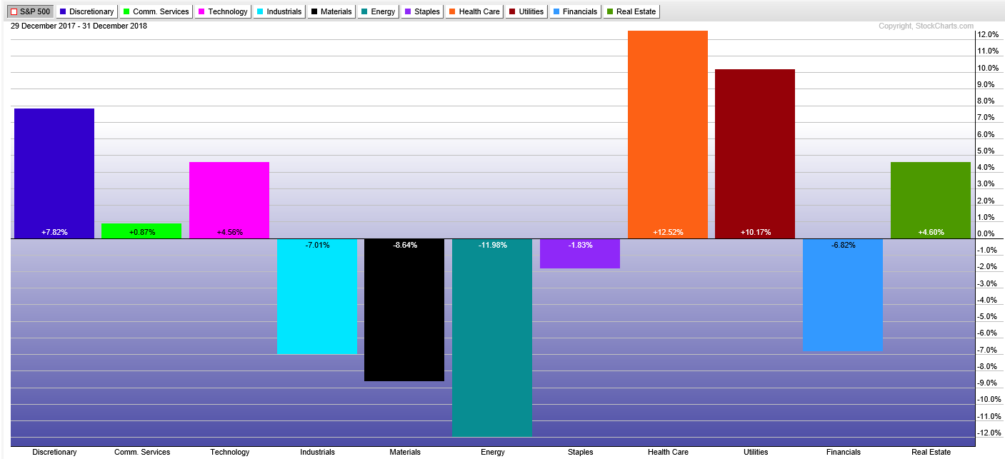 Chart B
Chart C shows Gold, Silver, Bonds, Real Estate, and Managed Futures. Unlike 2017, which had prices moving somewhat in concert with each other, which I think that is quite rare, 2018 has them all over the place. Good luck to anyone who tried to make money in those markets. Gold and Silver did rally as the equity market dropped in the last quarter. Seeking safety is the usual explanation.
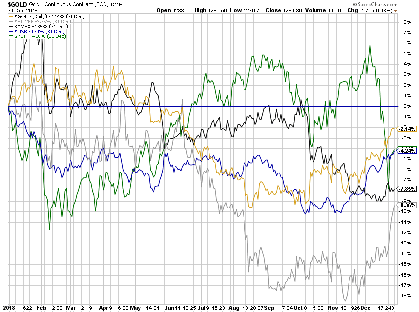 Chart C
Chart D is from Ron Griess’ website (www.thechartstore.com) showing the 20-year rolling returns on the S&P 500 Index. The last number is 3.63% annualized return over past 20 years as of 12/31/2018. The 3.63% at the end means that is the annualized return of the S%P 500 Index over the past 20 years. Don’t forget we had two big bear markets during that period. To put that in perspective, Chart E is the S&P 500 Index for that same 20-year period. Sometimes it is hard to remember that it wasn’t until 2013 that this index began making new highs. I picked the 20-year chart because that is the time period most have to sock it away for retirement.
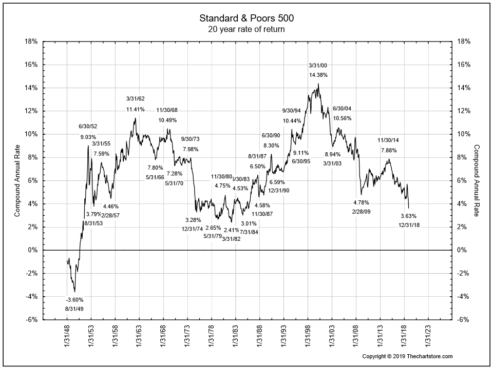 Chart D
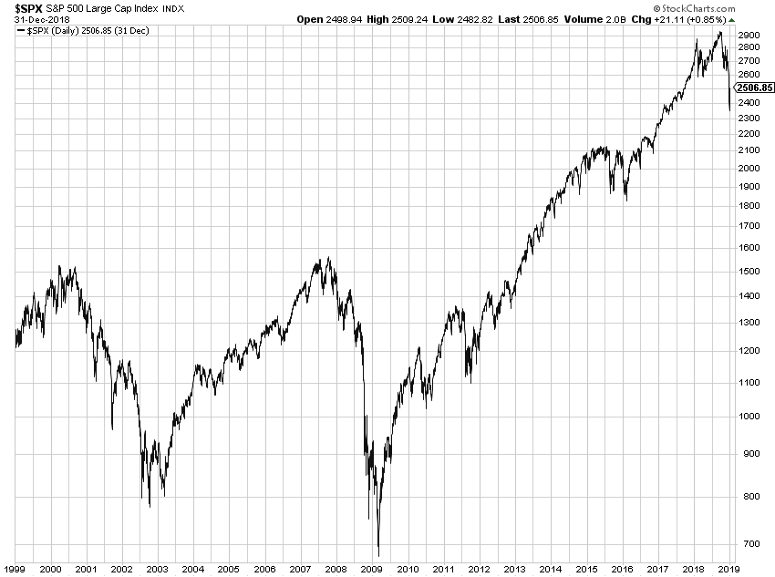 Chart E
Let’s hope 2019 is much better than 2018. I do not make forecasts, but if I had to guess about 2019, I'd say it is going to be tough market for most strategies. And I hope I am dead wrong. However, following a rules-based trend following model means I don't really care as the model will deliver the results based upon market action and the rules.
Dance with the Trend,
Greg Morris

