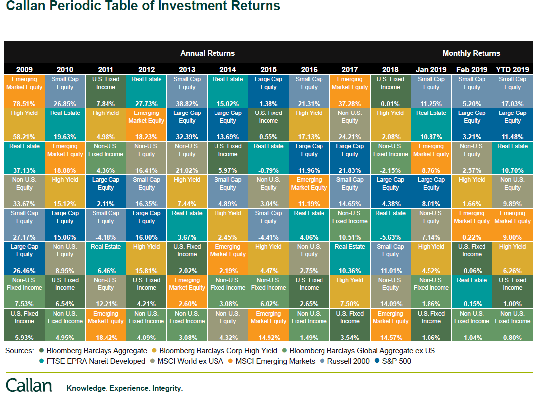
 First of all, you cannot retire on relative performance. Relative performance is often a valuable tool, but is also a marketing concept dreamed up by financial pundits who rarely outperform the market. Table A is a table of various asset classes and their relative performance since 2009, with the last 3 columns being the last 3 months. Keep in mind that each column (year) is totally independent of the other columns, and the assets classes at the top performed better than those at the bottom of each column. You do not know if they both lost money, both made money, one did, or not, other than the printed performance at the bottom of the box. It is just simple relative performance. And guess what? I’ll state it again; you cannot retire on relative returns.
 Table A is courtesy of Callan
Often the Callan Periodic Table of Investment Returns is shown to convince investors that chasing performance is a bad idea, as last years’ top performer probably won’t be the current year’s top performer. You can see that sometimes there is a string of consistent top performance. Years ago you could find a series of top performers with sometimes 4-5 years in a row at or near the top of the rankings. If an investor caught onto that trend after a few years, it wasn’t long before it failed miserably. Sadly, the investor, who probably thought they were genius added money each year and had no money management concepts or loss protection (stop loss) in place. If there was any real value with this, it is to learn and understand market history. From Table A, I could not find any asset class with more than 2 consecutive top performances; or in fact, anywhere on the table. You can search the internet and find variations of these types of table and those who go much further back in time.
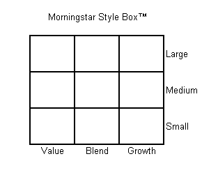
This is probably one of the most difficult obstacles to successful investing to overcome. It is human nature to want to be invested in the top performing stocks, funds, or strategies. Yet, you rarely know they are top performing until after they have had a few good years of top performance. In the old days many picked up the late January issue of Barron’s magazine when they showed the performance for all mutual funds for the previous year. Just like the Callan Periodic Table, when something is a top performer for a while, it more often than not, does not remain so. Style boxes are another dreadful source of performance chasing. A typical style box created by Morningstar in 1992 is shown in Graphic A. This gives investors an orderly classification system for mutual funds, which is unbelievably popular and used extensively to sell mutual funds. Morningstar ranks mutual funds into a five-star scale which forces a normal distribution because the top and bottom 10% get 5 stars, middle 35% get 3 stars, and the other two 22.5% groups get 4 and 2 stars. Research has shown that investors tend to put money into those with high ratings and withdraw money from those with low ratings, usually when they should be doing the opposite. In fact, many fund managers are tied to a particular style and measured by how they performed relative to that style. Their benchmark is the style box they have been classified into. If the fund drifts from its designated style, the marketing pressure insures adherence to the style box. I like to remind investors that when a manager who is tied to a benchmark (style) outperforms it, they call it alpha, however when the manager under performs the benchmark they like to say it is tracking error.
 Graphic A
I’d like to show you a modified style box for a trend following strategy in Graphic B. A trend follower is only concerned about up trends and down trends. If you feel that you must involve a style box approach, I recommend the one in Graphic B.
 Graphic B
With all that is arguably wrong with financial theory a future article will delve into some mathematical anomalies with using simple “bell curve” statistics which are based upon assumptions about the market that just do not play well and in fact are simply erroneous.
Dance with the Trend,
Greg Morris


