Note to the reader: This is the third in a series of articles I'm publishing here taken from my book, "Investing with the Trend," in article form here on my blog. Hopefully, you will find this content useful. Market myths are generally perpetuated by repetition, misleading symbolic connections, and the complete ignorance of facts. The world of finance is full of such tendencies, and here, you'll see some examples. Please keep in mind that not all of these examples are totally misleading -- they are sometimes valid -- but have too many holes in them to be worthwhile as investment concepts. And not all are directly related to investing and finance. Enjoy! - Greg
Believable Misinformation in Investing
Remember in our previous articles how many of the things we learned when we were young simply are not true? How many things have you learned in regard to investing that also just might not be true? Well...
- "Buy and hold is the only way to be successful in the stock market."
- "Dollar-cost averaging is a good technique."
- "Diversification will protect you from bear markets."
- "Compounding is the eighth wonder of the world."
- "You must remain invested at all times, or you will miss the 10 best days each year."
- "Average returns are never better than compounded returns."
- "Probability and risk are the same thing."
- "Equity asset allocation will protect you from bear markets."
- "Economists are good at predicting the market."
- "Chasing performance is a common technique."
The Void of Accountability
How often do you watch economists and market experts in financial media (television, print, etc.) offer strong opinions on the future direction of the economy and the stock market? Do they ever present their track record? Never! In fact, if you pay close attention, you will see that most of the "experts" are gaining something from their appearance. I'm shocked and disappointed at the absolute certainty in which they deliver their prognostications.
Hiding Behind Statistics
Have you placed a bet on the market using the Super Bowl indicator?
The Super Bowl indicator is based on the premise that, if the Super Bowl champion came from the old AFL, now known as the AFC, then the year will bring a downtrend in the stock market, while a winner from the old NFL, now the NFC, will lead to a bull market. Hopefully, you have not made any market decision on this, as that is a classic example of data mining and, even then, with an inadequate amount of data. This is not uncommon, however, as analysts, the financial media, newsletter writers, bloggers, and so on are constantly using data-mined statistics to make or support their hypothesis.
Figure 2.1 is a histogram of the annual returns on the Dow Industrial Average since 1897. The returns on the left are the down years, and the ones on the right are the up years. The up years account for 66 percent of all the years, so, if I were selling you a buy-and-hold strategy or an index fund, I could point to this chart and say, "Look, the market is up 66 percent of the time," and I would be correct. Is this actionable information? Of course not, it is only observable information. And it is good, because it helps one understand market history and statistics. But you can't make an investment decision based on this information.
Let's play a game. First of all, I promise you that it is a fair game; here are the rules:
- It will cost you $10 to play the game.
- You can play as many times as you desire.
- If you win, you will receive $1 million.
- There are no tricks.
- The honest mathematical probability of winning is 1 out of 6. Honest! No tricks!
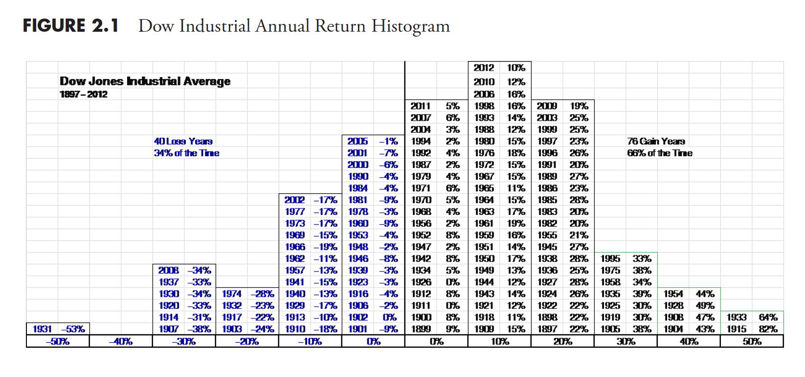 Figure 2.1
How many want to play?
When I do this during a presentation, most folks raise their hands; a few don't, but those are the ones that never raise their hand. I then announce that the game is Russian roulette, and ask, "How many want to play the game now?" No one raises their hands. I then ask, "What happened?" I changed your focus from these goofy statistics to the risk of playing the game, and when you found out the risk of playing, you were no longer interested. Most do not realize the difference between probability and risk. This is what you need to do with the market, analyze and assess the risk. Stop paying attention to the daily noise, and know the difference between actionable information and observable information.
You Must Remain Invested or You Will Miss the 10 Best Days of the Year
"You must remain invested, or you will miss the ten best days of each year." How many times have you heard that? While the fact of this matter is true, it is an impossible task to determine the best days beforehand. Let's turn it around and ask what happens if you miss the ten worst days each year.
Figure 2.2 shows the S&P 500 since 1979. The line that moves down and to the right is the line represents the "missing the ten best days" argument. Note that this analysis was about missing the 10 best (worst) days per year. Again, the argument is factual; it just isn't realistic. The line that moves up and to the right is the one that "misses the 10 worst days." Clearly, missing the 10 worst days gives a drastically better performance than missing the 10 best days. The two lines in the middle are the S&P 500 and the line representing "missing both the 10 best and 10 worst days," which you can see are quite close.
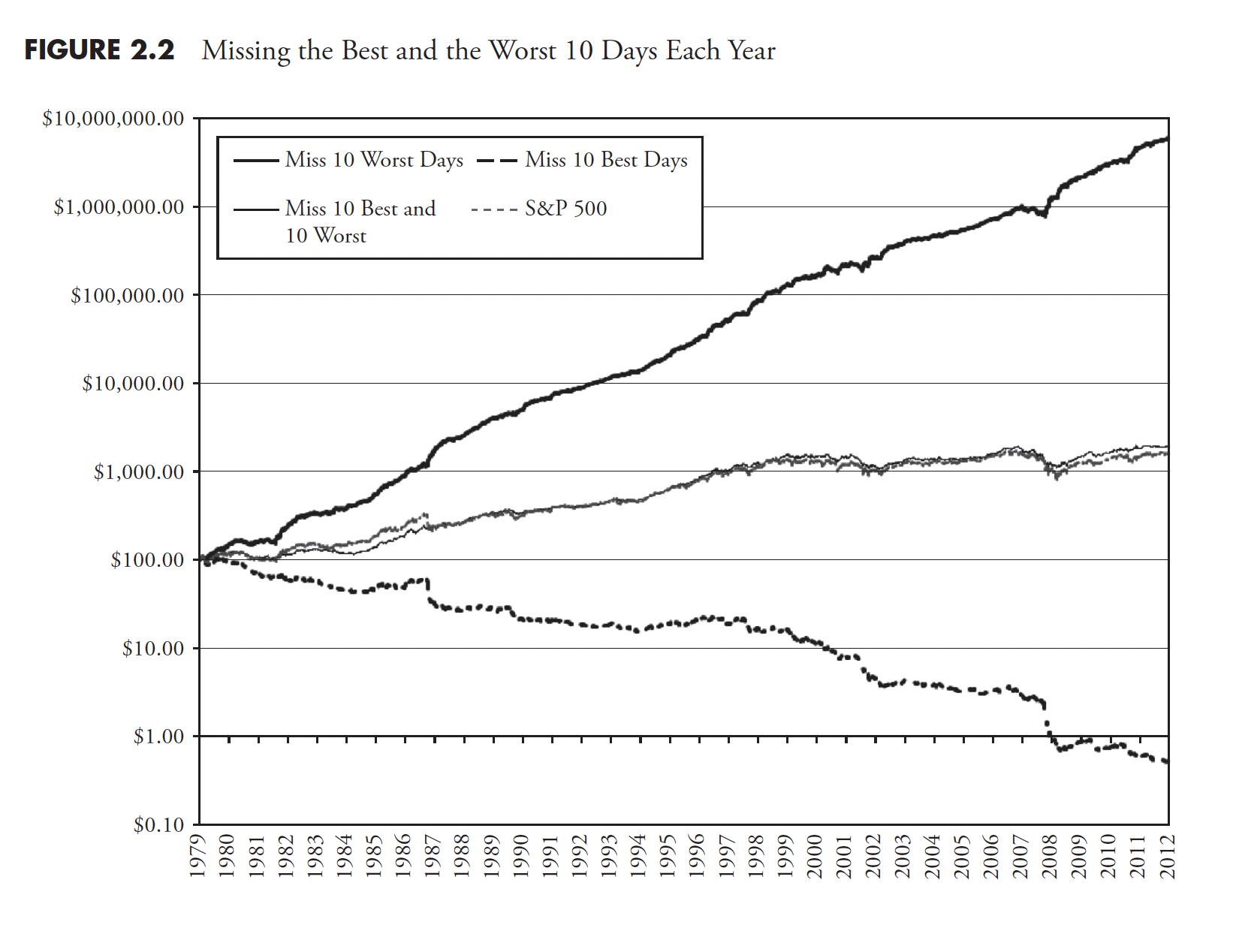 Figure 2.2
I have done this analysis also using the Dow Industrial Average back to 1885, and the results are always the same. I have done this over many varying time periods, and again, the results are the same. So, the buy-and-hold pundits and the index investing pundits want to scare you into believing their methods are better. A few articles from now, the section "The Deception of Average" should be enough to convince you that there is something wrong with that type of thinking. The best days (worst days) in the market are nothing more than interesting statistical anomalies. The argument that missing the best days would reduce the final return of a buy-and-hold strategy is true, but it also provides no information regarding the question of whether one can time the market in that regard. Somewhat like a strawman argument.
Table 2.1 is the data on the "missing days" conundrum. All data is updated through December 31, 2012. All calculations are based solely on price performance with no adjustment for dividends or inflation. It should be clear that if it were possible, missing the worst days each year would be the better strategy. This might be a stretch, but because missing both best and worst outperforms buy and hold, I think it shows that missing bad market days is more important. It also shows that missing days of high volatility are good. However, the purpose here is to challenge the marketing of buy and hold, which uses the "missing the best days" argument.
Remember, the message is clear and simple: The name of the game is to miss the bad days a lot more than missing the good days. This will play out as this book moves along. Note that most of the best days happen during bad or bear markets, usually tied to an overreaction to a short-term panic decline (you will see this in Table 3.1 ).
Diversification Will Protect You?
The world of finance is locked into the risk category of nonsystematic, or diversifiable, risk, and they do a really good job of it. However, diversifiable risk is a small piece of the big risk pie. There are many trite sayings about diversification, one being: "The only thing going up in a bear market is correlation." During big bear markets, correlations move rapidly toward one. This also means that most asset classes fail significantly during severe bear markets. The correlations among them move toward one, which means they become more and more correlated. Correlation is one of the primary components of modern portfolio theory. Diversification is a helpful tool, but it should only be employed to the point where its costs equal its benefits.
You can see in the two charts, Figures 2.3 and 2.4 , that, during up markets, most asset classes are uncorrelated and exhibit significantly different returns. However, in the second chart (Figure 2.4 ), during big bear markets, those same asset classes performed almost identically to each other, which challenges the need for diversification.
 Table 2.1: Best and Worst Days
The old saying goes, "Diversification works until it doesn't." The asset classes used in these two charts are shown in Table 2.2.
Diversification Works, as you can see in Figure 2.3 over the period from 2000 to October 2007...
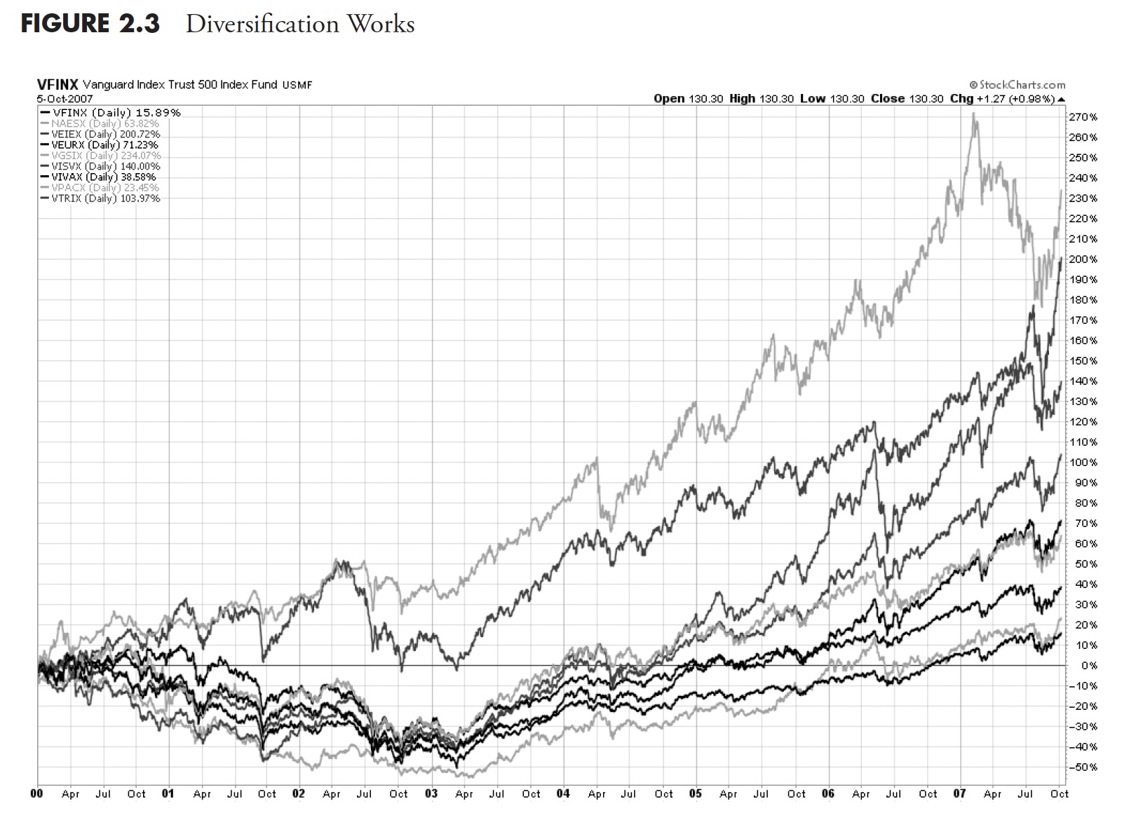 Figure 2.3: Diversification Works. Chart courtesy of StockCharts.com
....Until it doesn't, as you can see in Figure 2.4 over the period from October 2007 to August 2009.
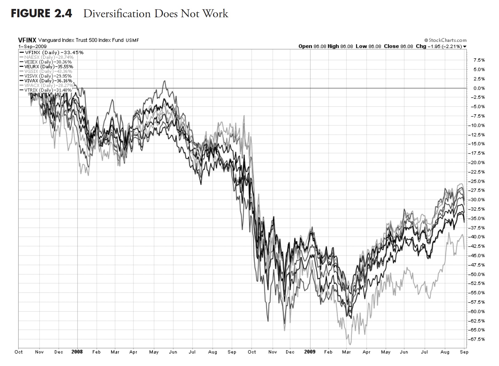 Figure 2.4: Diversification Does Not Work. Chart courtesy of StockCharts.com.
 Table 2.2: Components of the Diversification Charts (Figures 2.3 and 2.4)
Dollar-Cost Averaging
Dollar-cost averaging is simply the act of making like dollar investments on a periodic basis, say every month or every quarter. It is sold as a technique because they want you to believe that no one can outperform the market. There are many papers written on this subject, and I don't want to dwell on it. Dollar-cost averaging is very dependent on when you start the process. If you start the process at the top of the market, just prior to a large bear market, you will be buying all the way down, and this process could last a couple of years. Your average purchase price would probably be somewhere in the middle of the decline. A quick study of equivalent returns would tell you that the following bull move would need to go considerably higher than just halfway back up for you to just break even. In addition, it is also critical as to what periodic day or week you choose to make the investment. Should you do it quarterly and invest on the first day of the first week of the quarter, or something else?
The bottom line is that this process is subjected to unknown market risk, which can work for you but can also work against you. However, I think dollar-cost averaging is probably better than buy and hold, and it is certainly better than doing nothing, which might also be the same as buy and hold. When I hear someone talk about dollar cost averaging, I usually assume it is because they don't know what else to do. Anytime you can get someone to periodically contribute to an investment, you have accomplished something of value.
Table 2.3 is a really simple example of how it works using Apple (AAPL) stock from the year 2011, buying $500 of the stock on the first trading day of each month and determining the results on the day of the last purchase in December. You can see that, on the first trading day of December, you had accumulated 16.65 shares of Apple stock at an average price of $361.70 per share. The lump sum example assumes you bought all $6,000.00 on the first trading day at $329.57 per share, which gave you 18.21 shares.
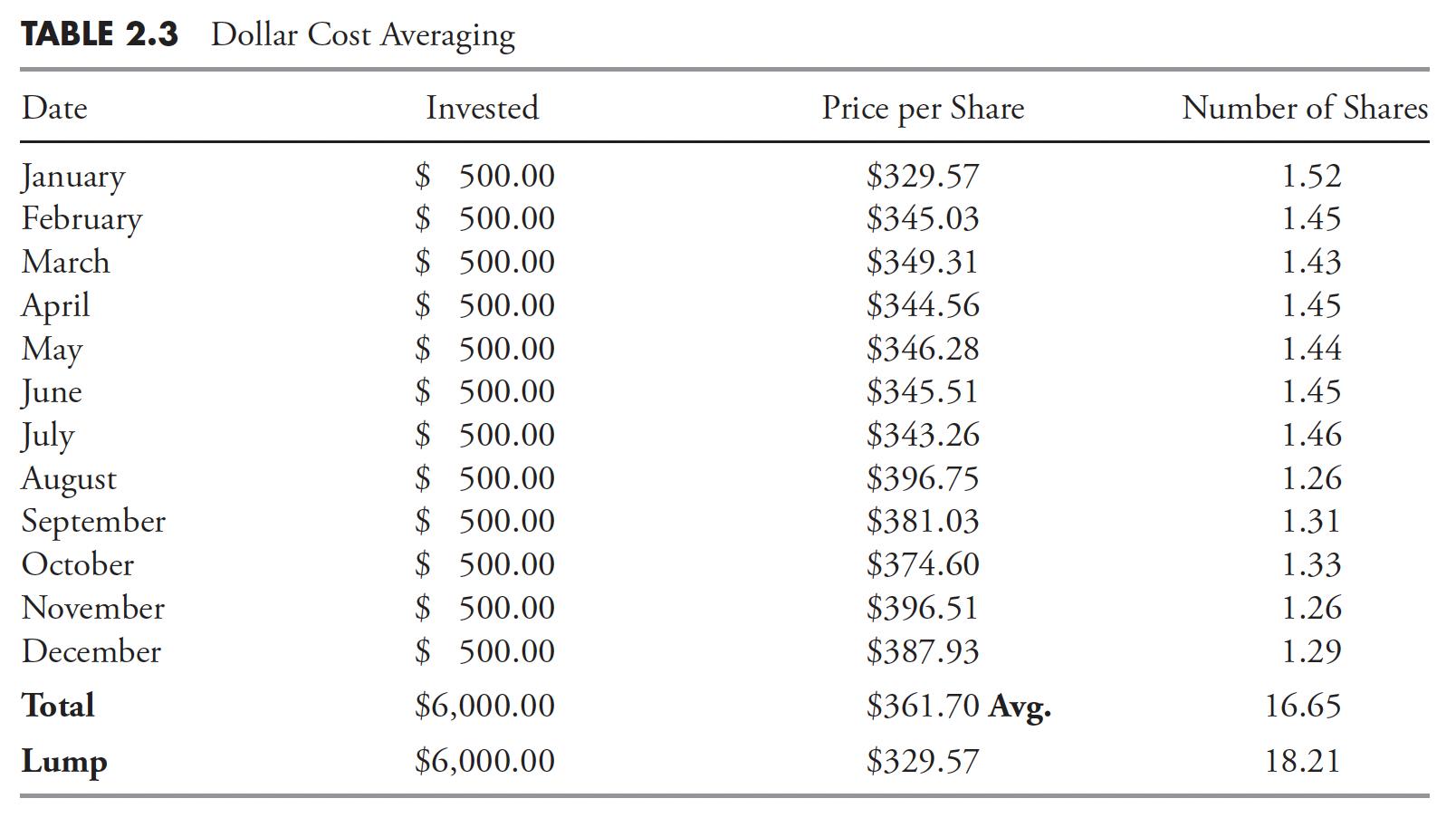 Table 2.3: Dollar Cost Averaging
From this example, the lump sum investment came out ahead, but I think you can see it has a lot to do with the time period for the investment, the volatility of the share prices, and, actually, the day of the month that you make the purchase. Some of the advantages of DCA are the affordability factor and the convenience; it can be set up just like any monthly household budget item or expense, and also something many people need to keep the process alive. The disadvantages are that lump sum investing can give better returns but also worse returns, and the disadvantage is that you won't know ahead of time. Also, when making numerous DCA investments, the fees are generally higher than lump sum. The bottom line is that it helps people make investments on a periodic basis, which is always going to be better than sitting on the sidelines because you don't know what to do. Furthermore, dollar cost averaging becomes less effective as an investor ages because of less time for compounding, and free cash is usually a lower percentage of total investment goals.
Jason Zweig, in a Wall Street Journal article on May 26, 2009, spoke of Benjamin Graham's comments on dollar cost averaging. Asked if dollar cost averaging could ensure long-term success, Mr. Graham wrote in 1962: "Such a policy will pay off ultimately, regardless of when it is begun, provided that it is adhered to conscientiously and courageously under all intervening conditions." For that to be true, however, the dollar cost averaging investor must "be a different sort of person from the rest of us... not subject to the alternations of exhilaration and deep gloom that have accompanied the gyrations of the stock market for generations past." "This," Mr. Graham concluded, "I greatly doubt."
He didn't mean that no one can resist being swept up in the gyrating emotions of the crowd. He meant that few people can. To be an intelligent investor, you must cultivate what Mr. Graham called "firmness of character"—the ability to keep your own emotional counsel. (A102)
Compounding is the Eighth Wonder of the World
I think it was Albert Einstein who made the above comment, even though I found no proof that he did. The rest of the quote is: He who understands it, earns it, and he who doesn't, pays it. I always remind folks that he forgot to include an adjective. Positive compounding is the eighth wonder of the world, which is usually associated with saving accounts and so on. Table 2.4 is a simple example of how one negative year can ruin your retirement plans. Notice that Investment Option B also started out with a phenomenal first-year return of +36 percent, compared to Option A's return of only +10 percent. Another example of why chasing performance can be very harmful to your wealth.
The investment option B in Table 2.4 would require a return of 16 percent the following year to get back to the 8 percent per year average. Beware of negative returns; they can destroy your financial plans, especially as you lose time to recover the losses.
It is critical for long-term investment success to not track short-term market movements. Instead, one should only try to outperform the markets over the long term. Let's assume that your investment goal is to maintain an annualized return of 10 percent over the next five years, as shown in Table 2.5. Here are the hypothetical market returns: +10 percent, +10 percent, +10 percent, -10 percent, +10 percent. Those returns look pretty good at first glance, even though one of them is negative. However, the impact on the actual investment return is quite different.
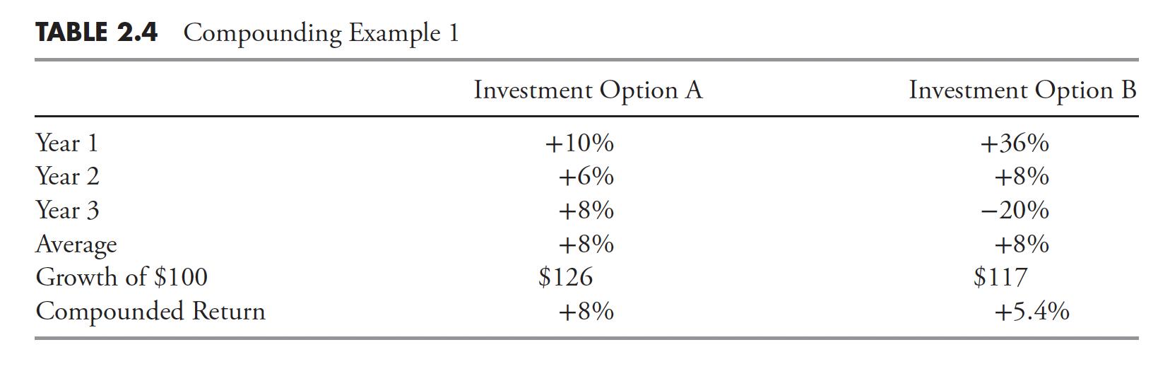 Table 2.4 Compounding Example 1
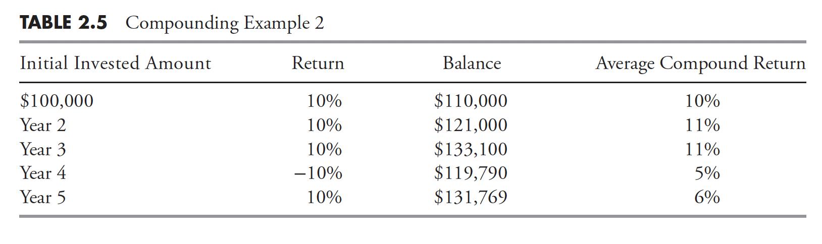 Table 2.5: Compounding Example 2
The important point is that it only takes one drawdown over any one-year period to destroy compounded returns. In the above example, it would take a 33% return in year five to return the portfolio to an annualized 10 percent return. This is why most investors' performance is far less than that of the actual market. Compounding is indeed the eighth wonder of the world, but it is only when the returns are positive.
Relative Performance
First of all, you cannot retire on relative performance. Relative performance is a marketing concept dreamed up by financial pundits who rarely outperform the market.
Figure 2.5 is a table of various asset classes and their relative performance. Keep in mind that each column (year) is totally independent of the other columns, and the asset classes at the top performed better than those at the bottom of each column. You do not know if they both lost money, both made money or if one made money and one didn't. It is just simple relative performance. And guess what? You cannot retire on relative returns. Normally, this table is displayed in color, so the delineation between the squares is more apparent, but showing the actual data was not the purpose of introducing it at this point.
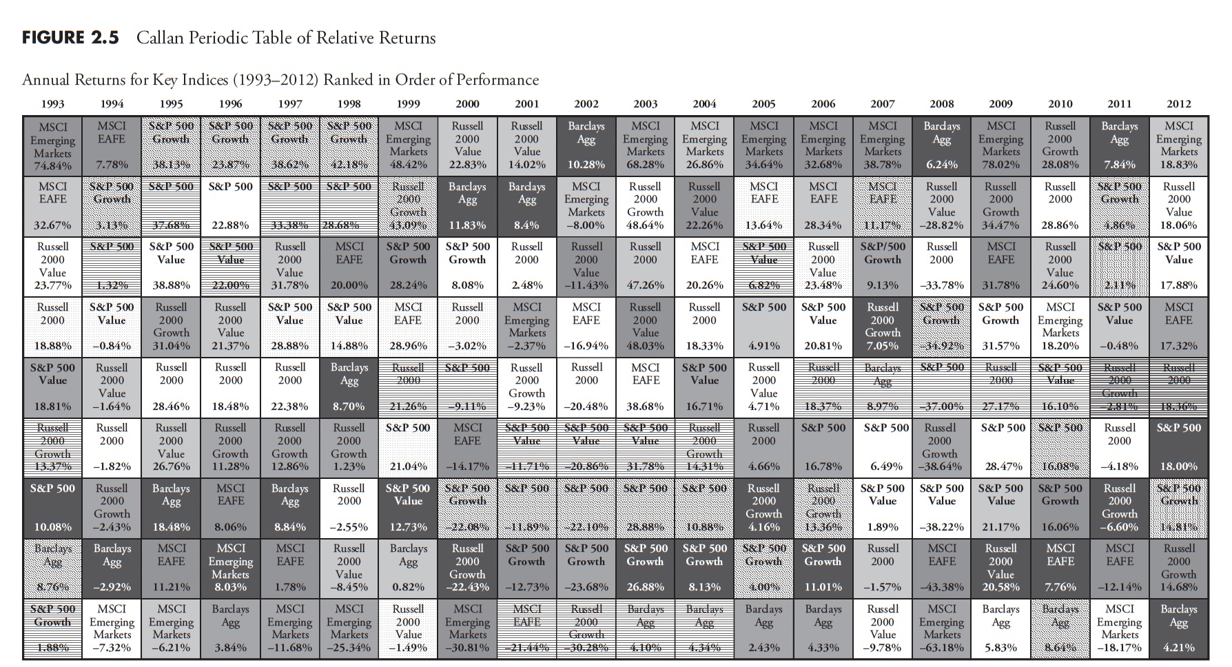 Figure 2.5: Callan Periodic Table of Relative Returns. Courtesy of Callan Associates.
Often, the Callan Periodic Table of Returns is shown to convince investors that chasing performance is a bad idea, as last year's top performer probably won't be the current year's top performer. You can see that, sometimes, there is a string of consistent top performance; in fact, in Figure 2.5, Emerging Markets was the top performer from 2003 to 2007. If an investor caught onto that trend after a few years, it wouldn't have been long before it failed miserably, and sadly, the investor, who probably thought they were genius, had been adding money each year and had no money management concepts or loss protection (stop loss) in place. Emerging markets fell to the worst performer in 2008 and have shown exceptional relative volatility since. If there was any real value in this, it is to learn and understand market history.
This is probably one of the most difficult obstacles to successful investing to overcome. It is human nature to want to be invested in the top-performing stocks, funds, or strategies. Yet you rarely know they are top-performing until after they have had a few good years of top performance. In the old days, many picked up the late January issue of Barron's magazine, when they showed the performance for all mutual funds for the previous year. Just like the Callan Periodic Table in Figure 2.5 , when something is a top performer for a while, it, more often than not, does not remain so.
Style boxes are another dreadful source of performance chasing. A typical style box, created by Morningstar in 1992, is shown in Figure 2.6. This gives investors an orderly classification system for mutual funds, which is unbelievably popular and used extensively to sell mutual funds. Morningstar ranks mutual funds into a five-star scale, which forces a normal distribution because the top 10 percent get five stars, the bottom 10 percent get one star, the middle 35 percent get three stars, and the other two 22.5 percent groups get four and two stars. Research has shown that investors tend to put money into those with high ratings and withdraw money from those with low ratings, usually when they should be doing the opposite. (A55)
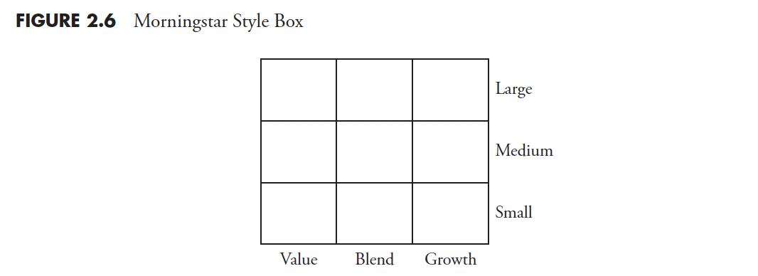 Figure 2.6: Morningstar Style Box
In fact, many fund managers are tied to a particular style and measured by how they performed relative to that style. Their benchmark is the style box they have been classified into. If the fund drifts from its designated style, the marketing pressure ensures adherence to the style box. I like to remind investors that when a manager who is tied to a benchmark (style) outperforms it, they call it alpha; however, when the manager underperforms, the benchmark they like to say is a tracking error.
Later in this book, you will see an investment strategy that does not pay any attention to styles or style boxes; however, I can show you a modified style box for a trend-following strategy in Figure 2.7. A trend follower is only concerned about uptrends and downtrends. If you feel that you must involve a style box approach, I recommend the one in Figure 2.7.
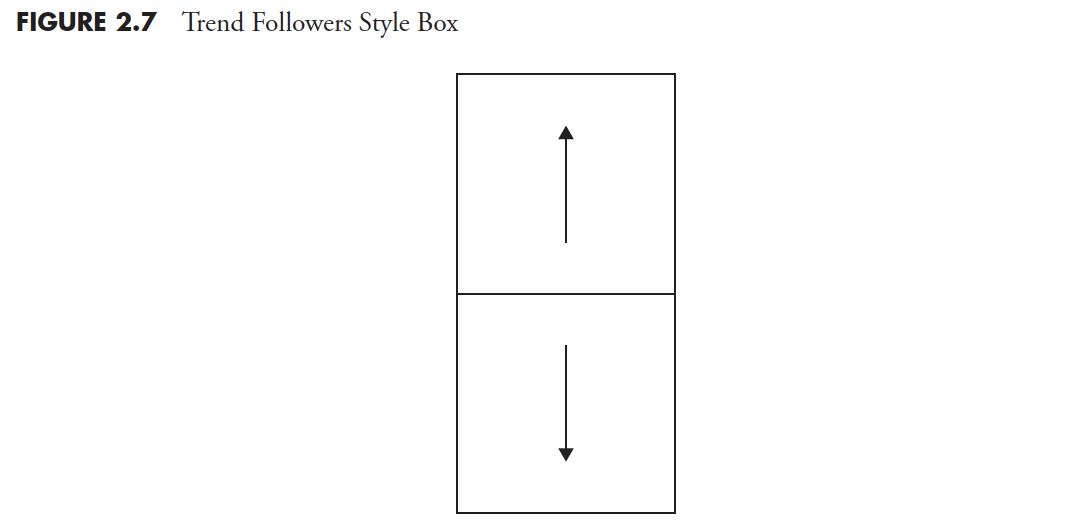 Figure 2.7: Trend Followers Style Box
With all that is arguably wrong with financial theory, the next chapter will delve into some mathematical anomalies with using simple "bell curve" statistics, which are based on assumptions about the market that just do not play well and, in fact, are simply erroneous.