Note to the reader: This is the ninth in a series of articles I'm publishing here taken from my book, "Investing with the Trend." Hopefully, you will find this content useful. Market myths are generally perpetuated by repetition, misleading symbolic connections, and the complete ignorance of facts. The world of finance is full of such tendencies, and here, you'll see some examples. Please keep in mind that not all of these examples are totally misleading -- they are sometimes valid -- but have too many holes in them to be worthwhile as investment concepts. And not all are directly related to investing and finance. Enjoy! - Greg
"The farther backward you can look, the farther forward you are likely to see." — Winston Churchill
Calendar vs. Market Math
There are 365 calendar days per year (365.25 for leap year consideration). There are five market days per week, so five-sevenths of 365 = 260.7 market days per year. Of course, to include leap year using the same methodology, five-sevenths of 365.25 = 260.9 market days per year. Hence, either 260.7 or 260.9 will round to 261 days per year. Next we need to adjust for market holidays, 261 days - 9 holidays = 252 market days per year. Market holidays (Table 7.1) were obtained from the New York Stock Exchange website.
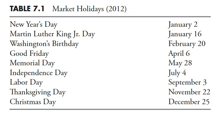 Stock Exchange Holidays
So now we know that there are 252 market days per year. If we divide that by the number of months per year (12), 252/12 = 21 market days per month. Hence, dividing market days by 12 will yield calendar months.
With this knowledge, we can then determine moving average, ratio, or rates of change values, such as:
- 1 month = 21 market days (for a month, you would use 21, not the normal 30/31 days in a month).
- 3 months = 63 days.
- 9 months = 189 days (close to the ubiquitous 200 days).
Understanding the Past
Although the old saying goes, the present [market] rarely is the same as the past, but it often rhymes. This is why we study the past so that, when similar events unfold in the market, we just might be able to recognize them and know what can possibly happen. Remember, markets constantly change, but people rarely do.
"All bull markets die, only the cause of death changes." — James Montier
Bull Markets
A bull market has many definitions. Usually, the one that makes the most sense (cents) is the one that mirrors the definition of a bear market—a move of 20% or greater without an opposite move of -20%.
Table 7.2 shows all bull markets in the S&P 500 Index of greater than 20% since 1931, ranked by duration in days. It should be clear that bull markets come in all sizes and durations. The current bull market (as of 12/31/2012) is number 8 in duration.
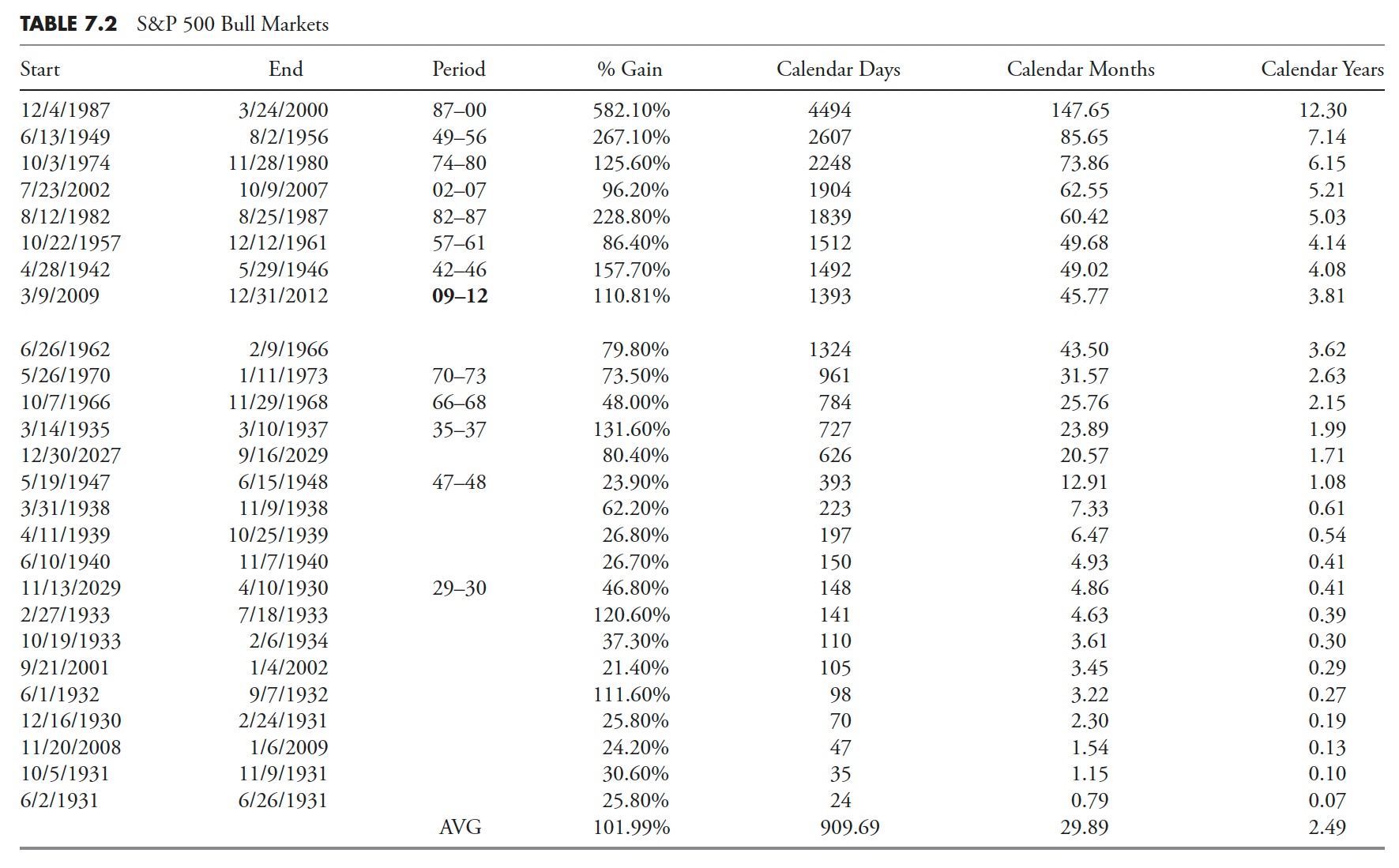
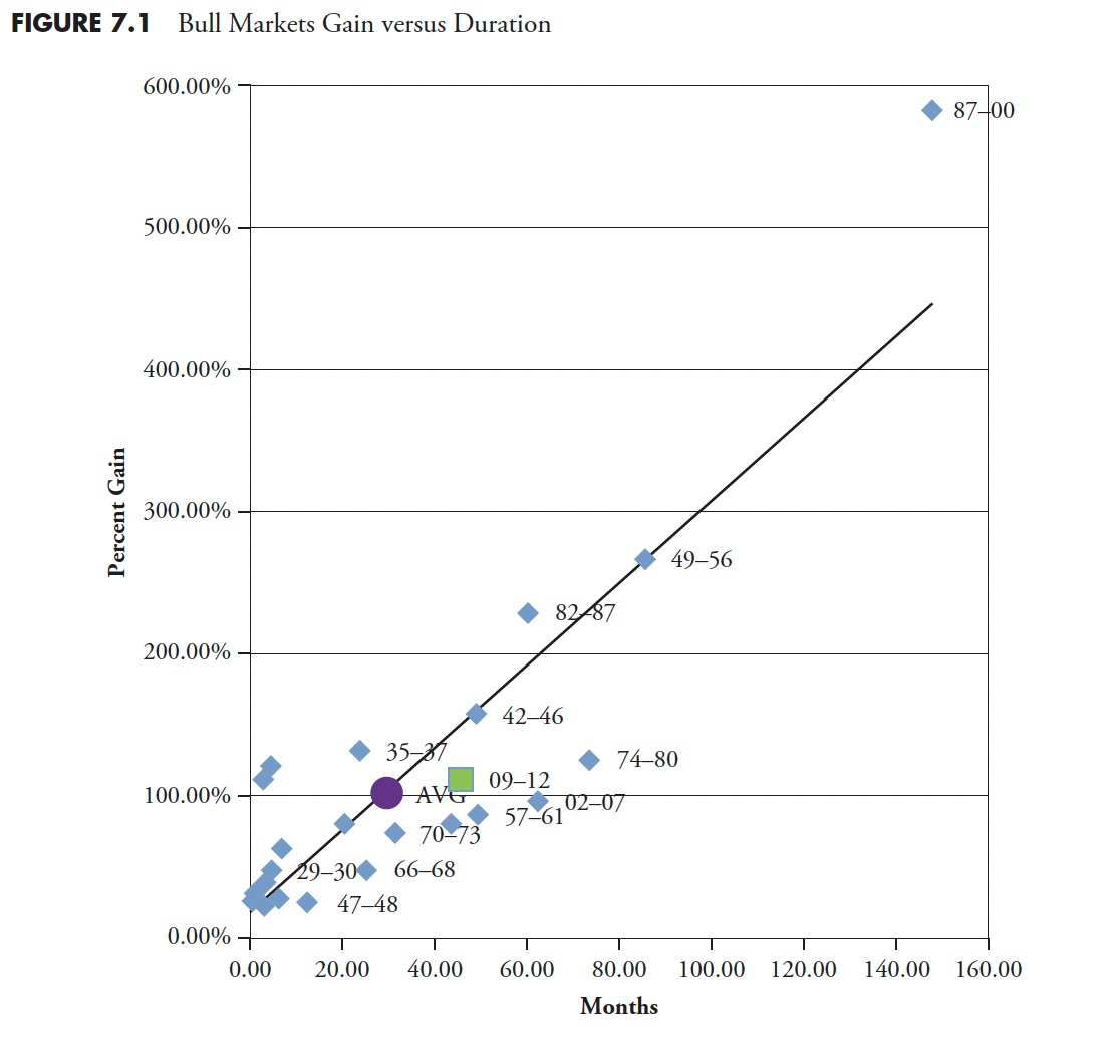
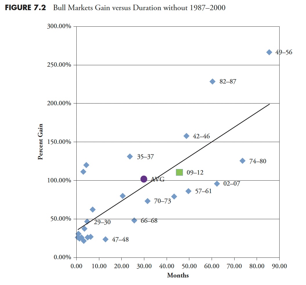
Figure 7.1 shows the data in Table 7.2 with Percent Gain versus Months duration. The 2009 to 2012 bull market is identified by the square, while the average of all bull markets is denoted by the dot. The 2009 to 2012 bull is below the least squares line, which means that, for its duration, it has not performed as well as the average. However, the 1987 to 2000 bull market could be considered an outlier and, if removed (see Figure 7.2), then the 2009 to 2012 bull is closer to average. Although this is foolish, it does show how data can be manipulated, or as Charles Barkley says, "If my aunt were a man, she'd be my uncle."
 Bull markets are when investors become genius and overconfidence flourishes. They are the times when capital grows and times are good. Often, bull markets are mixed with what appears to be really bad news, whether it is economic, political, or other. An old saying is that bull markets climb a wall of worry. A bull market can cause exceptional complacency and, when they begin to roll over into a bear market, most will be in denial and ride much of the bear market down. We won't spend much time on bull markets because the underlying theme of this book is risk avoidance, so the focus is on bear markets and all things associated with them.
 Bear Markets
Figure 7.3 shows the Dow Industrial Average back to 1885, using a semi-log scale in the top plot. The lower plot is a line that zigzags back and forth, known as a filtered wave. That lower line only changes direction after a move of at least 20% has occurred in the opposite direction. It shows only moves of 20% or more. The last move is not valid, as it only shows where the last price was from the last move of 20% or greater. Most are surprised at the frequency of up and down moves of that magnitude that have occurred in the past 127 years. Notice the three highlighted periods where there were very few up and down moves of greater than 20%.
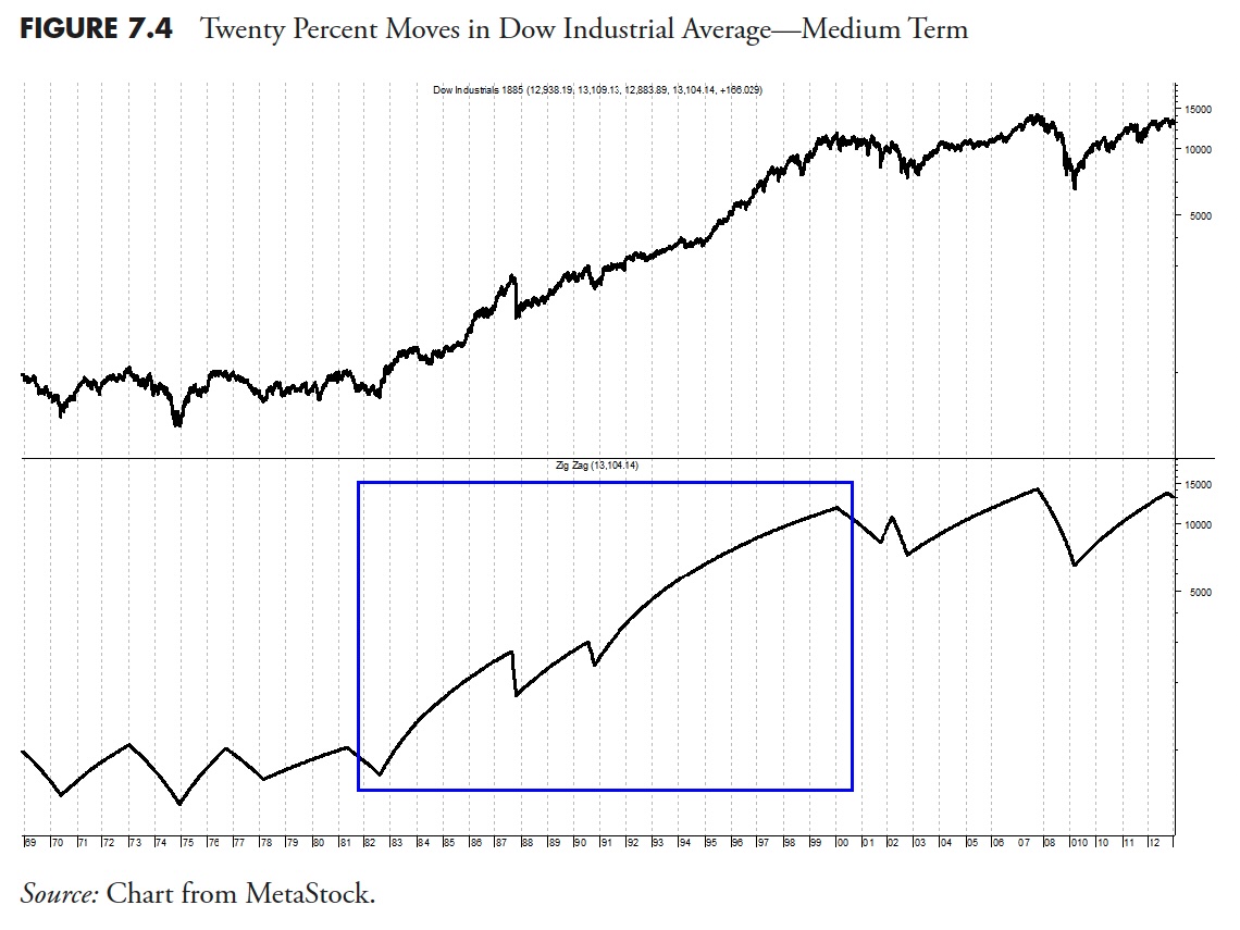
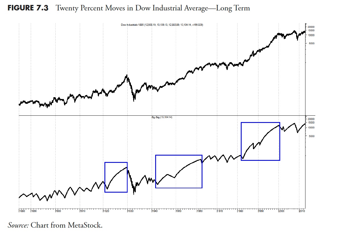 Figure 7.4 is the same as the one above, except that it only shows data since 1969 so that you can better see the moves of greater than 20%. Notice that there are periods (first half of chart) where there were many up and down moves of greater than 20 percent. These types of moves have also happened on the right edge of the chart since 2000. The period of time between 1982 and 2000 saw relatively few moves in comparison. As will be thoroughly reviewed later, these periods are driven by long-term swings in valuations.
It has long been assumed that moves downward of 20% or greater are called bear markets. Although this is a subjective call, it is widely accepted and won't be challenged here. Any move downward from a market high is called a drawdown and is measured in percentages. Therefore, a drawdown of 20% or more is also a bear market. Drawdowns are discussed in more detail later in this book.
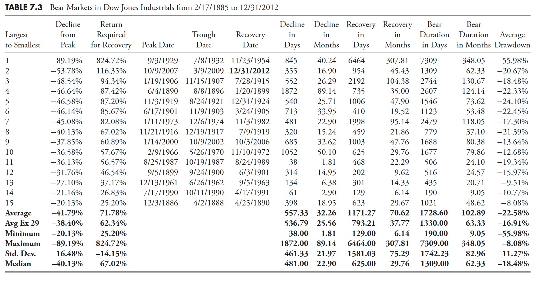
Table 7.3 shows the bear markets in the Dow Industrials since 1885. At the bottom of the table are some statistics to assist you in getting a feel for the averages, and so on.
- Average. The same as the mean in statistics: add all values and then divide by the number of items.
- Avg Ex 29. This is the Average with the 1929 bear removed, as it skews the data somewhat.
- Minimum. The minimum value in that column.
- Maximum. The maximum value in that column.
- Std. Dev. This is standard deviation, or sigma, which is a measure of the dispersion of the values in the column. About 65 percent of the values will fall within one standard deviation of the mean, and 95 percent will fall within two standard deviations of the mean.
- Median. If the data is widely dispersed or has asymptotic outlier data, this is usually a better measure for central tendency than Average.
From Table 7.3, you can see that there were 15 declines of greater than 20% over the past 127 years in the Dow Jones Industrial Average. Here are some statistics from the table:
- The average decline percentage was -41.79 percent.
- The average duration of the decline was 32.26 months.
- The average duration of the recovery was 70.62 months.
- Therefore, the average bear market from its beginning peak until it had fully returned to that peak lasted 102.89 months, or over 8.5 years.
- The average percentage gain for the recovery to get back to even was 71.78 percent.
Table 7.4 shows the Bear Markets in the S&P 500 Index since 1927. From Table 7.4, you can see that there were 10 declines greater than 20% in the past 85 years in the S&P 500 Index.
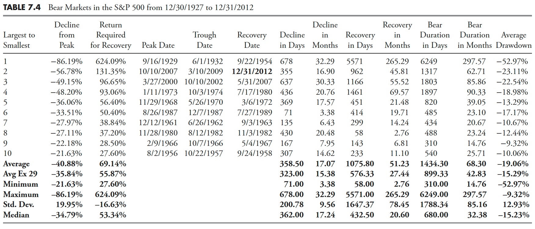
Here are some statistics from the table:
- The average decline percentage was -40.88%.
- The average duration of the decline was 17.07 months.
- The average duration of the recovery was 51.23 months.
- Therefore, the average bear market, from its beginning peak until it had fully returned to that peak, lasted 68.3 months or over 5.5 years.
- The average percentage gain for the recovery to get back to even was 69.14 percent.
Although the numbers are a little different between the two tables, the Dow Industrials also had 42 more years of data. The message is the same — however, draw-downs of greater than 20 percent (bear markets) can be painful, and it takes a long time to recover from them. There will be more detailed coverage of these tables in the upcoming "Drawdown Analysis" chapter.
Just How Bad Can a Bear Market Be?
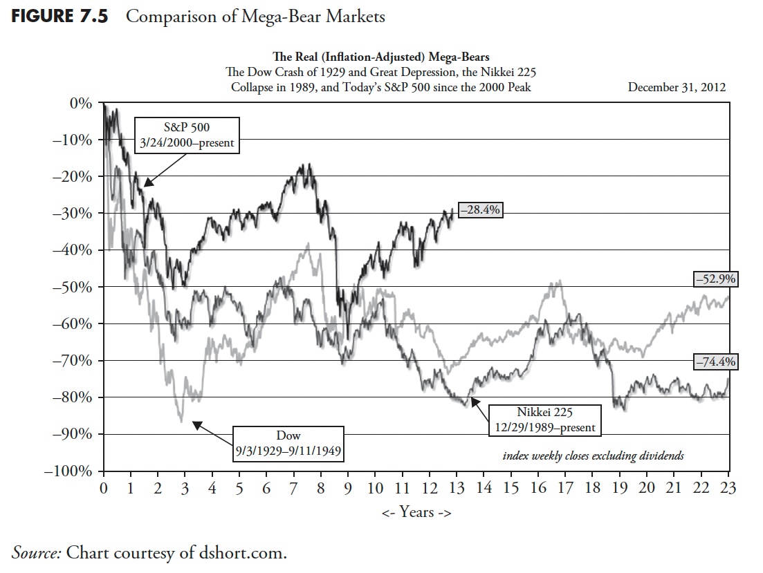
In an attempt to show how bad some bear markets can be in not only magnitude but duration, Figure 7.5 shows the S&P 500 beginning in 2000, the Dow Industrials overlaid from 1929, and the Japanese Nikkei 225 overlaid from 1989. All three begin at 0% on the left scale. These are inflation-adjusted so that you can see the full effect of holding over time. Although we do not know the future, studying the past clearly shows that really bad bear markets can last a very long time.
 Bear Markets and Withdrawals
Table 7.5 shows the last bear market, which began on October 9, 2007, using the S&P 500 Index price and a typical buy-and-hold retirement account making periodic withdrawals. As of 12/31/2012, the bear market had recovered almost all of its losses but not quite; therefore, a buy-and-hold investor would be almost back to breakeven after 5.5 years. However, if one is retired, it generally means one has set up a withdrawal schedule for income during retirement. In Table 7.5 it is assumed that the retirement account is withdrawing 6 percent per year adjusted quarterly for 3 percent annualized inflation. The column labeled Retirement Account shows the account without any withdrawals. The column labeled Account w/Distributions shows the value of the account with the withdrawals. The last column shows the percent return to get back to the initial $100,000 that was in the account when the bear market began. You can see that, in order to return the account to its original $100,000, it would take a return of more than 99 percent — in other words, one must double his or her money. So when you are confronted with advice to buy and hold because all bear markets eventually recover, consider this example.
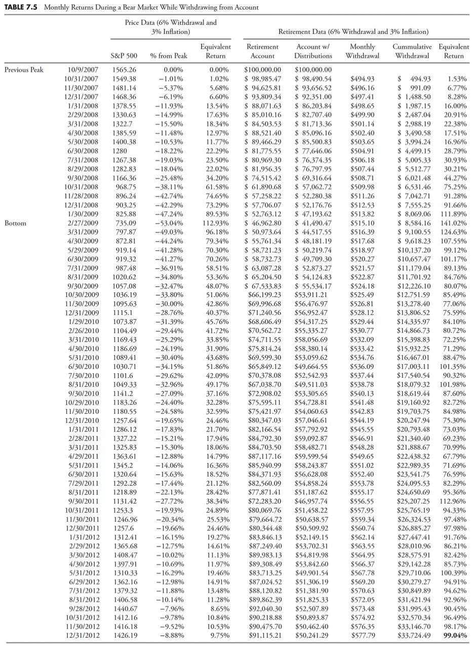
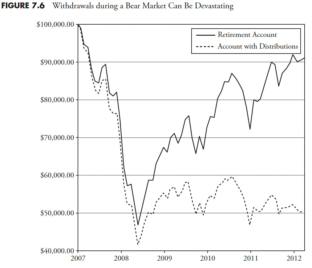
Figure 7.6 shows the devastating results of being retired during a bear market while withdrawing money for current income. While the buy-and-hold strategy eventually begins to recover, the periodic withdrawals from an ever-smaller account reach a state of deteriorating equilibrium. Even buy-and-hope fails miserably in this environment, and, when coupled with periodic withdrawals, it can be a life-changing event.
 Market Volatility
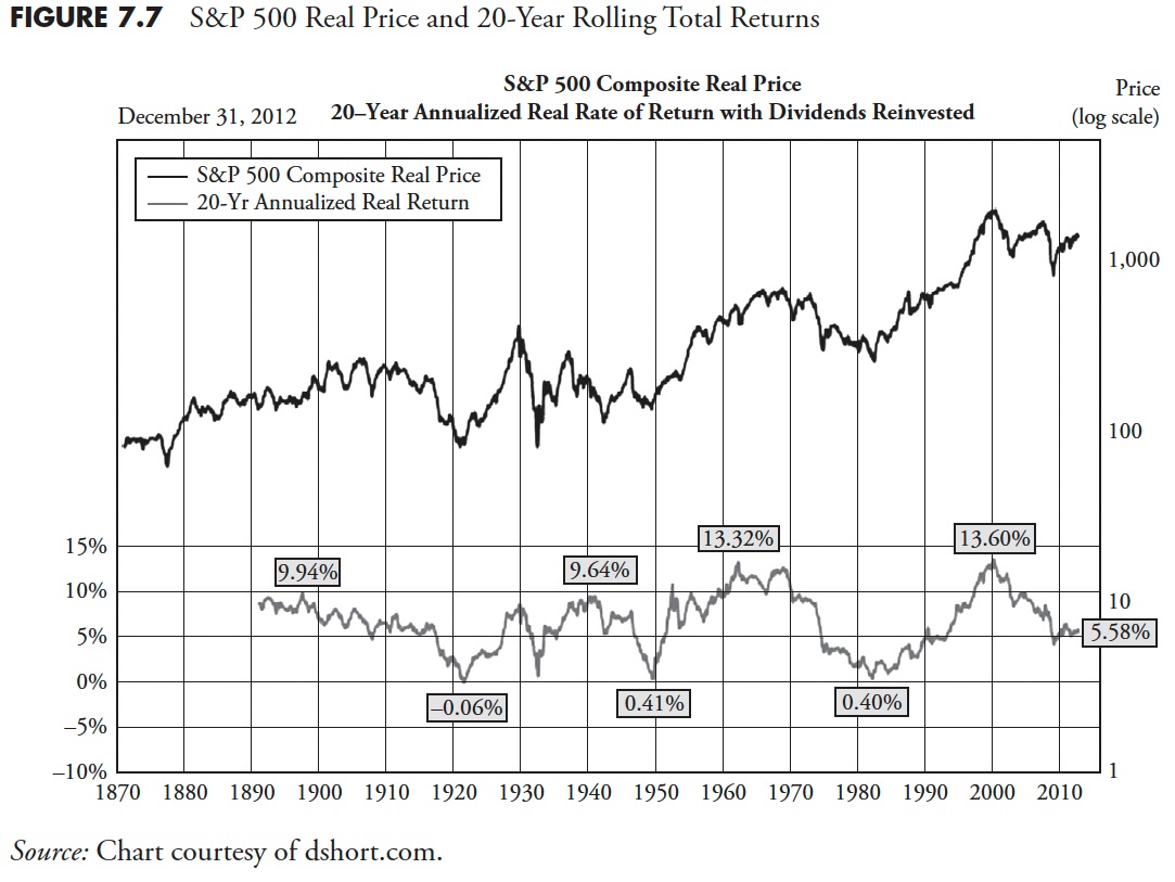
Another shock to people who have not studied market history is the volatility that exists at times. Figure 7.7 shows the S&P 500 real price (real means it does not reflect inflation's effect) and adjusted for dividends. The plot at the bottom shows the 20-year annualized real rate of return. I think it is fairly obvious that returns are not guaranteed over any time period. With the assumption that most investors have about 20 years to really put money away for retirement, a lot has to do with things totally out of your control — like when you were born. Clearly, there are better times to invest than others, usually only known in hindsight.
There are many ways to measure volatility in the market. The world of finance wants you to believe that volatility is risk, and that risk is measured by standard deviation. This would be fine if investors were rational, the markets were efficient, prices were random, and normally distributed. But they aren't.
Figure 7.8 shows price volatility using some of my favorite indicators of volatility. The top plot is the S&P 500 Index from 2008 to December 31, 2012. There are three plots below that show three variations of price volatility.
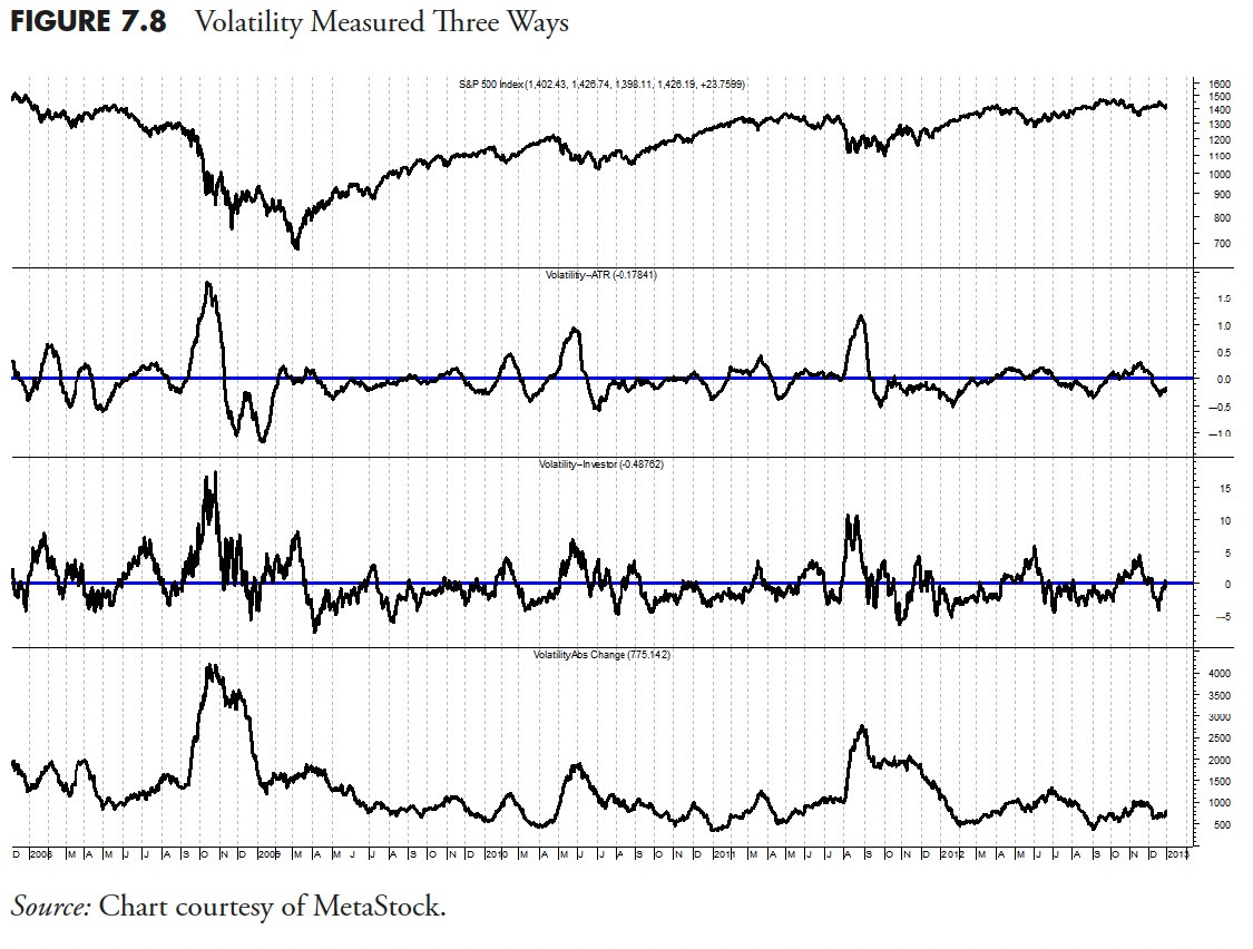
The second plot from the top shows the volatility of price changes using a technique called average true range. This is a preferable method, as it takes into account any gaps in price from one day to the next that occur in price histories.
The next plot is simply looking at the percentage price changes each day. The bottom plot shows the volatility of price similar to the one above, only it converts the data to absolute values. All three volatility plots have been smoothed over a 21-day period. I like to use 21 days because that represents the number of market days per month (see beginning of this chapter on Calendar Math).
You can see that during market downturns (see top plot) there is a tendency for volatility to increase. The more extended the down move, the greater the volatility. Volatility is a great measure of investor fear, probably better than most other sentiment indicators, because it is a direct measurement of indecision.
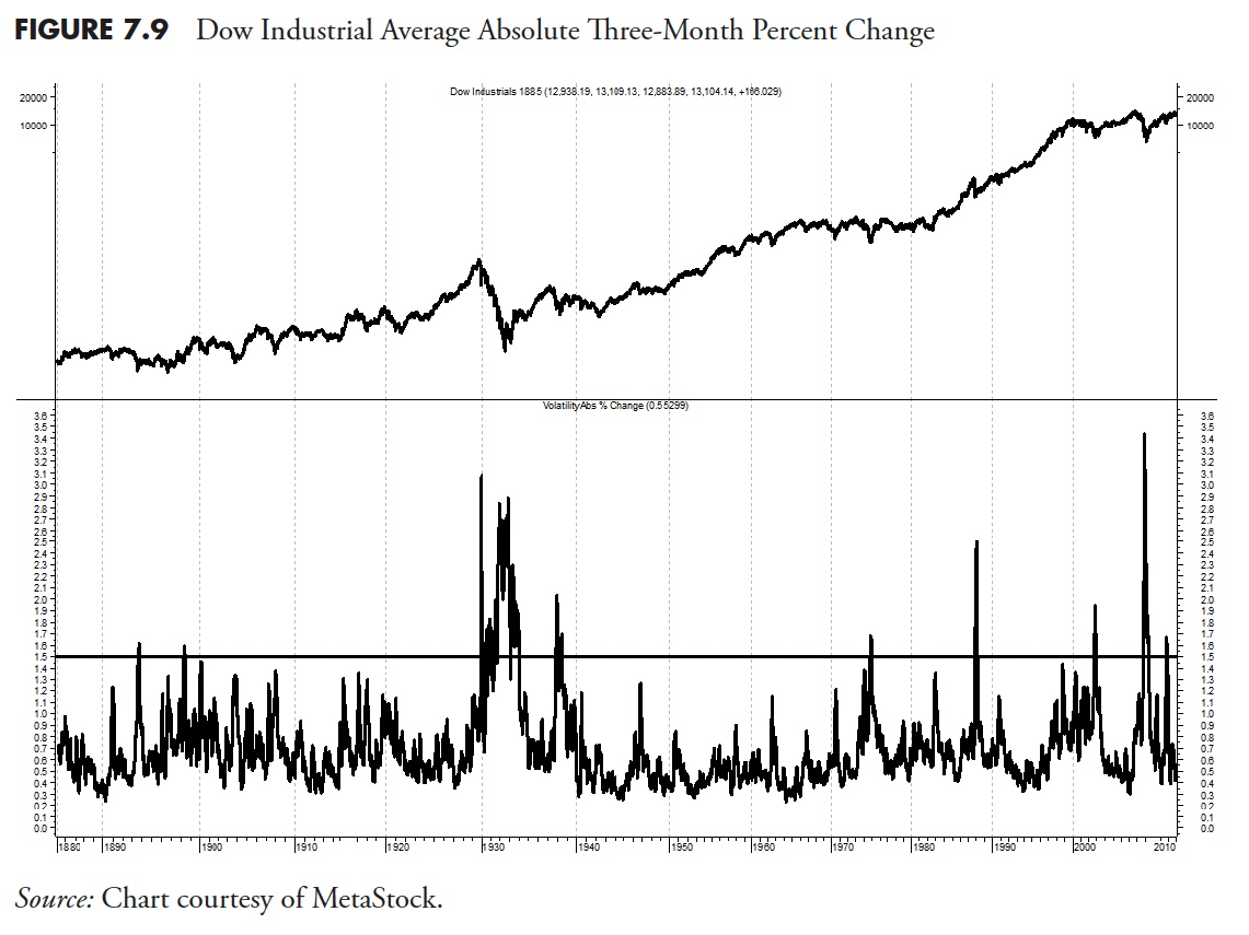
For a long-term perspective, Figure 7.9 shows the 63-day (3 months) absolute percentage change each day for the Dow Industrials back to 1885. The volatility is in the lower plot with a horizontal line at 1.5 percent for reference.
Another way to view volatility is to compare the monthly volatility relative to the yearly volatility. This is shown in Figure 7.10 with the S&P 500 Index in the upper plot, the monthly volatility in the lower plot with the smoother annual volatility overlaid. This method removes the absolute measurement and shows when the shorter-term volatility is greater than its longer-term value. For most who want to use a volatility measure on a single issue, this is my preferable method.
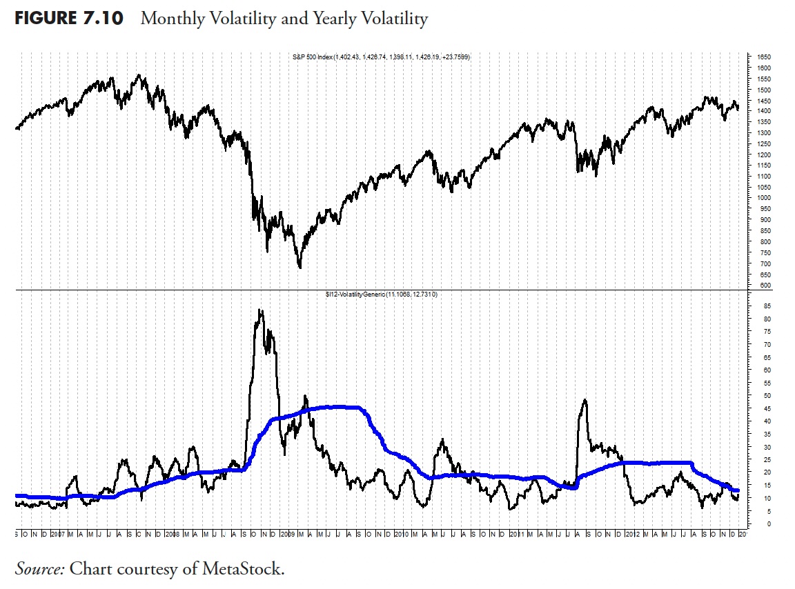
Figure 7.11 shows the S&P 500 with the Volatility Index (VIX). VIX is a Chicago Board Options Exchange (CBOE) tradable instrument designed to represent the sentiment of option traders and shows their expectation of 30-day volatility. It is constructed using the implied volatilities of a wide range of S&P 500 Index options. This volatility is meant to be forward-looking and is calculated from both calls and puts.
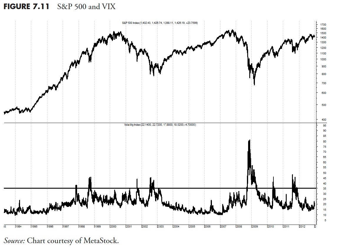
You can see from Figure 7.11 (S&P 500 on top and VIX on bottom) that whenever the VIX gets above 35 (horizontal line) the market is experiencing large volatility. Notice that there are significant periods without much volatility.
A concept that has surfaced in the past few years is measuring the volatility of volatility. I think this is a valid concept if one measures the volatility of something that is tradable, like the VIX shown in Figure 7.11. Figure 7.12 shows the S&P 500 Index in the top plot, the VIX in the middle plot (exactly the same as in Figure 7.11), and the Average True Range version of volatility over 21 days shown in the bottom plot.
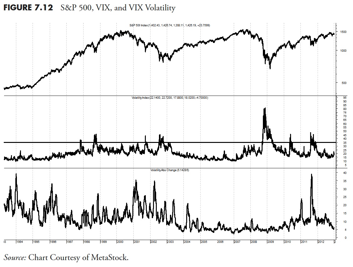
The VIX was originally launched in 1993, with a slightly different calculation than the one that is currently employed. The original VIX (which is now VXO) differs from the current VIX in two main respects: it is based on the S&P 100 (OEX) instead of the S&P 500, and it targets at the money options instead of the broad range of strikes utilized by the VIX. The current VIX was reformulated on September 22, 2003, at which time the original VIX was assigned the VXO ticker. VIX futures began trading on March 26, 2004; VIX options followed on February 24, 2006; and two VIX exchange-traded notes (VXX and VXZ) were added to the mix on January 30, 2009.
Highly Volatile Periods
Figure 7.13 shows 18 periods since 1900 in the Dow Industrial Average that were similar in their measure of volatility. I created this because when we get into a volatile period, the usual question asked by many is whether this will be how the markets will be forever. Once again, I am reminded of the late Peter Bernstein, who said that an investor's biggest mistake is extrapolation — assuming the recent past will also be how the future will be. In Figure 7.13, I used a 5% filtered wave, then measured the frequency of the waves within a confined period. The concept of filtered waves is defined in Chapter 1, and again in more detail in Chapter 10.

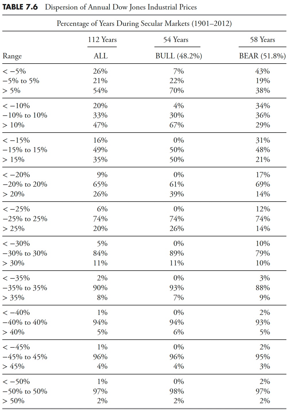
Dispersion of Prices
The following concept is from Ed Easterling of Crestmont Research. Although the compounded average annual change in the stock market is about 5% over the past 112 years (1900-2012), the range of dispersion in annual returns is dramatic. Table 7.6 presents the distribution of yearly index changes within the range of -5% to +5% increments during the past century overall (112 years) and during the secular bull (54 years) and bear (58 years) cycles. It becomes clear that moves of +/- 5%, and to some extent moves of +/- 10% on an annual basis are similar across both bull and bear markets, with the bulk (67%) of the +10% years in secular bull while the secular bears are fairly evenly distributed across the range. When the analysis of dispersion expands to annual moves of +/- 15% a year, the message is even more pronounced. The secular bulls show no occurrences of -15 percent, with the remaining segments evenly distributed. The secular bears have the largest percentage (48%) of their annual returns contained within the +/- 15% range. Once you get to the +/- 20% dispersions, which are tied to the moves associated with bull-and-bear cyclical markets, the dispersion is fairly consistent for the remaining data. It should be interesting to also note that there were more years deemed as within secular bear markets than in secular bull markets.
Thanks for reading this far. I intend to publish one article in this series every week. Can't wait? The book is for sale here.