Note to the reader: This is the twentieth in a series of articles I'm publishing here taken from my book, "Investing with the Trend." Hopefully, you will find this content useful. Market myths are generally perpetuated by repetition, misleading symbolic connections, and the complete ignorance of facts. The world of finance is full of such tendencies, and here, you'll see some examples. Please keep in mind that not all of these examples are totally misleading -- they are sometimes valid -- but have too many holes in them to be worthwhile as investment concepts. And not all are directly related to investing and finance. Enjoy! - Greg
It is not uncommon for investors to believe that the more information they have, the better their chance at choosing good investments. Financial websites offer alerts on stocks, the economy, and just about anything you think you might need. The sad part is that the investor thinks every iota of information is important and tries to draw a conclusion from it. The conclusion may turn out to be correct, but it is usually not.
The issue is that investor is trying to tie each item of news to the movement of a stock, which generally never seems to work; just a few minutes watching the financial media should tell you that it doesn't work. Human emotions make the investor feel good about having news that supports their beliefs, but rarely do those emotions contribute to investment success. I find it amazing how many times I go into an office and find the financial television playing, sometimes muted, but probably only when they see me coming. Too much information can lead to a total disarray of investment ideas and decisions. Keep it simple, turn off the outside noise, and use a technical approach to determine which issues to buy and sell. You'll be healthier.
Ranking Measures
Ranking measures are the technical indicators used to determine which issues to buy based on their trendiness. They can be assigned as mandatory or tie-breaker ranking measures. The mandatory ones are the ranking measures that have to meet certain requirements before an issue can be bought. The tie-breaker ranking measures are there to assist in issue selection, but are not mandatory.
Ranking measures can be used with individual stocks, Exchange Traded Funds (ETFs), mutual funds, and bonds; however, there must be a process for selecting them, if for no other reason than to reduce the number down to a usable amount. For example, in an exchange-traded fund (ETF)-only strategy, consider that there are nearly 1,400 ETFs, and a fully invested portfolio might only have positions in 20 ETFs. Ranking measures are indicators, mainly of price or price relationships that assist in the determination of whether an issue is in an uptrend.
Throughout this section, the charts show the exchange-traded fund SPY in the top plot whenever possible, the ranking measure in the bottom plot, and the ranking measure's binary overlaid on the SPY in the top plot. Some exceptions to using SPY are when volume is needed for the ranking measure, in which case another broad-based ETF will be used. A discussion of the parameters that can be used for each ranking measure is also included. I do not go into excruciating analysis on each chart, as the concept is really simple. The binary is the signal line, and it only represents the ranking measure's signals exactly. Not all ranking measures have a binary signal, as they are used for confirmation of a trend direction.
The discussion for each ranking measure is varied as some are fairly simple to understand and won't involve a detailed discussion. I certainly am not the type that discusses the wiggles and waggles of each indicator.
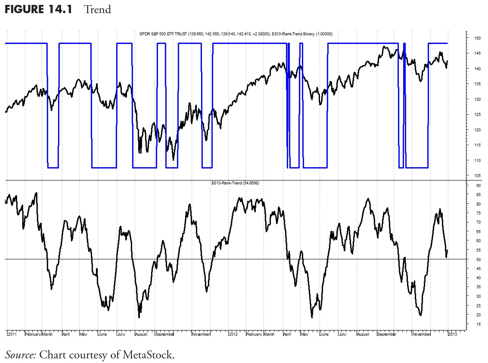
Trend
Trend is the name given to a derivative of an indicator originally created by Jim Ritter of Stratagem Software. He wrote about it in the December 1992 (V. 12:12, 534–534) issue of Stocks & Commodities magazine, in the article "Create a Hybrid Indicator." Trend is a simple concept, yet is a powerful combination of two overbought oversold indicators: Stochastics (%K) and Relative Strength Index (RSI). The indicator uses 50% of each one in combination, and while both are range-bound between zero and 100, the combination is also range-bound between zero and 100. Stochastics, normally much quicker to react to price changes, is dampened by the usually slower-to-react RSI. In combination, you have an indicator that shows strong trend measurements whenever it is above a predetermined threshold.
Parameters
The Stochastic needs to be much longer than when used by itself, while RSI can be used close to its original value. The Stochastic range of 20 to 30 should work well, with the final value determined by the length trend you want to follow. The RSI range can vary, but you don't want to make it too long, as it is already a slower-reacting measure. Finally, the threshold used for Trend should be in the 50 to 60 range, again dependent on how soon you want the signal, remembering that early signals will also give more whipsaws.
The examples of Trend in Figure 14.1 have the threshold drawn at 50, which is a good all-around value. The concept is simply that whenever Trend is above 50, the ETF is in an uptrend, and whenever Trend is below 50, it is not in an uptrend. The binary is overlaid on the price plot (top) so that you can see the signals better. Notice that when prices are in an uptrend, the binary is usually at the top, and when prices are not, it is at the bottom. Also note that, in the middle of the plot, there were a number of quick signals in succession; this is why one should not rely on a single indicator for analysis.
Trend Rate of Change (ROC)
This is merely the five-day rate of change of Trend. Why would you use that? When viewing a lot of data on a spreadsheet that does not contain any charts, and you see the value for Trend is 65, you also need to know if it is rising through 65 or declining through it. A snapshot of the data can be dangerous if you don't also look at the direction the indicator is moving.
Figure 14.2 is a chart of the five-day rate of change of Trend. You can see that while Trend is still slightly positive (above the 50 line), it is declining (see Figure 14.1). Then, when you compare it with the Trend ROC in Figure 14.2, it is showing significant weakness. Of course, showing the five-day rate of change of an indicator without showing the indicator itself is foolish; it was done here so that you could see the measure being discussed.
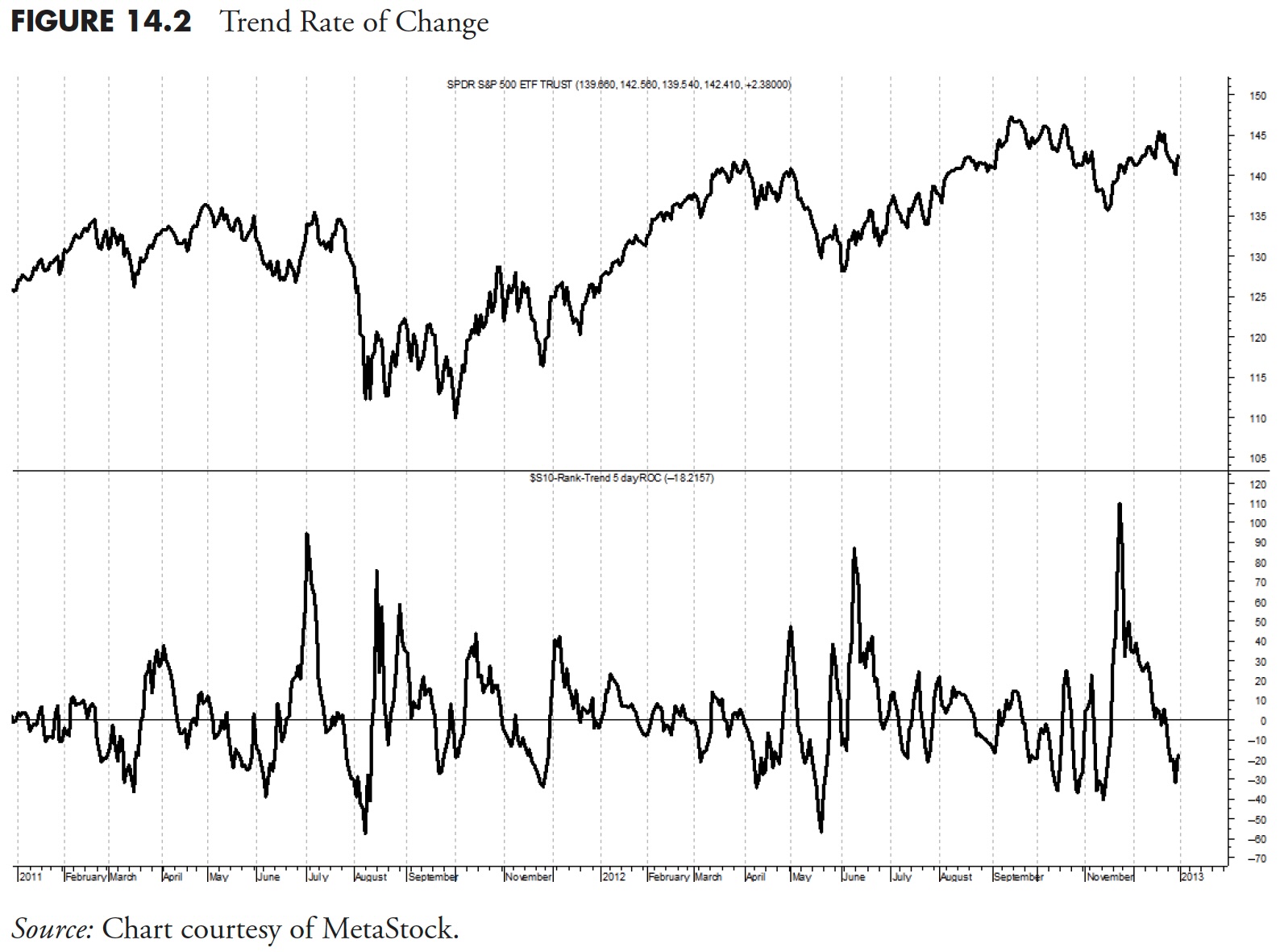
Parameters
This can be almost any value you desire based on what you are using it for. I used it here to see the short-term trend of an indicator, so five days is just about right. If you were using rate of change as an indicator for measuring the strength of an ETF or an index, then a longer period would probably be more appropriate. I use 21 days when I use ROC by itself.
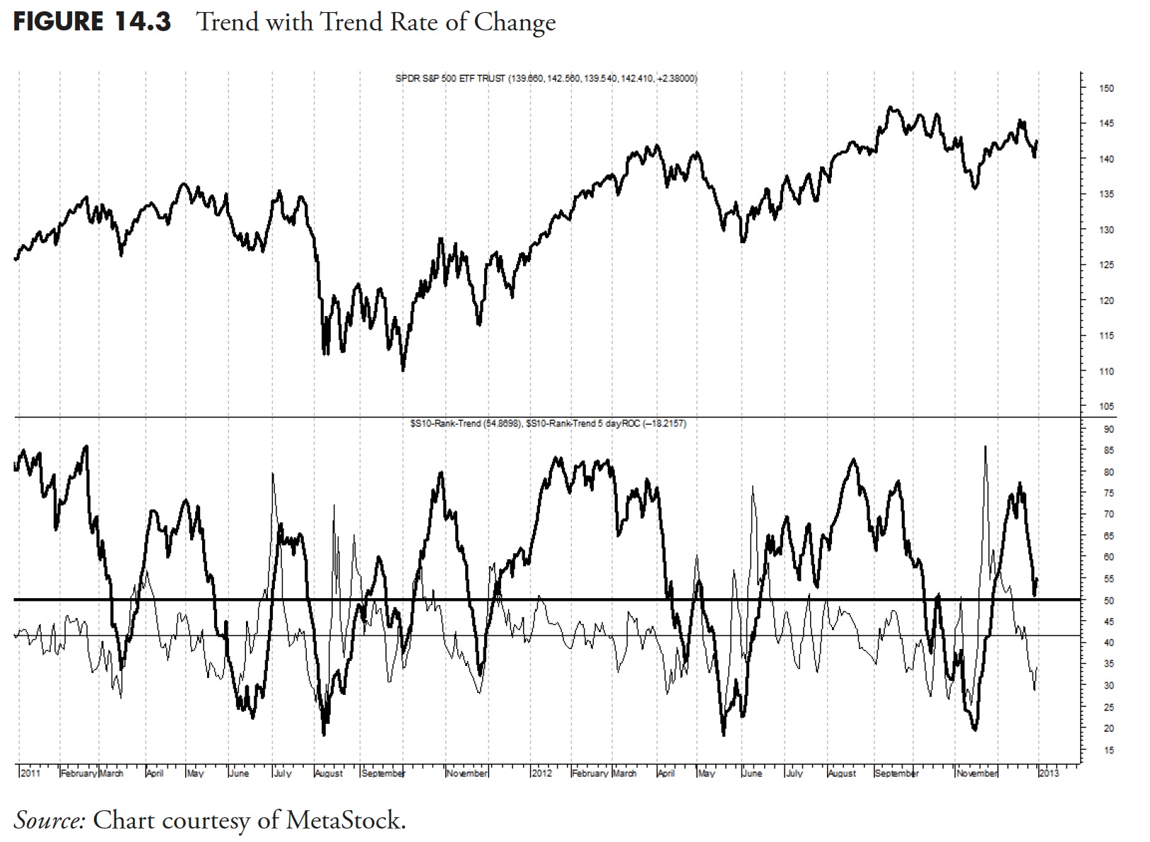
Figure 14.3 shows the Trend with the five-day rate of change of Trend overlaid (lighter). This is the way that all the mandatory ranking measures and some of the tiebreaker measures are shown. You can see from this that the Trend is above 50, but the five-day rate of change is deteriorating and is well below zero (negative).
Trend Diffusion
This is also known as Detrend, which is a technique where you subtract the value of an indicator's moving average from the value of the indicator. It is a simple concept, actually, and not unlike the difference between two moving averages with one average being equal to 1, or MACD for that matter. Technical analysis is ripe with simple diversions from concepts and often with someone's name attached to the front if it— don't get me started on that one.
Figure 14.4 is the same Trend as previously discussed, except that it is the 15-day Detrend of Trend, or Trend Diffusion. The middle plot is the Trend, with the lighter line being a 15-day simple moving average of the Trend. The bottom plot is the Trend Diffusion, which is simply the difference between the Trend and its own 15-day moving average. You can see this when the Trend moves above its moving average, the Trend Diffusion moves above the zero line. Similarly, whenever the Trend moves below its 15-day moving average in the middle plot, the Trend Diffusion moves below the zero line in the bottom plot. The information from the 15-day Trend Diffusion is absolutely no different that the information in the middle plot showing the Trend and its 15-day moving average, just easier to visualize.
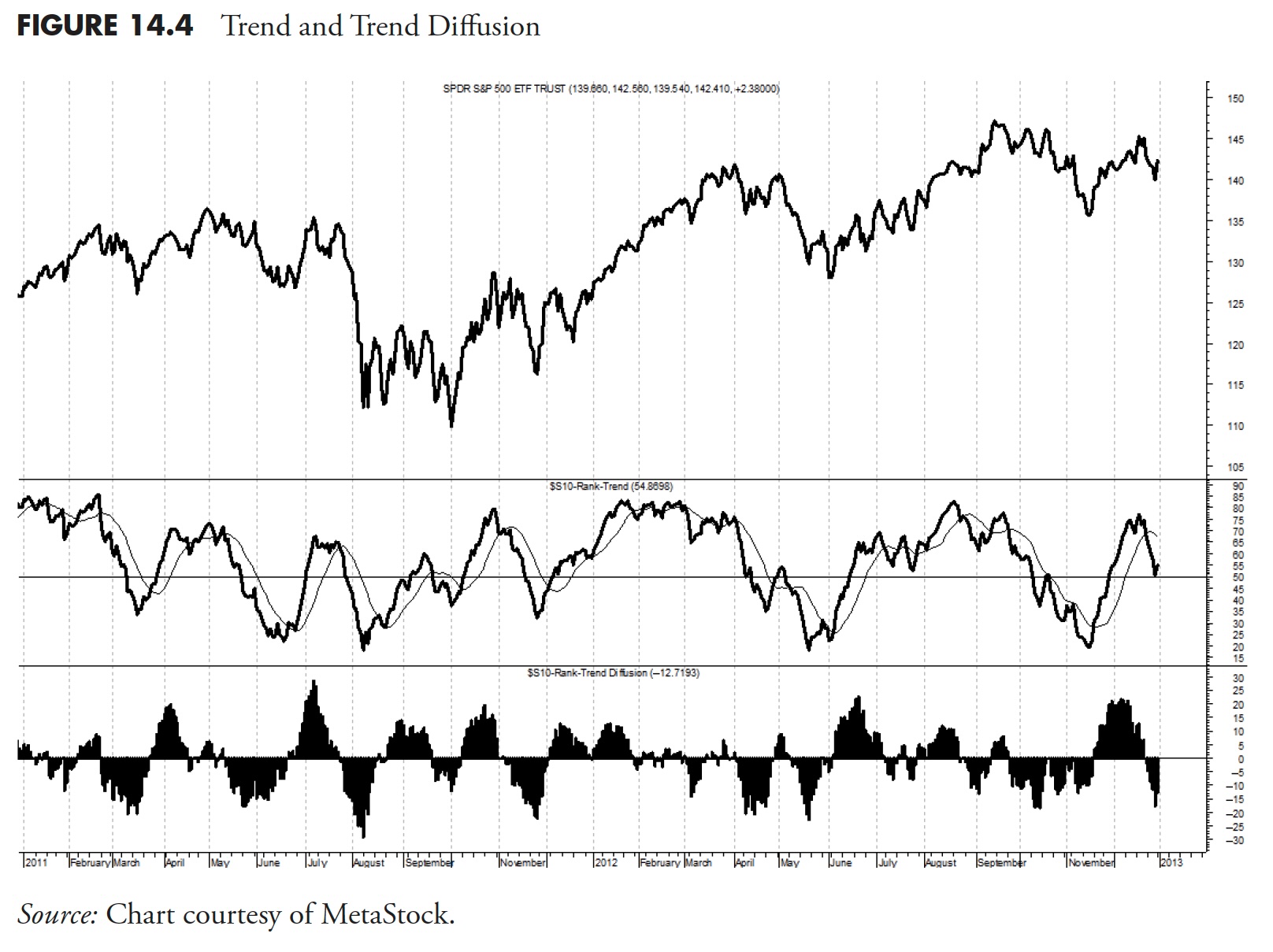
Parameters
The example in Figure 14.4 uses 15 days, which is three weeks. Parameters need to be chosen based on the timeframe for your analysis. A range from 10 to 30 is probably adequate for Trend Diffusion.
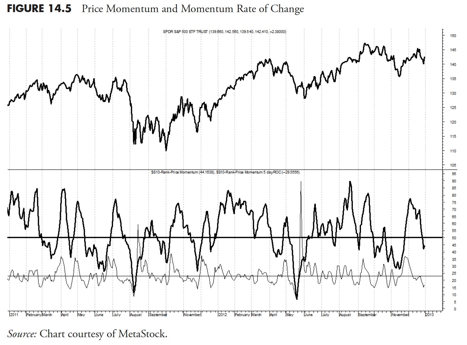
Price Momentum
This indicator looks back at the price today compared to X days ago. It is created by calculating the difference between the sum of all recent gains and the sum of all recent losses and then dividing the results by the sum of all price movement over the period being analyzed. This oscillator is similar to other momentum indicators, such as RSI and Stochastics, because it is rangebound, in this case from -100 to +100.
Parameters
Price Momentum is very close to being the same as rate of change; generally the only difference between the two is the scaling of the data. Momentum oscillates above and below zero and yields absolute values, while the Rate of Change moves between zero and 100 and yields relative values. The shape of the line, however, is similar. With momentum, the threshold is shown at 50, but could be higher if requiring more stringent ranking requirements.
Figure 14.5 shows the Price Momentum ranking measure (dark line) and its five-day rate of change (lighter line). You can see that the Price Momentum is weak and the ROC is negative and declining.
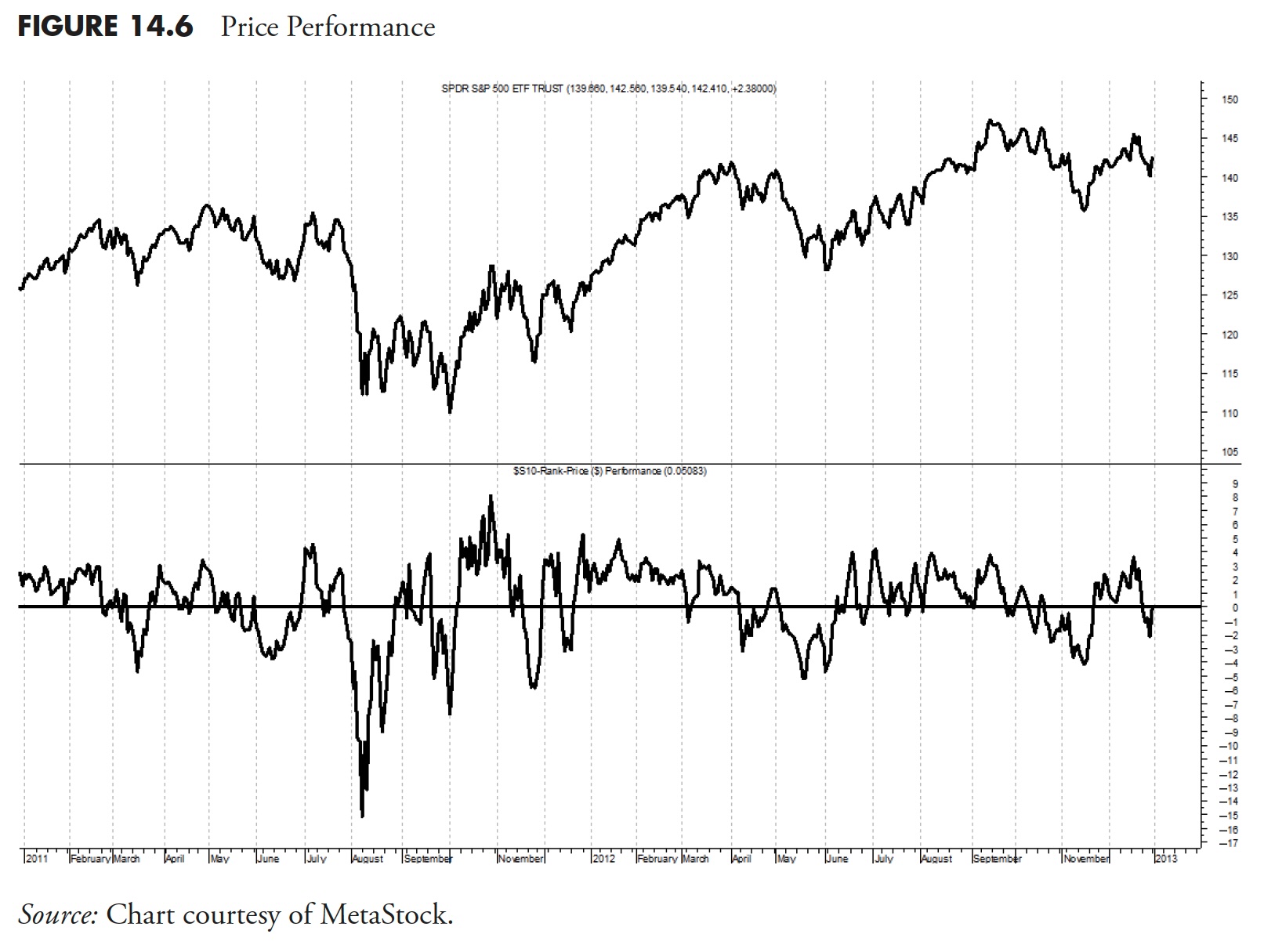
Price Performance
This indicator shows the recent performance based on its actual rate of change for multiple periods, added together, and then divided by the number of rates of change used. In this example, I used three rates of change of 5, 10, and 21 days, which equates to 1 week, 2 weeks, and 1 month. Simply calculate each rate of change, add them together, and then divide by three. This gives an equal weighting to rates of change over various days.
Parameters
Like many indicators, the parameters used are totally dependent on what you are trying to accomplish. Here, I am trying only to identify ETFs that are in an uptrend.
Figure 14.6 shows the Price Performance measure using the three rates of change mentioned above. There is no need to show the typical five-day rate of change of this indicator, since it is in itself a rate of change indicator.
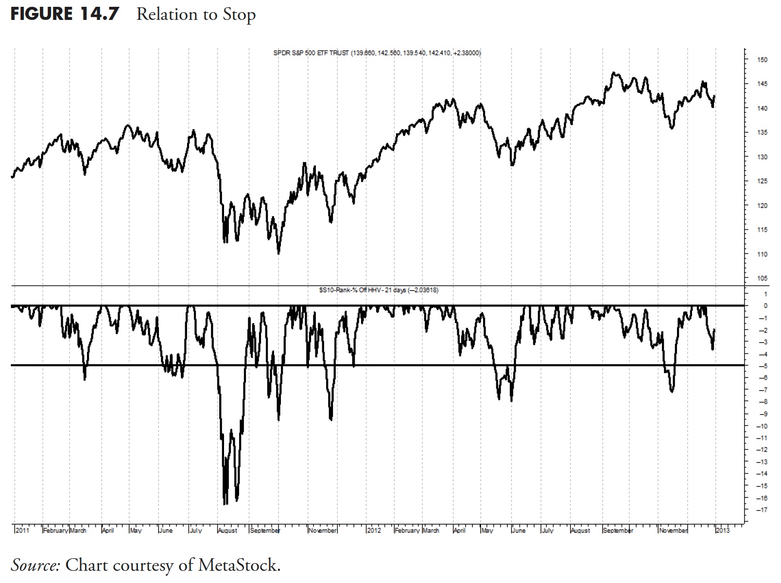
Relationship to Stop
This is the percentage that price is below its previous 21-day highest close. This is an extremely important ranking measure, and here's why.
If you are using a system that always uses stop loss placement (hopefully you are), then you certainly would not want to buy an ETF that was already close to its stop. This is the case when using trailing stops; if using portfolio stops, or stops based on the purchase price, this measure does not come into play. I like to use stops during periods of low risk of 5% below where the closing price had reached its highest value over the past 21 days. If you think about this, this means that, as prices decline from a new high, then the stop baseline is set at that point and the percentage decline is measured from there.
Parameters
In most cases, this is a variable parameter determined by the risk that you have assessed in the market or in the holding. I prefer very tight stops in the early stages of an uptrend, because I know there are going to be times when it does not work, and when those times happen, I want out. The setting of stop loss levels is entirely too subjective, but I would say that as risk lessens, the stops should become looser, allowing for more daily volatility in the price action.
Figure 14.7 shows the 5% trailing stop using the highest closing price over the past 21 days. The two lines are drawn at zero and -5%. When this measure is at zero, it means that the price is at its highest level in the past 21 days. The line then continuously shows where the price is relative to the moving 21-day highest closing price. When it drops below the -5% line, then the stop has been hit and the holding should be sold.
Please notice that I did not beat around the bush on that last sentence. When a stop is hit, sell the holding. Like Forrest Gump, that is all I 'm going to say about that.
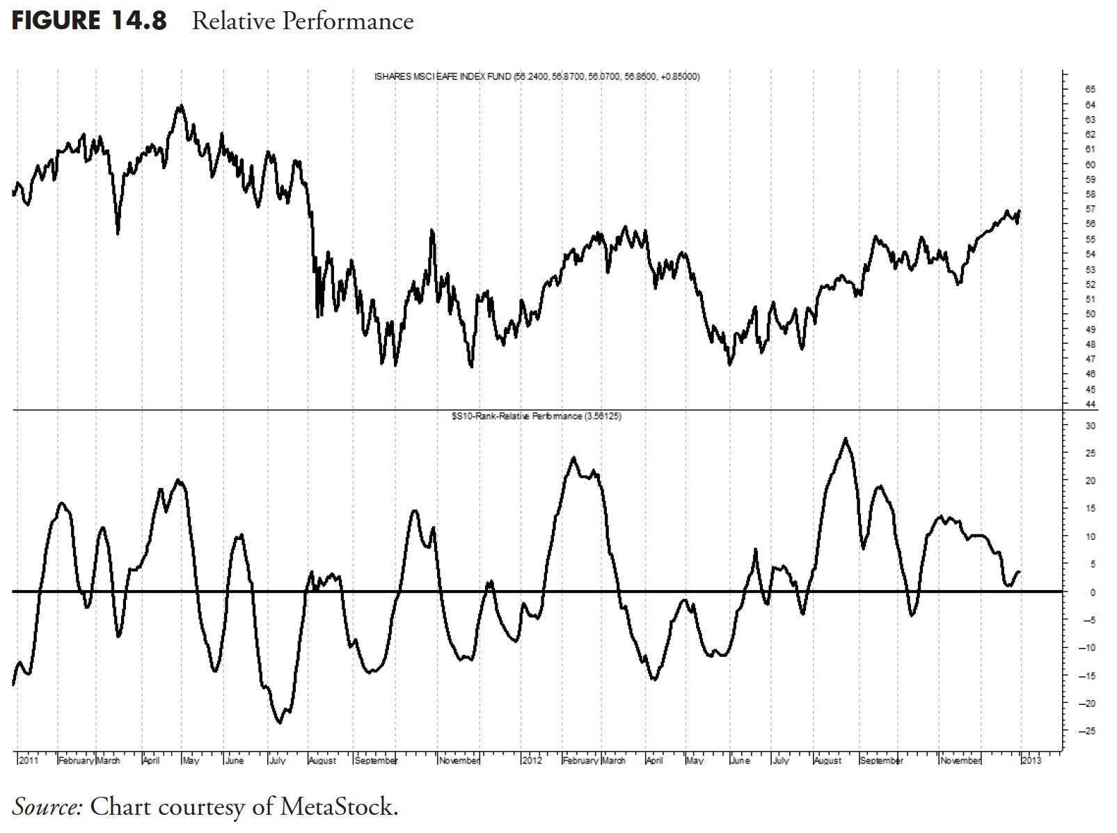
Relative Performance
This indicator shows the recent performance of an ETF relative to that of the S&P 500. Often, there is a tendency to show the performance relative to the total return version of the S&P 500. This is only advisable if you are actually measuring and using the total return version of an ETF. In addition, most measurements are of a timeframe where the total return does not come into play. However, purists may want one over the other, and the results will be satisfactory if used consistently.
Usually the data analyzed is price-based; therefore, the relative performance should be using the price only S&P 500 Index. Also, when comparing an ETF to an index, one must be careful when comparing, say the SPY with the S&P 500 Index, two issues that should track relatively close to each other. The mathematics can blow up on you, so just be cognizant of this situation. Hence, the example in the chart below has switched from using SPY to using the EFA exchange-traded fund.
Finally, you cannot simply divide the ETF by the index and plot it, or you will have a lot of noise with no clear indication as to the relative performance. I like to normalize the ratio of the two over a time period that is appropriate for my work; in this case, over 65 days. This can further be expanded, similar to the Price Performance measure covered previously, and also use another normalization period, say 21 days, then average them. Additionally, you can then smooth the results to help remove some noise. Remember, you are only trying to assess relative performance here.
Parameters
This, like many ranking measures, is based totally on personal preference, and also on the time frame you are using for analysis. In this example, I normalized the ratio with 65 and 21 days, then smoothed the result with the difference between their 15- and 50-day exponential average.
Figure 14.8 shows EFA relative to the S&P 500 Index. Whenever it is above the horizontal zero line, then EFA is outperforming the S&P 500. This would be considered an alpha-generating ranking measure if your benchmark is the S&P 500.
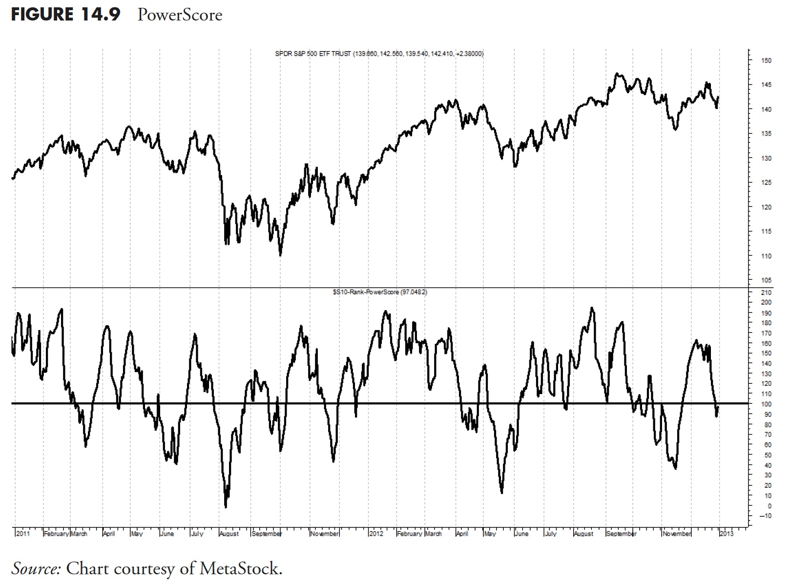
Power Score
This is a combination indicator that takes four indicators into account to get a composite score. Those indicators are Trend, Price Momentum, Price Performance, and Relationship to Stop. Additionally, the PowerScore also factors in the five-day rates of change of the Price Momentum and Trend measures.
Parameters
There are not really any parameters to discuss with PowerScore, as it is created by using four of the mandatory ranking measures. The concept here can be as broad or as narrow as needed. Using only the mandatory ranking measures seems reasonable; however, the PowerScore is unlimited in what components can be used.
Figure 14.9 shows the PowerScore with a horizontal line at the value of 100. Based on the calculations of the components for this indicator, whenever PowerScore is above 100, then it is saying that the components are collectively saying the ETF is in an uptrend. This could be considered a composite measure, but, unlike the ones referred to in the weight of the evidence components, this one uses all components.
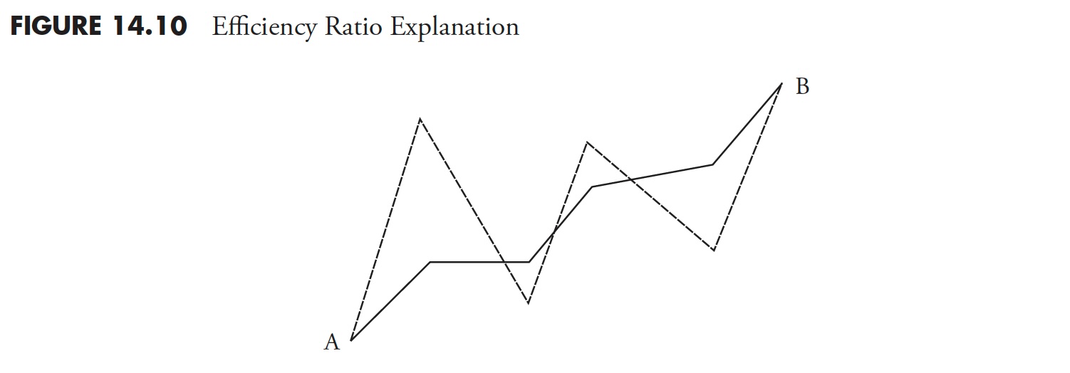
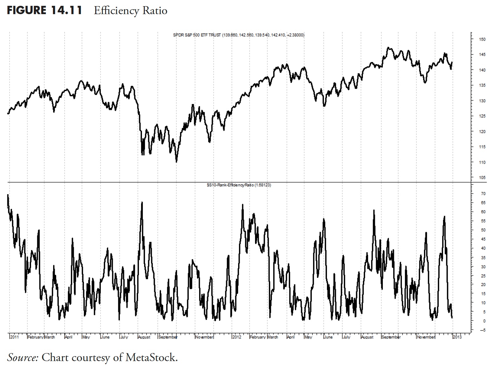
Efficiency Ratio
This ratio shows how much price movement in the past 21 days was essentially noise. It is a measure of the smoothness of the 21-day rate of change, created years ago by Perry Kaufman. It is an excellent ranking measure, but you need to know that it is an absolute measure of how an ETF gets from point A to point B; in this case, from 21 days ago until today.
Figure 14.10 is an example of how to think about this. If you were interested in two funds, fund 1 (solid line) and fund B (thicker dashed line), measuring their price movements of the same period of time, then which of the two would you prefer? The one that smoothly rose from point A to point B, or the one that had erratic movements up and down but ended up at the same place? I think everyone agrees that the smoother ride, or the solid line, is preferable.
Parameters
I use 15 or 21 days, but as always, this is more dependent on your trading style and time frame of reference. The value should closely mirror what the minimum length trend you are trying to identify, independent of direction.
Figure 14.11 shows the 21-day efficiency ratio for SPY. You can see that whenever the ETF is trending, the Efficiency Ratio rises, and when the ETF is range-bound and moving sideways, the Efficiency Ratio remains low. In other words, a high efficiency ratio means the ride is more comfortable. It is moving efficiently.
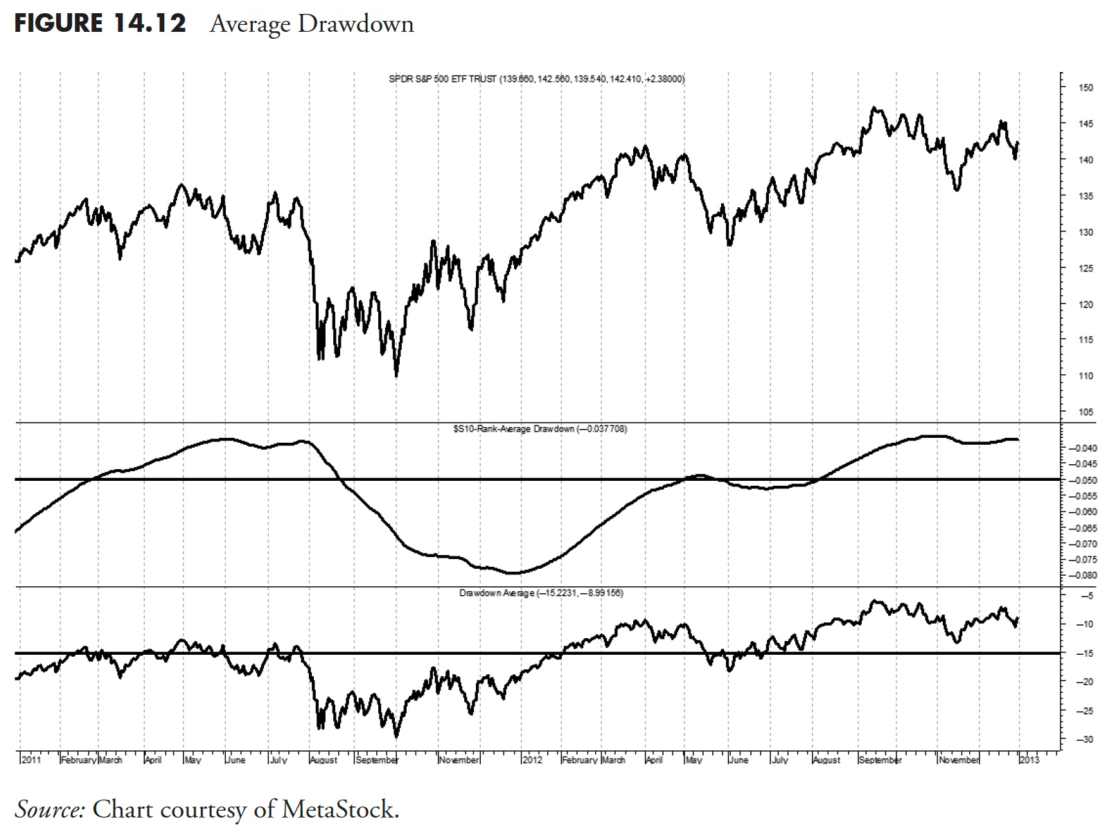
Average Drawdown
If you read the section in this book on Drawdown Analysis (Chapter 11), then you know exactly what this ranking measure accomplishes. The concept of average Drawdown for analysis and using it for a ranking measure are considerably different. To utilize average drawdown as a ranking measure, you need to use a moving average drawdown, such as over the past year. This is because an issue that has been in a state of drawdown for a number of years will not give you the ranking data that is needed for a frame of reference over the past few months. A moving average of drawdown will help reset the drawdown as time moves forward.
Parameters
I like to see the average drawdown over the past year, which is, on average 252 market days. This is enough time for a measurement, but short enough to get a feel for how long it remains in a state of drawdown.
Figure 14.12 shows the average drawdown over the past 252 days. The horizontal line is drawn at -5% as a reference. The lower plot is the cumulative drawdown, with the horizontal line being the long-term average.
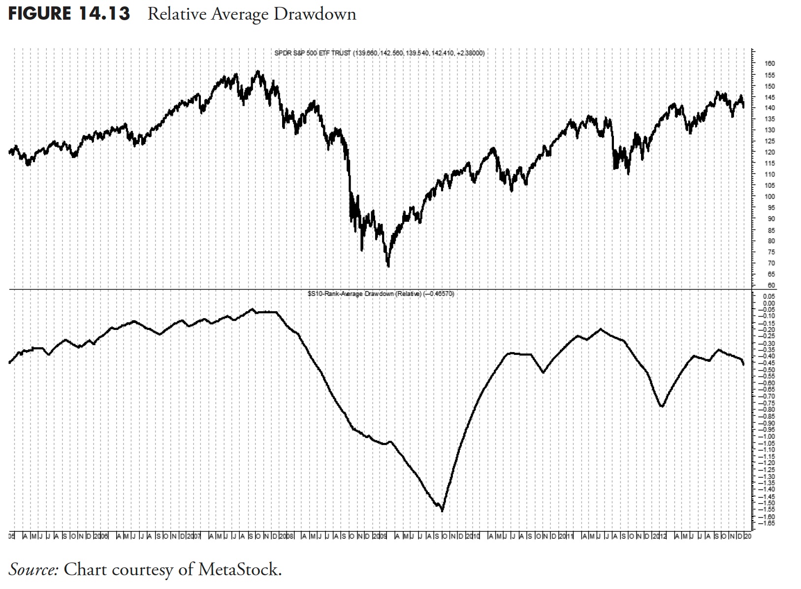
Relative Average Drawdown
Figure 14.13 shows the difference between the average drawdown of the issue compared to that of the S&P 500 Index. This is shown here only as an example of another type of ranking measure, and certainly would never qualify as a mandatory ranking measure.
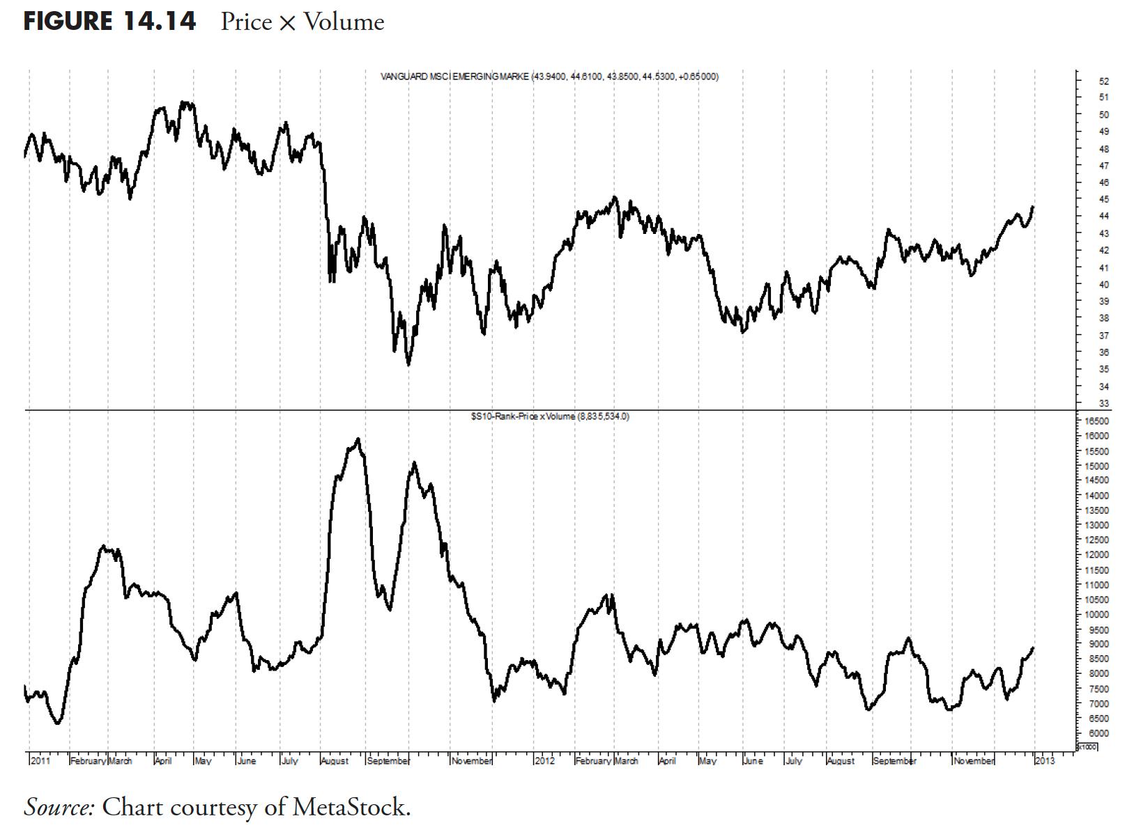
Price x Volume
Figure 14.14 shows the 21-day simple average of the volume times the close price. The purpose here is to show if the issue has enough liquidity to be traded. The ranking measures should always give a quick view on a variety of indicators, and this one might show you immediately if there is enough trading volume to give you the liquidity you would need to trade it. Of course, the ideal solution is to have a good relationship with the trading desk that you will be using, as they can give you up-to-date information on what volume you can trade.
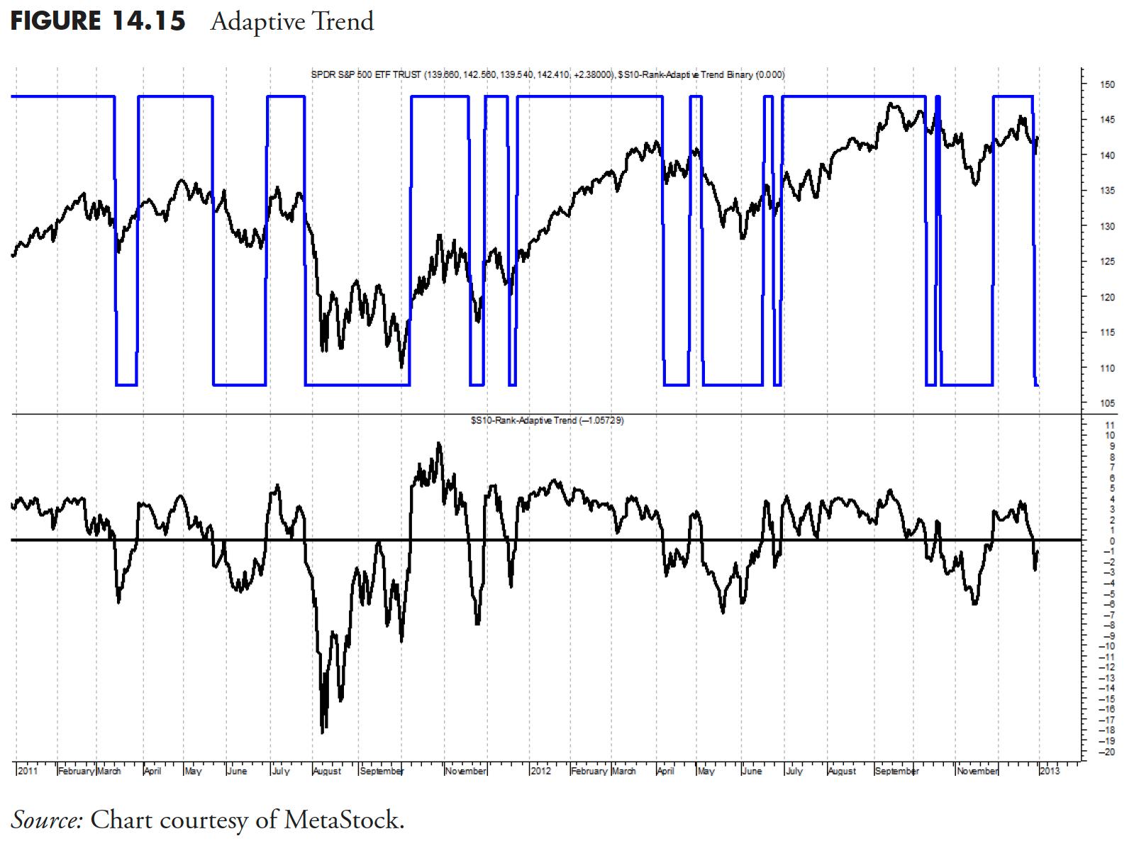
Adaptive Trend
Adaptive Trend is an intermediate trend measure that changes based on the volatility of the price movements. The Adaptive Trend measure incorporates the most recent 21 days of market data to compute volatility based on a true range methodology. This process always considers the previous day's close price in the current day's high–low range to ensure we are using days that gap either up or down to their fullest benefit. When the price is trading above the Adaptive Trend, a positive signal is generated, and when below, a negative signal is in place.
The chart in Figure 14.15 shows the Adaptive Trend as an oscillator above and below zero, so that when it is above zero, it means the price is above the Adaptive Trend, and when below zero, price is below the Adaptive Trend. The top plot shows the Adaptive Trend binary. If you prefer, the horizontal line at zero is the adaptive trend, similar to the Trend Diffusion discussed earlier.
Weighted Performance
Figure 14.16 is a weighted average of the 1-, 3-, 5-, 10-, and 21-day rates of change. One can argue that it is difficult to decide which exact period to measure for performance, and I would not disagree. The method takes a number of periods into consideration and averages them for a single result. One could carry this concept further and weight each of the measurements and have a double-weighted performance measure.
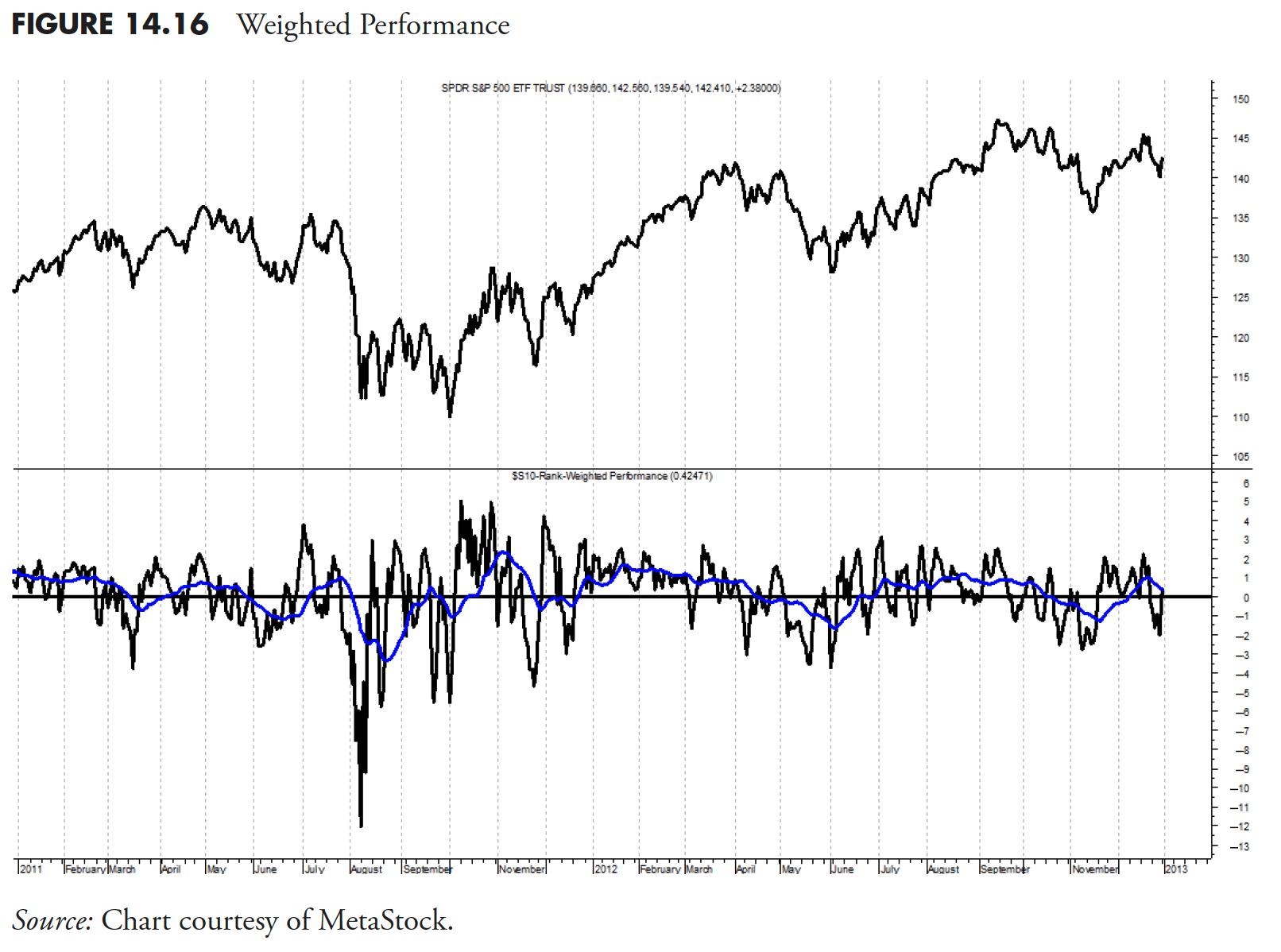
You should, however, try to keep things simple, as complexity has a greater tendency to fail.
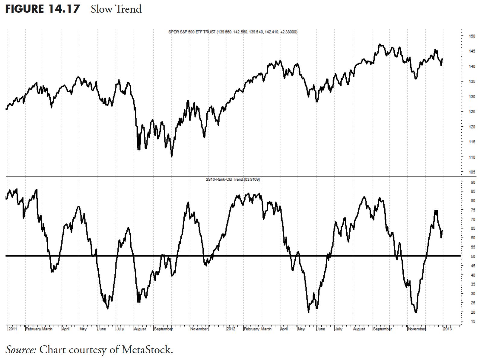
Slow Trend
This measure, shown in Figure 14.17 , is similar to Trend, but uses a longer period for its calculation. This concept can be used on many of the ranking measures as a second line of defense or confirmation. The faster version is good for initial selection, and the slower version is good for adding to positions (trading up).
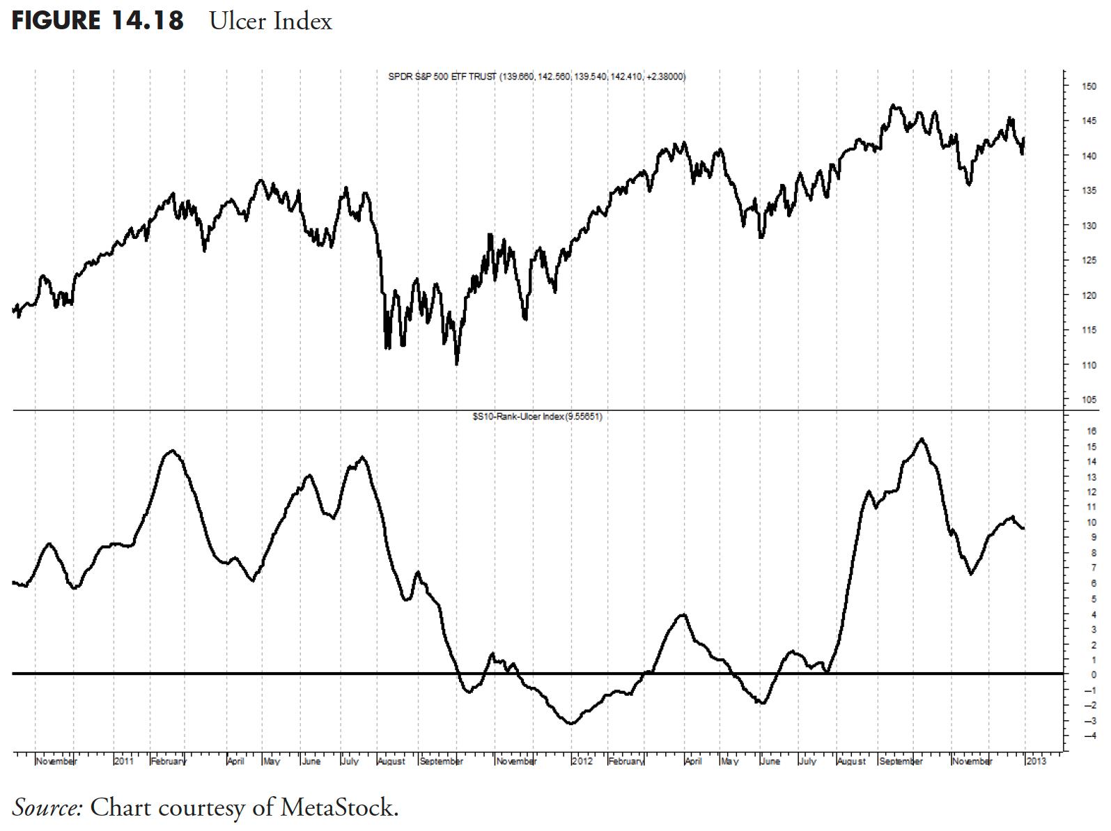
Ulcer Index
The Ulcer Index (Figure 14.18) takes into account only the downward volatility for an issue, plus uses price crossover technique with a 21-period average. This concept was first written about by Peter Martin in The Investor's Guide to Fidelity Funds, in 1989.
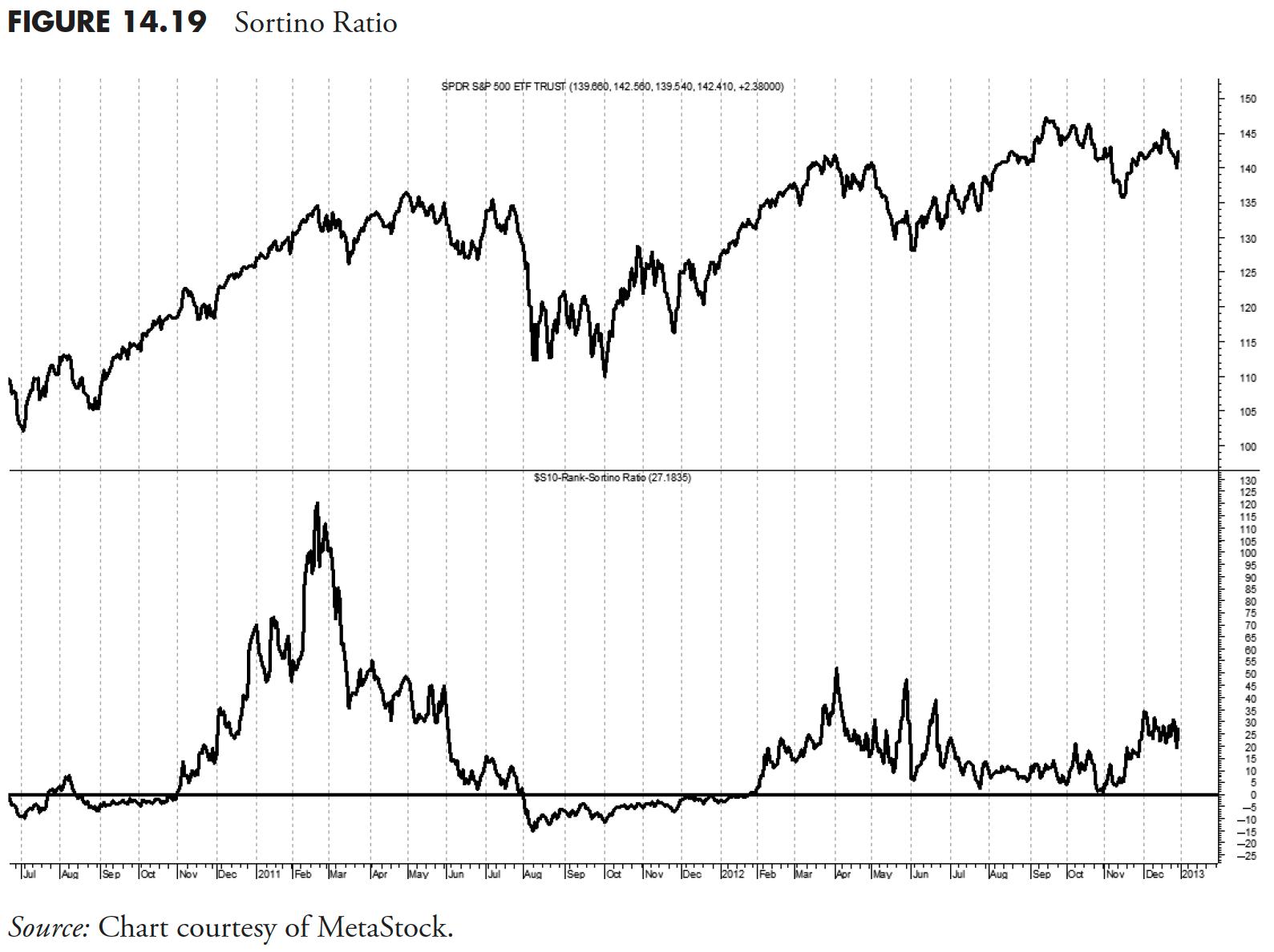
Sortino Ratio
Figure 14.19 shows the downside risk after the return of the issue falls below that of the 13-week T-bill yield. It is a risk-adjusted return like the Sharpe Ratio, but only penalizes downward volatility, whereas the Sharpe Ratio uses sigma (standard deviation). This is also similar to the Treynor ratio, which uses beta as the denominator and expected return for the numerator.
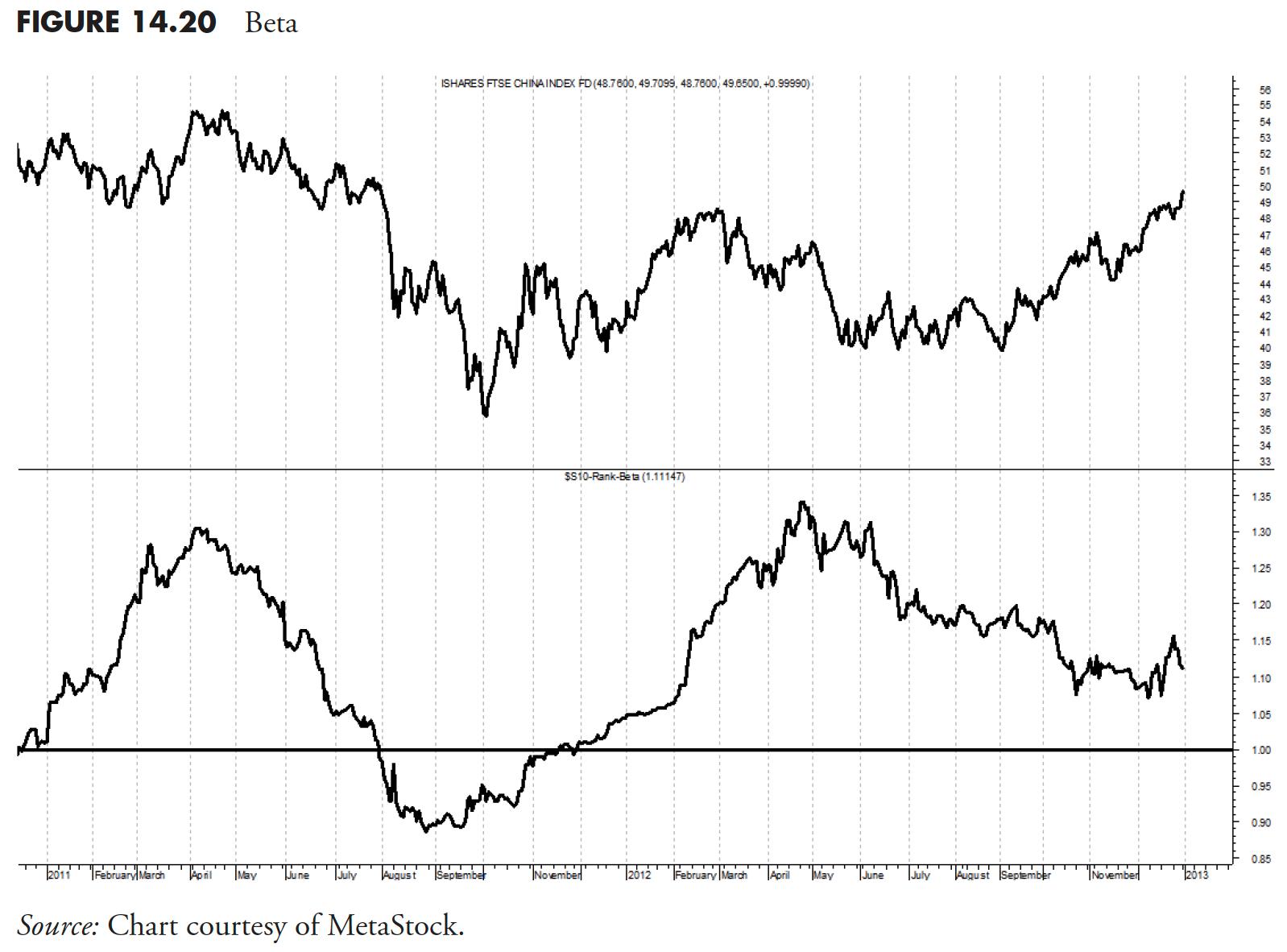
Beta
Figure 14.20 is the issue's beta based on the past 126 days (6 months). The same issue exists here as with the Relative Performance earlier. You cannot measure beta unless it is measured against something, in this case the S&P 500. Therefore, be careful when comparing a large-cap ETF to a large-cap benchmark, small-cap ETF to a small-cap benchmark, and so on.
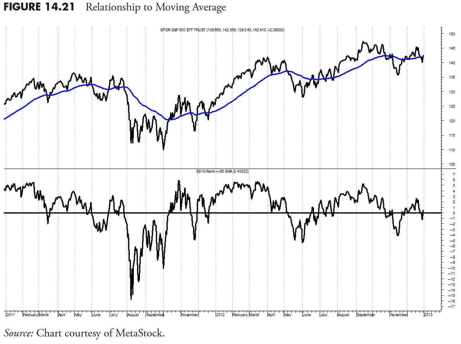
Relationship to Moving Average
Figure 14.21 shows the percent above or below the simple 65-day exponential moving average. This is similar to detrend or diffusion. I think here the value is that one should always pick a moving average period to use and stick with it, so that you get a feel for its action during certain market movements. In other words, you become accustomed to how this moving average works over time. I equate this to using only one wedge in golf instead of multiple ones. Most of us cannot devote the time to practice with multiple wedges, so learn one and stick with it.
Correlation
Correlation is an attempt to find a close relationship with an index such as the S&P 500. This is another one of those ranking measures you need to be careful not to compare a like ETF to a similar index. For example, the mathematics of correlation would blow up if you tried to compare the ETF SPY with the S&P 500 Index.
In Figure 14.22, whenever the line is near the top of the plot, then it is saying the correlation of the top plot is correlated to the benchmark being used. When the market is advancing, you want highly correlated holdings. When the market is declining, or you see it begin to roll over in a topping manner, you want to move into less correlated holdings. You must keep in mind that you are still a momentum player and, even though you want less correlation to the market, they still must be advancing on an individual basis.
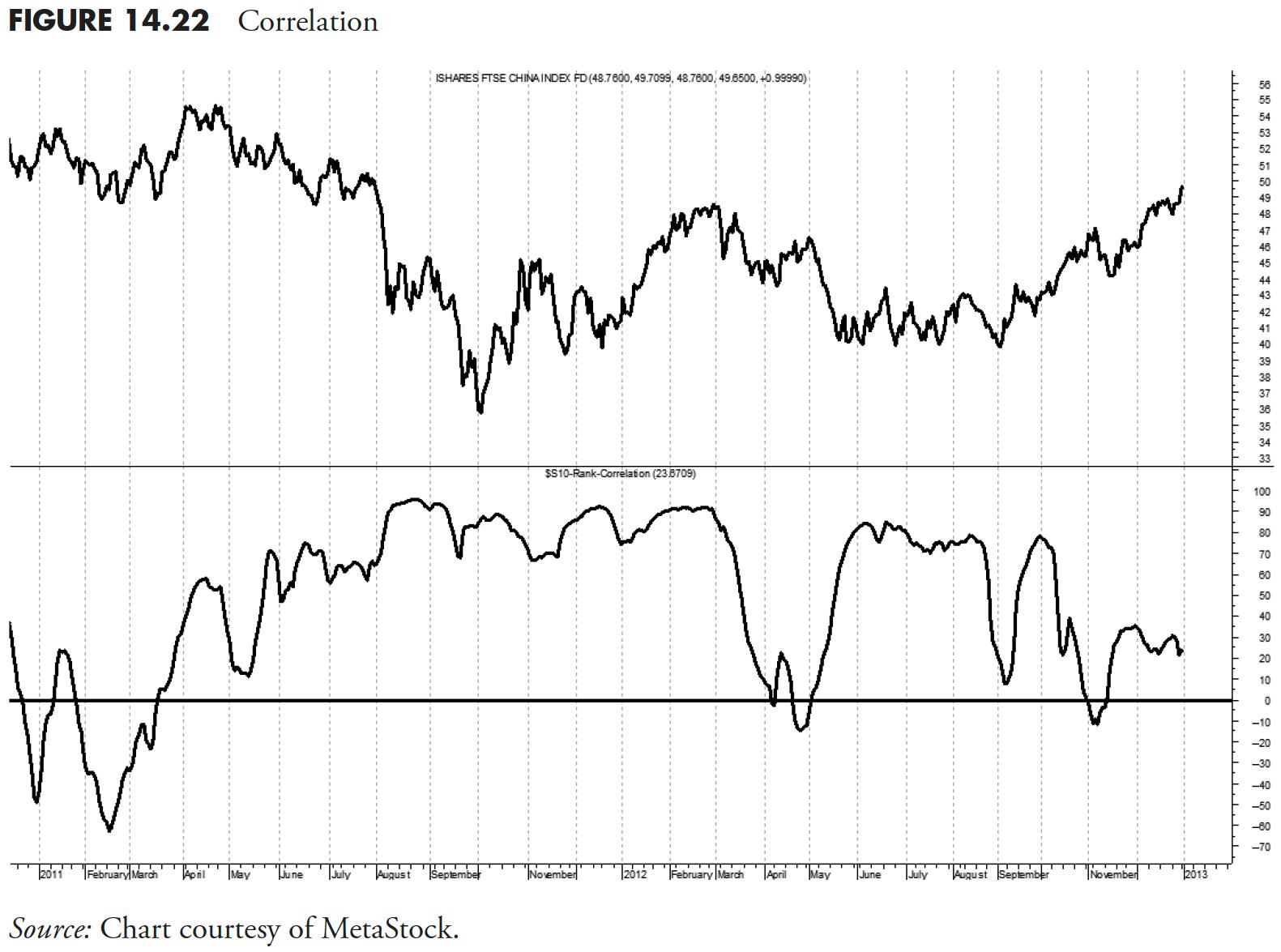
Correlation is not always causation, but don't try explaining that to your dog when he hears the can opener. -- Tom McClellan
Thanks for reading this far. I intend to publish one article in this series every week. Can't wait? The book is for sale here.