Note to the reader: This is the twenty-third in a series of articles I'm publishing here taken from my book, "Investing with the Trend." Hopefully, you will find this content useful. Market myths are generally perpetuated by repetition, misleading symbolic connections, and the complete ignorance of facts. The world of finance is full of such tendencies, and here, you'll see some examples. Please keep in mind that not all of these examples are totally misleading -- they are sometimes valid -- but have too many holes in them to be worthwhile as investment concepts. And not all are directly related to investing and finance. Enjoy! - Greg
This article continues directly from the preceding one.
Mutual Fund Expenses
If you are trying to decide on which mutual fund to buy and are looking at objectives, such as growth, conservative, or small-cap, you need to know this. Most of them hug a benchmark, and performance is based on how they perform relative to that bench.mark. If they beat the benchmark, they call it alpha, whereas if they don't, they call it tracking error. Because most mutual fund managers are tied to a benchmark, expenses can become the only discernible difference among them.
You need to understand mutual fund expenses because, so many times, decisions on which fund to buy boil down to this factor. Expenses can cause you to forget the goal, which is to select the fund that will give you the total return you need. Below is Table 15.2, which shows three mutual funds, their total expenses, and their total returns. Which mutual fund is delivering the most alpha?
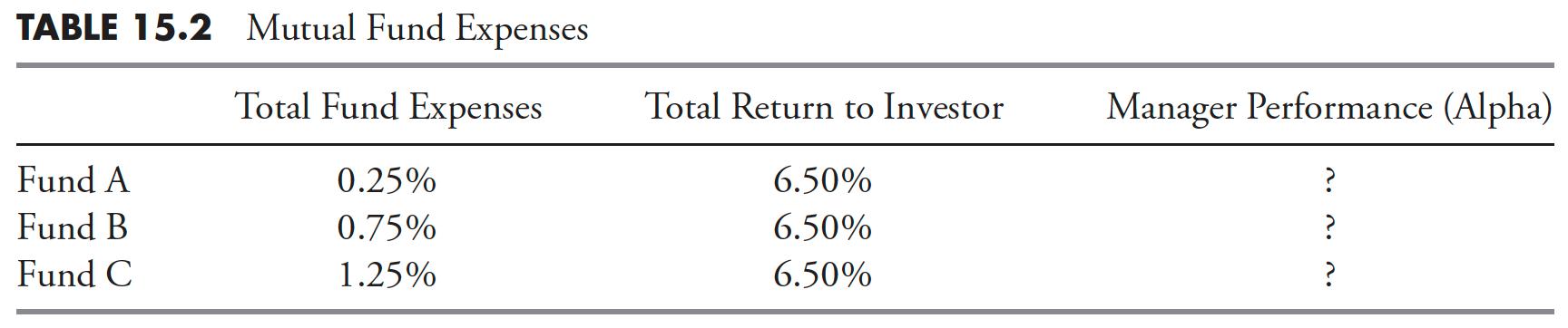
Fund C clearly delivered the most alpha. If Fund C generated the same total return as the other two with a higher expense, then Fund C manager produces the most alpha of the three funds. However, if you are a momentum buyer like me, the above does not come into play. The concern about expense ratios comes into play when, often, that is the only delineation among managers who all follow the same objective.
Turnover and Taxes
Turnover refers to the percentage of an investment vehicle's holdings that have been "turned over" or replaced with other holdings in a given year. Most unconstrained tactical models generally yield a high turnover.
- The turnover is based totally on market action; low volatility trends will not have high turnover, while short whipsaw-like moves will have high turnover.
- Rarely are there any long-term gains or losses.
- Predominately, there are short-term gains and losses.
A good model will not compromise its investment process with tax considerations. Plus, there is no risk of getting a long-term gain that you did not participate in. This is a phenomenon most never realize can happen until it happens, and by then it is too late. Most mutual funds that follow an objective will hold issues for really long periods of time, upward of many years. If you purchase shares of an open-end mutual fund, and, shortly thereafter, the fund manager decides to sell one of their long-term holdings, you will realize the full long-term capital gains tax, and you never participated in the actual gains.
Remember: Taxes are the consequence of successful investing.
Watching a Tactical Strategy over the Short Term
Most tactical unconstrained strategies are long-term. Following them daily is insane. Following them even quarterly is misleading. Many tactical unconstrained strategies do not have a benchmark. This is critical to understand and convey. Almost the entire world of money managers is tied to benchmarking and rebalancing any tactical unconstrained strategies do neither. Often, because of one's investment model, it will be out of sync with the market, which is why comparing it to a benchmark like the S&P 500 on an improper basis (short term) is frustrating. You must realize that expecting it to track the daily, weekly, or even monthly direction of a benchmark is admitting that you do not understand this process.
Benchmarking
Many funds/strategies are tied to a benchmark. In fact, I think most are tied to a benchmark. The goal of these managers is to try to beat the benchmark. Some do and some don't; yet when the number beating (or failing to beat) the benchmark is usually not worthy of comment, especially over time, I like to say that benchmarking is what you try to do when you have no idea what to do. The World of Finance is wrapped up in relative performance and comparison.
Relative performance is a widely used investment tool, but often causes horrible investment decisions. If a client is told his or her account is up 15%, they are happy; until you tell them the market was up 20%. This often causes a client to search for a new fund or advisor who claims to beat the market. We all know that no one can legally make that promise, but carefully worded marketing material can easily give the reader a subliminal message that makes them believe it can be done.
The cycle of performance chasing is the beginning of a vicious process of moving money from what is perceived to be a better-performing fund or strategy. Sadly, these moves usually happen at the point in time when they should add to their current account instead of sell it. In the case of tactical unconstrained management, which is what the Dancing with the Trend strategy is, trying to select a benchmark to measure performance is losing sight of the strategy's goals and the client's investment horizon. The only benchmark that should matter is the strategy return required to meet your goals. Most will find that, in their later years, a strategy that meanders to the upside with minimal downside action will be their most comfortable ride. Benchmarking in the investing world is common, often used in sales and marketing, rarely of any true value to an investor who is not interested in a strategy that does not attempt to beat a benchmark. It is, however, human nature to try to measure and compare things; sadly, that trait can cause poor results. In brief, benchmarking leads to chasing performance that generally leads to poorer performance.
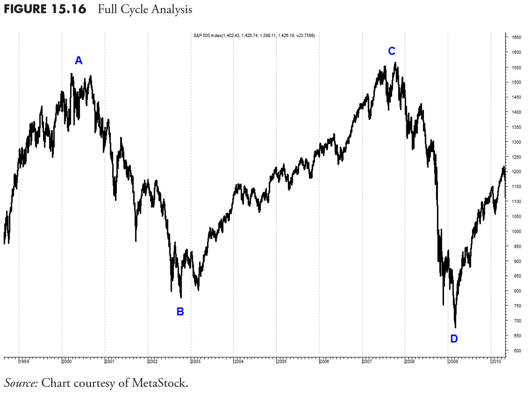
Full Cycle Analysis
If you would like an investment plan more oriented to your lifespan rather than your attention span, you probably would be better served with a tactical approach to the markets. The markets are not tied to the calendar, yet the world of finance is. Performance measures should be appropriate for the strategy, which means that tactical unconstrained should be measured over the full cycle of the market, whether it be top to top or trough to trough. As an example, in Figure 15.16 , a full cycle can be from A to C or from B to D.
Actual Results from a Rules-Based Trend-Following Strategy — Dancing with the Trend
I am guilty of overkill with the multitude of charts and tables in the remainder of this chapter; however, I have a reason for it. First of all, the Dance with the Trend strategy does not have a benchmark. No benchmark exists for trend following that uses stops and treats cash as an asset class. Personally, I don't think there ever will be. Secondly, many people look at a wide variety of performance data and risk statistics, and it seems logical to me to provide as many different "looks" as I can. Hopefully, I included one you are familiar with and can use.
This section shows you the results from the Dance with the Trend strategy, a rules-based strategy that uses a weight of the evidence approach to trend following, rules and guidelines, and strict discipline. The Dance with the Trend strategy began on December 31, 1996, with data through December 31, 2012. It has real results from a 17-year record of real money management; no back-tested results and no hypothetical results.
Dance with the Trend Performance and Risk Comparison
The Dance with the Trend strategy is compared to S&P 500 Growth, S&P 500, S&P 500 Value, Russell 2000 Growth, Russell 2000, Russell 2000 Value, MSCI EAFE, and MSCI Emerging Markets. These categories cover large-cap, small-cap, and international.
Figure 15.17 shows the number of instances of drawdowns greater than 10%. The Dance with the Trend strategy had only two instances. All others had at least six.
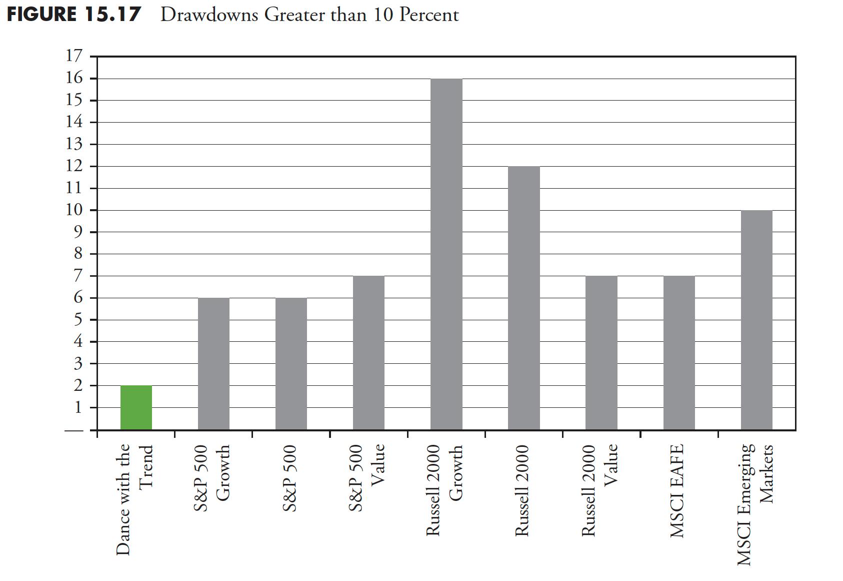
Figure 15.18 shows the number of instances of drawdowns greater than 20%, which is also considered a bear market. The Dance with the Trend strategy had no drawdowns greater than 20%. Let me say that again. The Dance with the Trend strategy had no drawdowns greater than 20%.
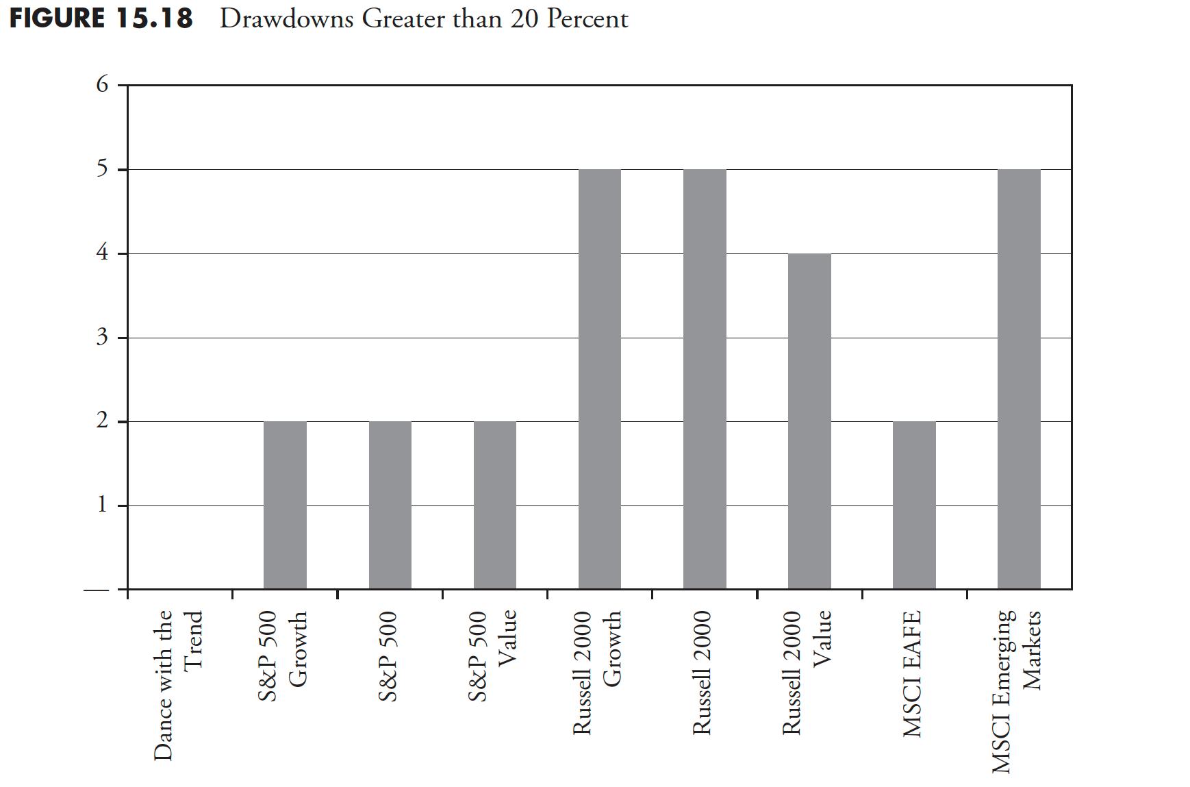
Figure 15.19 shows the total number of months spent in a drawdown of greater than 10%. The Dance with the Trend strategy had 42 months spent in a state of drawdown of greater than 10%, while others could be measured in decades.
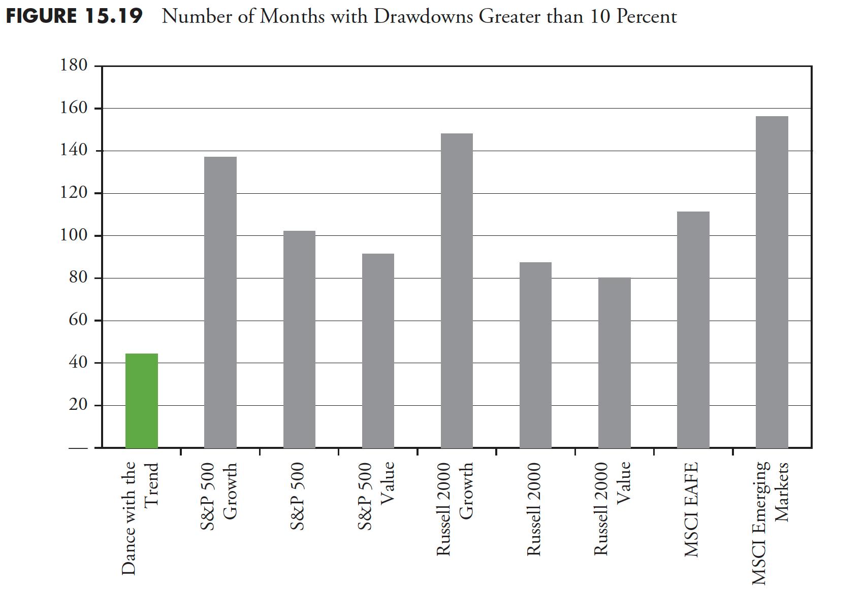
Figure 15.20 shows the number of months in Bear Market territory. The Dance with the Trend strategy had zero months in a bear status. Zero!
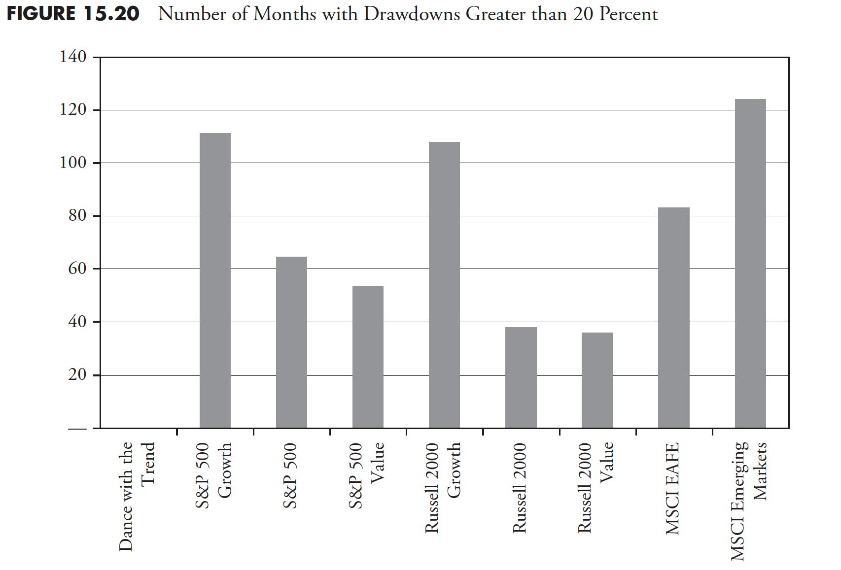
Figure 15.21 shows the maximum drawdowns. The Dance with the Trend strategy had a maximum drawdown of 17%. Remember, there were two giant bear markets during this period, each with drawdowns near -50%.
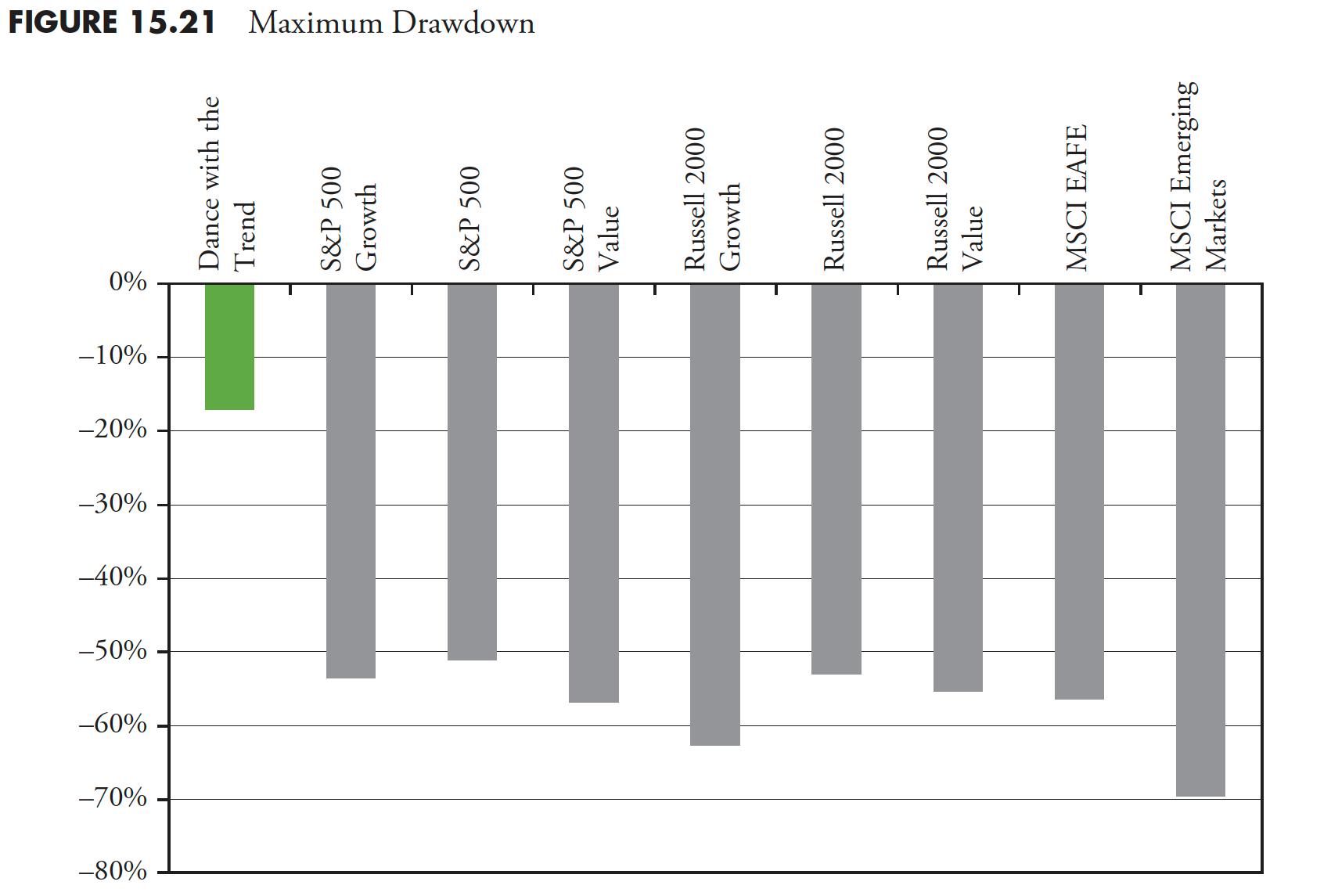
Figure 15.22 shows the average drawdowns. The average drawdown of the Dance with the Trend strategy was -5.1%.
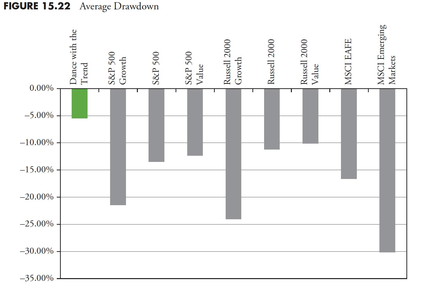
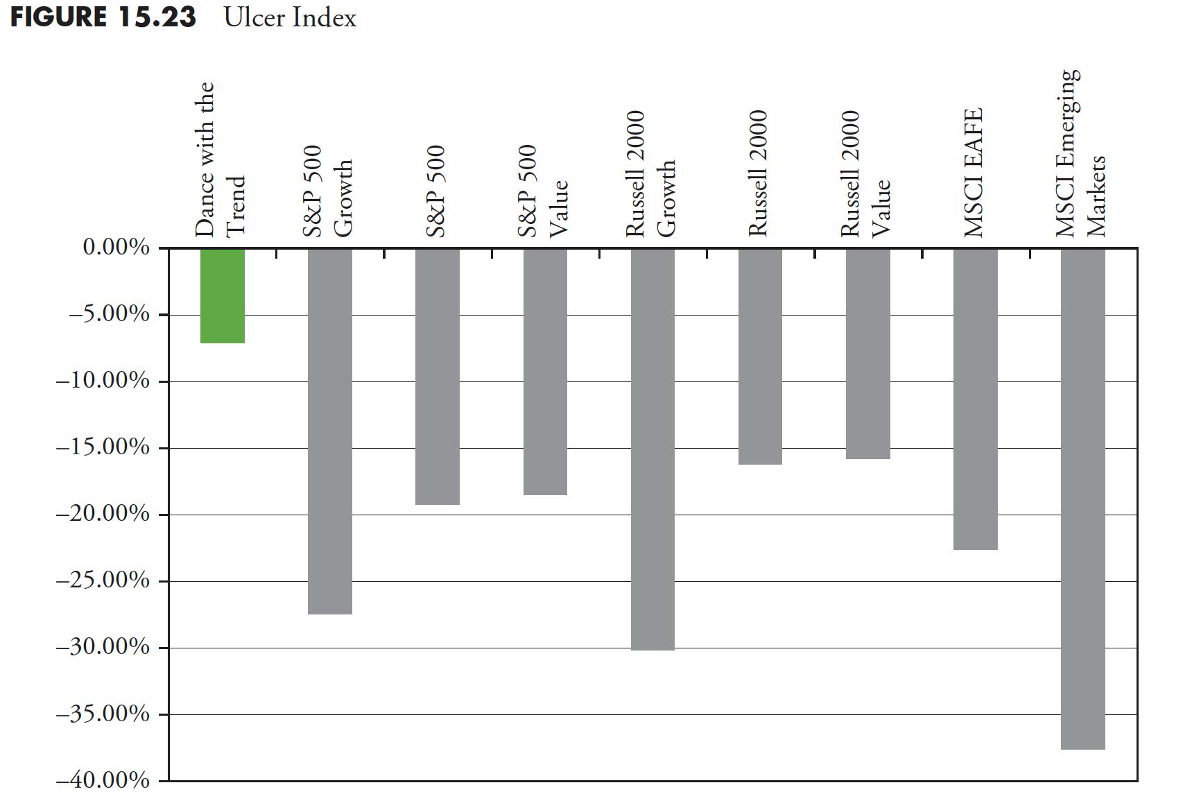
Figure 15.23 shows the Ulcer Index, which is a measure of risk. The Dance with the Trend strategy had an Ulcer Index of only -7%.
Dance with the Trend over a Full Market Cycle
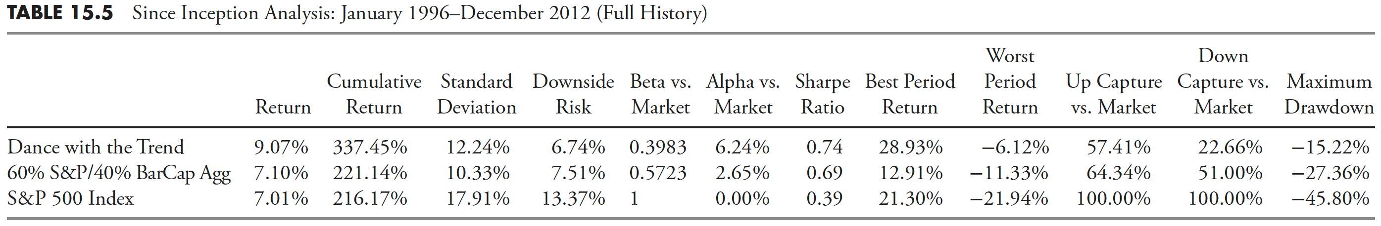
Any strategy that is a trend follower that treats cash as an asset class and moves to cash during bad periods in the market does not have a benchmark. The only way to correctly measure performance for a strategy such as the Dance with the Trend strategy is over the full market cycle. The next three tables include the ubiquitous 60/40 strategy for comparison, along with the also-ubiquitous S&P 500 Index. When one does not have a benchmark, at least something needs to be used. You can recall my comments on "The 60/40 Myth" in earlier articles.
The following tables use many statistical and risk measures; their definitions are scattered throughout the book, but all are reproduced here for convenience.
Return — This is the annualized return, which is also the geometric mean of the returns.
Cumulative Return — This is the compound return of the series from the beginning date.
Standard Deviation — A measure of the average deviation of the returns from their mean (same as sigma).
Downside Risk — Also known as the semi-standard deviation, as the sum is restricted to those returns that are less than the mean. (Author note: Be careful here and be aware of the amount of data being analyzed. An inadequate amount of data would make this value unreliable.)
Beta vs. Market — This is the sensitivity of the series compared to that of a benchmark. A beta of one means the return series and the benchmark are similar.
Alpha vs. Market — This is the mean of the excess returns of the series over beta times the benchmark. (Author note: This is horribly overused in modern finance and very difficult to distinguish from returns derived from beta.)
Sharpe Ratio — The annualized excess returns of the series divided by the annualized standard deviation.
Best Period Return — The maximum of the returns in the period of data analyzed.
Worst Period Return — The minimum of the returns in the period of the data analyzed.
Up Capture versus Market — This measures how well the series did in capturing the up periods of the benchmark.
Down Capture versus Market — This measures how well the series did in capturing the down periods of the benchmark.
Maximum Drawdown — The maximum compounded loss the series incurred during any period of measurement.
R-Squared versus Market — Shows how closely related to the benchmark the series is based on the variance of returns. This is also known as the goodness of fit.
Correlation versus Market — This measures how closely related the variance of the series is to the benchmark.
Table 15.3 shows the performance data for the first full bear/bull cycle in this century. When a risk statistic is compared to the market, that market is the S&P 500 Index.
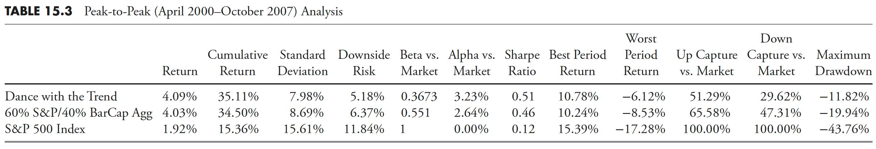
Table 15.4 shows the Dance with the Trend strategy during the bull/bear cycle.
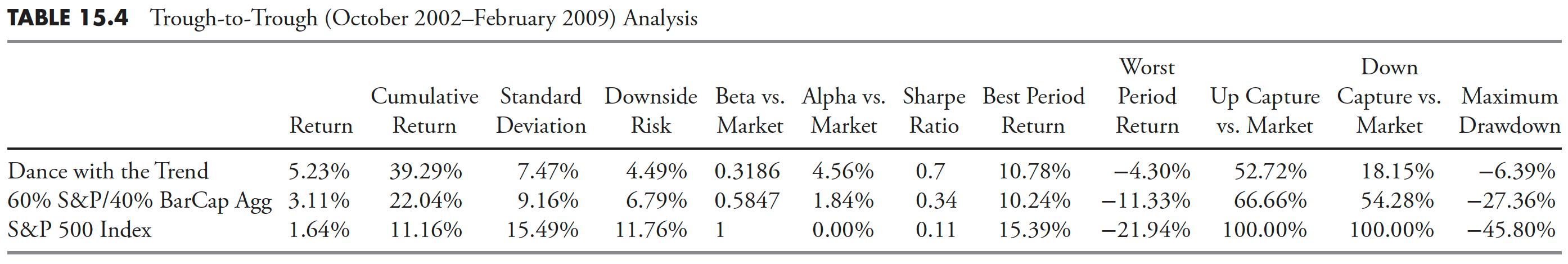
Table 15.5 shows the Dance with the Trend strategy since its conception.
Dance with the Trend with Other Asset Classes
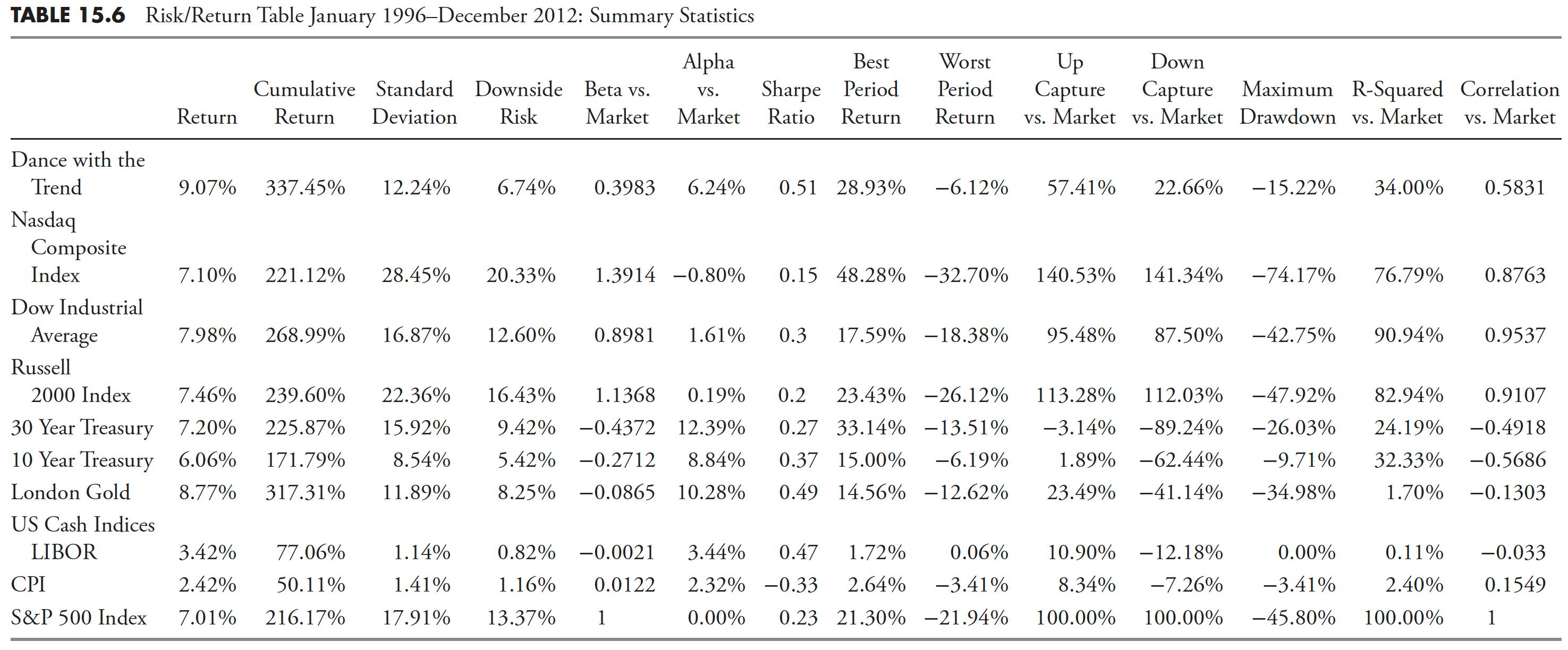
The following tables show various risk statistics for the Dance with the Trend strategy compared to a wide variety of other asset classes. If a strategy such as the Dance with the Trend strategy does not have a benchmark, then this is a more valid method of comparing performance measures. Table 15.6 shows all of the risk statistics used in the previous tables, with the addition of R-squared and Correlation.
Dance with the Trend Return Analysis
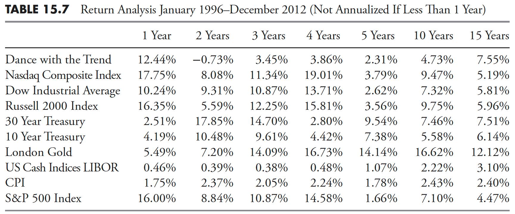
Table 15.7 shows the various asset classes' performance over various time periods from 1 to 15 years.
Dance with the Trend Upside Downside Analysis
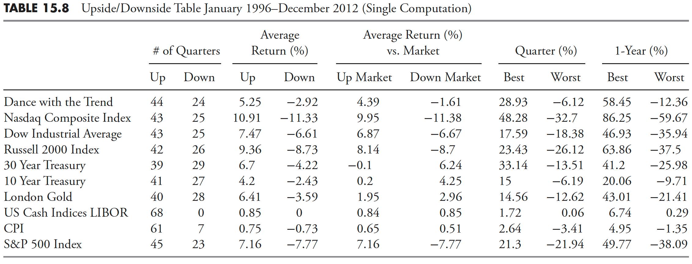
Table 15.8 shows statistics for various periods relative to up and down markets, as determined by the S&P 500 Index.
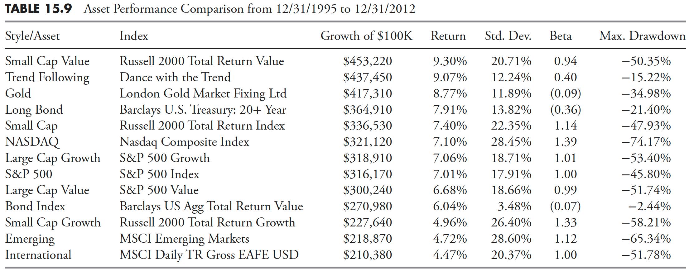
Dance with the Trend Comparison with Style/Asset Classes
Table 15.9 shows the performance of the Dance with the Trend strategy against a host of various asset classes.
Dance with the Trend Performance Comparison
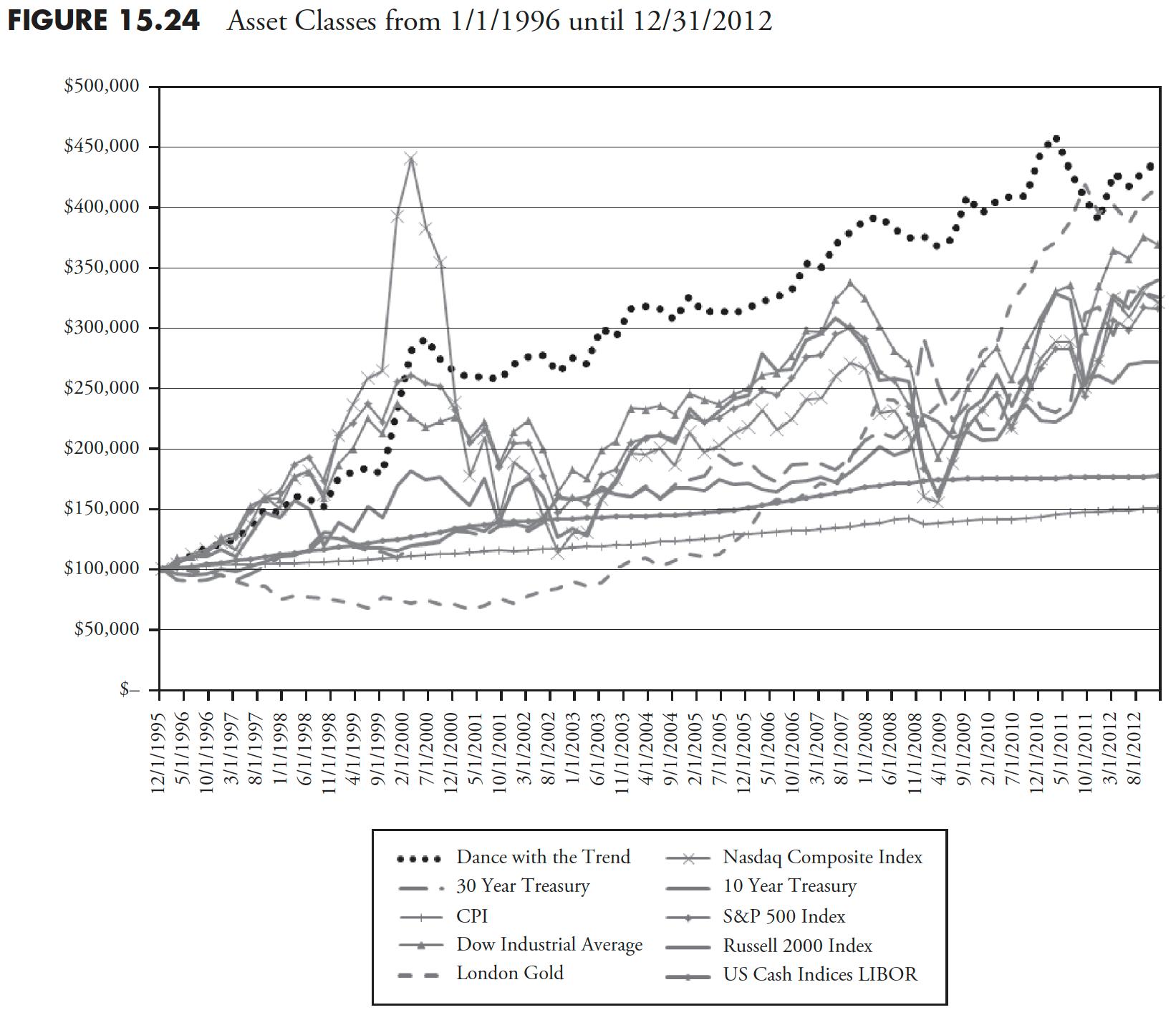
Figure 15.24 shows the various asset classes from 1/1/1996 until 12/31/2012. The dotted line (Dance with the Trend) offers a fairly smooth ride. As one ages, this comfortable ride becomes more and more important. It is an investment ride that is easy to stick with over the years. Another wonderful advantage is it means that one could pull out almost all of their money at any time, independent upon market action. Think about that!
Mean Shifting
The Dance with the Trend model measures the trend of the market, then utilizes rules to scale into the trend, and maintains risk containment measures (stop loss) both absolute and relative, and, when an uptrend is not identified, a cash position of up to 100% is utilized. There are two distribution concepts at play with this type of model. First the use of stop loss measures will reduce the downside variance and shift the return distribution mean to the right. Secondly, the baggage of trend following, known as whipsaws (see the previous article), will reduce the upside variance and shift the return distribution mean to the left. The benefit is that the mean shift to the right is much greater than the mean shift to the left, yielding a net shift to the right. (See Figure 15.25.)
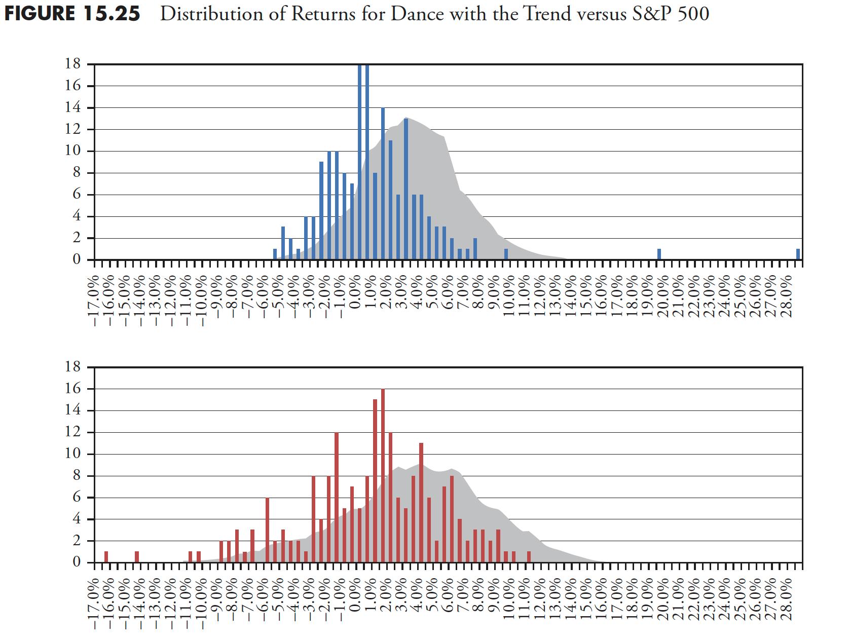
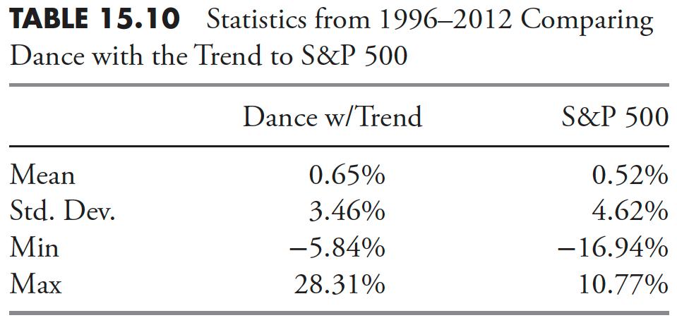
Table 15.10 shows monthly return distributions for the Dance with the Trend strategy from 1996 to 2012, compared to the S&P 500. You can see that the average (mean) of returns for the Dance with the Trend strategy for this 17-year period was 0.65% versus 0.52% for the S&P 500, and with lower variability as denoted by St. Dev. (standard deviation/sigma). The more significant point is the minimum (Min) value for the strategy is only -5.84% vs. the S&P 500 at -16.94%.
The top plot in Figure 15.25 is the monthly return distribution for the Dance with the Trend strategy from 1996 to 2012. The vertical axis shows the number of events that occurred at the various return levels. The shaded area is the 12-month moving average of those returns, so that you can more closely relate to where the bulk of returns occurred. The second plot is the monthly return distribution of the S&P 500 over the exact same time period, also with the 12-month moving average shown. Notice the lack of negative returns (left side) on the top plot of the strategy compared to the S&P 500 in the lower plot. This ability to avoid downside returns provides a right shift (more positive) in the mean of all values.
In the top plot, there are two return values that have been truncated (two long lines that reach the top of the plot) in order to keep the values in the vertical axis the same as those in the lower plot. Their values are 33 and 29. I think it is clear that the Dance with the Trend strategy offers higher returns, in addition to much fewer returns in the negative (left) realm.
That was a lot of performance comparisons. Hopefully, you were able to grasp the message that a rules-based trend-following strategy that uses stops and treats cash as an asset class is much better than many, if not most of, the investment strategies being hyped by managers who only try to follow a benchmark.
Thanks for reading this far. I intend to publish one article in this series every week. Can't wait? The book is for sale here.