StockCharts.com members got a sneak peek yesterday at the new DecisionPoint LIVE Public ChartList. There you will find all of the charts that I analyze during my webinars. They will be updated prior to my webinars on Wednesdays and Fridays. Additionally, I'll include a Chart Spotlight or bonus chart that you should see. Today's bonus chart with annotations will be the Rydex Assets Ratio chart. I recently received a question on how to best analyze it. I suggest you check out the ChartSchool article on the Rydex Ratios here for a more detailed explanation but a quick review is below.
Here's the question:
"In the Rydex total asset ratio section [of the DP Chart Gallery], how can the:
-moneymarket assets be drastically reduced
-bear funds marginally increased
-bull funds marginally decreased
-and total bull and moneymarket assets sky rocket at the same time?"
The chart is below:
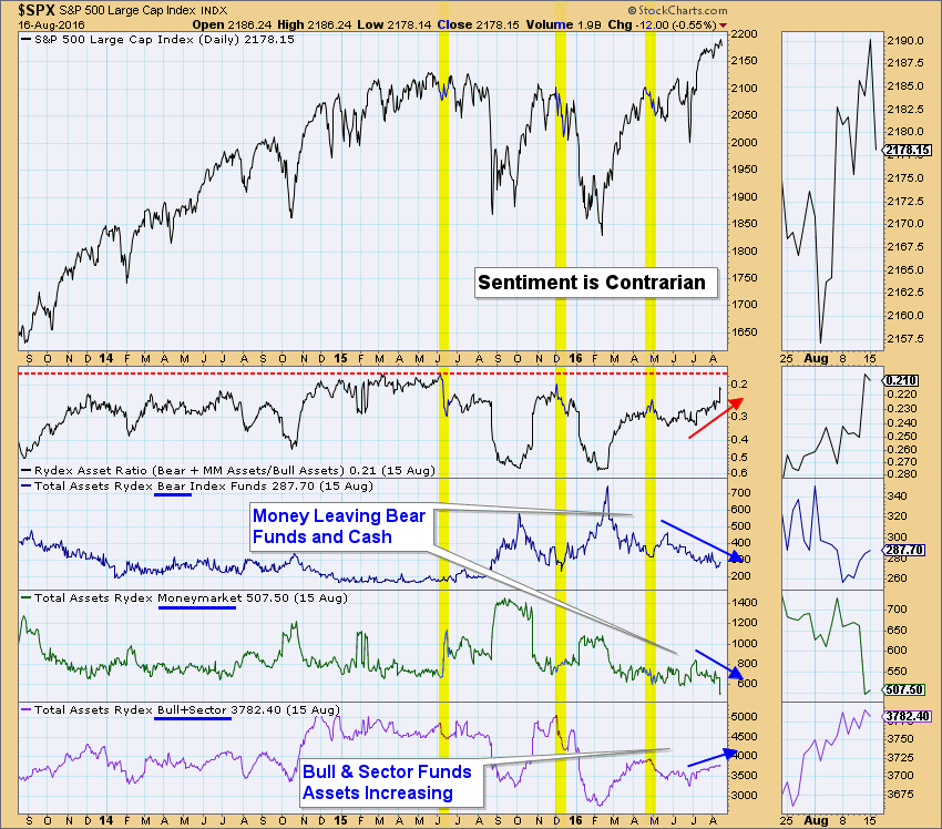
Let's look at each window starting from the bottom. The total assets in the bull and sector Rydex funds are increasing, meaning that the market players are bullish. Moving up, we notice that money is leaving money markets. This means players are feeling bullish or are preparing to reinvest cash (could move to bear or bull funds). Money is leaving the bear funds steadily which also indicates players are bullish. The Rydex Asset Ratio is getting smaller which implies there are greater assets in the bull funds (that total is in the denominator). Remember as the denominator approaches infinity (or gets bigger for non-math folks), the ratio gets smaller and smaller. When bear and money market assets deplete, the numerator gets smaller. As the numerator approaches zero (or gets smaller), the ratio gets closer to zero.
Conclusion: When investors and the market are feeling bullish, that is generally the time the market tops. The Rydex Assets and Rydex Cashflow analysis charts are sentiment gauges. When sentiment is bullish it is bearish for the markets. Notice the highlighted yellow bars on the chart. When the ratio is near zero and tops, we should expect a price decline. Just knowing that the movement of assets is leaning toward bullish sentiment tells us to expect a decline or correction. Another chart to explore is the Rydex Cashflow Ratio. This tracks the cashflow in/out of funds, not the assets themselves.
Come check out the DecisionPoint Report with Erin Heim on Wednesdays and Fridays at 7:00p EST, a fast-paced 30-minute review of the current markets mid-week and week-end. The archives and registration links are on the Homepage under “Webinars”.
Technical Analysis is a windsock, not a crystal ball.
Happy Charting!
- Erin