 It happened all in the same day. I was talking to my dad, Carl Swenlin exclaiming how I think I'm "chart pattern crazy". Then, I received a chart via email from one of my "DecisionPoint Report" webinar viewers. He actually sent the chart to someone else and I was copied on it. At the end of his explanation of the chart to his friend, he ended with, "Erin, I know you like charts."
This isn't about being a mathematics major in college...not exactly. My degree is actually a Bachelor of "Arts" not "Science". I chose this pathway for two reasons. First and foremost, I was able to dump the Physics requirements (least favorite subject of all time!). Second, it gave me a chance to study the theories, patterns and creativity behind the numbers.
This translates to technical analysis very well. My first introduction to stock charting was walking into my Dad's office and seeing the many pieces of graph paper taped together with carefully drawn pencil lines and OHLC bars hanging on the wall. What really caught my eye was the fat book of charts on his desk. Do you remember "Horsey Charts"? It was giant book of charts published by M.C. Horsey & Co. The lines and bars didn't look simply like "squiggly lines" to me, I immediately started to see the patterns, slopes, trends, etc. It was absolutely fascinating and I was only a teenager (I won't reveal the year).
You can imagine my excitement when DecisionPoint partnered with StockCharts.com for the first time. The charts generated using their scan engine and charting workbench became the ultimate sandbox to play in. As I built sand castles and knocked them down to just build another, I found my favorite indicators and determined that if I watched them daily, I have an advantage.
The Price Momentum Oscillator (PMO) developed by my Dad (with a little algebra help from me) is my all-time favorite indicator. As I told attendees at my ChartCon 2014 presentation, "I may be divorced, but I'm still married to the PMO!" It is invaluable for trades in all time frames.
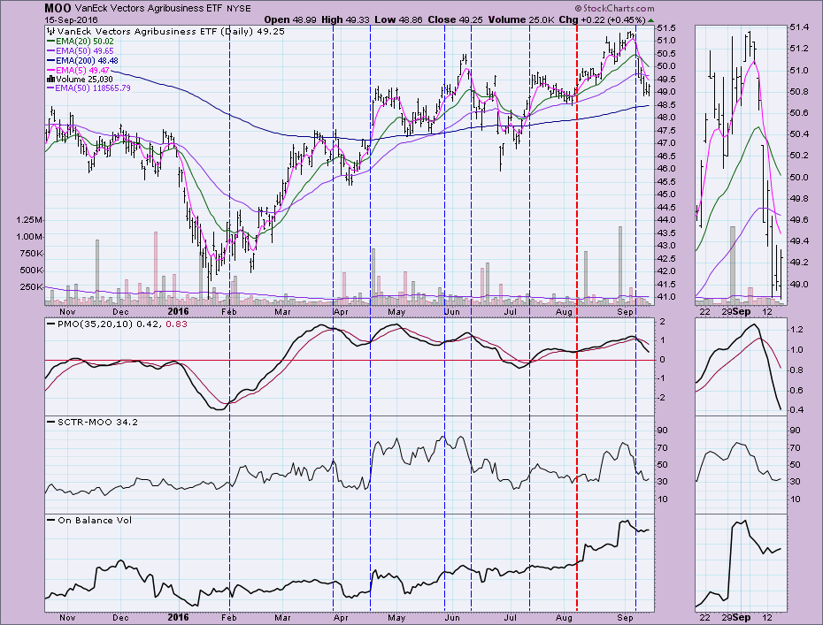
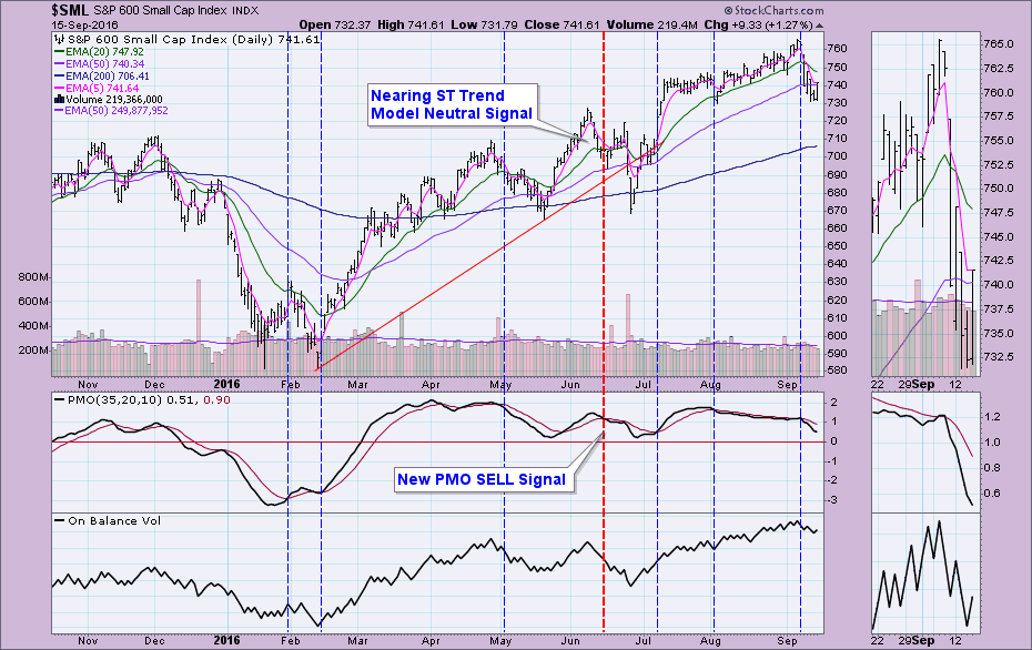
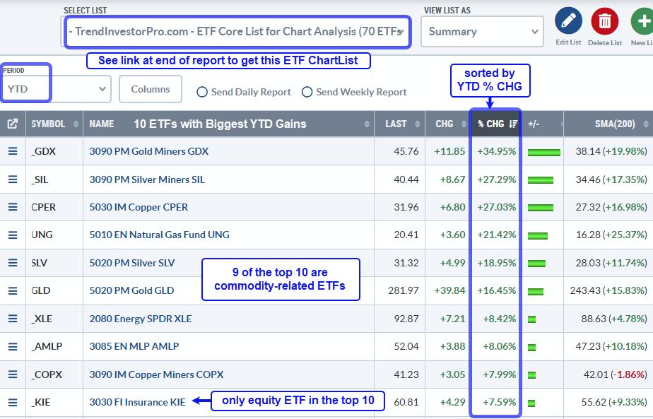
Here are some of my favorite PMO charts taken straight from my blogs and webinars. The thick dashed vertical red lines represent the point in time I wrote the article. The other verticals are just highlighting other signals that proved quite helpful or not; you can see that the PMO is not infallible, that is where the Trend Models come in (further discussion at ChartCon 2016) Enjoy the visuals, fellow ChartWatchers!
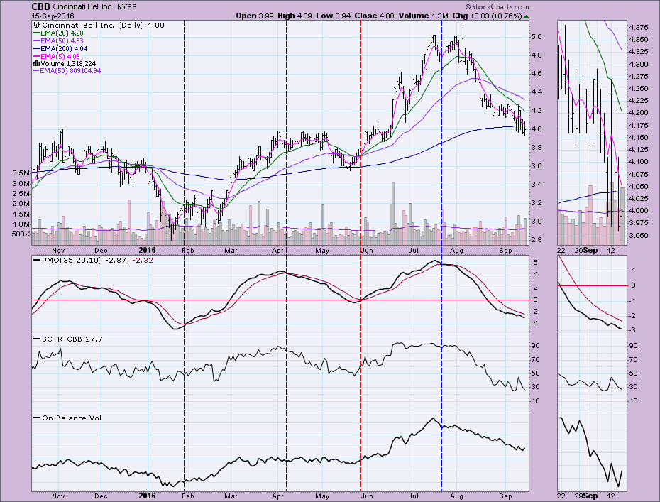
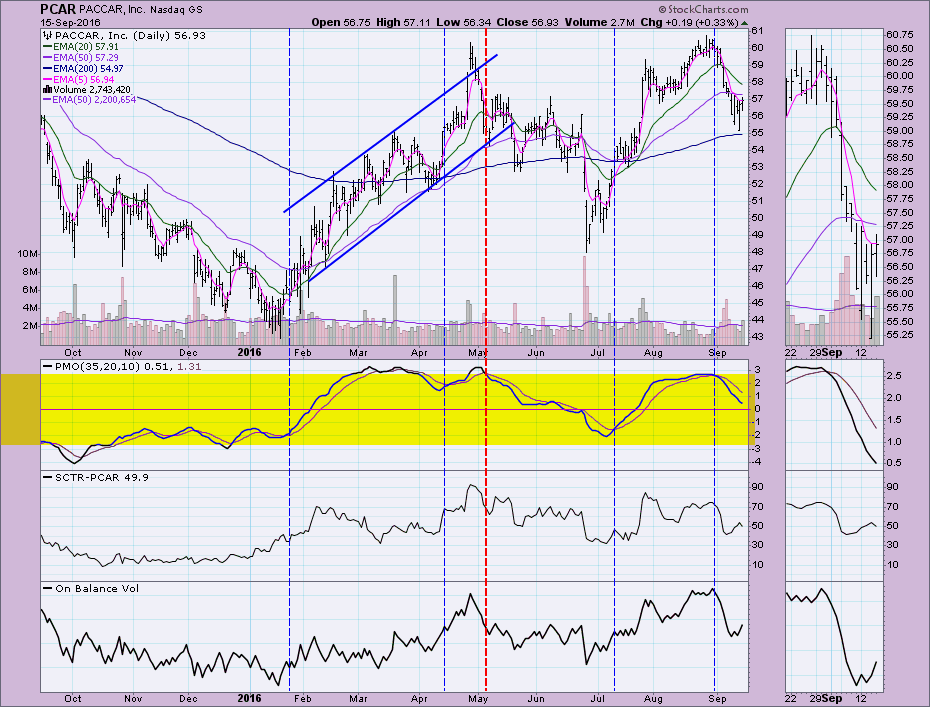 Conclusion: The PMO is only one of the primary indicators I use for determining good investments. I'm also a big fan of the SCTR and On Balance Volume (OBV). Any investment decision should also consider market and sector trends. I recommend you read about the Trend Model in ChartSchool. I'll discuss more about how to combine trend and momentum signals during my ChartCon 2016 presentation. Sign up now if you haven't. It's virtual and requires no travel! In reality, you cannot be an official "ChartWatcher" if you don't use StockCharts.com, as this is where the name was coined. Rest assured, if you're here, you're a ChartWatcher!
Technical Analysis is a windsock, not a crystal ball.
Happy Charting!
- Erin
The NEW DecisionPoint LIVE public ChartList has launched! Click on the link and you'll find webinar charts annotated just before the program. Additional "chart spotlights" will be included at the top of the list. Be sure and bookmark it!
Come check out the DecisionPoint Report with Erin Heim on Wednesdays and Fridays at 7:00p EST, a fast-paced 30-minute review of the current markets mid-week and week-end. The archives and registration links are on the Homepage under “Webinars”.

