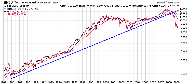
How bad is it? How big was the Internet bubble? How does the current decline compare to the 1987 crash? It's all here in black and white (and red and blue). On a log scale chart like this, movements of the same percentage appear to have the same height regardless of the point values.
The key take away here is that when the Internet bubble burst in 2002, the market went back to the "normal" rate of climb that it established after the crash in 1987. The current economic crisis destroyed that trendline in mid-2008 and is therefore much more serious.

About the author:
Chip Anderson is the founder and president of StockCharts.com.
He founded the company after working as a Windows developer and corporate consultant at Microsoft from 1987 to 1997.
Since 1999, Chip has guided the growth and development of StockCharts.com into a trusted financial enterprise and highly-valued resource in the industry.
In this blog, Chip shares his tips and tricks on how to maximize the tools and resources available at StockCharts.com, and provides updates about new features or additions to the site.
Learn More


