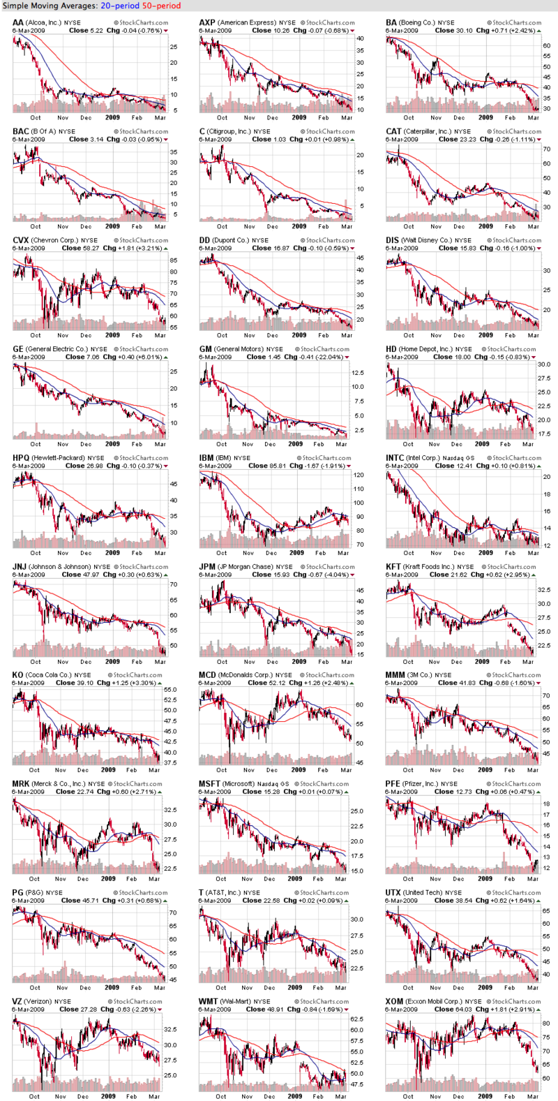
Click here for a live version of these charts.
OK - I apologize for the size of the image above, but it's worth the extra time needed to download I promise!
These are 6-month candlestick charts of the 30 stocks that make up the Dow Jones Industrial Average. As the old "Sesame Street" song goes, one of these things is not like the others. Can you spot it?
All of these charts look... well... terrible. But if you look closely, you'll see that one has its moving average lines reversed(!). Instead of the red 50-day MA on top (a bearish signal), one of these stocks has the blue 20-day MA on top. Can't spot it yet? OK, one more hint - look at the direction of the red 50-day MA lines on all these charts - on every chart except one, the red line is headed down.
Relatively speaking, IBM has been doing much better than its Dow brothers over the past 4 months and it shows in the position of its 20-day and 50-day MAs. (MRK was doing pretty good also until very recently.) Doing group chart analysis like this can help you spot "outliers" like IBM that may deserve closer scrutiny.
(BTW, only one Dow stock has a rising 20-day MA right now and it's not IBM. Can you spot it?)

About the author:
Chip Anderson is the founder and president of StockCharts.com.
He founded the company after working as a Windows developer and corporate consultant at Microsoft from 1987 to 1997.
Since 1999, Chip has guided the growth and development of StockCharts.com into a trusted financial enterprise and highly-valued resource in the industry.
In this blog, Chip shares his tips and tricks on how to maximize the tools and resources available at StockCharts.com, and provides updates about new features or additions to the site.
Learn More


