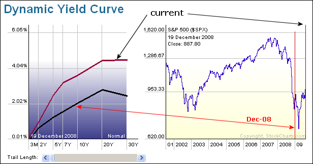
The Dynamic Yield Curve shows two plots over the last eight months. The black line shows the yield curve in December, while the maroon line shows the current yield curve. Today's yield curve is much steeper because 3-month rates are virtually unchanged since December, but longer rates have risen this year.

About the author:
Arthur Hill, CMT, is the Chief Technical Strategist at TrendInvestorPro.com. Focusing predominantly on US equities and ETFs, his systematic approach of identifying trend, finding signals within the trend, and setting key price levels has made him an esteemed market technician. Arthur has written articles for numerous financial publications including Barrons and Stocks & Commodities Magazine. In addition to his Chartered Market Technician (CMT) designation, he holds an MBA from the Cass Business School at City University in London.
Learn More


