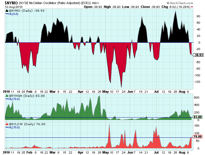
The "Hindenburg Omen" has been getting lots of press this week so I thought I'd put up a chart that people can use to track this elusive prophet of doom. All the different factors that go into the Omen's signal can be found in this article. This chart can be used to follow along and see if another "Unconfirmed Omen signal" occurs like it did on Thursday.
Here's how the chart looked after Thursday's close when the latest signal happened:

(Click here for a live version of this chart.)
The Omen signal looks at the ratio of NYSE New Highs and New Lows to the total number of issues traded. The signal happens when BOTH ratios are above 2.2%. Currently there are approximately 3,150 issues traded on the NYSE. If you do the math, that means that the 2.2% ratio is reached at 70 - which is where I placed the blue horizontal lines on the lower panels. If both the green and red graphs are above their blue lines, a signal is possible.
An Omen signal also requires that the number of new highs be less than twice the number of new lows. You'll need to look at the values on the right side of the chart and do the mental math to see if that is true. On the chart above, you can see that 83 is less than 2 times 76 so the requirement was met in this case.
The Omen also needs the McClellan Oscillator to be negative (thus the inclusion of $NYMO on the chart) and that the 10-week moving average of the NYSE be rising (something you'll need to confirm with a different, weekly chart).
Note: Hindenburg Omen aficionados prefer to get their Highs and Lows data from the Wall Street Journal in order to declare an official signal. That's fine. In that case, you can use this chart to see whether an Omen signal is possible, then use the WSJ data to confirm it.
- Chip


