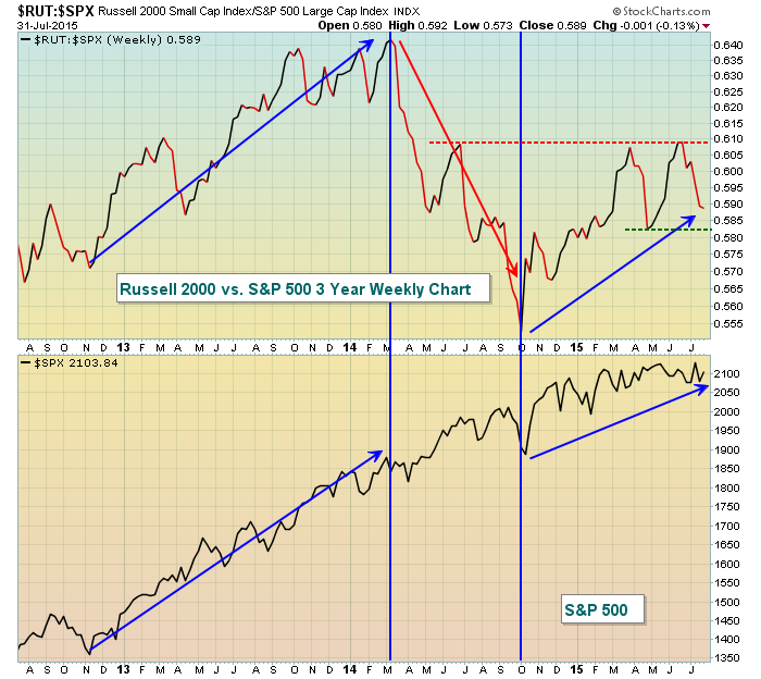
Advances in the stock market are much more bullish and likely more sustainable if small cap stocks are outperforming their large cap counterparts. Over the past three years, we've seen very volatile relative action between the S&P 500 and Russell 2000. During periods when the Russell 2000 has led, the stock market has performed much, much better. To the contrary, when the large cap S&P 500 leads the way, gains seem to grind to a halt. The following chart is a simple visual of how the S&P 500 performs (bottom half of the chart) based on the relative leadership of small caps (blue arrows rising on top half of chart) vs. the relative leadership of the S&P 500 (red arrow dropping):
If you're in the bullish camp, you want to see the relative ratio climb above relative resistance (red dotted line) while the bears want just the opposite - loss of relative support (green dotted line).
Happy trading!
Tom


