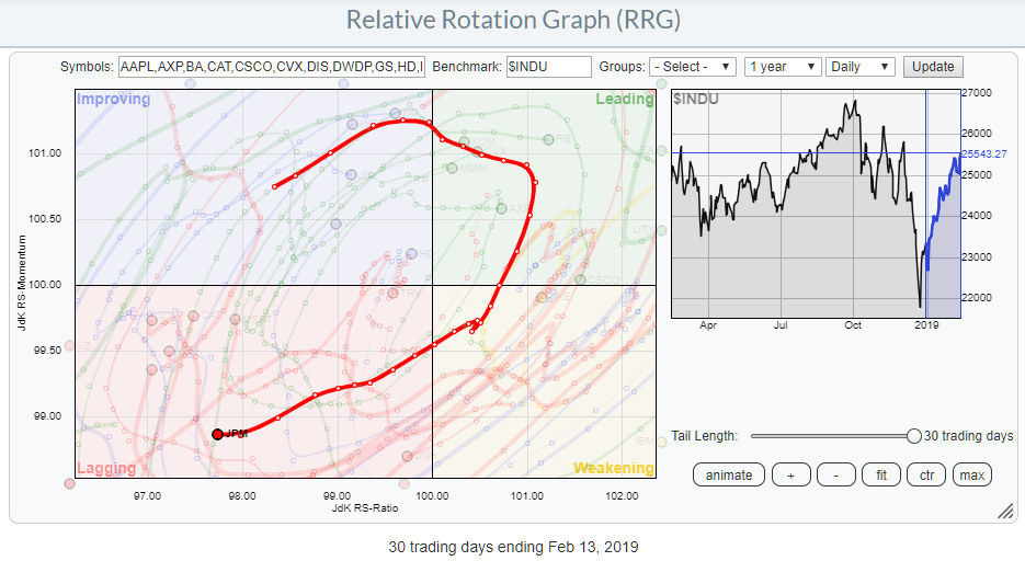
One of the choices in the drop-down selection on the Relative Rotation Graphs page is the DJ-industrials (Dow 30 Industrials). This RRG shows the rotation of all 30 Dow stocks against the $INDU.
The RRG above shows the daily rotation and highlights the rotation of JP Morgan Chase & Co. (JPM), a heavyweight in the financials sector.
This rotation caught my attention as it is moving strongly lower on the JK RS-Ratio scale and pushing further into the lagging quadrant.
The reason for bringing up the daily version of the RRG for Dow stocks and looking for JPM was the rotation for JPM that I observed on the weekly version of the RRG, which is my usual starting point.
Weekly Rotation
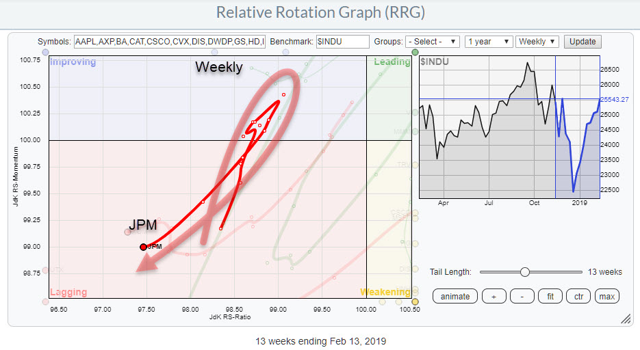
The weekly version of the RRG above is shown below.
 This weekly image shows the longer term, 13 weeks, rotation of JPM and as you can see this tail completed a rotation completely at the left-hand side, Lagging-Improving-Lagging, of the graph. This is the type of rotational pattern that occurs when strong negative trends are in play.
When I see a rotation like this on a weekly RRG I want to see how it interacts with the daily, hence the daily RRG at the top of this article as it shows how JPM rotated from improving through leading and weakening and then back into lagging over a period of 30 days and is now heading in a similar direction as the tail on the weekly RRG.
Lots of pieces of the puzzle that are pointing to more weakness, ie relative underperformance for JPM, in the weeks/months ahead.
Final Check
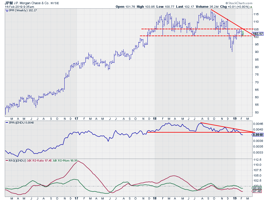
The final check is and always has to be, the price chart.
 The relative strength against the DJ Industrials index already started to set in halfway through 2018. When the price broke below the important horizontal support zone between $100-$105 in December, relative strength managed to hold up but the recent rally in JPM was not strong enough to keep up with the pace of the recovery in $INDU, causing relative strength to lag behind and eventually break below its horizontal support recently.
This happens while the price is struggling to move higher and is running into resistance in the $100-$105 zone and seems to be putting in a new high.
I am watching a break below support near $100 for an acceleration lower in price which will very likely fuel a further weakening of relative strength and thus a push deeper into the lagging quadrant on the Relative Rotation Graph.
My regular blog is the RRG blog If you would like to receive a notification when a new article is published there, simply "Subscribe" with your email address using the form below.
Julius de Kempenaer | RRG Research
RRG, Relative Rotation Graphs, JdK RS-Ratio, and JdK RS-Momentum are registered TradeMarks ®; of RRG Research
Follow RRG Research on social media:
Feedback, comments or questions are welcome at Juliusdk@stockcharts.com. I cannot promise to respond to each and every message but I will certainly read them and where reasonably possible use the feedback and comments or answer questions.
If you want to discuss RRG with me on SCAN, please use my handle Julius_RRG so that I will get a notification.


