The most widely followed Dow Jones index is the Dow Jones Industrials Average. But, in reality, this is only one of three averages that make up the Dow Jones Composite average.
The other two are the Dow Jones Transportation and the Dow Jones Utility averages.
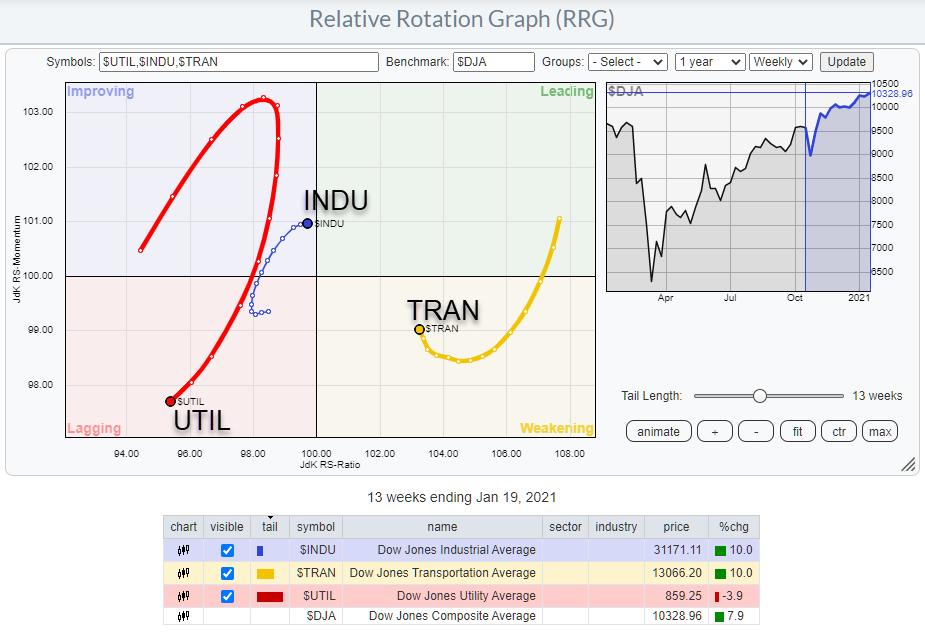
The RRG above shows the breakdown of the Dow Jones Composite average in those three groups, enabling us to see how they move/rotate against each other with $DJA as the benchmark.
Here are a few takeaways from the chart:
- Utilities have nose-dived back into the lagging quadrant after a short rotation through improving. This confirms the relative downtrend that is still in play for this group
- Transports is in an opposite rotation from Utilities; it is inside the weakening quadrant, but curling back up and underway for a renewed entry to the leading quadrant.
- Industrials are in the middle of this rotation and are completing a rotation through all four quadrants. They are about to move back into leading.
- This setup with Industrials and Transports on the right side of Utilities, with both at a positive trajectory and Utilities at a negative trajectory, suggests that the uptrend for the overall market is still alive and kicking.
This comes close to the classic Dow theory that states that :
The market is in an upward trend if one of its averages (i.e. Industrial or Transportation) advances above a previous important high and is accompanied or followed by a similar advance in the other average.
The chart below shows the three averages stacked on top of each other.
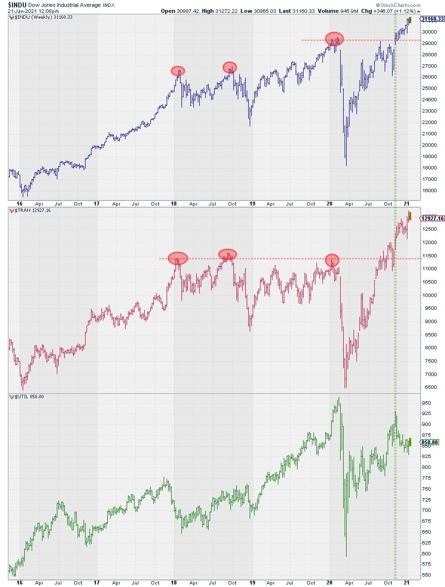
I have labelled the most important highs (imho) on the top two charts for the industrials and transportation averages.
The second high in 2018 has not really convincingly managed to break above the previous high earlier in that year. At the start of 2020, $INDU managed to break above the second 2018 high. The high in $TRAN, on the other hand, did not break higher. Hence, according to the Dow Theory, NO general market uptrend!
Towards the end of 2020, $TRAN managed to break above the early 2020 high in October. And, six weeks later, $INDU also managed to take out the previous high, which triggered the Dow theory signal for a general market uptrend.
So, in essence, according to the Dow Theory, this uptrend is only 9-10 weeks old and basically has only just begun!
#StaySafe, --Julius
My regular blog is the RRG Charts blog. If you would like to receive a notification when a new article is published there, simply "Subscribe" with your email address.
Julius de Kempenaer
Senior Technical Analyst, StockCharts.com
Creator, Relative Rotation Graphs
Founder, RRG Research
Host of: Sector Spotlight
Please find my handles for social media channels under the Bio below.
Feedback, comments or questions are welcome at Juliusdk@stockcharts.com. I cannot promise to respond to each and every message, but I will certainly read them and, where reasonably possible, use the feedback and comments or answer questions.
To discuss RRG with me on S.C.A.N., tag me using the handle Julius_RRG.
RRG, Relative Rotation Graphs, JdK RS-Ratio, and JdK RS-Momentum are registered trademarks of RRG Research.


