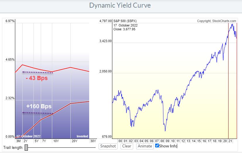
In March 2021, lending money to the US Government for ten years would give you a return of around 1.7%/ann over the next 10 years. Lending money to the government for 2 years at the same time would give you roughly 0.1%/ann for the next 2 years. Which makes sense, as one would require a bigger reward for lending out money for a longer duration vs. a shorter duration.
The difference between these 10- and 2-year yields (on Govt bonds) at the time was 160 Bps (1.6%). This represents a "normal" steep shape of the yield curve shown in the lowest curve in the graph above. Since then, the yield curve has flattened and eventually became inverted. The yield on 2-year bonds is now higher than on 10-year bonds. That is shown in the highest of the two curves. The difference between 10- and 2-year bonds has now shifted to minus 43 Bps.
It is clearly visible how the higher curve is much flatter than the lower curve. The process leading to that change is called the flattening of the yield curve. Here is the animated version.
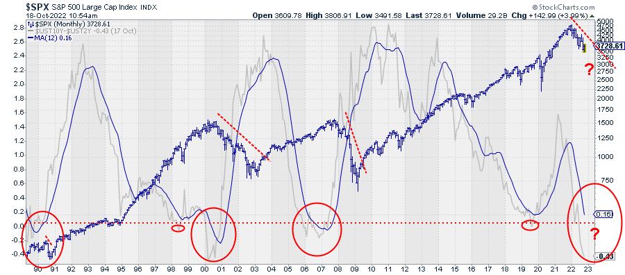
The chart above shows this difference between 10- and 2-year yields plotted on a standard price-time graph since 1990. The grey line is the actual difference, the solid blue line is the 12-month moving average and the blue bar chart is the S&P 500 index.
It is hard to pinpoint exact dates or moments, but the big picture shows three major yield curve inversions over the last 30 years (big red ovals). Every time the yield curve started to steepen again and rise back above 0, the S&P either started to decline or continued/accelerated a decline that had already started.
Despite the fact that the market ($SPX) seems to be improving somewhat at the moment, this is one of the observations that keeps me from getting overly bullish at this point.
--Julius
Julius de Kempenaer
Senior Technical Analyst, StockCharts.com
Creator, Relative Rotation Graphs
Founder, RRG Research
Host of: Sector Spotlight
Please find my handles for social media channels under the Bio below.
Feedback, comments or questions are welcome at Juliusdk@stockcharts.com. I cannot promise to respond to each and every message, but I will certainly read them and, where reasonably possible, use the feedback and comments or answer questions.
To discuss RRG with me on S.C.A.N., tag me using the handle Julius_RRG.
RRG, Relative Rotation Graphs, JdK RS-Ratio, and JdK RS-Momentum are registered trademarks of RRG Research.


