As the week ends, let's use GoNoGo Charts to get sense of market moves.
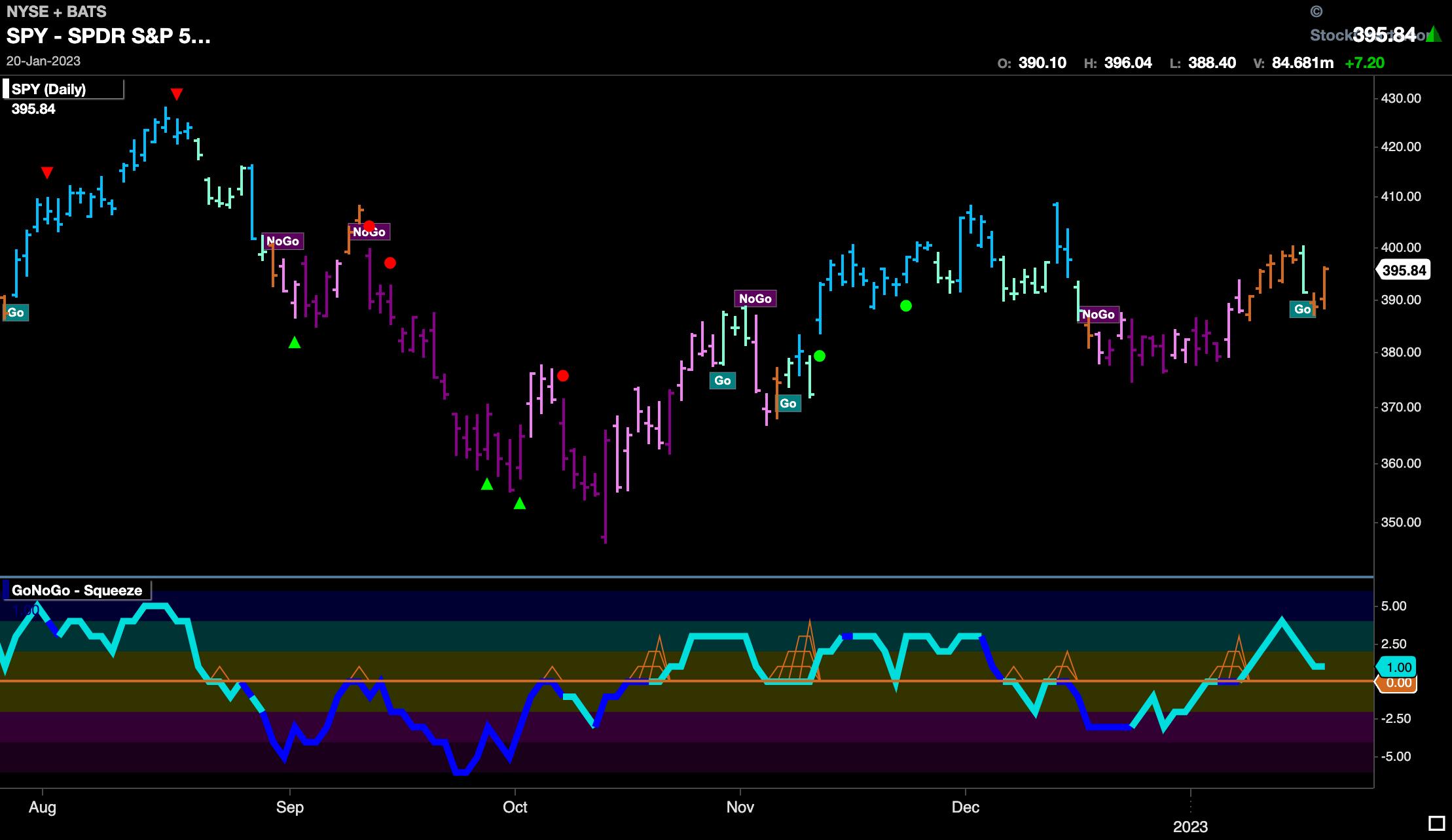
The chart below shows the $SPY with daily prices and the full suite of single security GoNoGo Indicators applied. Price moved higher into midweek before tumbling on Wednesday. The last bar of the week saw prices climb from this new low. We saw an aqua "Go" bar that quickly reverted to more amber "Go Fish" bars. Remember, the "Go Fish" bar represents uncertainty, and so the market is not yet convinced that we are ready for a new "Go" trend. Having said that, GoNoGo Oscillator broke above the zero line over a week ago and has stayed positive since. We will need to see the oscillator find support here at the zero line to prevent a return to a "NoGo".
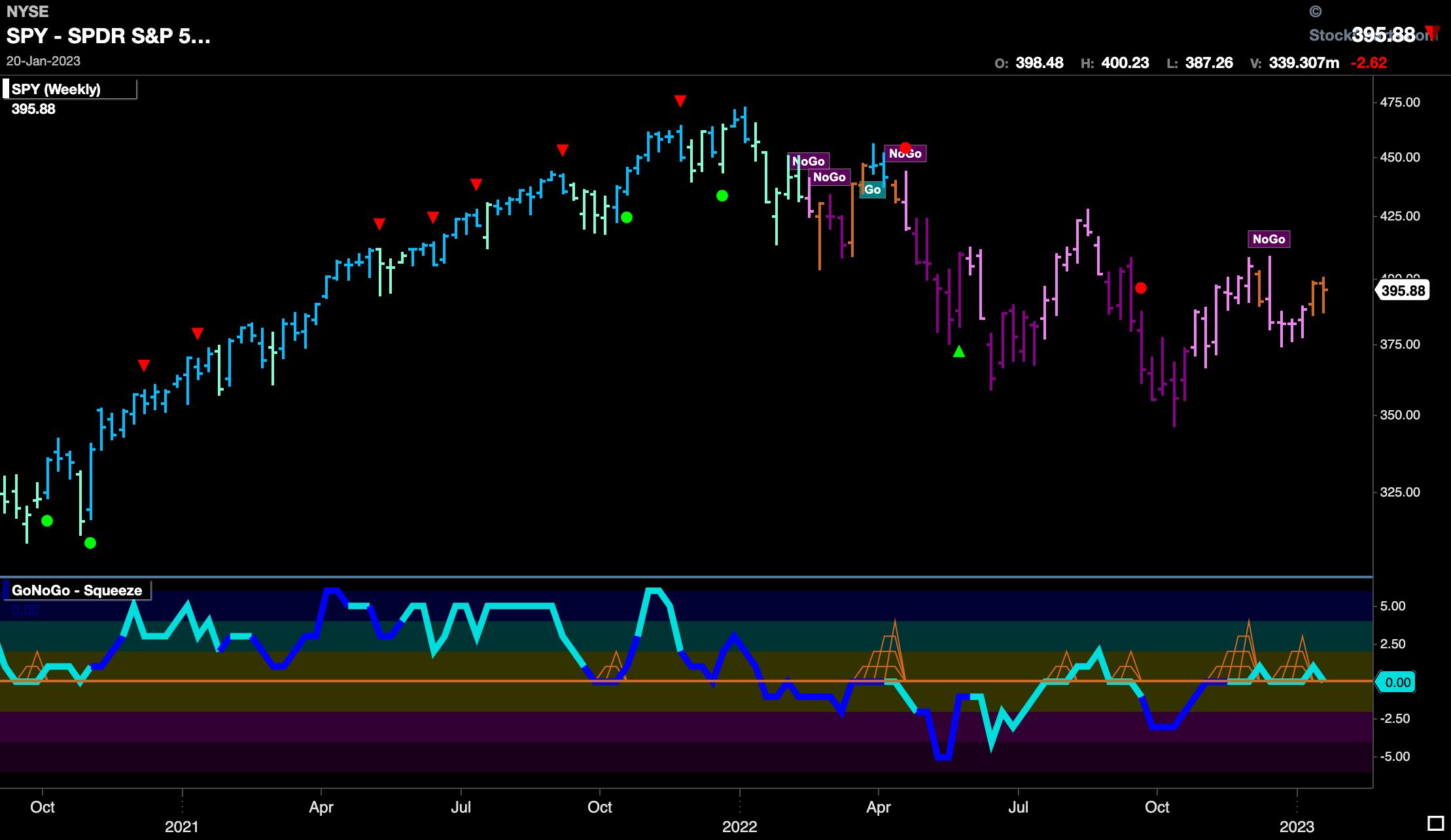
As we zoom out and look at the weekly chart below, we see a second bar of uncertainty reflecting the market's indecision. A second successive "Go Fish" bar highlights the fact that the "NoGo" has lost its hold on the market, but we are not in a "Go" yet until we see blue or aqua bars. If we turn our attention to the GoNoGo Oscillator in the lower panel, we can see that it continues to struggle with the zero line. Technically, we are finding support at this level, but we have been unable to move significantly into positive territory. We will want to see momentum rally here to give price the push it needs to paint "Go" bars on the weekly chart.
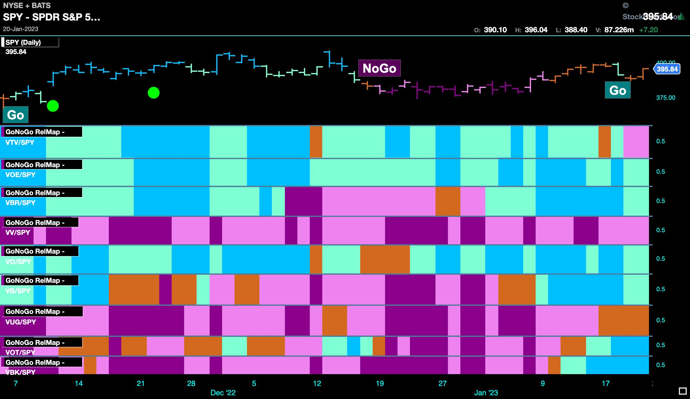
Let's turn to some GoNoGo RelMaps to understand where the performance is coming from, as we see the signs of a market moving towards a more risk-on environment. Below, we have a GoNoGo RelMap showing the Morningstar 9 style boxes. These tickers can be easily found on StockCharts. In an interesting move this week, we can see large cap value has started to underperform relative to the S&P 500. Mid-cap and small-cap value are still in relative "Go" trends, but it is the bottom of the map that is changing fast. Small- and mid-cap growth have entered relative "Go" trends, which is a sign of a more risk-on environment.
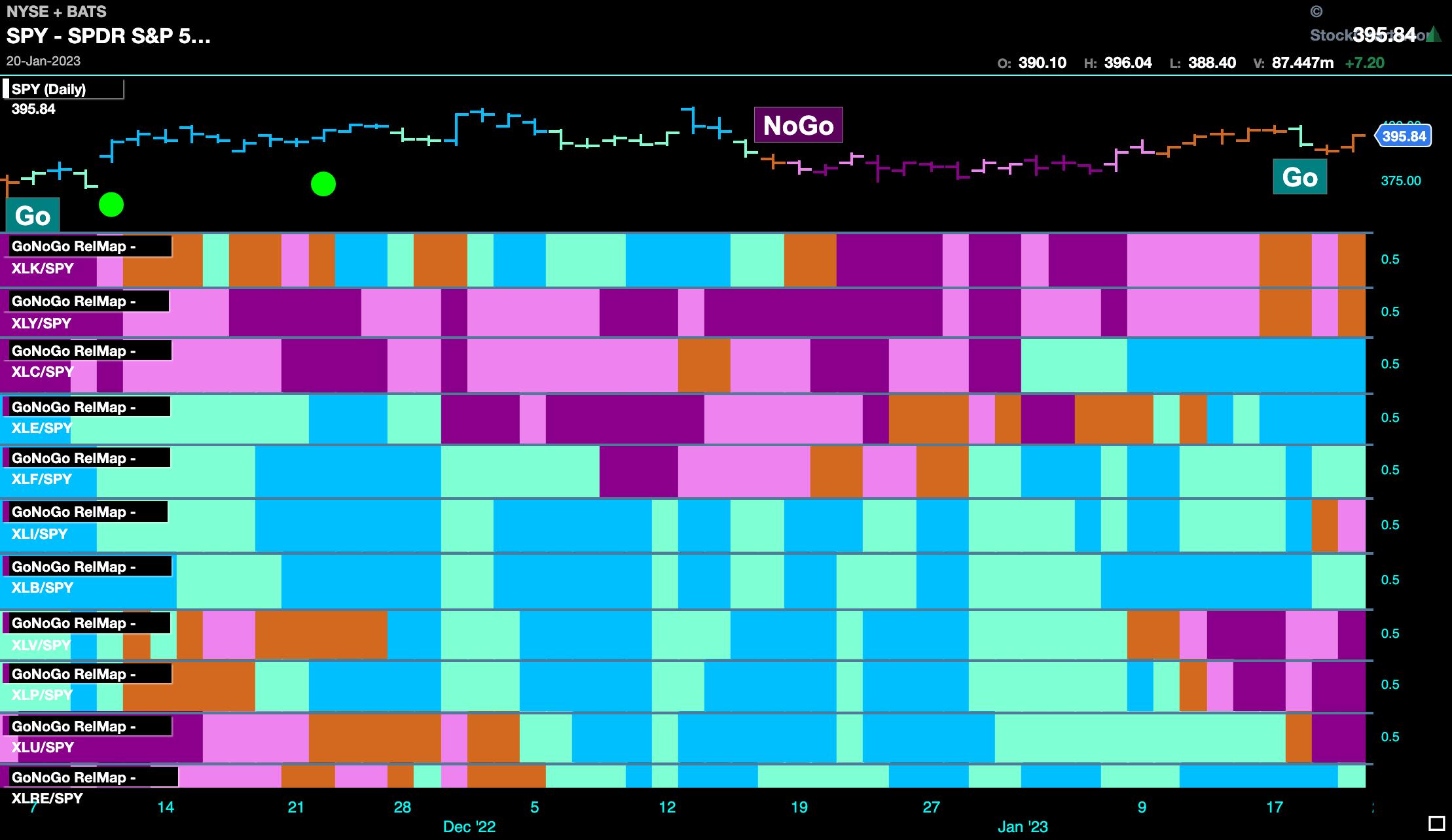
Finally, the GoNoGo Sector RelMap confirms that change is afoot also. We can see that the growth sectors, technology ($XLK) and discretionary ($XLY), have painted amber "Go Fish" bars to end the week, moving out of relative "NoGo" trends. More traditionally, the defensive sectors, i.e. healthcare ($XLV), staples ($XLP), and utilities ($XLU), have all rolled over into "NoGo" trends relative to the S&P 500. It will be important to monitor this week ahead to see if the trend continues, with the more beaten-down growth stocks starting to rally.
Better Charts. Better Decisions.
Alex Cole