Technical analysis provides a broad toolkit of indicators, and if you use too many indicators on your chart, it can get complex and lead to "analysis paralysis." But when you put some thought into selecting a combination of indicators, it can give you a weight of the evidence perspective, one that you can use across timeframes and in any market regime. And that can be a powerful composite blend of information.
Step One: Develop a Process
As a trader or investor, you need to develop a trading process. Checklists are great, helping you figure out when to enter and exit positions and create repeatable discipline, which could help avoid behavioral pitfalls.
Remember when you were learning to drive? While learning to drive can be fun, it also involves risk. For the sake of safety (risk management) and efficiency (profitability), a car driver needs to master the different functions of the vehicle and interpret, in real-time, the challenges that await you on the roadways (markets). As a new driver, you learn that every time you get into your vehicle, it's sensible and potentially lifesaving to follow a "new driver checklist."
New Driver Checklist
☑ Adjust the seat and steering wheel positions to reach gas, brake, and clutch.
☑ Fasten seat belt.
☑ Adjust mirrors and check for obstacles at the rear and sides of the vehicle.
☑ Check all lights are functional.
☑ Engage brake when starting engine.
☑ Signal before driving off.
And, while driving, there is a ton of info to process and react to in real-time, including speed, distance from other cars, navigation, fuel levels, gear shifting, and so on.
A disciplined approach to driving makes you more responsible and, more importantly, a safer driver. When you graduate to the level of an experienced driver, following the checklist becomes subconscious.
A Trading Checklist
When using technical analysis to invest in the financial market, you can apply a similar checklist. Creating a checklist and having the discipline to follow it helps ensure you don't make irrational decisions based on emotions such as fear and greed. You can add a diversified blend of technical indicators to identify trends and their reversals. You invest with the hope of making a return on your investment. So, you want to participate in most of a security's price move while avoiding the hazards of the financial markets. You want an intelligent framework in which to invest so you can make fast, effective decisions based on objective information.
A technical analysis checklist might include the use of:
☑ Trend lines
☑ Moving averages
☑ Momentum analysis
☑ Volume analysis
☑ Price patterns
☑ Dow Theory
Over time, sophisticated traders and portfolio managers develop their individual technical checklist to remove uncertainty in the decision-making process for each trade. This allows a trader or investor to take deliberate action, rather than succumb to the emotional reactions that arise from what's being talked about in the news or by other investors and traders.
To extend the driving metaphor, think of a Formula One race. While it might be helpful for a driver to understand the physics of internal combustion engines or fluid dynamics, this knowledge isn't necessary to pilot the car around the racetrack.
One of the advantages of technical analysis is that you can understand the price action of any security over any timeframe without a deep understanding of the fundamentals of that industry, knowledge of corporate actions, or management politics. You need to be skilled enough to pilot your investments around the racetrack. If you stick to a rules-based process that follows a sensible set of guidelines, you can remove subjectivity or uncertainty and invest in any area of the market.
How To Create a Sensible Technical Checklist
Identifying a trend is arguably the most important concept in technical analysis. If you can identify market trends, you can profit from most of the move. Nicolas Darvas exclaimed, "Buy high and sell higher." The concept is simple, but executing it is another story. This is why you need a disciplined process, i.e., a checklist, to confidently recognize a price trend as early as possible. But how might an analyst do this?
The chart below is an example of a responsible (yet rudimentary) checklist of trend identification, using the stock price chart of Caterpillar, Inc. (CAT).
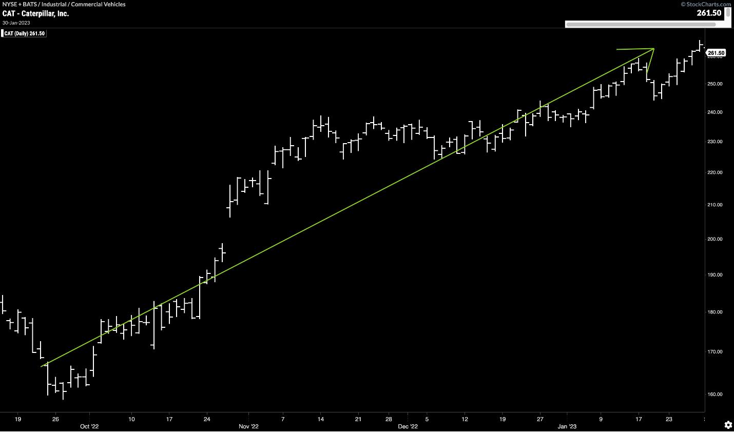
CHART 1: DAILY CHART OF CATERPILLAR STOCK (CAT). The stock price is moving in a defined trend with higher highs and higher lows.Chart source: StockChartsACP. For illustrative purposes only.
Trends and Indicators
First and foremost, can you identify a trend? Are you seeing higher highs and higher lows? In short, are you seeing prices move in a discernible direction? For an uptrend, you should see price moving from the bottom left to the top right.
Next, you would apply an indicator to help identify the highs and lows such as Donchian channels (see chart below). Donchian channels compare current price to the highs and lows of price action over a defined period. For example, if the current price is the 20-period high, then the upper line of the channel (red) will move up with price. A similar formula is used to identify higher lows (green). This way, you can see the price trend plotted via channels on the chart.
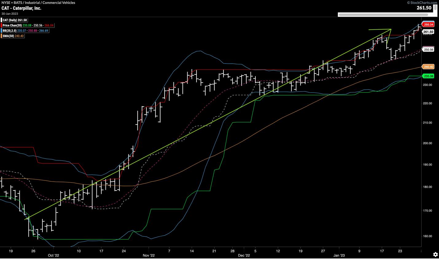
CHART 2: DAILY CHART OF CATERPILLAR STOCK PRICE. Donchian channels with a 50-day simple moving average and Bollinger Bands. These indicators help to identify price trends on the price chart.Chart source: StockChartsACP. For illustrative purposes only.
You could add Bollinger Bands® to identify breakouts. You may remember from math classes that 95% of all data points in a set of normally distributed data will fall within two standard deviations of the mean. Bollinger Bands work off that principle. Bands formed two standard deviations away from a mean tell you to pay attention to any data that falls outside of those two standard deviations. Typically, the mean used in Bollinger Bands is the 20-period moving average. Therefore, if price breaks out of the bounds of a Bollinger Band, something important is happening. When the bands are narrow, volatility is compressed. The start of a new trend can often be identified in the direction of the break.
Adding Volume and Moving Average Convergence Divergence
Chart 3 shows these three indicators overlaid on the chart of Caterpillar stock. To get a sense of market participation, you could add volume to the chart.
Volume is a confirmatory indicator. It was used by the founder of western technical analysis, Charles H Dow. Volume can provide confirmation when looking at price action. Significant price action when volume is heavier than usual informs our understanding of the strength of the price move. For example, a trader may want to see market enthusiasm (heavy volume) on a price breakout.
To keep this example simple, let's add just one more indicator to the chart: the Moving Average Convergence Divergence (MACD) indicator. This study is often thought of as a blend of trend and momentum ideas. The MACD looks at the difference between two exponential moving averages. This gives the user a sense of how short-term prices move relative to longer-term prices. Then, a further exponential average is used to smooth MACD and give a signal line. Traditionally, when the MACD line crosses above its signal line, it's a bullish sign because the short-term average of price is crossing above the longer-term average.
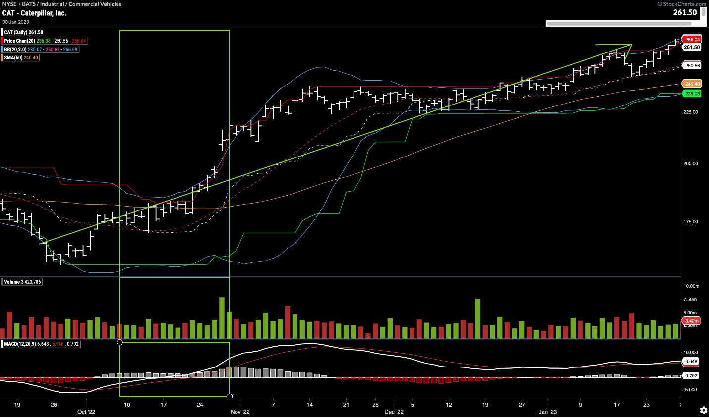
CHART 3: DAILY CHART OF CATERPILLAR. Here you see that Donchian channels, Bollinger Bands, 50-day simple moving average, volume histogram, and MACD suggest the start of an uptrend.Chart source: StockChartsACP. For illustrative purposes only.
At this stage, it's best to pause, take a step back, and try to make sense of the chart that's been built so far. Assess all the information that's on the chart of CAT and ask yourself, "At what point can I be confident in identifying the beginning of a new upward trend?
Note the area inside the green rectangle in Chart 3. Somewhere during this timeframe, all trend identification criteria were met.
- MACD first crosses above its signal.
- A few bars later, price breaks out of the upper Bollinger Band.
- That's followed by the red Donchian upper channel line moving higher, indicating a new 20-period high in price.
- Several bars later, price climbs above its moving average.
- Finally, volume rises as the market shows enthusiasm for the strength of the price move.
All this is great, but there's a problem. As the checklist grows and the number of valid technical concepts is added, your analysis can be overwhelming, which makes it difficult to see price action itself.
Using this relatively simple checklist can introduce uncertainty. How many elements of the checklist must be present to enter the trade? What if you're otherwise bearish on the Industrials sector or commercial vehicle manufacturers? Could you find evidence to argue staying out of the trade? Analysis paralysis creeps into your process, and you fall prey to your behavioral biases.
Many professional traders use a more complex process with more indicators than what's outlined above. This introduces redundancy or even conflicting signals. With enough lines on the chart, the human mind can convince itself of almost anything. Too many components on the chart can obscure price action, the most important indicator of all. This leaves you with more questions and uncertainty.
The Solution
The challenge is to retain all the information from the trend identification checklist, yet remove the complexity of the data displayed on the chart. You want to separate signals from noise to gain a clear picture of trend while focusing on price.
GoNoGo Trend Indicator
GoNoGo Trend® blends the foundational studies used by industry professionals into an indicator that color-codes the price bar based on trend strength. Handling all the complex technical analysis and computing the heavy mathematics in the background, you get a chart that uses a weight of the evidence approach to show trend direction and intensity.
Borrowing terminology from a NASA shuttle launch, trend direction is divided into "Go" or "NoGo", giving a simple pass/fail test for long positions. By building sensitivity into the study, the charts provide a weak and strong form color for "Go" and "NoGo" trends. Strong blue bars indicate the most bullish trend conditions. Paler aqua bars represent a weaker form of a "Go" trend. A strong "NoGo" trend is painted with purple bars, and a weaker "NoGo" trend is displayed with pink bars.
A "NoGo" trend indicates a bearish technical environment. It means the checklist has been broken and helps to objectively exit long positions and potentially evaluate short positions in the same security. Amber bars indicate neutral readings on the composite of trend indicators and are named "Go Fish" bars. Jesse Livermore is famously quoted as saying "in markets, there is a time to go long, a time to go short, and a time to go fishing." When there aren't enough criteria being met for trend direction, GoNoGo Trend tells you to "Go Fish" and paints the bar amber.
Chart 4 represents the same CAT chart with the GoNoGo Trend indicator applied. You can see where the new upward trend is identified with the "Go" flag.
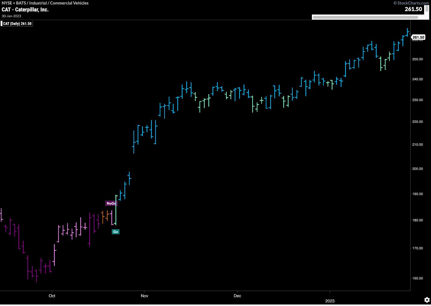
CHART 4: DAILY CHART OF CATERPILLAR SHOWING GO AND NOGO SIGNALS.Chart source: StockChartsACP. For illustrative purposes only.
Compare this with the vague area of trend identification in Chart 3.
The Bottom Line
The government wouldn't launch billions of dollars of hardware into space unless the conditions were a "Go". The decision to launch an investment should be just as clear.