 I only trade the strongest and prettiest equities in the market. I’ve written before about how I leave my deep value purchases to the Sequoias and Fairholme Funds of the world. With my own stocks, the challenge is how to ascertain if one equity is stronger and prettier than another equity. As a trader, it’s all about probabilities. If the probability pointers align up better with one stock versus another, in my book that equity is stronger and prettier, thereby becoming a more appealing trade. Let me explain.
Over the years, my trading journal has clearly showed me that “stock enchantment” is far less profitable than “stock engagement”. Enchantment is that poor and inconsistent trading behavior where you buy an equity based on a nebulous intuitive basket of attributes that you don’t totally understand or can’t explain completely and that therefore becomes almost impossible to replicate consistently. As soon as you sense you are giving in to the “dark side” of investing, get yourself re-centered.
Engagement, on the other hand, is when you behave in a consistent manner, follow your methodology and move away from the dark side towards trading with the winds of probability at your back. But, you ask, how does an investor compare probabilities on separate stocks? Yes, it can be done.
I buy the strongest stocks – with my definition being those that meet my “Tensile Trading Triple Threat” criteria or T-cubed for short. In other words, assuming that the general market is trending up, my T3 criteria (a) requires stocks to be in sectors which are outperforming the general market; (b) requires that the industry to which the stock belongs be outperforming its own sector; and (c) demands that the stock itself be outperforming its own industry group.
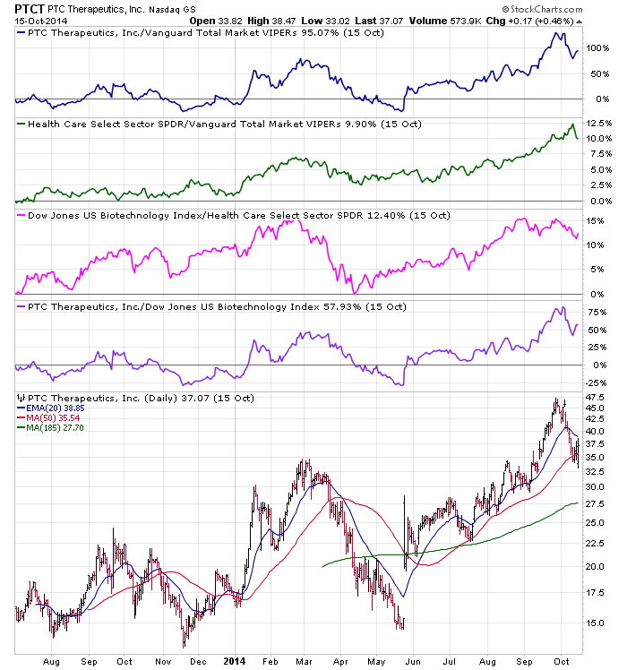
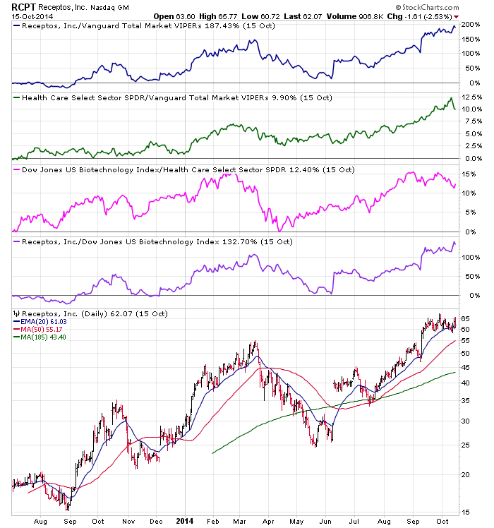
The first cut is clearly a relative strength methodology that determines how strong the equity up for consideration actually is when compared to its sister stocks. Review the two stocks below. Which do you deem to be the strongest?
As you are simultaneously analyzing these two stocks breaking out in September, note that they are both in the same industry. Therefore, their sector –to-market and industry-to-sector charts look identical and both are strong. Note, however, that RCPT is stronger versus PTCT when you consider the other two graphs which show how they are outperforming the market and their Biotech Industry group. Compare the percentage on the right side vertical scale.
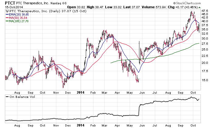
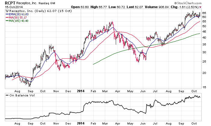
My second criterion is to find the prettiest stock or, to use a metaphor, the equity that the institutional investors want to dance with the most. My definition of prettiest stock is the one with the most attractive money flow. If the institutions are buying it, it results in a very appealing volume accumulation chart.
I’m looking for the ‘belle of the ball’ whose dance card is full of institutional suitors, and volume accumulation is the reality check I’ve found to be the most reliable. Remember that it’s not what the institutions, the media or the talking heads say; it’s how they place their bets with their own money that matters. They generally don’t ask ugly equities to dance! Which of these equities do you find the prettiest?
With respect to their dance cards, both equities are showing attractive on balance volume, confirming that the institutions find both to be very pretty stocks.
I need to touch on a few important corollary issues here. First, this approach assumes you are a growth-oriented momentum investor like myself. If your methodology is a value-driven penny stock bottom-feeder approach, then you need to tweak appropriately my strongest and prettiest charts approach. In other words, be crystal clear about your personal trading style.
Secondly, address the timeframe question. I’m a position trader. If you are a long term buy-and-hold investor or a day trader type, then you’ll also need to tweak this approach to match your own investing method.
Finally, a significant advantage I’ve found of this engagement versus enchantment approach is that it’s normally beneficial to stop, take a deep breath and try to remove the emotions from the investing equation.
At this juncture, deploying a methodology that examines the hard cold probabilities and compares those amongst various candidates will produce a higher percentage of winners over time. In other blogs, I’ve written about using point and figure charts to calculate reward to risk ratios which also can contribute to both comparing potential candidates as well as producing a higher percentage of winners over time. I’d suggest using the strongest and prettiest approach as a first cut, and once you’ve narrowed down the field, use the reward to risk ratio as your final determinant as to which stock you choose.
The bottom line is that profitable investing is built as much out of what you chose to trade as it is about what you chose not to trade. My T3 criteria and volume accumulation methodology provides a framework for consistency that facilitates trading more of those equities most soaked in positive probabilities and helps you avoid the lower probability and lower profitability trades. Over time, your portfolio growth, too, will reflect your discipline and adherence to this probability trading approach.
Trade well; trade with discipline!
-- Gatis Roze

