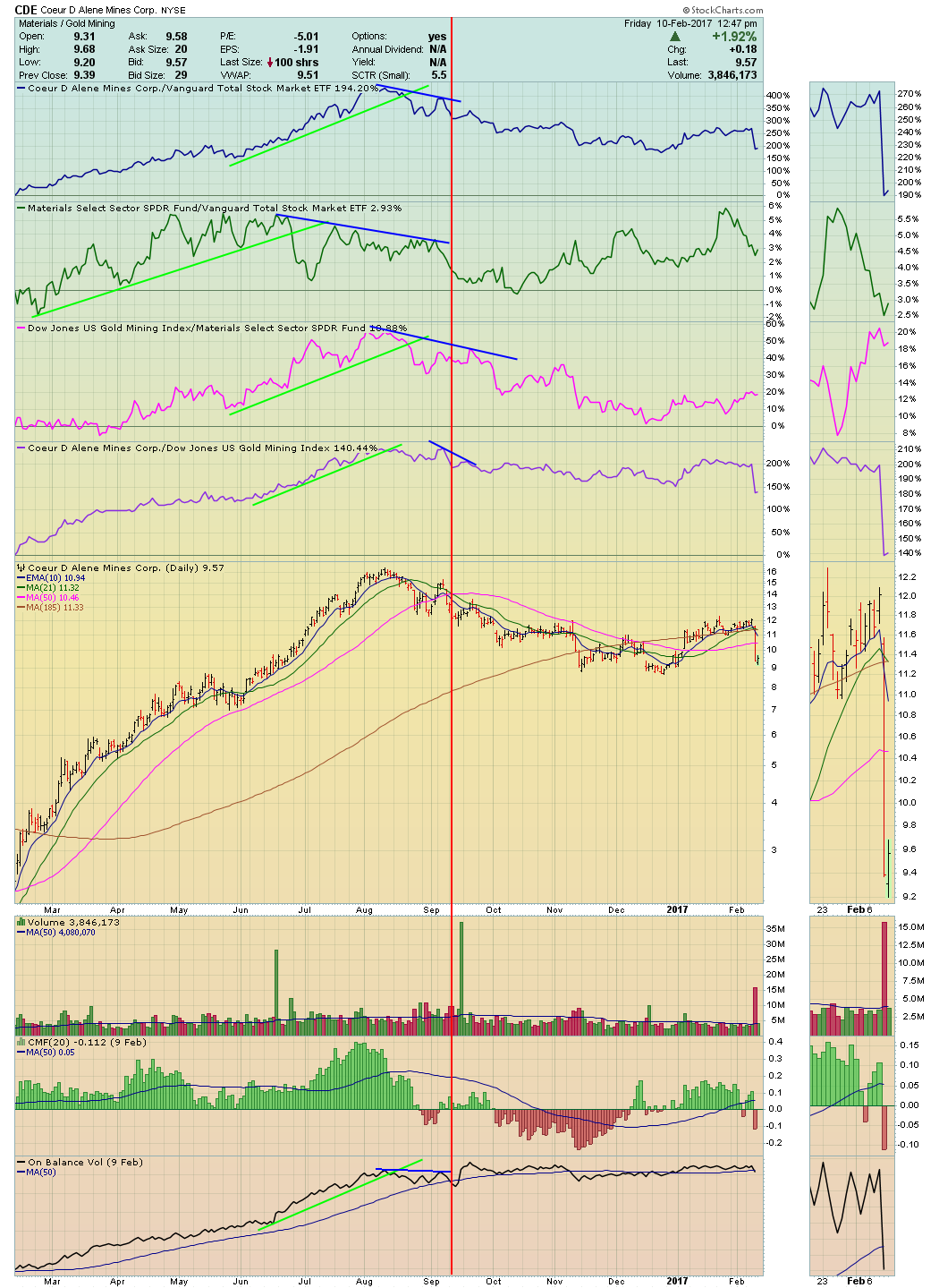
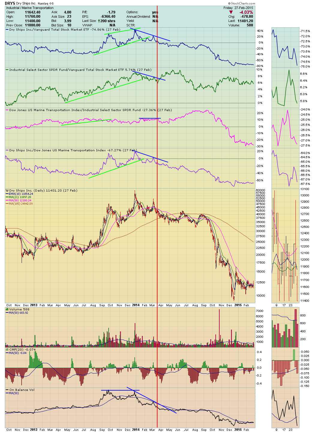
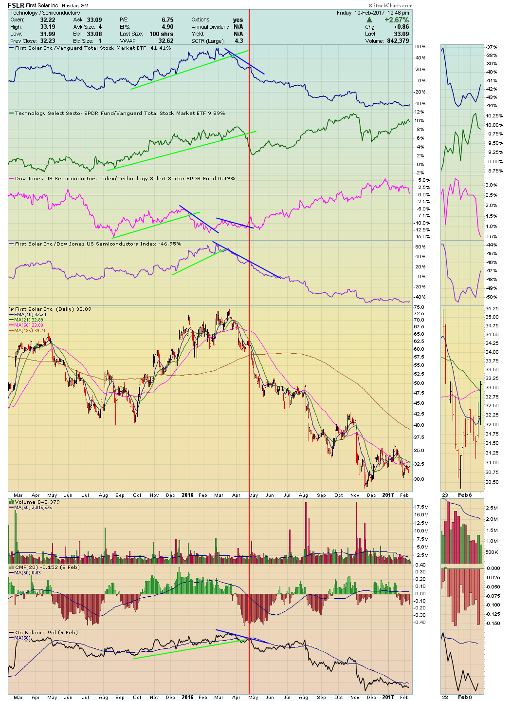
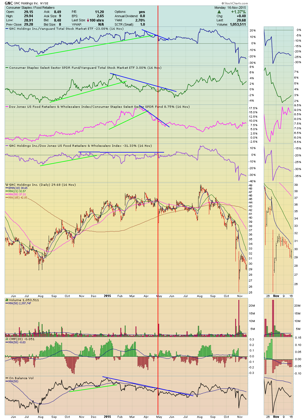
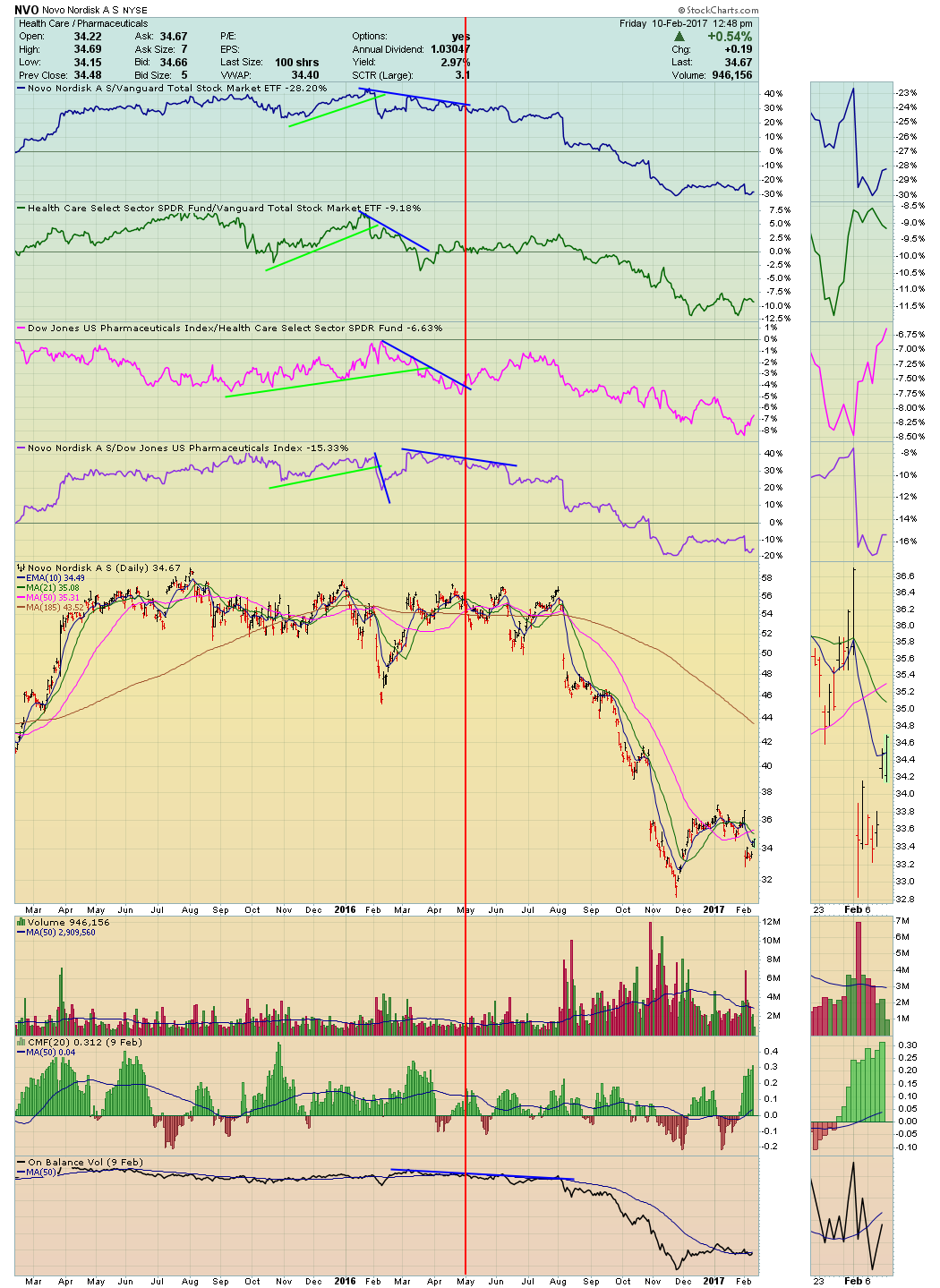
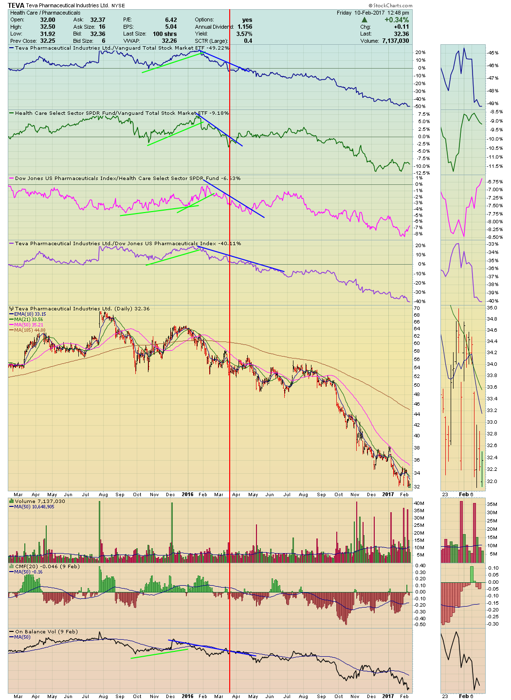
 In Action Practice #10, we applied the Tensile Trading methodology to the buy side of the six charts. This week, we apply the same price relative approach to the sell side and show that it works just as effectively there. We even recycle the CDE buy chart and now annotate the same chart with appropriate sell signals.
The point is that investors can use the power of the Tensile Trading methodology to both profitably get into a high probability position as well as get out of a position with fading probabilities. Please remember that there is no universal right or wrong placement of the vertical selling line. We each require a unique personal set of selling clues before being able to pull the trigger. What you should aspire to achieve is consistency in applying your sell discipline.
What I’d like you to focus on here is the fact that high probability stocks put money in your pockets as long as the following align: (1) the stock is outperforming the market (VTI); (2) it’s in a sector that is also outperforming the market; (3) it’s part of an industry group that is outperforming its sector; and (4) the stock is outperforming its brothers and sisters in its industry group. High probability leads to better profitability.
In a nutshell, this is the Tensile Trading methodology in its most basic form. When any of those probability enhancers begin to fall apart or weaken, the winds of positive probability are dying and you should take some profits. Our book has an entire chapter explaining the selling methodology which details the complete approach.
In an attempt to have you focus only on the price relative and money flow aspects of this selling exercise, I have not addressed others aspects such as price breaks in horizontal support, volume and price spread analysis, or moving averages and trendlines. I certainly invite you to take on that extra effort in identifying your own “uncle point” to install your vertical red sell bar.
So here are the six charts from the Action Practice #10 blog published on January 27, 2017. I have annotated them and installed my red vertical line which shows the date at which I reached my personal “uncle point” – i.e. when the clues were adequate so that taking money off the table was the prudent course of action.
 This week’s Action Practice charts:
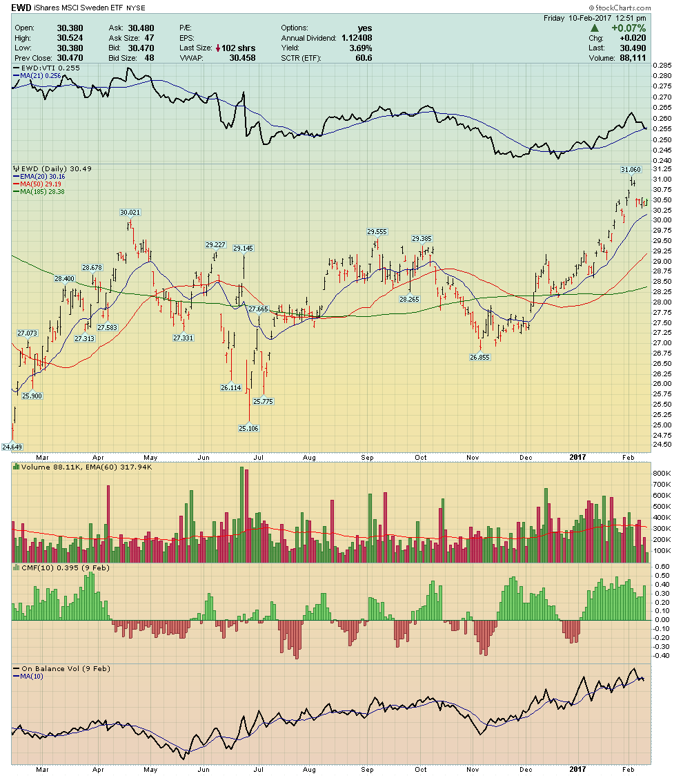
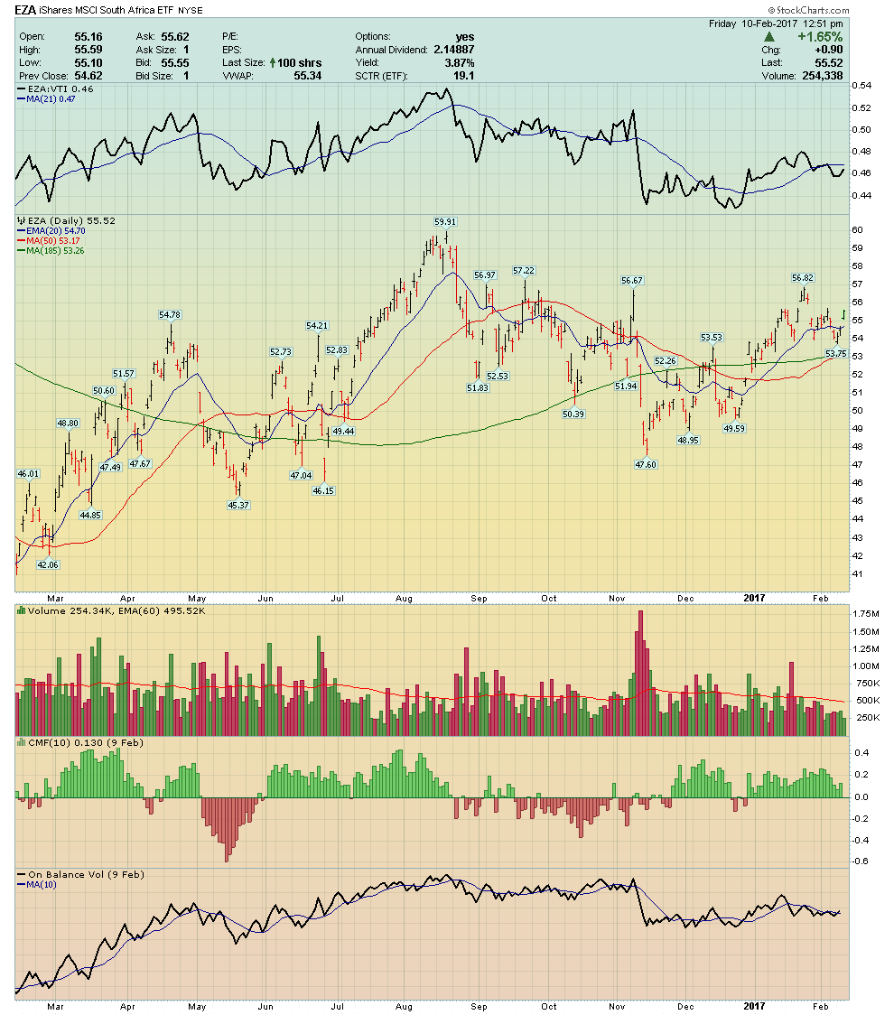
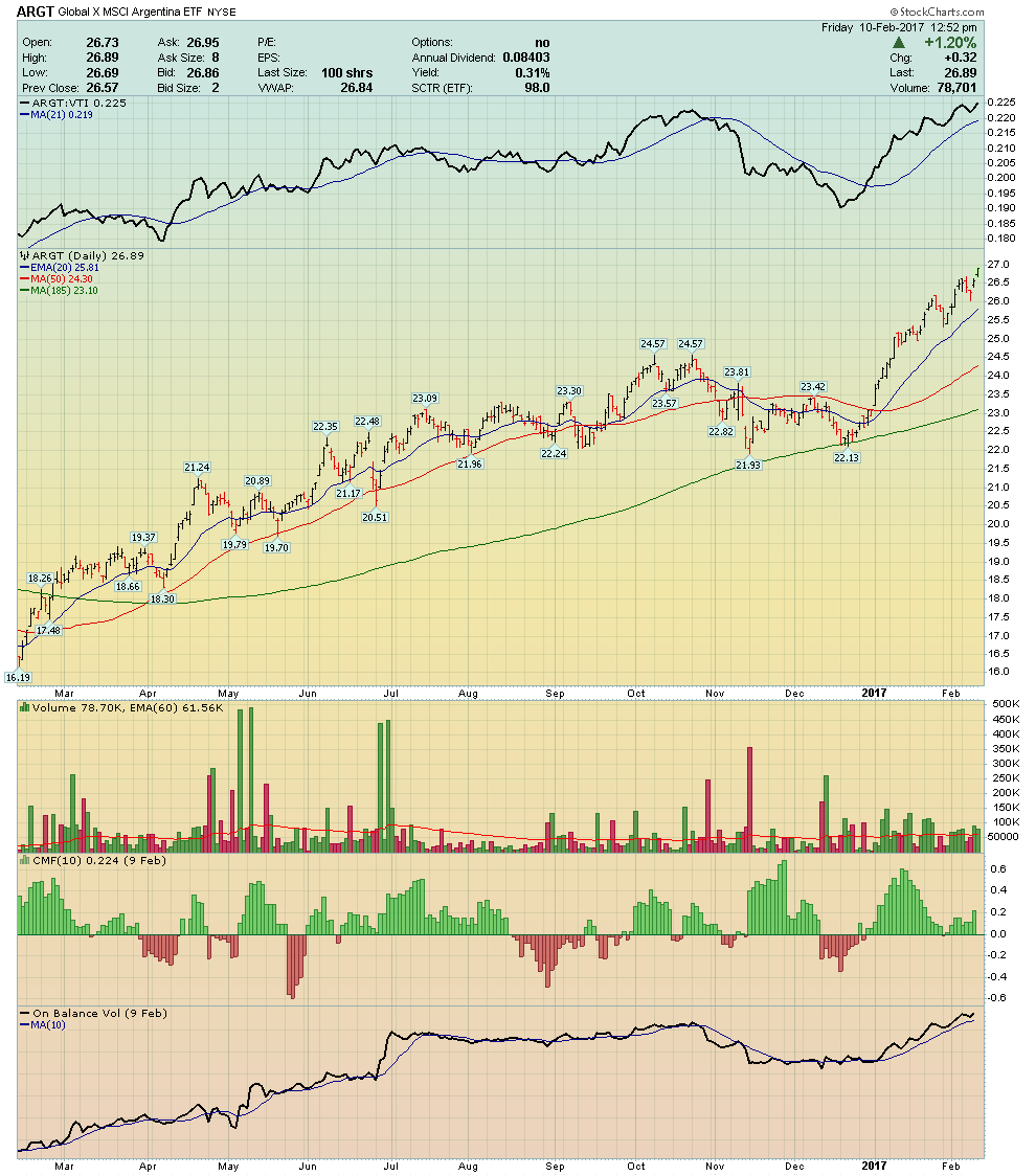
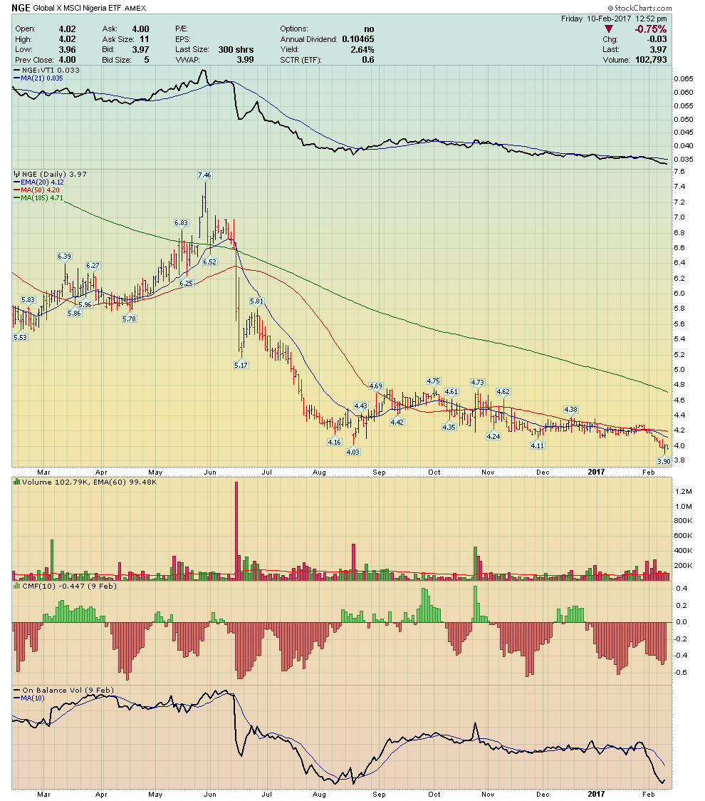
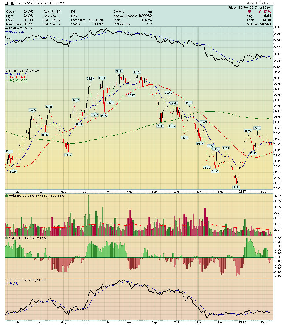
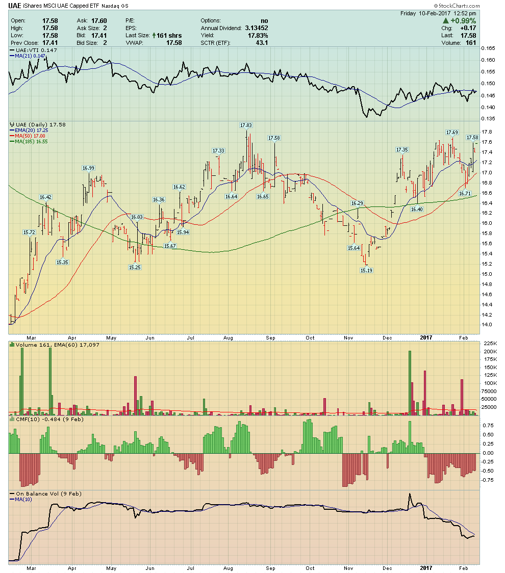
In the past, I’ve mentioned that an investment strategy (for a portion of your portfolio) that appeals to many investors is to focus on country fund ETFs. According to Fidelity, the top performing global market has been outside of the USA one hundred percent (100%) of the time over the past 30 years. This is why our ChartPack contains a ChartList of the top 65 country funds in the world – all pre-selected and labeled with formatted charts.
This week’s exercise is to group the six country fund charts into three groups based on money flow.
- Group A: Buyers in Control – Positive Money Flow / Volume Accumulation
- Group B: Neutral Money Flow – Flat Money Flow
- Group C: Sellers in Control – Negative Volume Accumulation
Trade well; trade with discipline!
- Gatis Roze, MBA, CMT
- Author, Tensile Trading: The 10 Essential Stages of Stock Market Mastery (Wiley, 2016)
- Presenter of the best-selling Tensile Trading DVD seminar
- Presenter of How to Master Your Asset Allocation Profile DVD seminar
- Developer of the StockCharts.com Tensile Trading ChartPack