It's sector rotation time again!
For those of you who haven't noticed it by now. I am (trying to) maintain some sort of subject-rotation in my blogs as well.... The subjects being; Asset Class rotation, (US) Sector rotation, International equity markets rotation, and (DOW 30) Individual stock rotation. They should each be 4-5 weeks apart which gives us roughly 4-5 new observations on a weekly RRG. Following this schedule brings me to the analysis of the S&P sectors again.
The Relative Rotation Graph below holds the 9 S&P sector ETFs.
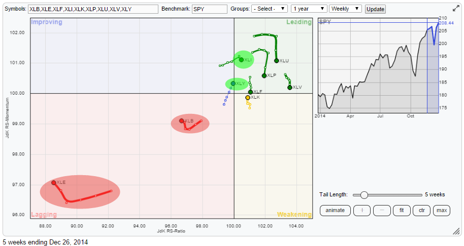
This chart shows a very pronounced picture. Very clearly XLE (Energy) and XLB (Materials) are deep inside the weakening quadrant. Then there is XLY (Consumer Discretionary) which is still in the Improving quadrant but very, very, close to crossing over into leading.
The majority of the sectors are found inside the Leading quadrant with most of them losing relative momentum (heading lower on the JdK RS-Momentum scale). Finally XLK (Technology) is found inside the Weakening quadrant but it is moving higher on the JdK RS-Momentum scale.
On the RRG plot there are two sectors that draw my attention from a positive perspective, these are XLI (Industrials) and XLY (Consumer discretionary).
Industrials (XLI)
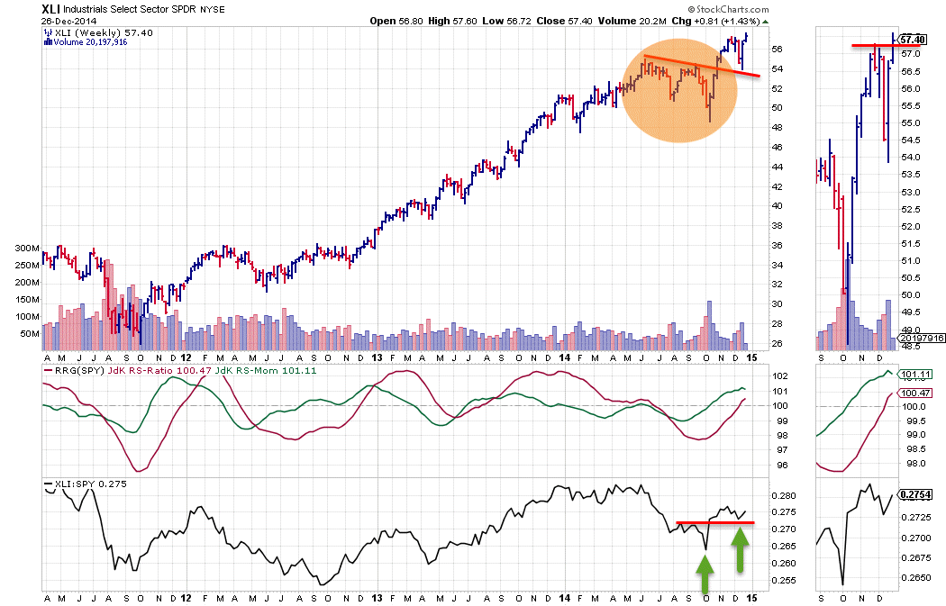
The XLI chart is characterized by a long standing up-trend in price. Like many charts this trend emerged out of the late 2011 lows and has been working its way higher ever since. There has been a short interruption of the series of higher highs and higher lows during the summer when it looked as if a turnaround had taken place but this appeared to be only temporary when the slightly falling resistance line was taken out recently.
The relative trend over the same period went through a number of up- and down-moves. The most recent down-move started in June-July when the raw RS-line broke its up-trend and the RS-Ratio dropped below the 100-mark signalling a relative down-trend. With the recent improvement of the price chart, the relative chart improved as well. At first reflected by a rise of the JdK RS-Momentum line above 100, putting the sector inside the improving quadrant on the RRG. And most recently followed by a cross above 100 in the RS-Ratio line. This puts XLI inside the Leading quadrant now and it is the sector with the highest relative momentum.
On the raw RS-line the first signs of a new series of higher highs and higher lows is starting to take shape, ideally I would like to see a break above the most recent high on the raw RS-line, confirming the start of a new series of higher highs and higher lows. On the price chart such a confirmation seems to be taking place at this very moment with XLI pushing above its most recent peak as can be seen well on the zoom thumb-nail on the right of the price chart. The only caveat being that it is happening at very light volumes (the reason for that being obvious). With some follow through next week and at the beginning of the new year XLI looks set for a renewed period of out-performance.
Consumer Discretionary (XLY)
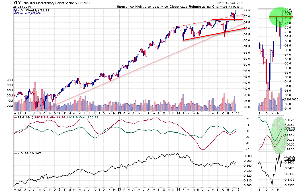
With the JdK RS-Ratio at 99.96 and JdK RS-Momentum at 100.33 XLY is acting very close to the benchmark (SPY). This can be monitored very nicely by scrolling through time on the RRG chart. Note the close proximity to the centre of the RRG chart as well as the relatively short tail, compared to other sector tails on the chart. Such a short tail, caused by only small increments from observation to observation, indicate a slow or stable move in relative strength.
In general such a move would be ignored as it means performance more or less in-line with the index. However, what catches my eye here is the steep upward angle of XLY while heading towards the Leading quadrant. Enough reason for further investigation.
On the chart above it can be seen that the JdK RS-Ratio of XLY has been moving below the 100-level for the better part of the year. Initially backed by falling relative momentum as well. After the initial drop the raw RS-line started to move more or less flat pushing RS-Ratio above 100 which positioned XLY inside the improving quadrant for a while but still on the left hand (negative) side of the RRG chart. The relative power simply was not enough to keep up with the performance of the broader S&P 500 index during that period.
The first attempt to break this relative down-trend took place in October but failed. At the moment XLY seems better set for a move higher with now both the RRG-lines pushing above the 100-level while the raw RS-line is working hard to carve out a bottom.
The zoom thumb-nail on the right shows the improvement on both the price and the relative charts in more detail. On the price chart the previous high is being broken upwardly which should add fuel to the rally while on the relative charts the RRG-lines are now both pointing higher, suggesting that there is more relative performance underway.
With a crowded Leading quadrant the two sectors that show up in the Lagging quadrant really stand out. And NOT in a positive way.
Energy (XLE)
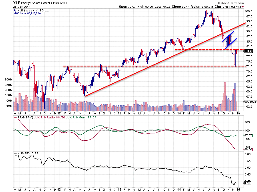
XLE is a negative eye-catcher on this RRG chart for quite a while already. From a relative perspective it is the weakest sector inside the S&P 500 universe. The JdK RS-Ratio is the lowest of all ETFs on the RRG chart and it is pointing sharply down which means that more weakness is still being added. This is reflected by a JdK RS-Momentum line below 100. The only thing that has changed over the past few weeks is that this relative momentum is flattening out which means that the pace is stabilizing which means that the trend is now down at a stable level and not at an ever increasing level.
It is very well possible that in coming weeks a small pick-up in relative momentum will be seen but given the very low levels on the JdK RS-Ratio scale this has to be interpreted as a recovery within the longer-term down-trend. Such an improvement in relative momentum will cause a rotation to take place on the left hand side of the plot which characterizes a very strong (relative) down-trend.
Also a look at the raw RS-line (lower pane) learns that a turnaround of this relative trend is not imminent.
On the price chart the flag-pattern has done its job and after the downward break XLE fell sharply and tested horizontal support near 72.50. Right now we are seeing a recovery after this sharp drop but former support around 80 is already kicking in as resistance. Further upside is therefore judged to be limited while relative strength remains weak. Hence for the time being the smarter move seems to be to still stay away from the Energy sector.
Materials (XLB)
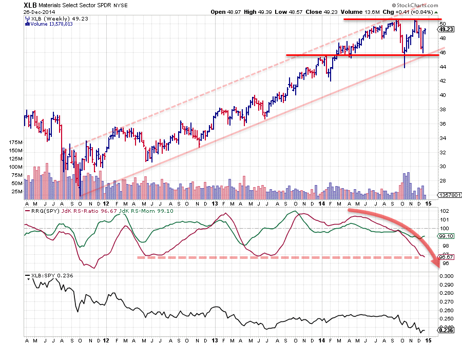
Just like the XLI and XLY charts above, XLB is characterized by a long-term up-trend in price but once again the relative trend against SPY has gone through a number of high-low rotations. After a relative up-trend that started in September 2013 the JdK RS-Ratio of XLB vs SPY dropped below 100 sometime in August, triggering a new relative down-trend. This move has continued lower since it started with relative momentum at a stable level just below 100.
On the RRG chart this translates in XLB moving left on the horizontal JdK RS-Ratio axis almost horizontally as RS-Momentum stayed around the same level, roughly 99. A slow but very secure relative down-trend and looking at the RRG-lines in combination with the raw RS-line not much improvement in sight for coming weeks.
On the price chart the last rally failed to break its previous high causing that level, just above 50, to now become a serious resistance barrier. The drop after testing that resistance ended near 46 where horizontal support was found offered by a previous high and two old lows. All in all this seems to capture the performance of XLB inside a trading range now. With SPY powering ahead as it is more relative under-performance can be expected for XLB in the weeks ahead.
Conclusion
- Industrials (XLI) just entered leading quadrant and has highest relative momentum, expect more out-performance going forward
- Consumer Discretionary seems to be successful at its second attempt to turn the relative trend back up
- Energy and Materials continue to stand out in a negative way on the Relative Rotation Graph and are better still avoided in the weeks ahead.
Julius de Kempenaer | RRG research
RRG, Relative Rotation raphs, JdK RS-Ratio and JdK RS_Momentum are registered TradeMarks by RRG Research


