Summary
- NO sectors inside the lagging quadrant and only one in leading
- Sector rotation suggests market in transition
- Financials continue to loose ground vs Healthcare
- Technology picking up against Materials
- Sector rotation from Energy to Utilities starting to shape up
Quick scan
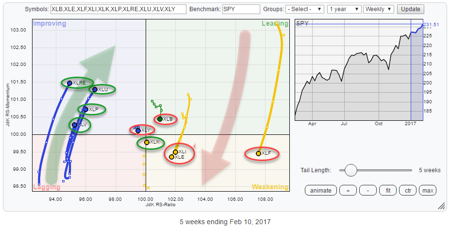
A first look at the Relative Rotation Graph above triggers two interesting observations.
First of all, there are NO sectors inside the lagging quadrant... not even one! And there is only one (materials) inside the leading quadrant.
Secondly, the tails of the sectors in this universe (S&P 500 index) are predominantly showing vertical (momentum driven) movement.
My conclusion based on these two observations is that this is a "market in transition" with half of the universe; XLY, XLB, XLI, XLE, and XLF heading South to South-West while the other half; XLRE, XLU, XLP, XLV, and XLK is heading North to North-East.
Looking at the general direction of the tails on the various sectors and the 50/50 split it looks like a big rotation is going on out of the group heading South/South-West, into the group heading North/North-East.
Within this rotation, I am monitoring three pairs.
The first two pairs are Financials versus Health Care and Materials against Technology. Both combinations already got attention in the previous RRG blog on US sectors.
The third pair that is emerging now is Utilities versus Energy.
Please be aware that these are not "fixed" pairs. It makes perfect sense, for example, to look at Technology against Energy or Utilities against Financials as well or a group of sectors against another group of sectors.
Financials vs. Healthcare
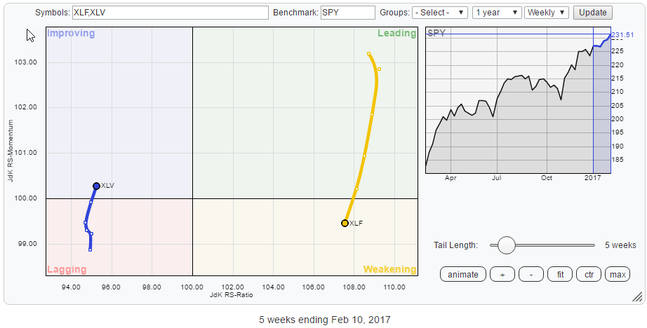
The RRG shows the detailed rotation of XLF and XLV. Both sectors are moving in opposite direction on the JdK RS-Momentum scale with XLF still high and XLV still low on the JdK RS-Ratio scale. So it is not a clear (change in) trend yet. Financials are the stronger sector in a well established relative uptrend against SPY and XLV continues in a solid relative downtrend against SPY.
But both moves are getting overstretched and seem to need some countertrend move, and this is where the opportunity comes in.
Financials Select Sector SPDR Fund - XLF
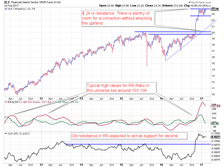
XLF keeps pushing against the horizontal resistance around $ 24. Clearly, a break would ignite a further rally and provide new fuel for the current uptrend.
But from a relative point of view, the question is how much more the current relative uptrend can be stretched. After breaking horizontal resistance, the RS-Line peaked and started to come off a bit. The JdK RS-Ratio, which (also) measures the strength of a trend, has peaked at (for XLF within the SPY sector universe) extreme levels and does not seem to have a lot of room to push further without some form of correction.
The combination of price struggling with resistance and a relative trend that is overstretched lead to the belief that in the near term the odds are in favor of a corrective move for Financials (against SPY).
Health Care Select Sector SPDR Fund - XLV
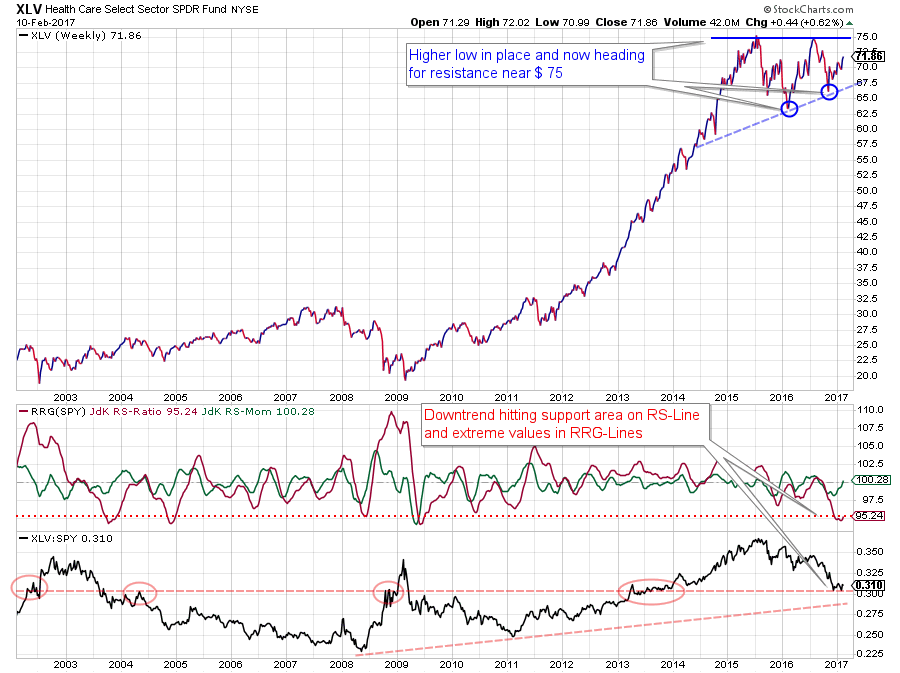
In Healthcare we see a price chart that has peaked around $ 75 back in 2015 and a test of that peak again in 2016. The good news here is that both lows following those peaks are set at a higher level which indicates demand is coming in at a higher price point.
The weak part of the Healthcare sector comes from the relative strength charts. The raw RS-Line is still clearly in a downtrend that started from the peak in 2015 and has worked its way lower to current levels around 0.3 where some peaks and consolidations have formed in the past 15 years. Hence some support may be expected.
Translating the downtrend in the RS-Line to the RRG-Lines we see that the RS-Ratio line has reached extremely low levels out of which, over the past years, relative rallies or countertrend moves have started.
Just like the Financials sector is still in a relative uptrend, Healthcare is still in a relative downtrend. But both are trying to put in a (relative) peak and a trough and start a countertrend move. This means that the recovery/correction can offer an opportunity at least for the short-term!
Technology vs Materials
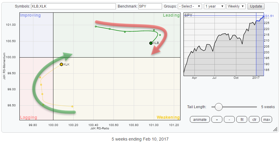
The opposite rotations of Materials and Technology got noticed in the previous blog and the, zoomed in, RRG above shows that this rotation has continued over the past few weeks.
Additionally, the rotation now also started to come in on the RS-Ratio scale as well.
Technology Select Sector SPDR Fund - XLK
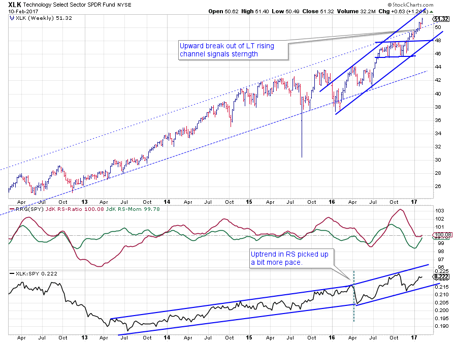
The price chart of XLK over the past five years looks pretty ideal, starting in the bottom left corner and ending in the top-right. The don't get much better than this.
The big trend, so far, was contained within the boundaries of a rising channel. A few weeks ago this channel was broken to the upside which confirms the current strength of the trend and at the same time triggers another acceleration.
With price accelerating to new highs, a new rising channel can be penciled in, running at a steeper angle and enough room for the sector to move without breaking its new, or old, channel. This is a strong sector!
The accompanying relative trend only started to move higher in the middle of 2013 but since then has kept pace with the price trend very well and, just like price, began to move at a steeper angle from the early 2016 lows.
The recent high-low rotation in relative strength caused RS-Ratio to drop back to the 100-level which means that any overstretched conditions have normalized and the trend is back to normal and ready for a new leg higher.
The only difference with price is that the RS-Line still needs to break to new relative highs to confirm current strength. Such a break in RS will be the catalyst for that next leg higher.
Materials Select Sector SPDR Fund
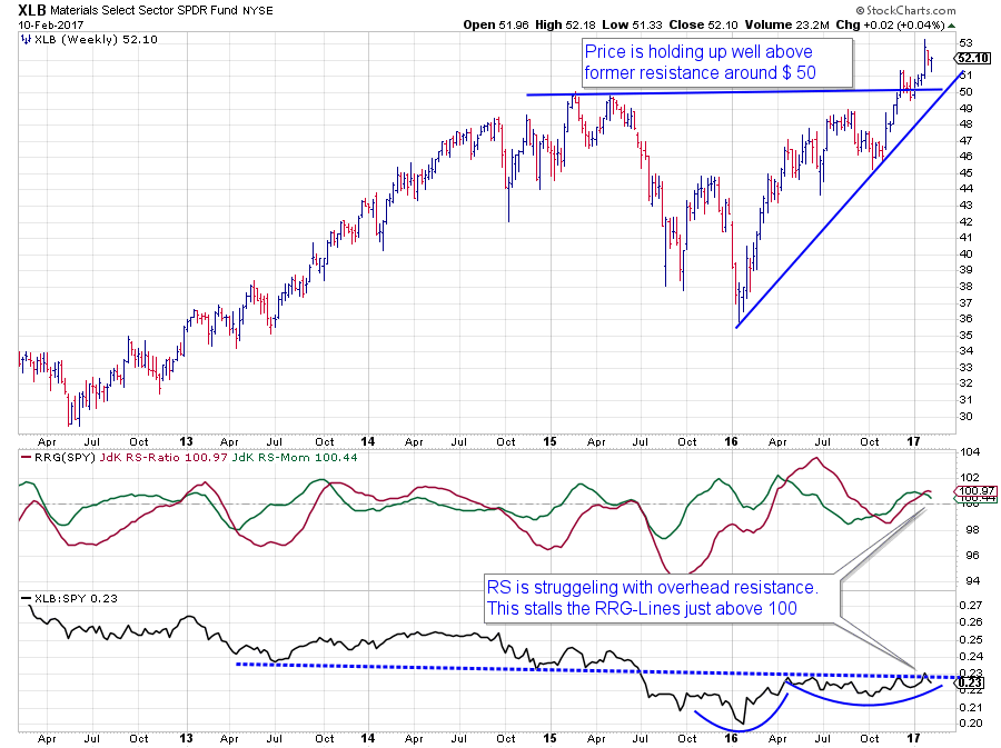
The price chart of the Materials sector has cleared overhead resistance around $ 50 at the end of last year and continued higher with a good rhythm of higher highs and higher lows.
From a price perspective, things look good with XLB pushing to new highs and old resistance expected to act as support going forward which limits downside risk.
The problem lies in the relative strength vs. SPY. The raw RS-Line bottomed out at the beginning of 2016 but after a quick rally started to move sideways and is still doing that. Since April last year, the relative line of XLB versus SPY is pushing against overhead resistance (blue dashed line) and so far has not been able to push through.
The result is that JdK RS-Momentum has already started to roll over again which will drag RS-Ratio lower as well in the next few weeks. This relative movement will cause the rotation of XLB on the RRG to move from the leading quadrant, in which it still is, down into weakening.
Based on how close the sector is rotating to the 100-level on the RS-Ratio scale any further relative weakness in coming weeks is expected to push XLB into the lagging quadrant after that, making Materials a sector to better avoid at the moment.
Utilities vs. Energy
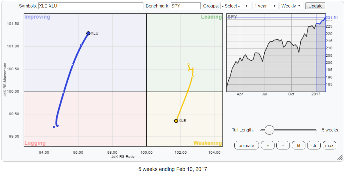 A new rotational pair that started showing up over the past weeks is Utilities against Energy. XLU is moving inside the improving quadrant, powering higher on the RS-Momentum scale and starting to pick up on RS-Ratio while XLE just crossed into the weakening quadrant from leading and beginning to lose strength on the RS-Ratio scale.
Energy Select Sector SPDR Fund
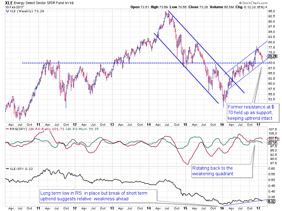
On the price chart, XLE is still holding up well after breaking the downtrend at the beginning of 2016 and subsequently taking out overhead resistance around $ 70 which also served as support on the pull-back.
The problem is in the relative strength against SPY.
The raw RS-Line put in a low at the beginning of 2016 and gradually started to work its way higher from there. This has led to a rotation into the leading quadrant and a solid outperformance for the Energy sector for the better part of XLE in 2016.
Recently the RS-Line is starting to show some signs of weakness and the RRG-Lines are rolling over and moving lower. This suggests, at least, some short-term relative weakness but given the fact that the RS-Ratio line is close to 100 not much more weakness will be needed for it to push lower and cause Energy to rotate into the lagging quadrant.
Utilities Select Sector SPDR Fund - XLU
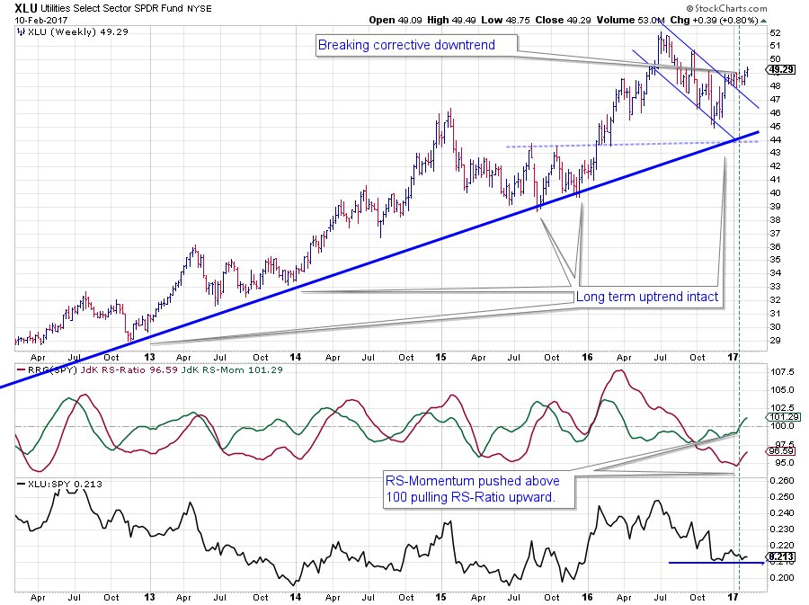 XLU is still well above the rising trendline that connects all the major lows since 2012 on the chart above. The most recent low even managed to come in a little bit above this trendline, signaling strength and more aggressive buying.
The corrective downtrend, coming off the 2016 high was recently broken, and last week XLU managed to take out its previous higher which is another sign of strength.
This also reflects on the relative charts where we see raw the RS-line finding support at the level of its previous low, and both RRG-Lines have started to move higher indicating that the relative trend of Utilities is turning for the better.
The levels of the RRG-lines position the sector inside the improving quadrant and the length of the tail suggests that there is enough power behind the move to continue this rotational path in coming weeks.
Conclusion
All in all the rotation of the sectors that make up the S&P 500 index seems evenly split between positive and negative rotations. The fact that no sector is inside the lagging quadrant and only one sector moves inside the leading quadrant indicates that a transition in sector leadership is underway.
The previously mentioned positive rotations for Technology and Healthcare are now joined by Energy while Energy is joining the weaker patterns that were already found for Financials and Materials.
The sequel for this current sector rotation and its impact on the longer term outlook for these sectors will likely start to take shape in the coming month. Check your RRGs a few times a week to detect any anomalies at an early stage.
Julius de Kempenaer | RRG Research
RRG, Relative Rotation Graphs, JdK RS-Ratio and JdK RS-Momentum, are registered TradeMarks by RRG Research
Follow RRG Research on social media:


