 As 2017 draws to an end, the Relative Rotation Graph for asset classes is sending a very clear message!
Equities are leading the way into 2018!
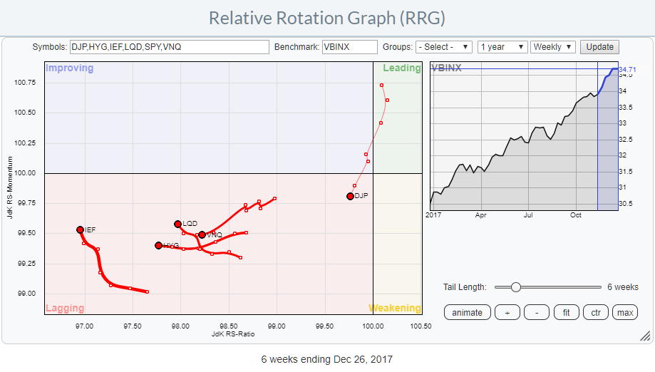
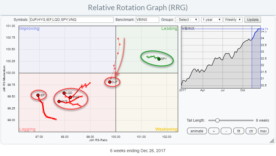
The RRG above shows some ETFs representing various asset classes and uses VBINX, a balanced index fund, as the benchmark.
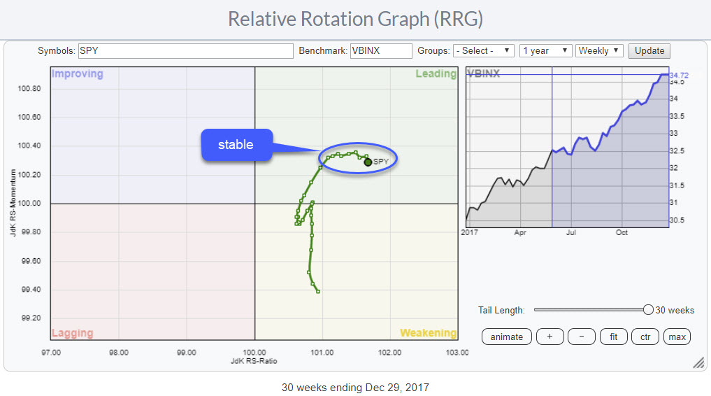
With only SPY, representing the asset class equities, inside the leading quadrant and ALL others inside the lagging quadrant, the message could not be more clear.
Summary
- All fixed income related asset classes are inside the lagging quadrant
- With only SPY inside leading, the Equity/Bond decision is easy
- Interesting rotations for commodities (DJP) on weekly and daily Relative Rotation Graphs
A busy lagging quadrant
With five out of six asset classes in this universe positioned inside the lagging quadrant, the area is pretty crowded.
All fixed income related asset classes (IEF, LQD, and HYG) are inside lagging, making the decision between equities or bonds an easy one. Out of these three, IEF and, to a lesser extent, LQD, are picking up a bit of positive relative momentum (higher JdK RS-Momentum) while HYG continues to head due West.
Real-Estate picked up (negative) steam recently and continues to move further into the lagging quadrant at a negative RRG-Heading.
Commodities have just re-entered the lagging quadrant from improving after a very short stint through leading but measured in terms of JdK RS-Ratio it is the second strongest asset class in this universe, and it is positioned very close to the benchmark.
Note:
The RRG chart above very well shows the difference in thickness of the tails for various asset classes. The further away from the benchmark (center of the chart) the thicker the tail and allegedly the biggest potential for alpha as that security deviates most from the benchmark
A closer look at commodities
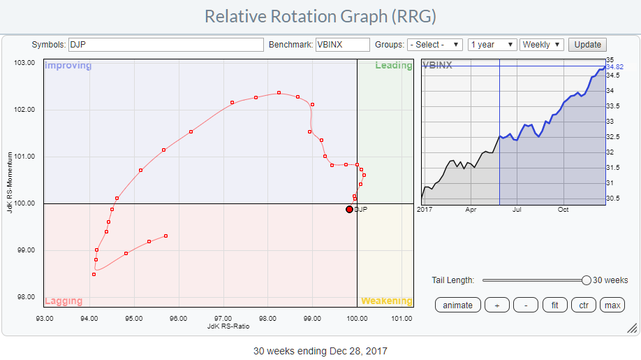
On the weekly RRG above DJP is rotating from improving into lagging after a short stint through leading. To get a better perspective of this move I have isolated it on a separate RRG while showing a longer tail.
What we see here is an asset class that came from a position very deep inside the lagging quadrant and started an impressive rotation through improving in July/August.
As is often the case with securities which dropped soo deep into the lagging quadrant they fail to maintain enough relative momentum to push them over into the leading quadrant, preferably at a positive RRG Heading. This is exactly what happened here, DJP missed the power to really push through into the leading quadrant and already started to decline on the JdK RS-Momentum axis well before it reached 100 on the RS-Ratio scale.
The quick peek on the other side was more like an "overshoot" than a strong rotational pattern.
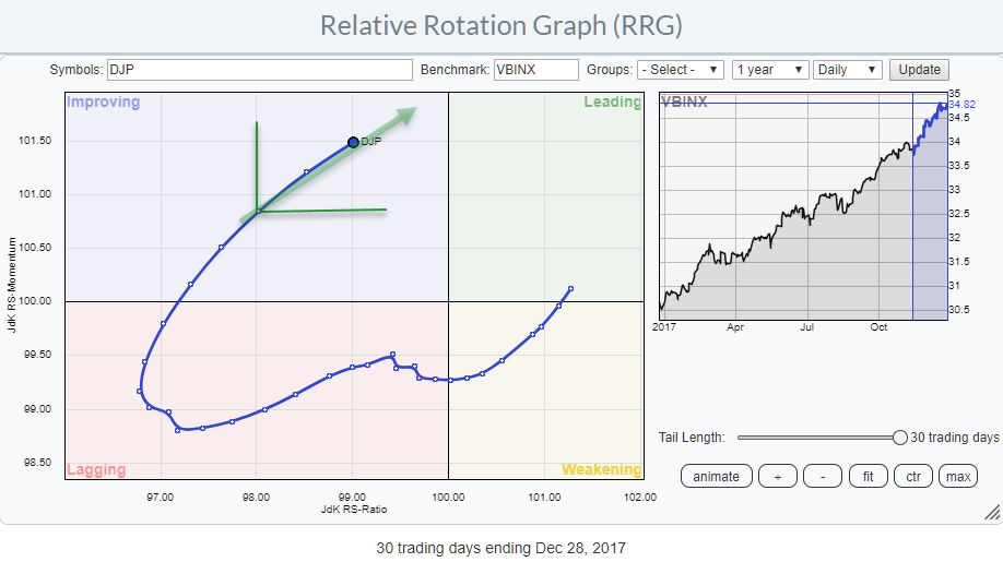
As indicated above it IS the second strongest asset class in this universe, so a further inspection of DJP makes total sense. Which is why I wanted to see the daily version of the rotation to get a better feel of what is going on.
That daily rotation, as shown above, shows a strong rotational pattern with DJP positioned inside the improving quadrant at a strong RRG-Heading and close to crossing over into leading. With the weekly rotation of DJP just inside lagging after a very strong rotation through improving and very close to the benchmark, this daily rotation has my attention as it might be strong enough to pull DJP around on the weekly!
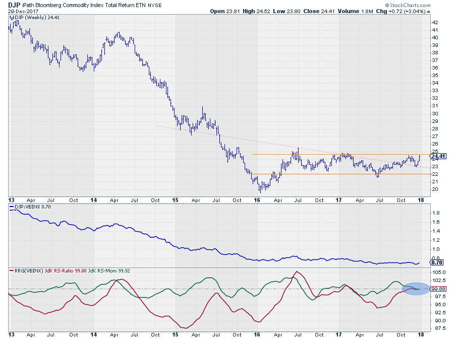
DJP - iPath Bloomberg Commodity Index TR weekly
Commodities ended their long-term downtrend after their low below $ 20 at the beginning of 2016 and started moving in a sideways pattern. That sideways pattern brought the RRG-Lines back to levels much closer to the 100-mark on the JdK RS-Ratio line and caused a few rotations on the RRG chart.
The most recent, strong, rotation through improving was the result of the RS-Ratio line being pulled towards the 100-level by strong relative momentum, ignited by the rise on the price chart, taking DJP from the low end of the range back to the upper boundary. The inability to push through at the time and the drop back made DJP rotate quickly through leading and back into lagging.
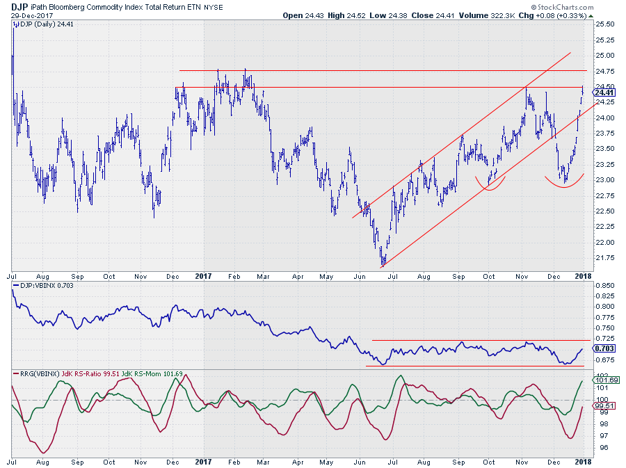
Recent price action is strong, and once again DJP is knocking on the resistance door near $ 24-25 which is much better visible in the daily chart below.
DJP - iPath Bloomberg Commodity Index TR daily
The daily version of the DJP chart in combination with the relative strength and the RRG Lines zooms in and magnifies the relative moves we have seen on the Relative Rotation Graphs.
A few observations. First of all the downward break at the beginning of December was not positive and cause a setback in the long-term basing pattern. Secondly, the $24.50-24.75 area will be a tough nut to crack in terms of resistance. And thirdly relative strength needs to break away from its trading range before anything meaningful can happen vis-a-vis other asset classes.
Having said that, the recent rally is very strong and is causing strong relative momentum as well. I do not think you have to be in a hurry, but Commodities as an asset class and DJP as the tradable instrument deserve our attention. If DJP can clear its overhead resistance in price as well as relative strength against VBINX a lot of upside potential will be unlocked.
IEF - iShares 7-10 Year Treasury Bond ETF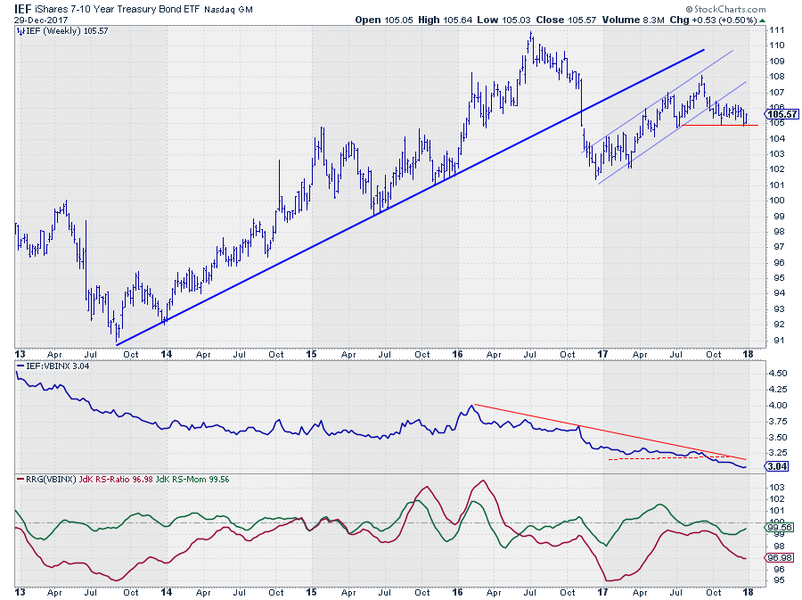
Government bonds (IEF) is one of the weaker or the weakest asset class in this universe since August when it started to take over that position from commodities.
Despite the nice rally we have seen in the first 6-7 months of 2017 its relative strength against VBINX did not move much higher but rather stayed flat. When IEF broke its rising support line, relative strength started to fade again and broke down to new lows, sending the RRG-Lines lower and IEF deep(er) into the lagging quadrant. At the moment the support level at $ 105 seems to be the level to watch as a break will very likely ignite even more downside price movement and more relative weakness.
It's lonely at the top
Not only is SPY (equities) the strongest asset class measured by RS-Ratio at the moment, it is also the most stable one. Over the past 8-9 weeks, SPY has lowly moved higher on the RS-Ratio scale with almost no change on the RS-Momentum scale. This causes a short(ening) tail which indicates a stable trend.
SPY - SPDR S&P 500 ETF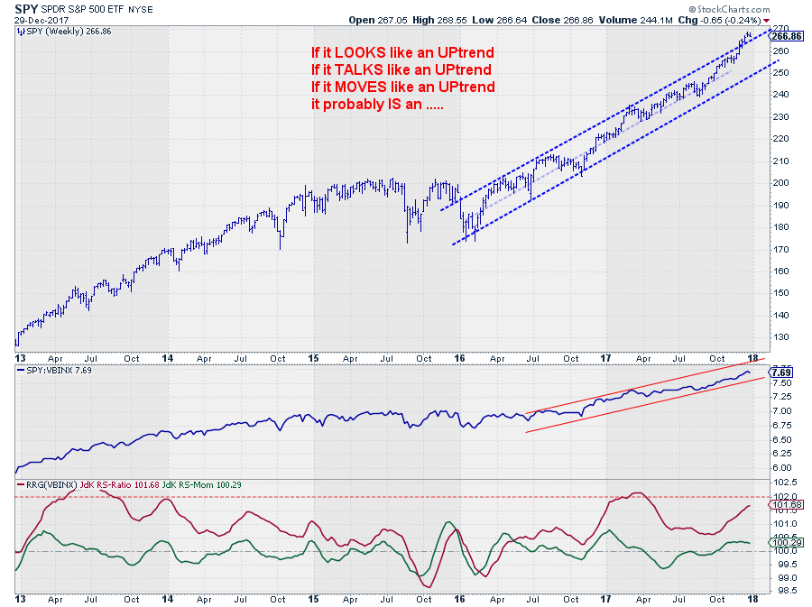
I'm sure you can all dream the SPY chart.
For the time being, the interpretation, my interpretation, remains very simple. It's in an uptrend!
As we all know even uptrends go through a certain high-low-(higher-)high rotation. And that rhythm is still fully intact. As a matter of fact, just recently SPY broke out of the already rising channel to the upside which usually is a very strong signal and it suggests a strong start for equities going into the new year.
From a relative perspective, the slowdown from April to October has now turned around and created renewed upside potential from a relative perspective as well.
Hence, going into the new year, Equities are still the place to be but keep an eye on commodities as they may come into play again.
Happy New Year
From a cold and rainy Amsterdam, I would like to use this opportunity to wish all of you readers a very happy, healthy and prosperous New Year. A big thank you goes to Chip Anderson and the team at StockCharts for all their support so far and I'm really looking forward to continuing to work with them in 2018 and beyond to expand our coverage and bring additional functionalities for Relative Rotation Graphs® to all StockCharts.com users.
If you like to receive a notification anytime, a new article is posted on this RRG blog, please leave your email address and press the green "Subscribe" button below this article.
Julius de Kempenaer | RRG Research
RRG, Relative Rotation Graphs, JdK RS-Ratio, and JdK RS-Momentum are registered TradeMarks of RRG Research
Follow RRG Research on social media:
If you want to discuss RRG with me on SCAN, please use my handle Julius_RRG so that I will get a notification

