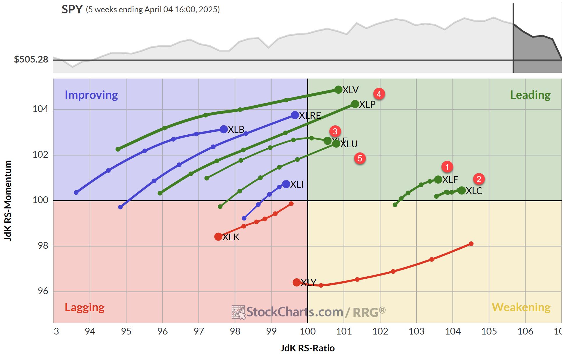
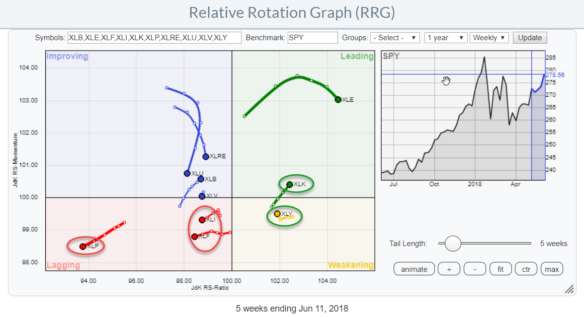
 The Relative Rotation Graph shows the rotation of the ten S&P 500 sector ETFs (SPDR family) against the S&P 500 index ETF (SPY).
The rotation of the technology sector (XLK) back into the leading quadrant after a short period of rotation through the weakening quadrant is s strong sign.
The spread between the Consumer Discretionary- and Consumer Staples sectors continues to widen further and seems to be entering another leg up in its relative strength line. A strong relative strength for Discretionary over Staples is usually a bullish indication for the general market.
Two other weak spots in this sector universe are for Financials and Industrials which are rotating deeper into the lagging quadrant.
Summary
- Technology rotating back into the leading quadrant
- XLY/XLP spread pushing to new (extreme) highs
- Financials and Industrials showing weak(er) rotation
Zooming in on the RRG
Zooming in on the Relative Rotation Graph showing only the five sectors mentioned above shows a bit more detail about the current state of market rotation.
Starting inside the lagging quadrant it’s the Consumer Staples sector that shows the weakest rotational pattern. I had to scroll all the way back to June 2017 to see when XLP crossed into the lagging quadrant and on that occasion, it was after only a few weeks at the right-hand side of the graph. The real weakness and negative cross already happened a year earlier, in July 2016.
The sharp “hook” that is seen in the rotation of the Staples sector actually traces out a pattern as shown by the (magnified) dimmed arrow.
The Financials sector is showing a stable but weak rotation, after a short upward blip in relative momentum things turned negative again and XLF now continues further into the lagging quadrant at a negative RRG-Heading.
Industrials went through some unusual short up-down swings. The best way to understand such moves is to shift the RRG into lower gear and move to the daily time frame.
The clip below shows the rotation for the Industrials index during the same period as the tail on the weekly version above.
Inside the leading quadrant, we find the Technology sector again after it rotated through the weakening quadrant for a short period of time. The “hook” is essentially the same as seen in the Industrials tail but reversed (upward instead of downward).
The Discretionary sector started to curl upward again while inside the weakening quadrant which usually is a sign of strength as the relative trend is already up (right-hand side of the graph) and the temporary dip in relative momentum is starting to reverse upward. The shortening distances between the weekly observations indicate that downward pressure is fading clearing the way for a new leg up.
Consumer Staples - XLP
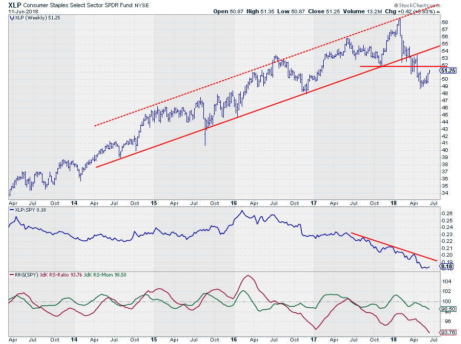 Despite all records in the price that we have seen in the S&P 500 chart so far, the Staples sector managed to actually break its uptrend earlier this year.
The relative strength line of XLP vs SPY already started moving in a downtrend in the first half of 2016 and has not looked back. The most positive that happened for this sector was a flat period at the beginning of 2017 which caused the JdK RS-Ratio line to retract all the way back to the 100-level and cause a very brief rotation through the improving and leading quadrants.
Once both RRG-Lines dropped back below 100 the relative downtrend continued in full force, pushing XLP to the left-hand side of the RRG and into the lagging quadrant again.
The recent break below the rising support line on the price chart only adds to the weak picture for Consumer Staples at the moment.
Financials - XLF
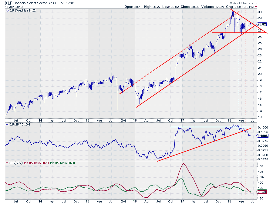 The Financials sector is struggling to remain inside the boundaries of the rising channel that is in place since early 2016. What bothers me from a chart perspective is the fact that the last few highs all came in at a lower level while the lows were more or less at the same level. This creates the shape of a descending triangle which usually breaks out to the downside.
For this reason, $ 26.50 is a support level that should be watched closely. A downward break, especially at a Friday close, will very likely be the trigger for an acceleration lower.
The relative charts are not looking much better. The ascending triangle in the relative strength line was broken earlier this year but the break did not hold above its breakout level and reversed back below. The result was a sharp reversal in relative strength (failed breakouts often cause strong reversals in the opposite direction) which also broke the rising support line.
The RRG Lines dropped below 100 with the JdK RS-Momentum line leading the RS-Ratio line as usual. With both lines heading lower, the Financials sector may be expected to continue its underperformance against SPY and move deeper into the lagging quadrant.
Industrials - XLI
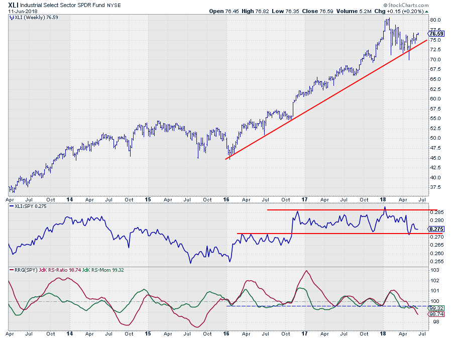 XLI is just about holding up above it rising support line but the recent decline off the high came in a series of lower highs and lower lows which is not very strong. If this rhythm can be reversed in coming weeks things could improve a little bit from a price perspective.
The RS-Line is caught in a trading range since setting the high at the end of 2016. At the moment the RS-Line is testing the lower boundary of that range.
What worries me is that RS-Ratio just dropped to its lowest level in over two years, below the level of its last five lows which were all set just below 100.
The combination of a weak price chart and a weak relative chart while the weekly and daily RRG tails are heading in the same (negative) direction suggests that further weakness, under-performance should be expected.
Technology - XLK
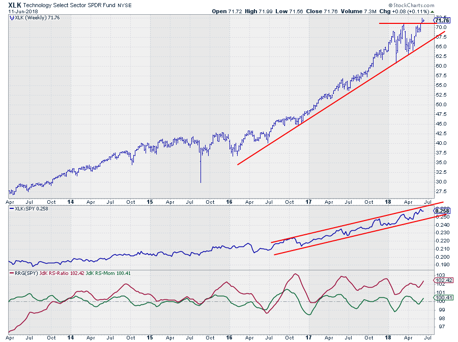 The Technology sector is a different story.
The uptrend that started at the beginning of 2016, or maybe even earlier, is still in play and despite some wide swings in the first half of this year, XLK seems to have made up its mind again by breaking to new highs in both price and relative.
It is very hard to be bearish on XLK with a chart like this.
The RRG-Lines are both solidly above 100 again after a short stint through weakening (RS-Momentum below 100 while RS-Ratio is still above 100). This creates an RRG-Heading at almost 45 degrees suggesting that there is more out-performance for XLK in store.
Together with energy and Discretionary, Technology is the only sector at the right-hand side of the plot.
Consumer Discretionary - XLY
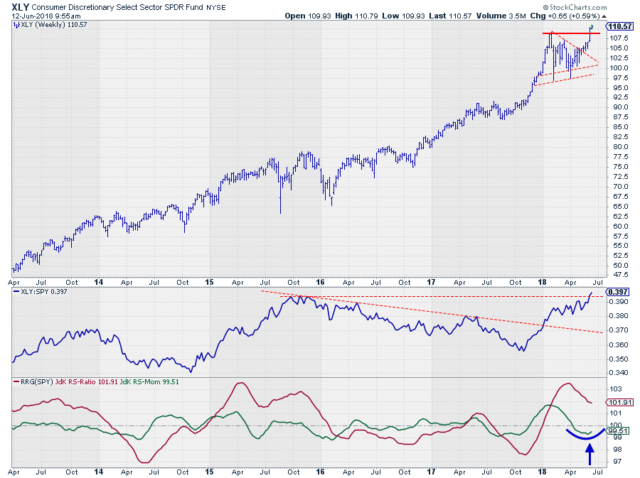 Both consumer sectors, and especially the spread between them or the rotation on an RRG, usually gives a pretty good clue whether we are in a risk-on or a risk-off environment. And with the state of affairs at the moment the signal could not be more bullish.
Staples is on the far left of the RRG heading further into negative territory and Discretionary is inside the weakening quadrant, at the right side of the graph, and curling back up which we know is usually a strong sign for a new relative leg up.
The chart of XLY in itself is sending strong signals as well as it just broke to new highs after the consolidation pattern that formed during H1 of 2018.
This break in price is backed by a break in relative strength as well while the RS-Momentum line is curling back up.
The only further confirmation we could look for is for the tail to turn into a 0-90 degree RRG-heading.
Needless to say that the XLY/XLP chart is even stronger than XLY/SPY.
Calling a top?
It is, always, very tempting to “call” a market top. Especially after a long rally as we have seen and are still seeing at the moment.
And I have to admit, it is tempting to build a bearish case for the (stock) market. However, I have seen too many people crash and burn while “predicting” all 5 of the last two bear markets….
The one remark that I want to make as a word of caution is that only three out of ten sectors are currently on the right-hand side of the RRG.
Although these three make up around 45% of the market I would, ideally, like to see a bit more sectors at, and moving toward, the right-hand side.
For now, signs continue to point to risk-ON
Let me know what you think of this usage of RRG in the comments? If you want to receive a notification when a new article in the RRG blog is published? Simply "Subscribe" and leave your E-mail address.
Julius de Kempenaer | RRG Research
RRG, Relative Rotation Graphs, JdK RS-Ratio, and JdK RS-Momentum are registered TradeMarks ®; of RRG Research
Follow RRG Research on social media:
If you want to discuss RRG with me on SCAN, please use my handle Julius_RRG so that I will get a notification.


