 While working on my previous article, one stock, in particular, drew my attention. I only casually addressed it in that article as I wanted to do a more extensive review separately.
We are talking about Walt Disney (DIS).
In this post, I will try to build a longer-term picture with the evidence piling up to support a big move.
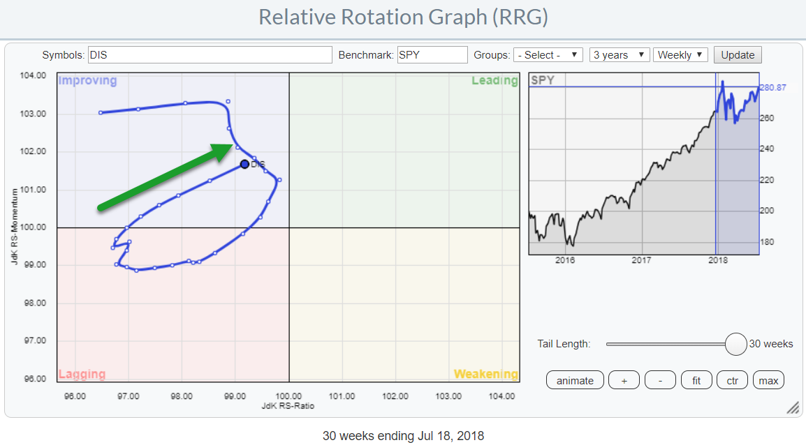
The Relative Rotation Graph above shows the stock in isolation against SPY over the last 30 weeks. The tail shows that DIS started losing relative momentum well before it was able to reach the leading quadrant.
The rolling down inside the improving quadrant indicated the relative weakness that was still ongoing for DIS against SPY at that time (second half of January). The weak relative momentum eventually caused DIS to rotate back into the lagging quadrant where it remained for another 15 weeks.
The previous crossover from lagging into improving happened mid-November 2017 when JdK RS-Ratio was around 93. The crossover that brought DIS back into improving after its rotation back through lagging occurred in the week ending 22 June near 97 on the RS-ratio scale. Chances for the rotation to continue into the leading quadrant are therefore much higher this time.
Daily RRG
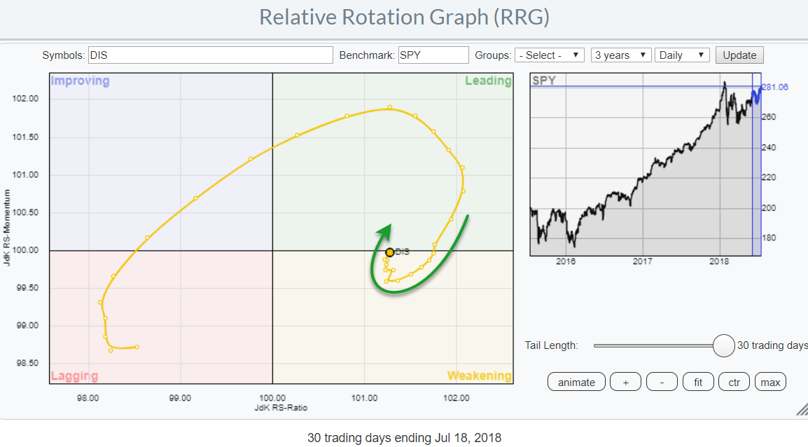 Switching to a daily RRG shows that the improvement that is visible on the weekly RRG has resulted in a strong rotation of DIS into the leading quadrant and the tail has already rolled over and back into the weakening quadrant after this first upward leg in relative performance.
Over the past few days, the distances between the day to day observations on the tail got shorter, indicating stabilization, while the tail started curling upward again and is now nearing a renewed crossover into the leading quadrant.
This leaves us with a strong combination of a weekly RRG showing a tail inside the improving quadrant pointing towards leading and a daily RRG showing a tail that is curling up and turning into a strong RRG heading inside the weakening quadrant and almost passing 100 on the RS-Momentum scale.
The sector perspective
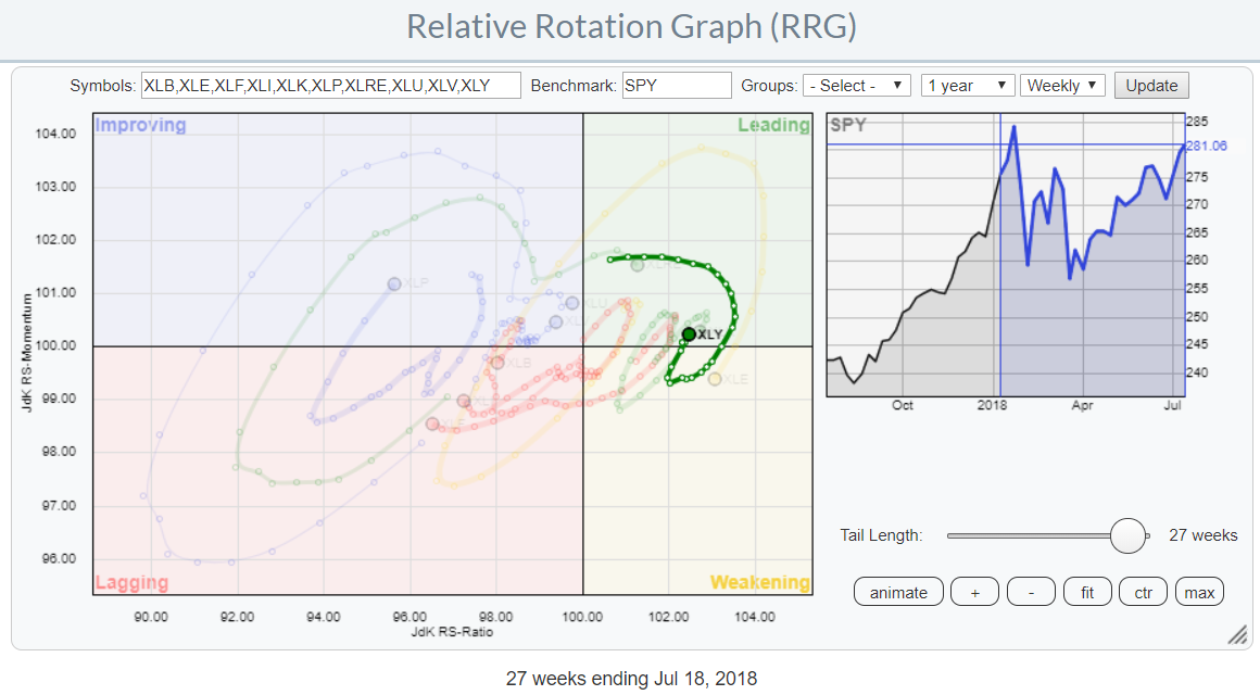 DIS is a member of the Consumer Discretionary (XLY) sector. AMZN is dominating that sector at a weight of over 20% followed by HD at 7.5% and NFLX at almost 6%. DIS is the number four stock at over 5% weight in XLY.
The weekly RRG of S&P sector ETFs above, with XLY high-lighted, shows the strong rotational pattern for Discretionary stocks that are turning up at a strong RRG-heading again and just crossed back into the leading quadrant, seemingly ready for a new leg up against SPY.
DIS vs. XLY
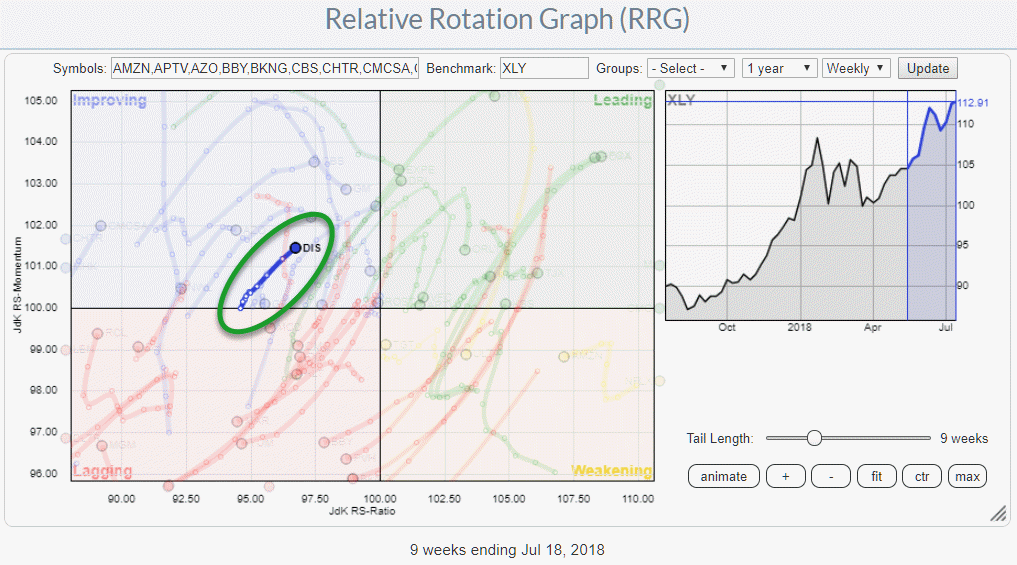 Zooming in on the members of the Discretionary sector against the XLY benchmark shows DIS inside the improving quadrant at a strong RRG heading that is pointing to the leading quadrant and here also increasing distances between the week-to-week observations on the tail.
So we have a strong and improving stock in a strong and improving sector!
This lining up of positives on the RRG charts, begs for further inspection on the price chart.
Stretched formation on a weekly chart
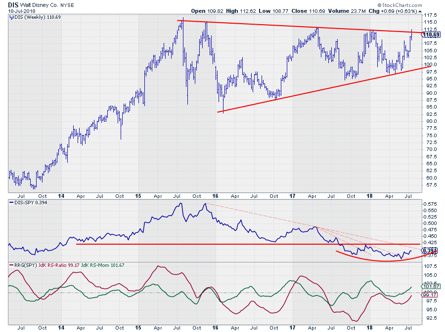 Reading the RS-Line on this weekly chart above learns that the downtrend, lower highs, and lower lows, is still intact but there are a few positives to mention.
The distance/depth from low to low is decreasing. In other words, the declines in RS push less below the previous lows than they used to.
On the RS-chart, I have drawn a few falling resistance lines (light red shaded and dashed). Two shorter ones have already been broken upward, and RS is on its way to challenge the resistance coming down from the 2015 peak. The final confirmation for the ending of the downtrend (watch out this is not the same as the confirmation for a new uptrend) will be when the previous high is taken out which coincides with the break of the solid red horizontal barrier.
Most of the time, if not always, the first chart that I look at is the weekly price chart in combination with the RRG-Lines and raw relative strength. If necessary, I then switch to a daily version of that chart for more detail.
When I brought up that chart for DIS, I noticed the huge triangle-like pattern that has been forming since 2015. Because of the stretched out nature of this formation, I pulled up a monthly chart as I feel that price patterns like a triangle, for example, should not be too stretched out.
Or, if they are, they should be confirmed in the higher time frame. SO instead of moving to a daily version of the chart, I wanted to inspect the monthly.
Text-book triangle on the monthly chart
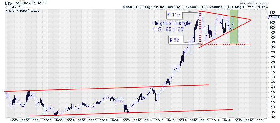 On the monthly chart, this triangle shows up in an almost text-book form regarding size, width, and position.
After breaking out of the long range that stretched from the late nineties to 2012, DIS embarked on a very strong uptrend that took the price from $ 40 in 2012 to a high of $ 115 in 2015. After setting that high DIS started to move sideways while making some big swings up and down.
These swings and the resulting highs and lows are making an almost perfect symmetrical triangle. What's even better, it's ready to pop!
The height of the pattern (vertical red dotted line) is around $ 30, the $ 115 peak in 2015, minus the $ 85 low at the end of 2015. The base of the pattern (horizontal red dotted line) runs from mid-2015 to the apex of the support and resistance lines (solid red) late 2019. The ideal time for a breakout, with maximum impact, is somewhere between 2/3 and 3/4 of the width of the formation. Which means around NOW!
If and when that breakout occurs we may project the height of the pattern, in this case roughly $ 30, from the breakout level in the direction of the breakout.
Symmetrical triangles can come as reversal or continuation patterns, and in the case of DIS, it is not decided (yet) what it will be. But it is always tempting to build a case for direction, and I like to believe that the break will be upward.
From a pure chart-technical perspective the triangle is not entirely symmetrical in the sense that the support line that connects the lows is sloping upward a little steeper than the resistance line is sloping down.
To me this suggests that buyers are a bit more aggressive, they come back at higher levels to buy than sellers are coming back to sell.
Combining this with a strong relative strength on both the daily and the weekly time-frames supports a bullish case "IMHO."
Where are we NOW?
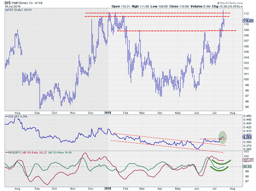 Finally, for the more detailed picture, we need the daily chart of DIS.
The upward break in relative strength shows that a new uptrend has begun there. Taking out that previous high was important. This is leading the RRG-Lines higher where the RS-Ratio line was already comfortably above 100 and RS-Momentum is now about to cross back above that level as well, which will push DIS into the leading quadrant on the daily RRG.
On the price chart, the resistance area around $ 112 is showing up in more detail now. A first attempt to rally failed two days ago, but so far DIS is holding up well above support that is now pegged near $ 109 for the near term. As long as that level holds I am still eying a break beyond $ 112, preferably the extreme high at $ 112.62 for a first confirmation.
But remember, we are looking for and building a long-term case so taking out resistance on the daily chart is just a first box that needs to be ticked. The next one would be a similar situation at a Friday close in coming weeks, and finally, we like to see a monthly close above $ 112-113.
We're not there yet but the positive signs seem to be piling up, so stay tuned as this could be a BIG one!
Let me know what you think of this usage of RRG in the comments below. If you would like to receive a notification when a new RRG blog article is published, simply "Subscribe" with your email address using the form below.
Julius de Kempenaer | RRG Research
RRG, Relative Rotation Graphs, JdK RS-Ratio, and JdK RS-Momentum are registered TradeMarks ®; of RRG Research
Follow RRG Research on social media:
If you want to discuss RRG with me on SCAN, please use my handle Julius_RRG so that I will get a notification.


