Relative Rotation Graphs are a great tool to visualize equity sector rotation and they are probably most used for that purpose. However, there are many more areas where RRGs can be used to get a big picture view of what is going on among a group of securities or related financial instruments.
A shorter version of this article appeared in the Chartwatchers newsletter of Saturday 8/4.
Commodities
One of these areas is commodities. Here at Stockcharts.com commodities are regularly commented on by Greg Schnell, among others, who even has the commodities countdown blog, dedicated to the commodity markets.
As there are many commodity-related indices, ETFs, and mutual funds etc. I have tried to put together a balanced set of ETFs (or ETNs as these are called) covering a wide array of commodity sub-indices.
setting up a universe
When I put together universes for use in Relative Rotation Graphs, I am always looking for securities that belong to the same "family". For the equity sectors, for example, I mostly use the SPDR sector ETFs. They are all managed by the same provider which means that there will be no overlap and consistency in the membership of stocks etc.
For commodities, it is a bit harder to find consistency as there are many providers of indices and tradeable products but not all available (sub-)indices are covered by tradeable products. I have yet to find a resource that covers all in a consistent manner.
From a commodity indices "family" point of view, Bloomberg does a good job with its Bloomberg commodity indices family. You can find more information about this here. But it seems that they, very recently (3 August), have made some changes to the setup of the sub-indices.
For the time being and for this purpose I will use a set of data that comes close AND is available on Stockcharts.com
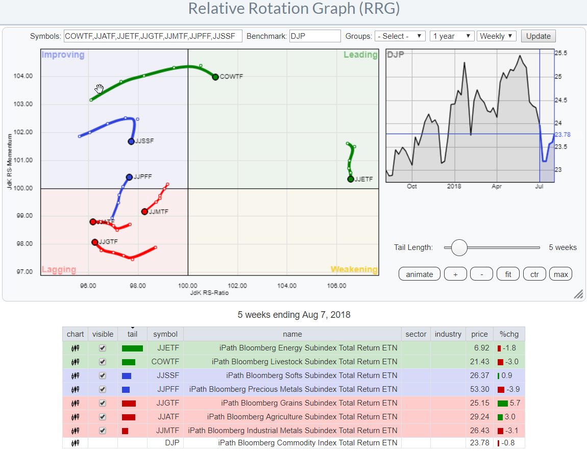
This setup is visualized in the RRG below.
 As we are using ETFs/ETNs here we are depending on the availability of these products in the markets. The index provider can create (sub-)indices but if banks or asset managers do not create any tradeable products based on these indices it is still hard to trade them or create exposure other than directly trading the underlying futures contracts.
ETNs vs Indices
The alternative in this case, and depending on the situation this may even be the preferred way to analyze a universe, is to use the underlying indices instead of the ETF/ETN based on that index.
Stockcharts carries a lot of these underlying indices, ticker symbols starting with $BCOM.. as well, which expands our possibilities.
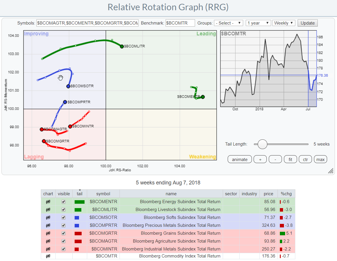 This RRG above shows the same commodity groups as the first RRG at the top of the article but this one uses the $BCOM indices.
You will see that the general rotational picture is similar on both charts but you will also find some subtle differences. These are caused by the fact that the ETNs always have a light "tracking error" vs the indices that they are replicating. From time to time a tracking error can get a bit bigger because of some, trading related, event that affects the pricing of the ETN. This could be a large transaction executed on an exchange, it can be the difference between the bid and the ask of the ETN (an index does not have a bid-offer spread) etc.
Because of the recent changes, I want to examine this index family a bit better in coming weeks and see if I can come up with a pre-defined and pre-populated set of commodity universes and make them available in the selection drop-down on the RRG page.
Commodity rotation
Let's go back to the RRG and see what's going on in this universe at the moment.
The First Relative Rotation Graph above shows the relative position of almost all major sub-indices that make up the Bloomberg Commodity index total return index against the ETF/ETN that tracks this index, DJP.
Energy sub-index dominates the commodity universe
The big outlier here is clearly the energy subindex which is far away to the right at a high JdK RS-Ratio level but moving lower on the JdK RS-Momentum scale.
This sub-index has dominated the relative rotation among commodities since roughly Q4-2017 and it is still in a leading position.
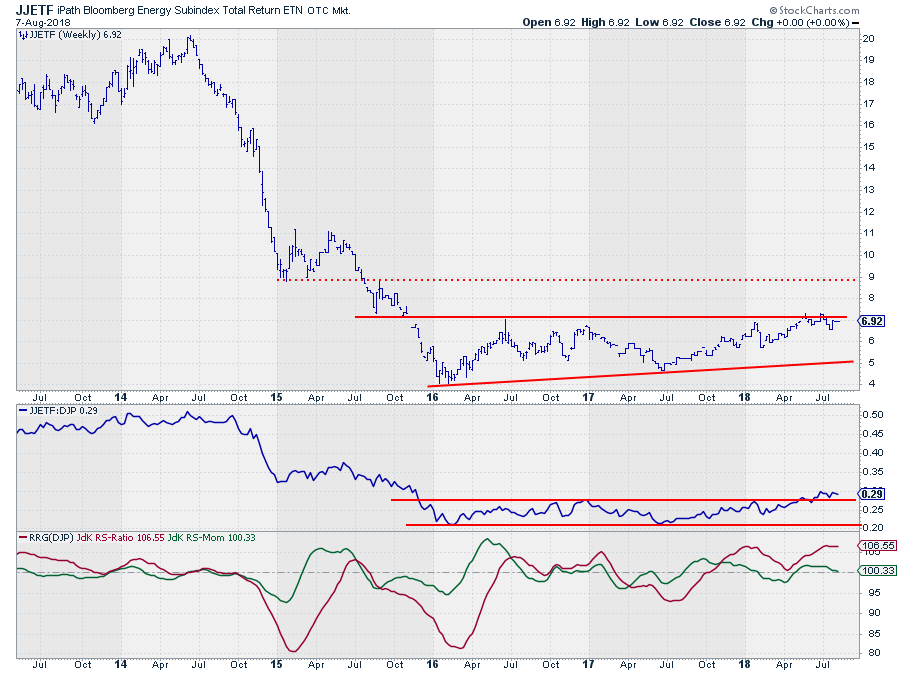 The price chart shows heavy overhead resistance around $ 7 which needs to give way for a further rise. After $ 7 the next resistance level is not showing up until $ 9.
The relative strength against DJP is a different story. during 2016 and 2017 the RS-line moved in a sideways range but managed to break out of that range a few weeks ago. The RRG-Lines picked up a relative uptrend vs DJP late last year after which RS-Ratio remained above 100.
RS-Momentum moved below 100 for a few weeks at the start of the year, rotating JJETF through the weakening quadrant and back into leading again in the second half of April. At the moment the RS-Momentum line is again about to crossover into weakening but given the high reading of RS-Ratio and the upward break out of the range on the RS-chart, the odds seem to be in favor for another rotation through weakening and then back to leading. Offering another entry opportunity, probably in coming weeks.
Livestock
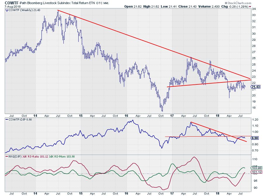
The livestock group (btw I love the ticker: COWtf ;) ) is also inside the leading quadrant making it the second strongest group in this universe. However, the rotational pattern, especially when put into perspective with the regular chart above, urges caution IMHO.
The rotation into the leading quadrant is the result of the relative improvement that this group went through since its relative low mid-May. The good news is that this improvement managed to break the downward sloping trendline that was in play since mid-2017. The bad news is that shortly thereafter the relative line ran into horizontal overhead resistance (thin red line) and is now rolling over again which takes its toll on the tail of COWTF. Starting to roll over only one week after entering the leading quadrant is not particularly strong. It looks like COWTF gas burned too much fuel and needs a refill in order to progress further into leading.
For that to happen I believe we would need to see an improvement on the price chart as well. COWTF broke below (almost) horizontal support a few months back and has been struggling to get back above it a few times since. Very shortly also the declining resistance line will come into play and cause a double resistance that needs to be broken for further improvement. Seems like a hard nut to crack and it can/will cause trouble for the relative strength line to keep up.
Broader picture
The broader picture for commodities with Energy at the far right-hand side of the plot and Livestock just inside leading but already rolling over while all other groups reside at the left-hand side (RS-Ratio < 100) underscores the dominance of Energy at the moment. It also makes for a very delicate balance in this universe that can change rapidly when Energy cannot hold up its current strength.
in order to beat the broad commodity index at the moment, you need to stick with energy. The precious metals group could be an outsider as it started to pick up relative momentum but it is not there yet. As a matter of fact, I do not like the (price) chart at all but the RS-Line is leveling off which means an improvement from that perspective.
Let me know what you think of this usage of RRG in the comments below. If you would like to receive a notification when a new RRG blog article is published, simply "Subscribe" with your email address.
Julius de Kempenaer | RRG Research
RRG, Relative Rotation Graphs, JdK RS-Ratio, and JdK RS-Momentum are registered TradeMarks ®; of RRG Research
Follow RRG Research on social media:
If you want to discuss RRG with me on SCAN, please use my handle Julius_RRG so that I will get a notification.

