RRG Charts September 21, 2018 at 08:31 AM
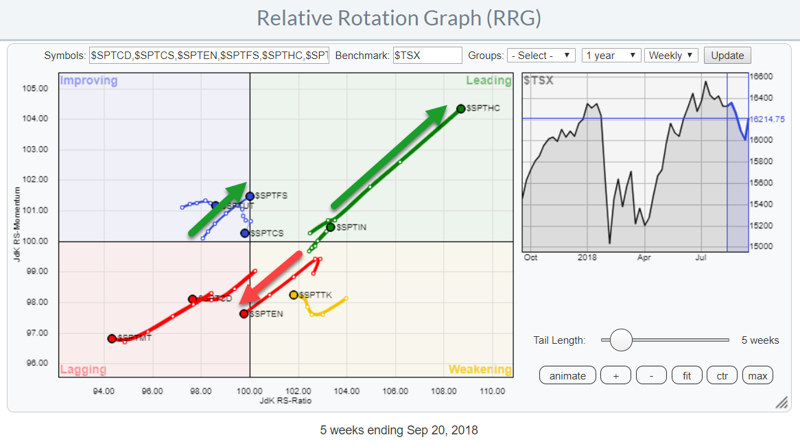
The Relative Rotation Graph for Canadian sectors is showing a very distinct move for the Healthcare sector. It is inside the leading quadrant and powering further into it at a strong RRG-Heading at a very long tail... Read More
RRG Charts September 13, 2018 at 09:32 AM
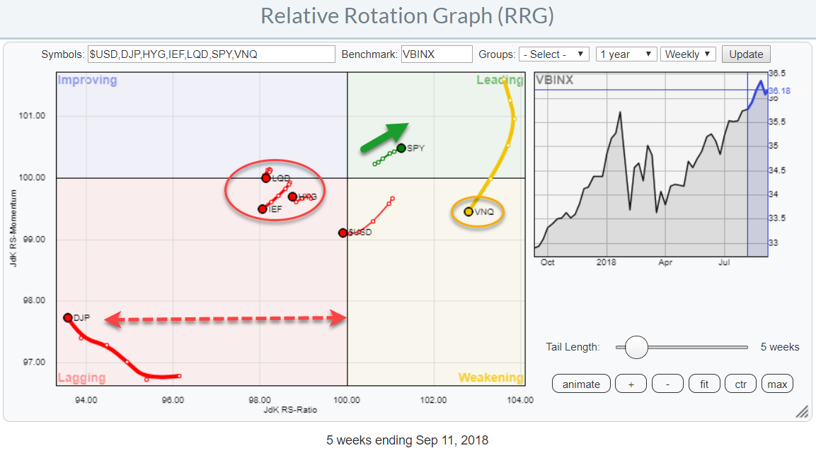
The Relative Rotation Graph shows the relative positions of various asset classes (ETFs) against VBINX, a Vanguard balanced index fund, as the benchmark... Read More
RRG Charts September 06, 2018 at 05:37 AM
In one of my recent articles, I high lighted that Relative Rotation Graphs can do (much) more than just show equity sector rotation by showing how RRG can be used to analyze rotation among the different commodity groups against a broad commodity index... Read More