 After finishing the previous article on plotting breadth indicators on Relative Rotation Graphs I have spent hours and hours on studying probably a couple of thousand different RRGs holding various groups of sectors in combination with their breadth equivalents.
And although I did not find the perfect prediction tool or the ideal leading indicator I do think using these alternative data series on RRGs can function as a piece of the puzzle that we are trying to solve.
What have I learned so far?
For this experiment I worked with four different breadth data-sets that are available on Stockcharts.com, these are:
- The Bullish percent series.
These are the series that start with $BP.... for each sector in the S&P 500. These numbers are then compared to $BPSPX to create the Relative Rotation Graph. - The Stocks above 200-EMA per sector
These are the series that start with !GT200.... These numbers are then compared to !GT200SPX - The stocks above 50-EMA per sector
Similar as 2 but using 50-day lookback period - The stocks above 20-EMA per sector
Same as 2 and 3 but with 20-day lookback period
From my initial research into these breadth indicators, I came to the (preliminary) conclusion that they are probably best used on the daily time-frame as they calculate the day-to-day percentages of stocks above a certain EMA period or in case of the BP series, the number of stocks on a P&F buy signal within the sector.
Only the BP and the 200-EMA series seem suitable to track on a weekly basis as their day-day changes will be less than the changes in the 20- and 50-day EMA series and will, therefore, cause less erratic moves when plotted on a weekly RRG.
For this article, I will be using the $BP series on weekly data as that is my preferred time-frame and BP seems to work best with that setup. As far as I have found the !GT series move in a similar fashion but a little more erratic. The outcome should not be too different.
The process
So how did I investigate any relationship? The answer is simple, pretty much by eye-balling and scrolling back and forth through time on multiple RRGs side by side. Leading to pictures as below.
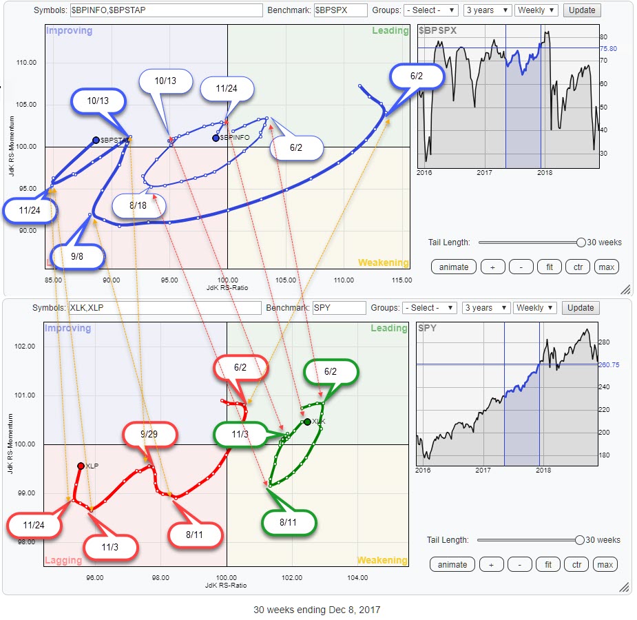
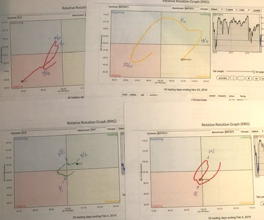
I won't publish all the pictures that I have been looking at scrolling back and forth through history but the images above should give you an idea of the process.
I have tried to label and identify as much "turning points" as possible to see how they align between the breadth version.
The outcome of this "eyeballing exercise" is that I could not find a consistent leading pattern. Most of the time both curves seem to be turning together, sometimes breadth is leading and sometimes the price based RRG is leading.
Not very exciting and certainly not the holy grail.
Cap-weighted vs Equal weighted
During the research, I was trying to rationalize and explain or clarify why I was seeing what I was seeing. At one point I realized that the ETF-price based RRG is influenced by the weights of the individual stocks in the sector index. One or two big stocks could drag the sector, and therefore it's relative strength, down while the majority of the stocks would still be going up causing a positive reading for BP and above-EMA series.
Of course, that could also go the other way. Only one or two stocks in a sector go up and push relative strength higher while the majority of stocks in the sector is below their EMA or at P&F sell signals, sending BP data lower.
For a minute I thought I had the key to the solution but this is what came out when I compared the rotational patterns of cap-weighted sector ETFs with their equal weight counterparts.
The two RRGs show the rotational patterns of the Technology and Staples sectors over the same period as the RRGs above.
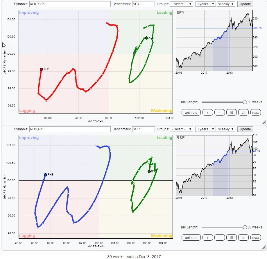 My conclusion? Yes, there are differences between the cap-weighted and equal-weighted sectors but they are not big enough to change the rotational pattern that a sector goes through. Despite the fact that the sectors are positioned a bit differently on the RRG canvas the rotational patterns are largely the same. Definitely not different enough to warrant a preference of one over the other for this cause.
Are breadth based RRGs going to be helpful at all?
Not in the sense of being a leading indicator that is going to tell us in advance when the rotations on a regular RRG are going to bend over or curl up. Maybe that would have been too good to be true, I don't know. Maybe I am not (yet) looking in the right places. But research (of financial markets) is a never-ending quest so I will keep my eyes open going forward.
Having said that I don't believe that the whole exercise has been completely useless. Performing research, to me, is throwing a ton of ideas against a wall and see what sticks one way or another. Very often the ideas bounce back off the wall or fall straight to the ground. More often than not, as a matter of fact, ideas will drop down to the ground when researched further, only a few will stick.
The rotations of the breadth data on a Relative Rotation Graph seem to move in sync with the rotations of the price based RRG. Assuming that that is the "normal" behavior and deviations from that normal behavior could mean something. Just like "divergences" on regular indicators like MACD and RSI often act as early warning signals.
Divergences are hard to quantify, can last very long, and therefore always need to be used in conjunction with other tools. Instead of looking for breadth rotations as leading for price rotations I started looking for differences.
If I translate that to RRGs and breadth data plotted on RRGs that means that deviations in rotational patterns between the price based RRG and the breadth based RRG will serve as a trigger, an early warning, for a further inspection of that sector. Just like divergences on a regular chart.
A check of RRG-Lines
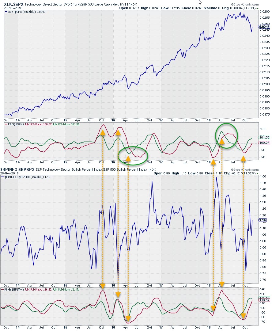 These pictures show the XLK:$SPX ratio with its RRG-Lines at the top and the $BPINFO:$BPSPX ratio with its RRG-Lines below. The difference in characteristics between the two Relative Strength lines is imminent. The breadth based ratio is more clearly contained between extremes and sows less trendiness.
I have connected a few highs and lows in the RRG-Lines of both setups to check if there is any lead-time. Going over a few of these charts it looks like there is a bit of lead on breadth turns when the RS-Ratio (breadth based) is at extreme levels, levels around 70-80 and 130-140. On an RRG that means turns that take place towards the edges of the plot.
When the RRG levels for the breadth data are close(r) to the center of the chart they need to track and confirm the moves on the price based RRG.
Divergences between breadth- and price based RRGs are (early) warning signals and they seem to become (more) reliable when they occur at extreme levels.
Actual rotations
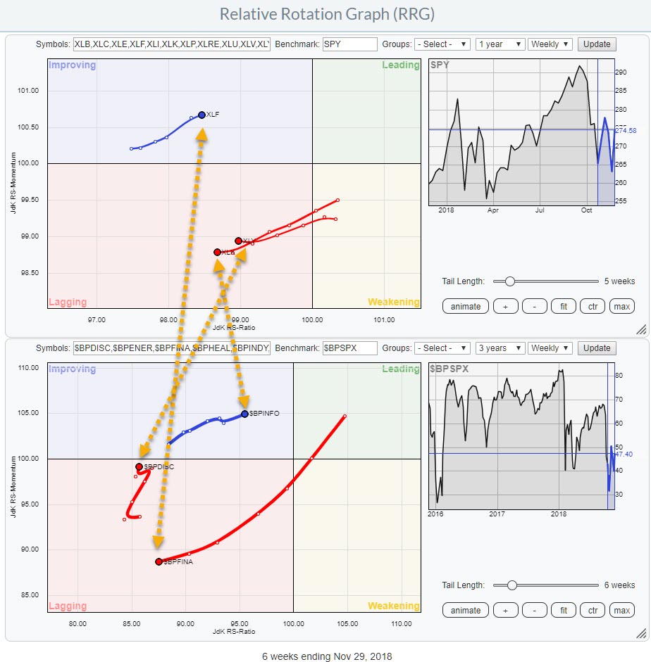 Here is how I look at the sector rotation combining relative breadth and relative price data on two RRGs
At the moment there are three sectors where the rotations of breadth are disconnected from the rotations based on price.
These sectors are Technology (XLK) where breadth is inside improving and heading towards leading while price-relative is inside lagging and heading further into negative territory. Digging a bit deeper and checking the breadth rotation on the daily RRG, where Technology is about to cross over into lagging from weakening, leads me to believe that the rotation on breadth will soon turn down again towards the lagging quadrant and start confirming the relative price rotation.
Consumer Discretionary (XLY) is heading deeper into the lagging quadrant on the price RRG while breadth is going through an upward move. The fact that this up-move in breadth is taking place at low RS-Ratio levels (85) makes it very difficult to pull the price rotation out of the doldrums as no improvement whatsoever is visible there.
The third sector is Financials and that is probably the most notable difference. On the price RRG, Financials is inside the improving quadrant after a period of weak relative performance in the first half of 2018. The rapid deterioration of the Bullish Percentage numbers for the sector makes it very doubtful if the sector can maintain its improvement on price relative. So IMHO the odds for Financials are calling for a rotation back to the lagging quadrant for XLF.
The big picture
Even if there is no distinct lead time of turns in breadth relatives before price relatives the RRG of breath relatives still enables us to watch the rotation of breadth data on a stand-alone Relative Rotation Graph to help paint the breadth picture of the whole market broken down by sectors. That in itself, I think, is added value and gives you an out-of-the-box angle to look at (breadth-) data.
The crux will be to blend these observations into a relative strength/RRG, based workflow as another piece of the puzzle that we are trying to solve.
Let me know what you think of this usage of RRG in the comments below. If you would like to receive a notification when a new RRG blog article is published, simply "Subscribe" with your email address using the form below.
Julius de Kempenaer | RRG Research
RRG, Relative Rotation Graphs, JdK RS-Ratio, and JdK RS-Momentum are registered TradeMarks ®; of RRG Research
Follow RRG Research on social media:
If you want to discuss RRG with me on SCAN, please use my handle Julius_RRG so that I will get a notification.


