RRG Charts December 31, 2018 at 09:27 AM
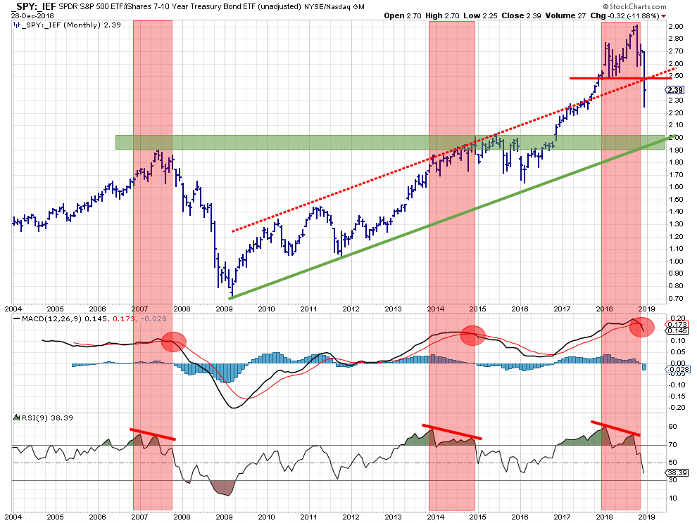
The above chart shows the stocks/bonds ratio using monthly bars since 2004. IMHO this is one of the most useful charts to decide on an important portion of the asset allocation in your portfolio. Should you invest in stocks or in bonds. In other words, "Risk ON" or "Risk OFF"... Read More
RRG Charts December 22, 2018 at 08:55 AM
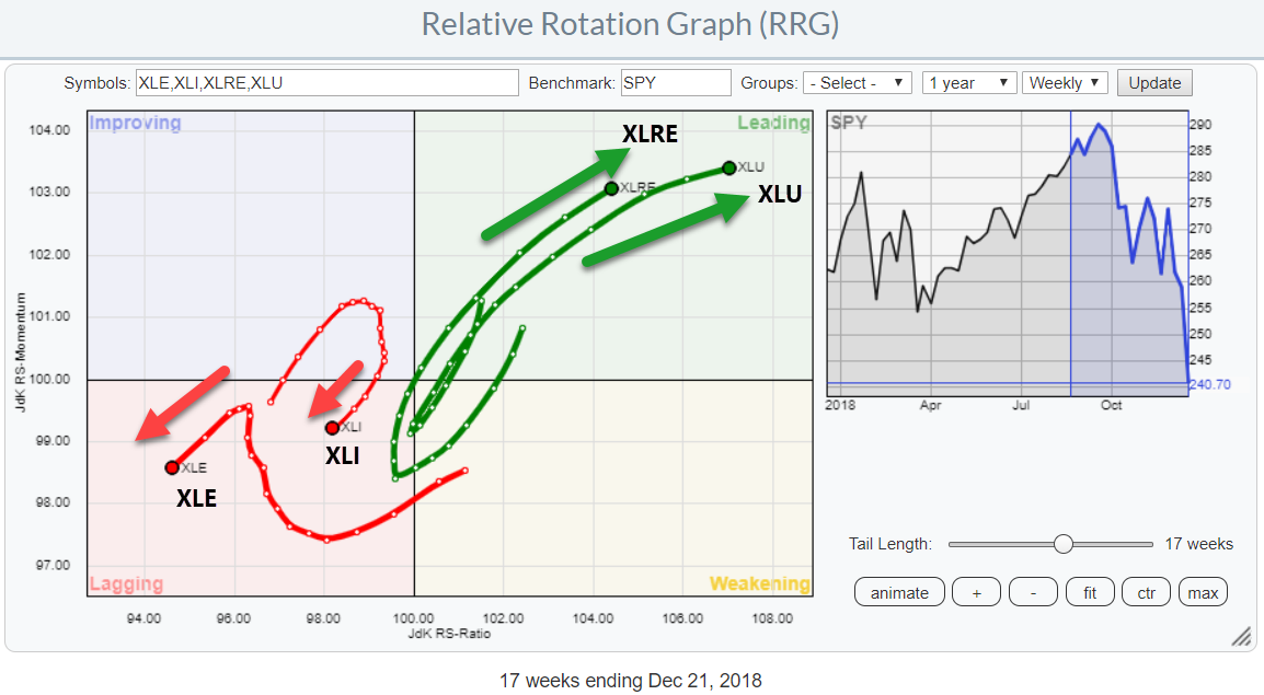
In my previous post, I highlighted both the Real-Estate and the Utilities sectors as (strong) outperformers during this weak period for stocks in general... Read More
RRG Charts December 12, 2018 at 11:21 AM
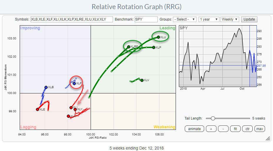
The market keeps throwing us curve balls on a daily basis. The Relative Rotation Graph above translates these curve balls into (sector-) rotational patterns... Read More
RRG Charts December 04, 2018 at 12:53 PM
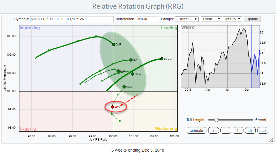
The Relative Rotation Graphs shows the rotation of various asset classes around a balance benchmark portfolio (VBINX). The message could not be more clear... Read More