Earlier today, I was preparing for my weekly Sector Spotlight show on StockCharts TV (airing every Tuesday at 10:30am ET), and, as today is the first Tuesday of the month, that meant looking at monthly charts for Asset Classes and US sectors. This routine gives me a good (forced) opportunity to step back and take a look at longer-term trends and developments.
The easiest way (for me) to do this is to have the Relative Rotation Graph for Asset Classes open in one browser window at the left side of my screen, while simultaneously having a ChartList with SharpCharts holding the same tickers as on the RRG at the right side of my screen.
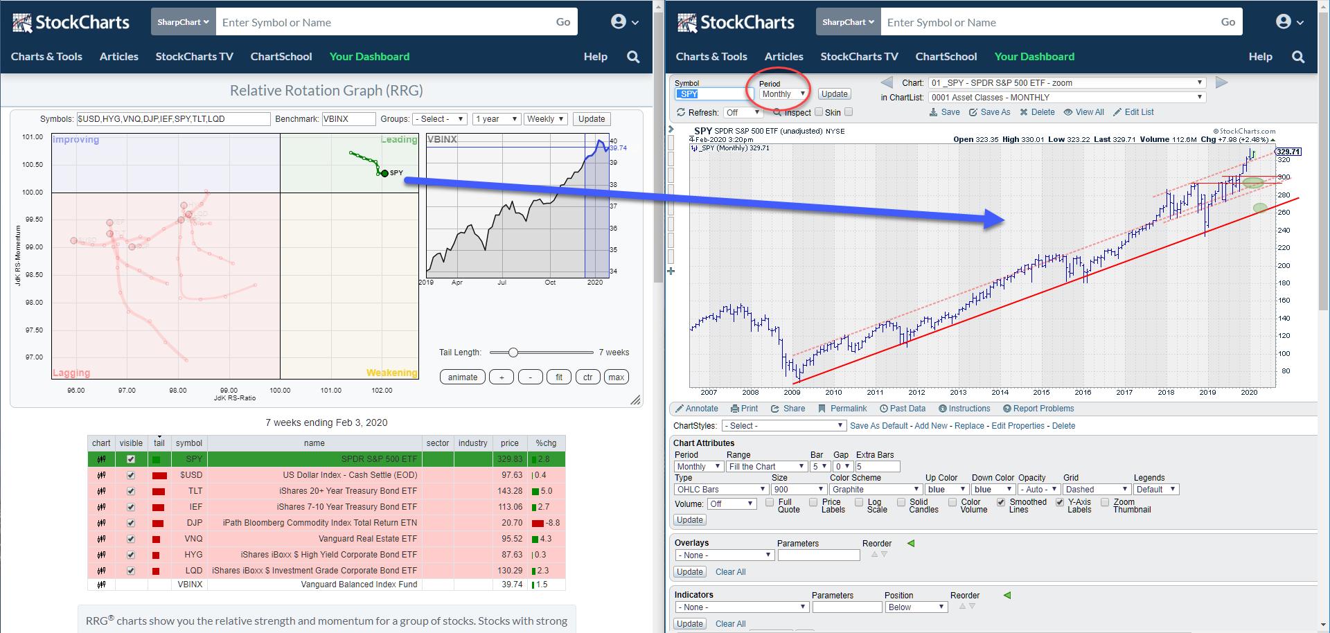 Fig. 1: RRG and ChartList with monthly charts side by side
I can then select the asset classes in the table below the RRG and bring up the Monthly chart for that asset class in the browser window at the right. This setup allows me to easily browse through the various asset classes and get a high-level overview of trends that are in play.
The screen shot above (Fig. 1) highlights the position and the tail of SPY on the RRG, with the monthly chart on the right hand side. The SPY chart is printed again below at full width to get a better view.
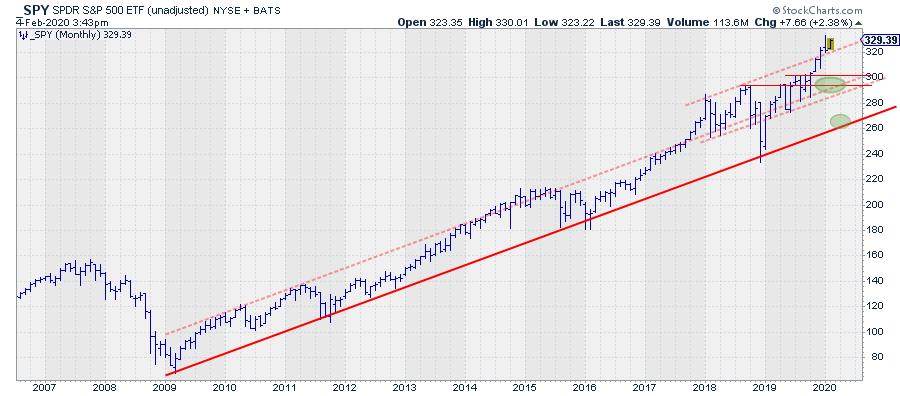
Despite the recent volatility - caused by a virus or something else, who knows? - the trend is still clearly up. The last bar on this chart shows the price action for the start of February. The previous bar is the full month of January.
I keep a few trendlines on this chart, on which I am keeping an eye. The most important one is the solid support line that emerges out of the 2009 low and currently has between seven and nine touch-points, depending how much leeway you allow. Or how "fat your edding marker" is. Parallel to that support line, I added 2/3 dashed lines that used to mark the upper boundary of the rising channel.
An upward break above an already rising resistance line is usually a bullish sign. That happened at the start of 2018, again in 2019 and, more recently, at the end of 2019 when SPY broke above the third dashed line (the highest one).
When such a break holds, that is a sign of strength, and the former resistance line will then start to act as support. That happened after the first break in 2018, it happened after the break at the start of 2019, and it seems to be happening as we speak. After breaking above its rising resistance line in December, SPY continued to rally in January, then dropped back but held above support at the close of the month. February so far has a low above support, which means that the break is still valid.
An observation that I've made over the years, but cannot back it up with hard numbers, is that, when a market drops back into the former rising channel after a break, a decline very often follows to the lower part of that rising channel.
In the chart above, I have circled the two main support areas of interest. The first one is the bottom of the rising channel between the two dashed parallels, around the 300 area. The second one is at the level of the main (solid) support line around 270.
IF, and only IF, SPY drops back into the channel, these levels are likely to become downside price targets.
Of course, I am always interested in the intermarket relationships that are visualized on the RRG. Obviously the most important relationship is the one between stocks and bonds.
On the RRG, we see SPY inside the leading quadrant but rolling over downward for a few weeks, while IEF and TLT are inside the lagging quadrant but have been moving higher on the JdK RS-Momentum scale for a few weeks now.
Is this opposite rotation a temporary move in favor of bonds within a longer term uptrend in favor of SPY? Or is there is a big trend reversal in the making? While trying to decipher the answer to this question, I started to play around with various setting and periodicities and ran into the chart that is printed at the top of this article.
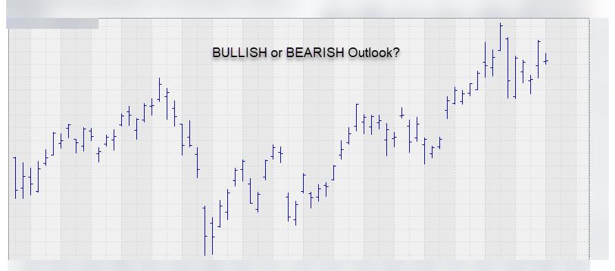
The question I am asking myself, and now asking you, is this: Is this a bullish looking chart, is it a bearish looking chart, or is it perhaps neutral?
My take?
- We are looking at a series of higher lows with intermittent higher highs, the characteristics of an uptrend.
- We broke an important previous high, which subsequently offered support that validated the upward break.
- We recently formed a new low against the lower boundary of the rising channel.
- We are working our way higher within the boundaries of this rising trend.
All in all, IMHO, this is a bullish-looking scenario/trend.
But what does this chart show?
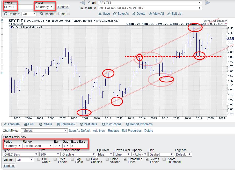 Quarterly chart of SPY:TLT
The monthly and weekly charts are less pronounced and are probably best qualified as a trading range since the December 2018 low.
The daily chart is printed below.
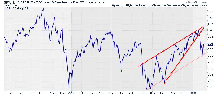
Here, we see an executed wedge, for which the target lies around the lows of the formation that were formed in August, September and October.
At the moment, the ratio is caught by a trendline out of the August low, but, for me, that is a very fragile line with only a few touch-points. The recent decline is only the first decline after completing the wedge, so a bit more downside may be expected.
Summary
All in all, this leads me to believe that the current rotation from stocks to bonds is temporary in nature and a setback within the longer term uptrend, visualized in the blind chart at the top of this article, which appears to be the quarterly chart of SPY:TLT.
Given the magnitude of the moves on this quarterly chart, this rotation could definitely be a "tradable" move for short-to-medium-term-oriented traders/investors.
-- Julius
Julius de Kempenaer
Senior Technical Analyst, StockCharts.com
Creator, Relative Rotation Graphs
Founder, RRG Research
Want to stay up to date with the latest market insights from Julius?
– Follow @RRGResearch on Twitter
– Like RRG Research on Facebook
– Follow RRG Research on LinkedIn
– Subscribe to the RRG Charts blog on StockCharts
Feedback, comments or questions are welcome at Juliusdk@stockcharts.com. I cannot promise to respond to each and every message, but I will certainly read them and, where reasonably possible, use the feedback and comments or answer questions.
To discuss RRG with me on S.C.A.N., tag me using the handle Julius_RRG.
RRG, Relative Rotation Graphs, JdK RS-Ratio, and JdK RS-Momentum are registered trademarks of RRG Research.
Julius de Kempenaer
Senior Technical Analyst, StockCharts.com
Creator, Relative Rotation Graphs
Founder, RRG Research
Host of: Sector Spotlight
Please find my handles for social media channels under the Bio below.
Feedback, comments or questions are welcome at Juliusdk@stockcharts.com. I cannot promise to respond to each and every message, but I will certainly read them and, where reasonably possible, use the feedback and comments or answer questions.
To discuss RRG with me on S.C.A.N., tag me using the handle Julius_RRG.
RRG, Relative Rotation Graphs, JdK RS-Ratio, and JdK RS-Momentum are registered trademarks of RRG Research.


