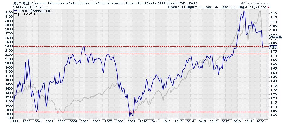
The ratio between XLY:XLP, Consumer Staples vs. Consumer Discretionary, has traditionally been a pretty good gauge to get an idea about being in a risk-on or risk-off environment.
The chart above shows the XLY:XLP ratio, with the S&P 500 plotted behind it. Around the big turns, this ratio has the tendency to send some early warning signals. I am not going to say that it was (or is) the perfect stock market barometer, but I like(d) using it in the background. That same rotation from Staples to Discretionary and back would also show up on Relative Rotation Graphs, showing a distinct opposite direction for the tails of both sectors.
That relationship started to change around 2015-2017, when AMZN really started to accelerate. Because of the weight of AMZN in XLY, this dragged XLY up as well, (probably) more than it would have before. This also distorted to traditional opposite rotating tails for XLY and XLP on the Relative Rotation Graph.
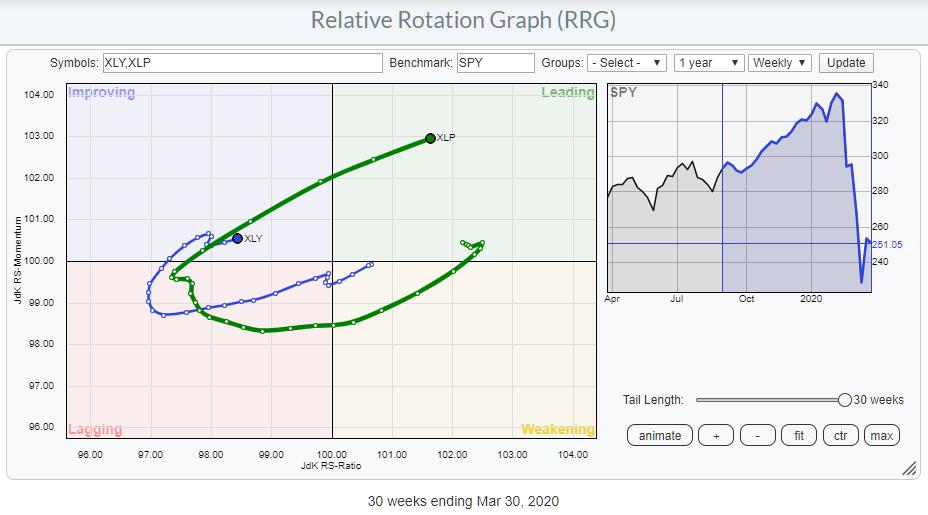
This chart shows the 30-week tail for both XLY and XLP, and you can see that the rotational pattern is more or less similar. They are definitely not moving in opposite directions.
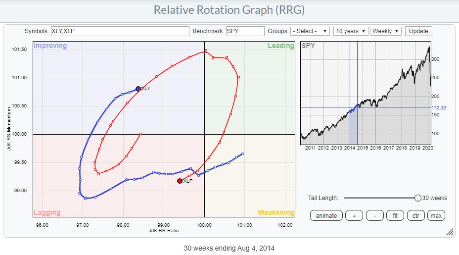
Below is an image of XLY vs. XLP in the middle of 2014 when things were (sort of) "normal":
When we change to the equal-weight universe for US sectors, the rotational image for these two changes dramatically.
Below is the current rotation for RHS vs. RCD with RSP as the benchmark. Compare that to the RRG showing XLP and XLY vs. SPY in the first RRG above.
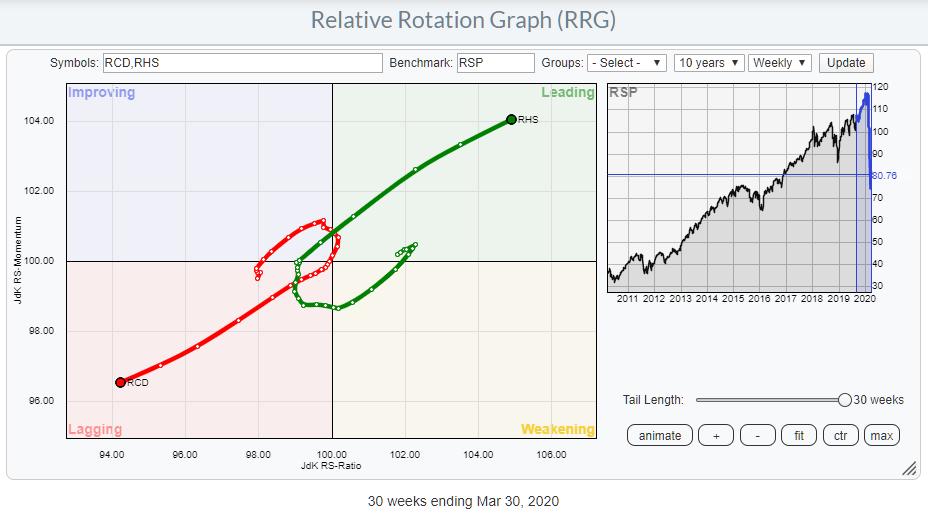
These are the same stock universes, but now all are equal weight so that the dominance of AMZN is now gone. All of a sudden, you see the clear opposite direction of the two tails sending that big risk-off message. Depending on how aggressive you would read the RRG, that signal came somewhere in January or early February, when the tails started to roll over (or curl up for RHS).
Finally, the impact of AMZN on XLY can also be shown by loading up the RRG with the individual stocks.
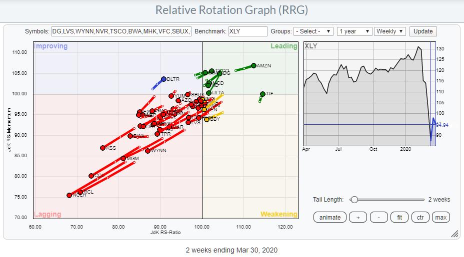
Above is the universe vs. XLY. The majority of members are inside lagging and moving further into it at an almost straight line, with an RRG-Heading of 225 degrees. Basically, this means that when you have your over-/underweight for AMZN right, you will beat the index (XLY).
Things change when you swap XLY as the benchmark for RCD.
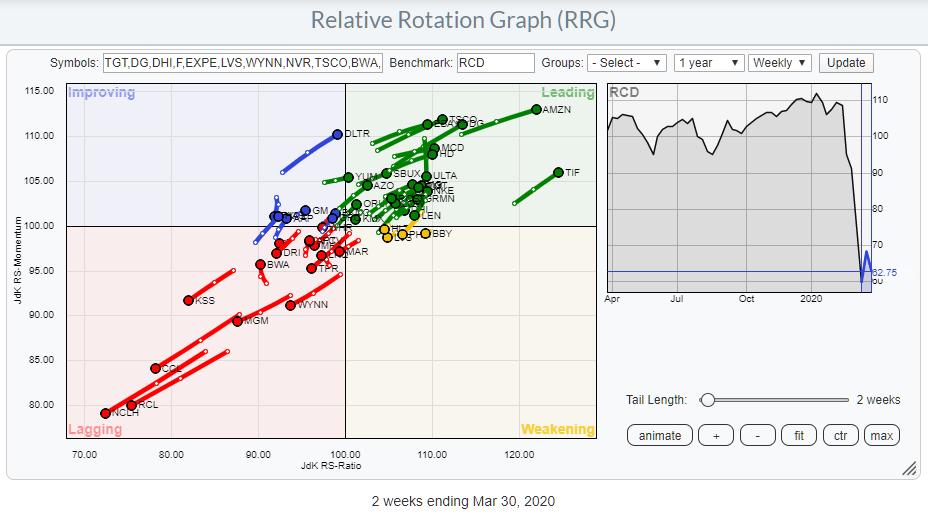
Now, the universe is much more evenly spread around its benchmark (center of the chart). Still, AMZN stands out as one of the better stocks in this group, but the pool to fish in has become a bit larger.
The bottom line is actually two things.
First, it makes sense - and will likely pay off - to dig a little bit deeper and go below the surface of investable instruments such as ETFs. Basically, make sure that you know what you invest in.
Second, that knowledge can help you benefit from differences, as described above.
In this particular case, I think I will shift to using RCD:RHS, instead of XLY-XLP, as one of my gauges to keep an eye on risk on/off. Also, playing the XLY:RCD pair is like buying or selling AMZN with a little less single-stock risk. ;)
From the reading of the tails for RCD and RHS on the Relative Rotation Graph, I am getting a big risk-off message for now.
#StaySafe
--Julius
Julius de Kempenaer
Senior Technical Analyst, StockCharts.com
Creator, Relative Rotation Graphs
Founder, RRG Research
Want to stay up to date with the latest market insights from Julius?
– Follow @RRGResearch on Twitter
– Like RRG Research on Facebook
– Follow RRG Research on LinkedIn
– Subscribe to the RRG Charts blog on StockCharts
Feedback, comments or questions are welcome at Juliusdk@stockcharts.com. I cannot promise to respond to each and every message, but I will certainly read them and, where reasonably possible, use the feedback and comments or answer questions.
To discuss RRG with me on S.C.A.N., tag me using the handle Julius_RRG.
RRG, Relative Rotation Graphs, JdK RS-Ratio, and JdK RS-Momentum are registered trademarks of RRG Research.
Julius de Kempenaer
Senior Technical Analyst, StockCharts.com
Creator, Relative Rotation Graphs
Founder, RRG Research
Host of: Sector Spotlight
Please find my handles for social media channels under the Bio below.
Feedback, comments or questions are welcome at Juliusdk@stockcharts.com. I cannot promise to respond to each and every message, but I will certainly read them and, where reasonably possible, use the feedback and comments or answer questions.
To discuss RRG with me on S.C.A.N., tag me using the handle Julius_RRG.
RRG, Relative Rotation Graphs, JdK RS-Ratio, and JdK RS-Momentum are registered trademarks of RRG Research.


