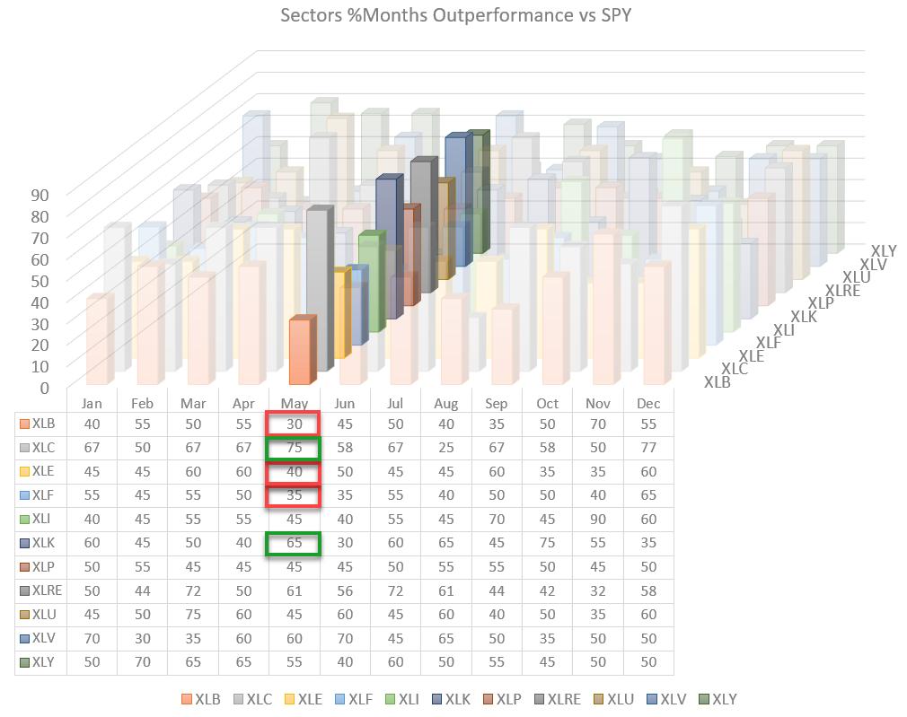
At the end of the month, or the beginning of a new month, I like to look at the expected strength for sectors based on seasonality.
The chart above visualizes the seasonal strength for US sectors in one 3D image. The numbers in the table represent the % of occurrences for each sector outperforming SPY for each month of the year. The typical period used is 20 years, except for the Communication Services and Real-Estate sectors, which have shorter history available.
What I am looking for are values of roughly 70-and-higher or 30-and-lower, as they seem to have an edge, at least in the past.
When the value is 70, it means that that sector outperformed SPY in that month in 70% of the historical observations. Hence, when the number is 30, that sector underperformed SPY in 70% of the historical observations.
Although it is not giving exact "signals" or crisp and clear guidelines on what to do, this sort of information can help investors to "paint a picture" and potentially help them in mapping out what upcoming movements are possible/likely.
Because seasonality analysis is a cyclical thing, that means it's a typical recurring pattern that unfolds over time. In a way, it is similar to Relative Rotation Graphs, as they also show a recurring rotational pattern over time.
The big difference is that an RRG shows the (recurring) rotational pattern that is actually underway based on current price-data, while seasonality shows a (recurring) seasonal pattern that can be expected to unfold based on historical data.
When you combine the "expected" performance from studying seasonality with the "actual" rotation on the Relative Rotation Graph, you can see whether both observations are strengthening or contradicting each other. Both can help you make better informed decisions.
Seasonality for May
What can we expect for the month of May?
In the image above, the seasonal values for the month of May are highlighted, and there are a few observations worth noticing.
- Materials (XLB) is at 30, which means that the sector has underperformed the S&P 70% of the time over the past 20 years. This suggests weakness for XLB in May.
- Communication Services (XLC) is at 75, which means that this sector has outperformed the S&P 75% of the time. Although history for this sector is shorter, it is still a percentage that is worth keeping an eye on.
- Energy (XLE) is at 40%. Not a super-strong (or weak) number, but at least something to keep in the back of your mind when looking at the Energy sector.
- Financials (XLF) at 35 means that, 65% of the time, XLF underperformed SPY in the month of May.
- Technology (XLK) at 65 suggests that the odds are in favor of Technology outperforming SPY in the coming month.
Current Rotation On RRG
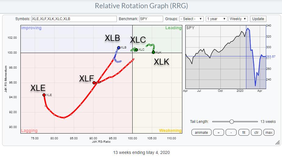
The graph above shows the sector rotation as it is currently underway for the sectors that were highlighted from the seasonality table.
- Materials has just rotated from the lagging quadrant into improving and seems to be traveling further at a positive RRG-Heading. From this rotation, one would expect an outperformance for the materials sector in the weeks to come. So this actual rotation does not match the expected weakness from the seasonal pattern. These sorts of contradicting signs make me hold back either way. Although the rotation on the RRG suggests outperformance, I would scale down any positions based on the expected seasonal weakness. Also, in case of any intentional positions aiming for downside action based on seasonality, I would hold back because of the actual rotation in positive direction.
- Communication Services is showing the strongest seasonality number AND has just rotated from improving into the leading quadrant. This is an alignment that I am willing to exploit. The rotation on the RRG is still very fragile, close to the benchmark and with a very short tail. But it is moving in the right direction. The high seasonality figure makes me comfortable getting positions that benefit from an outperformance of XLC over SPY in coming weeks.
- Energy has been a weak sector for a very long time already and, based on the position on the JdK RS-Ratio scale, it still is. The recent upward move of the XLE-tail while inside the lagging quadrant shows some improvement, which, btw, is also visible at shorter time frames, but the expected weakness from seasonality is probably signaling that this up-move in relative momentum is very likely (just) a hiccup in an extended (relative) downtrend. Therefore, no immediate action, but looking for new opportunities to the downside when rotation on the RRG turns negative again. Probably best to monitor this on a daily RRG to embark on a new leg down for XLE, which would bring it in sync with its seasonal pattern.
- Financials is well inside the lagging quadrant and moving further into negative territory. This nicely aligns with the expected weakness from seasonality, suggesting an underperformance for the sector in May. That happened 65% of time over the past 20 years. The combination of actual rotation on RRG and expected seasonal pattern make this the best play to the downside in the coming month.
- Technology, despite the recent loss of relative momentum, remains one of the highest-ranked sectors based on RS-Momentum. With seasonality showing an outperformance for XLK over SPY 65% of the time in May, I am happy to hold on to any position in XLK, assuming that it is going through a temporary setback and will complete its rotation at the right-hand side of the Relative Rotation Graph.
Based on these observations, there are two sectors that are now in sync on both the RRG and the Seasonality charts.
Communication Services
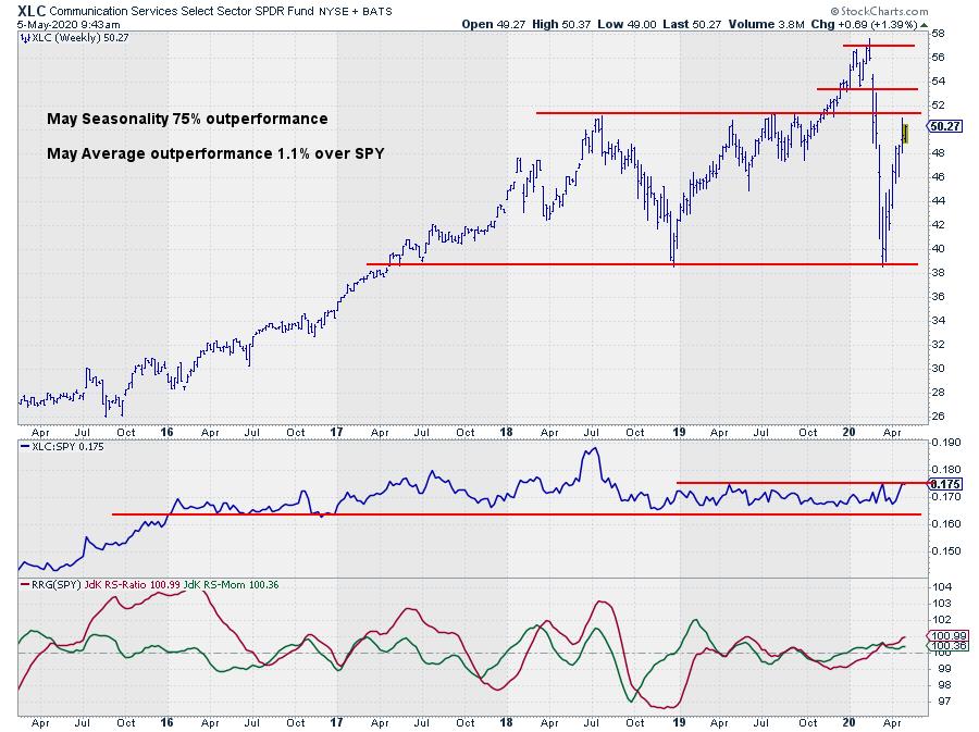
There is overhead resistance around $51.50 in price and, at the moment, the Relative Strength Line (middle pane) is about to break out of a 14-month trading range. Breaking out of that range in RS will certainly add fuel to the outperformance for the sector, while a break above resistance in price will definitely help strengthen RS even further.
Both RRG lines are above 100 and rising, suggesting that a breakout of the RS range is due shortly.
Financials
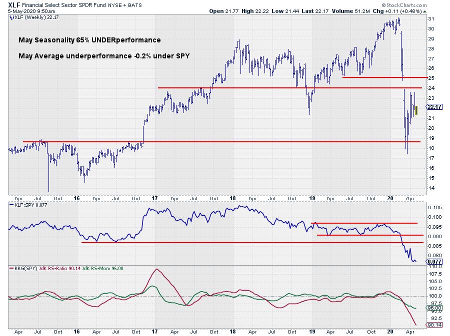
After the drop to support in the region around $18.50 XLF did not manage to close the gap, stalling twice just below horizontal resistance at $24. The RS-Line started accelerating lower when it began breaking horizontal support levels; there is no sign for any imminent recovery.
The outlook for XLF is and remains weak for the coming period. This thought is reinforced by an expected weak seasonal pattern.
#StaySafe,
Julius
If you would like to receive a copy of the spreadsheet to visualize seasonality in 3D, just send me a message and I'll be happy to mail you a copy.
Julius de Kempenaer
Senior Technical Analyst, StockCharts.com
Creator, Relative Rotation Graphs
Founder, RRG Research
Host of: Sector Spotlight
Please find my handles for social media channels under the Bio below.
Feedback, comments or questions are welcome at Juliusdk@stockcharts.com. I cannot promise to respond to each and every message, but I will certainly read them and, where reasonably possible, use the feedback and comments or answer questions.
To discuss RRG with me on S.C.A.N., tag me using the handle Julius_RRG.
RRG, Relative Rotation Graphs, JdK RS-Ratio, and JdK RS-Momentum are registered trademarks of RRG Research.


