
There is a lot of talk lately regarding the Growth to Value rotation that seems to be going on. And if you look at the surface, that is certainly true, but there is more to it than meets the eye...
The Relative Rotation Graph below visualizes this rotation and shows that the process already started back in May.
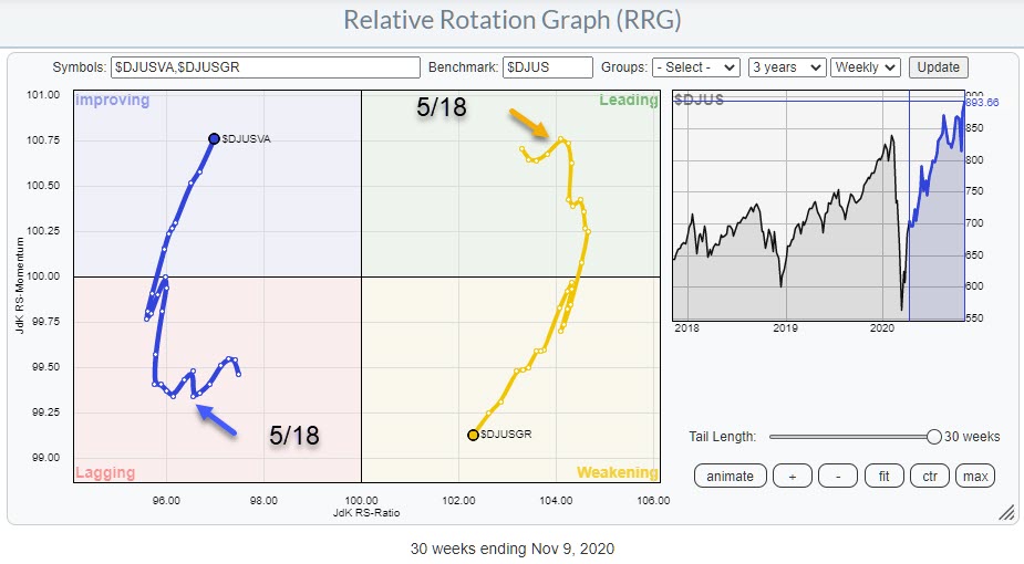
The 30-week tail shows the shift from Growth to value starting in the second half of May. Initially, it was "just" a loss of relative momentum (JdK RS-Momentum) as the tail moved vertically lower, but, over the last 10 weeks, Growth also started to lose on the JdK RS-Ratio axis while Value (obviously) picked up.
This rotation now seems to be accelerating in favor of Value, with Growth pointing towards the lagging quadrant and Value to leading. Given their positions inside weakening and improving, still solidly away from the 100-level, the possibility for a rotation back to leading (for Growth) and back to lagging (for Value) without hitting the opposite side of the RRG remains, but the odds are getting smaller. This is especially apparent when you look at both the individual charts for Growth ($DJUSGR) and Value ($DJUSVA).
Growth
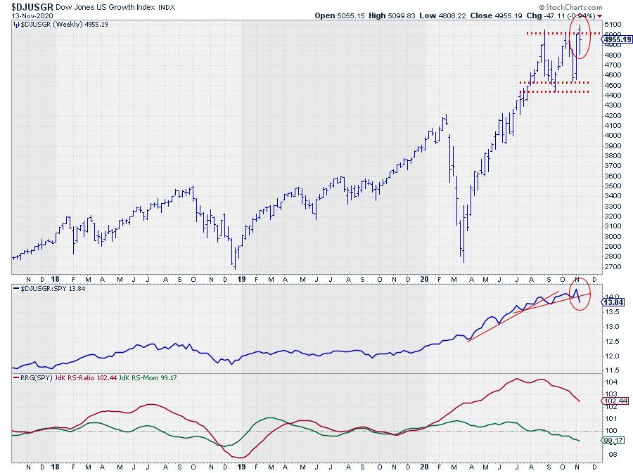
The DJ US Growth index failed at breaking above its two previous highs, which were lining up to offer resistance last week. At the same time, the relative strength line rolled over and broke below a st-rising support line for the second time in last few months. The RRG-Lines are responding, with JdK RS-Momentum already well below 100 and JdK RS-Ratio now clearly moving lower.
All in all, upside has just become a bit more difficult, while downside on the price chart is open towards the 4500 area.
Value
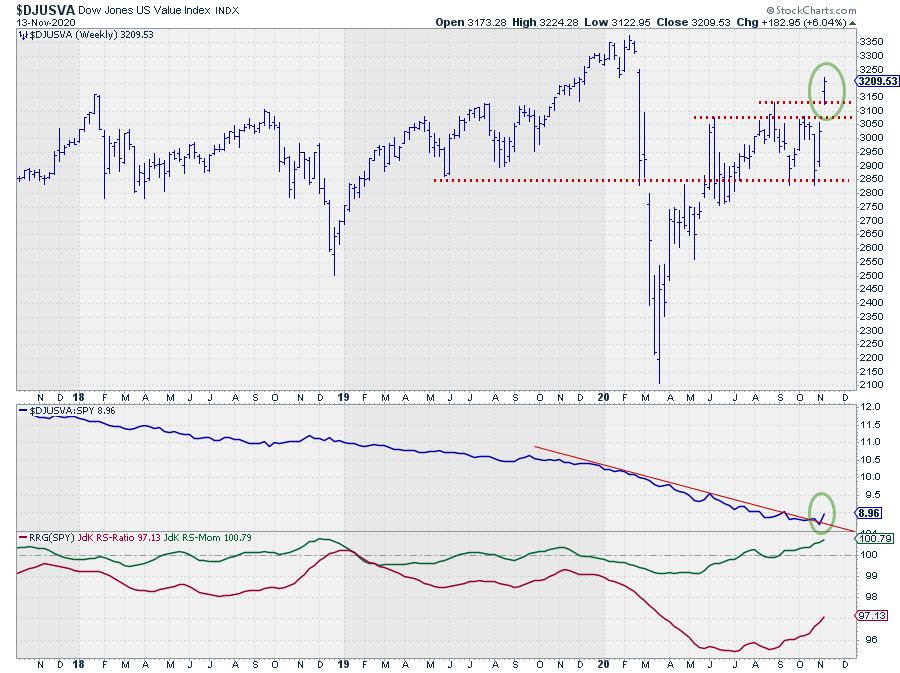
The DJ US Value index, on the other hand, managed to break away from its consolidation and hold well above the previous resistance area, which can now be expected to act as support. At the same time, the relative strength line seems to be breaking above a (year-old) falling resistance line.
Combining these two charts and the RRG showing the relative rotation for both indexes vs. the DJ US index, we can clearly see a preference for US Value stocks at the moment.
BUT is this the Complete Picture?
 If we would stop our analysis here, the call is pretty clear: Value over Growth. But it makes sense to dig a little deeper and see what is happening "under the hood" of this rotation.
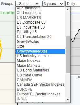
The chart that can help you getting more and better insight into the underlying rotations in these market segments is available under the drop-down selection on the RRG page. Under the header for "US Markets", there is a "Growth/Value" RRG universe. That is the RRG chart shown above. Then there is a "Size" RRG universe. This one shows the relationship between Large-, Mid- and Small-caps vs the DJ US index.
And then there is the universe "Growth/Value/Size". This RRG shows a combination of the previous two universes where Growth and Value segments are broken down by size or, if you wish, the size indexes are broken down by growth and value. This setup gives you a better and more detailed look at the rotations among the various segments.
Growth - Value - Size in ONE picture
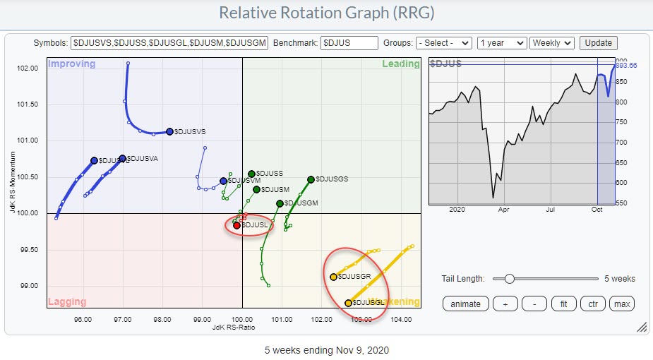
This RRG is showing an interesting rotational picture. There are 11 indexes plotted on this graph and only THREE are at a negative RRG-heading. These are DJ US growth, DJ US Growth Large and DJ US Large Cap, circled in the chart above. ALL other indexes are at a positive RRG-heading.
The simple takeaway from this chart is that it's only the Large-Cap-Growth stocks that are losing relative to the market. Pretty much all other segments are doing pretty well. As a matter of fact, the leading segments in the market now are Small-Cap-Growth and Mid-Cap-Growth.
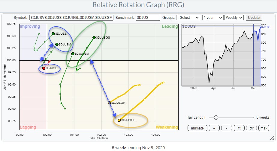
This can be seen in the RRG above, which is the same RRG as the first one showing all size and growth-value segments in one image, but now zoomed in and focused on the important rotations that are visible.
Two major rotations are showing up here. The first one is the rotation from Large-cap stocks into Mid- and Small-caps. This can be seen in the two blue-circled areas. Large caps are rotating into the lagging quadrant, while both small- and mid-caps just moved into the leading quadrant. That sends a clear message that large-cap stocks are now giving way to small- and mid-caps.
The second rotation is the rotation inside the Growth segment. The first RRG clearly showed money rotating out of growth into value. But when you zoom in on the Growth segment, it becomes visible that it is predominantly money flowing out of Large Cap Growth stocks (the orange oval) but INTO mid- and small-cap growth stocks.
As a matter of fact, both the tails on small-cap-growth and mid-cap-growth just completed a rotation from leading through weakening back into leading which, we know, is usually a strong sign.
Small-Cap Growth
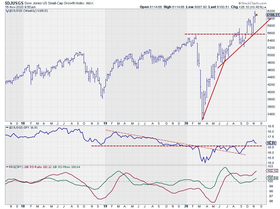
The chart for Small-Cap-Growth ($DJUSGS) shows a clear break above resistance at the beginning of October, with a test of support on the pull-back at the end of the month and a subsequent rally above the prior peak. That is all bullish behavior.
On the relative strength chart, the RS-Line broke falling resistance already in May, after which the ratio was caught below horizontal resistance until the end of September when that overhead barrier was taken out. As long as this level holds and the RRG-Lines can continue to trade higher above 100, Small-Cap-Growth stocks are expected to improve further and push deeper into the leading quadrant.
Thus, when you look a bit deeper under the hood, it is not so much a growth to value rotation but much more a "Large-Cap-Growth" to "Small- and Mid-Cap-Growth" rotation that is currently underway!
#StaySafe, --Julius
Julius de Kempenaer
Senior Technical Analyst, StockCharts.com
Creator, Relative Rotation Graphs
Founder, RRG Research
Host of: Sector Spotlight
Please find my handles for social media channels under the Bio below.
Feedback, comments or questions are welcome at Juliusdk@stockcharts.com. I cannot promise to respond to each and every message, but I will certainly read them and, where reasonably possible, use the feedback and comments or answer questions.
To discuss RRG with me on S.C.A.N., tag me using the handle Julius_RRG.
RRG, Relative Rotation Graphs, JdK RS-Ratio, and JdK RS-Momentum are registered trademarks of RRG Research.


