This article appeared in last weekend's ChartWatchers newsletter with the title "Sector Rotation Model Suggests Bull Market in Stocks Ongoing". As I feel that it is one of the more important/better articles showing how to use Relative Rotation Graphs in combination with other analysis techniques, I want to have it published in the RRG blog itself as well. This version has minor adjustments, the title aside, including links to the charts used that you can save for your own reference.
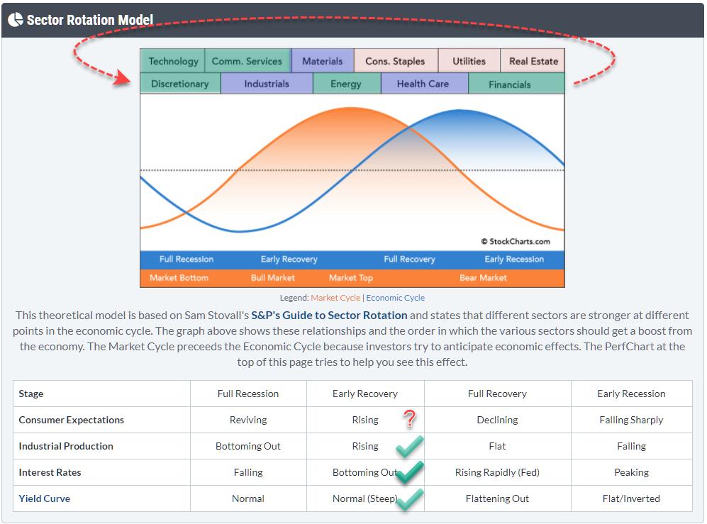
From time to time, I like to check the macro environment and try to see if I can find meaningful clues to draw conclusions from generally accepted theories/models. The Sector Rotation Model (From Sam Stovall's guide to sector rotation) is one of those models that I like to track.
The graph at the top shows the theoretical flow of expected outperformance as it flows through the sector landscape during various phases of the economic cycle. The table underneath it shows four important macroeconomic metrics that need to fit, or support, the flow of the market through the cycles. The idea is that markets follow this cyclical pattern and that, if you know where we currently are in the cycle, we can gauge what's lying ahead of us.
It would be waaaay too easy if markets would always rigorously follow that same pattern with all those metrics in sync. Obviously, that does not happen; there are too many moving variables in play. But what we can do is see how each of these metrics and variables behave and are positioned at this point in time, then work back towards an opinion on the expected behavior for the market.
Sectors
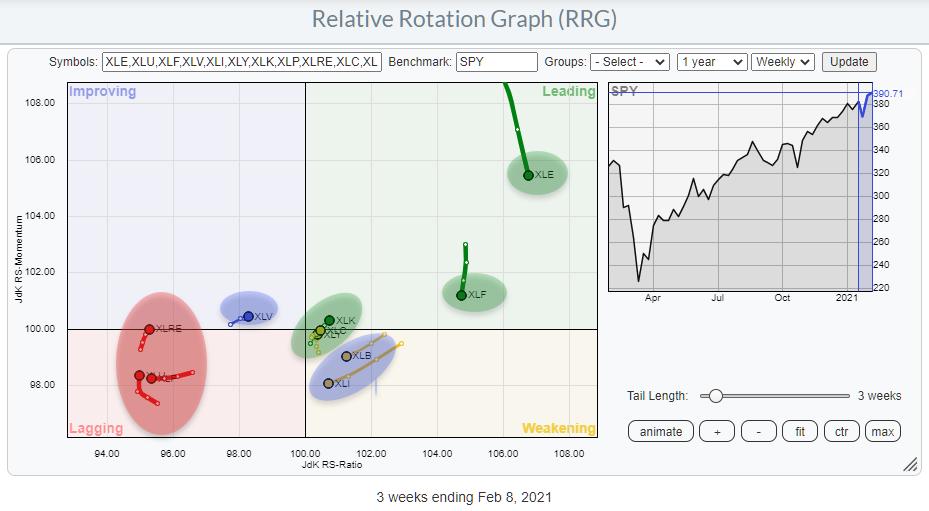
The Relative Rotation Graph above shows the current rotations for all eleven sectors. I have shaded them according to my view of what is bullish (green=outperform), neutral (blue=in line with market) or bearish (red=underperform). I have then copied these colored labels to the sectors at the top of the sector rotation model. And what we can see is that sectors are pretty nicely clustering together on that model chart.
Technology, Communication Services and Consumer Discretionary are all located at the left-hand side where the economy theoretically moves from "Full Recession" to "Early Recovery". But Financials also belongs to that cluster. As this is a cycle, the Financials sector can also be positioned just before Discretionary.
Of the green (outperforming) sectors, only Energy is out of whack, as it usually (out)performs later in the cycle.
The red (underperforming) sectors are also clustering towards the right side of the model. That supports the idea that the center of gravity based on the current sector rotation lies somewhere in the green-shaded area. I have, sort of, eye-balled that center of gravity based on the cluster of green sectors. It's a pretty rough guide anyway.
The blue sectors are not disturbing that rotational picture at all at the moment.
All in all, from a sector rotational perspective, we have a (rough) estimate of where we are in the economic cycle.
Checking the Other Boxes
The next thing we need to do is check how the other metrics (macro variables) are positioned and whether they support or negate the pointer that we got from the sector rotations.
Consumer Expectations
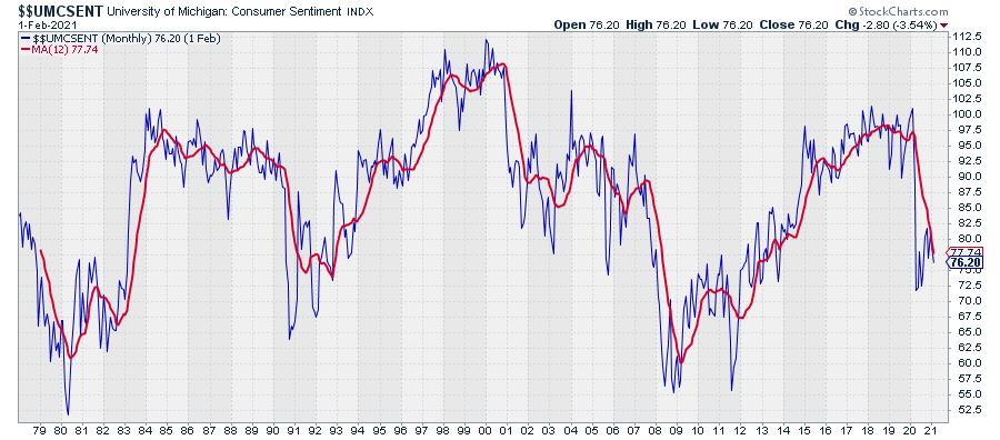
On StockCharts, we carry the University of Michigan Consumer Sentiment Index, which is shown in the chart above.
Reading from the table under the Sector Rotation Model (image at top), we can read that there are four possible states for this metric, each attached to a phase in the economic cycle: Reviving, Rising, Declining or Falling Sharply.
Falling Sharply is what happened at the start of 2020, but over the last months we see a rise. So the big question here is how to qualify that recent move...
Do we see the whole thing as declining? And is this recent rise only a hiccup in a longer decline? Or is it reviving after a decline, associated with a full recession? Or is it already just rising, associated with Early Recovery?
Conclusion: I find this one difficult to pinpoint, so I'm left with a question mark. You can't get all the answers to all the questions. (My wife disagrees, she knows everything ;) )
Industrial Production
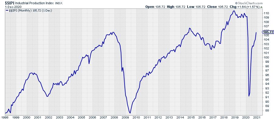
IF the economy is somewhere between Full Recession and bottoming out, then the Industrial Production should be rising. The chart above shows the IPI index and I think we can safely conclude that it is rising after falling sharply at the start of 2020.
Conclusion: Industrial Production fits the assumption that the economy is somewhere between Full Recession and Early Recovery.
Interest Rates
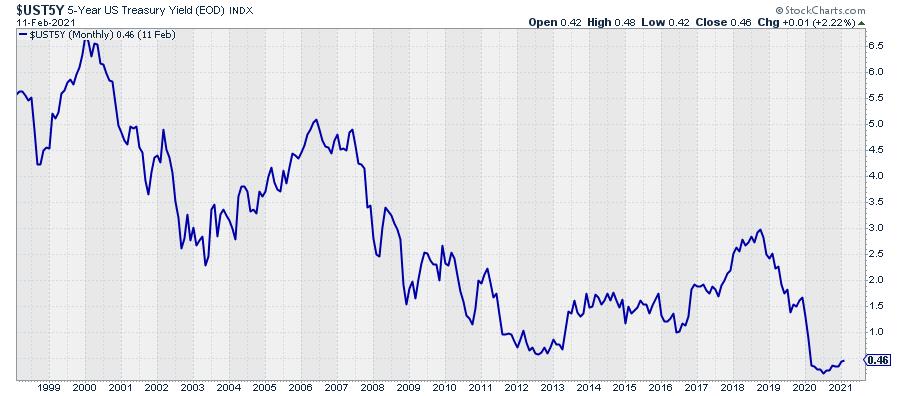
With regard to the direction of interest rates, it depends a bit on which part of the curve you are looking at. The longer-dated yields are definitely on the rise while shorter dated is flat(tish).
The chart above shows the 5-year Treasury yield as sort of middle-of-the-road metric. Bottoming out seems a fairly accurate description of what we see on that chart.
Conclusion: Interest Rates also fit the assumption that the economy is somewhere between Full Recession and Early Recovery.
Yield Curve
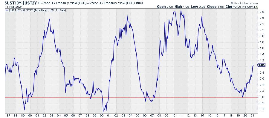
This one is easy. I have discussed it many times in Sector Spotlight and written articles.
The chart above shows the yield-curve, i.e. the difference between 10-year and 2-year yields. The number is positive, which means that the curve is normally shaped (10-year yields higher than 2-year yields) and it is steep(ening). So the yield curve is moving from normal (Full Recession) to normal-steep (Early Recovery).
Conclusion: The shape and the direction of the yield curve matches the assumption that the economy is somewhere between Full Recession and Early Recovery.
Overall Conclusion
Wrapping it all up, we can conclude that 4 out of the 5 elements of this model are ticking the box for the economy to be positioned somewhere between Full Recession and Early Recovery, which corresponds with a bull market in stocks. The only question mark is the direction of Consumer Expectations.
Four out of Five looks pretty solid to me and leads to the conclusion/expectation that the bull market in stocks is still underway, or maybe even has just begun (again).
Chart List
The charts in this article are linked to the live versions. I have also aggregated them in a public chart list that you can access to view these charts up to the current date.
#StaySafe, --Julius
Julius de Kempenaer
Senior Technical Analyst, StockCharts.com
Creator, Relative Rotation Graphs
Founder, RRG Research
Host of: Sector Spotlight
Please find my handles for social media channels under the Bio below.
Feedback, comments or questions are welcome at Juliusdk@stockcharts.com. I cannot promise to respond to each and every message, but I will certainly read them and, where reasonably possible, use the feedback and comments or answer questions.
To discuss RRG with me on S.C.A.N., tag me using the handle Julius_RRG.
RRG, Relative Rotation Graphs, JdK RS-Ratio, and JdK RS-Momentum are registered trademarks of RRG Research.


