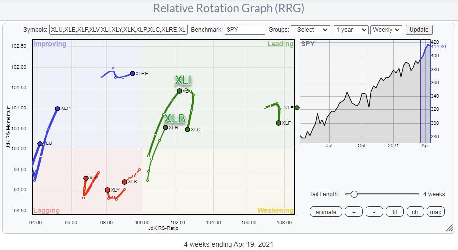
Currently, two sectors stand out on the Relative Rotation Graph for sectors -- Industrials and Materials. Both tails are pushing further into the leading quadrant after a rotation through weakening and back into leading. Such a rotation usually signals a new up-leg in an already established rising relative trend. If we look at their individual price charts in combination with relative strength vs. SPY, we see quite similar images.
Materials
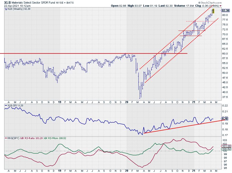
The Materials sector, XLB, is nicely trending upward between the boundaries of a rising channel on the price chart, with ample room to move up and down without leaving the channel. Relative Strength vs. SPY turned upward after a prolonged move lower in Q1-2020 and, since then, has followed a gradually rising trend, putting in higher lows against a slightly up-sloping support line.
Since a high (relative) in December, the JdK RS-Ratio line moved lower, reflecting the more or less sideways move in relative strength. Two weeks ago, relative momentum started to pick up again and managed to keep the RS-Ratio Line from dropping below 100.
With both RRG-Lines now back above 100, the sector is now rotating further into leading again.
Industrials
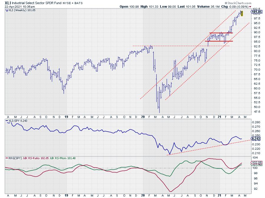
The Industrials sector, XLI, is on a similar path as Materials; a nice regular up-trending channel on the price chart and a series of higher lows in relative strength, with a recent rotation of both RRG-Lines moving back above 100 and pushing the XLI tail further into the leading quadrant.
What about Industries?
The Industrials sector is especially big in terms of the number of stocks. Within the S&P 500, 74 stocks are classified as Industrial, and the sector can be broken down further into industries.
If you load the members of the Industrials sector from the drop-down selection on the RRG page, it will load the top-50 Industrial stocks in terms of Market Capitalization.

In the table below the RRG, you will see the stocks' names on the plot and the sector, in this case Industrials, AND you will find the Industry column next to the sector column. This is a further breakdown of the Industrials sector into Industries.
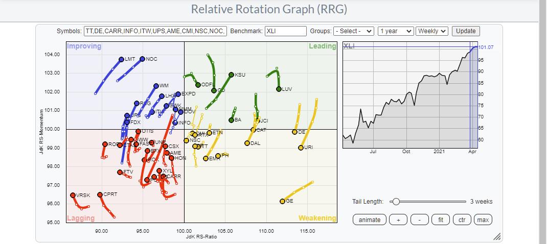
To get a better handle of the rotation of these industries vs. the sector, we can open an RRG that shows all these industry indexes on a Relative Rotation Graph. The easiest way to do that is from the Sector Summary Page.
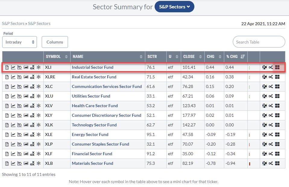
On the Sector Summary Page, you will see a line with data and various icons per sector. The last icon on the line for each sector is the RRG icon. Clicking that icon will open up a Relative Rotation Graph that holds the industry indexes that make up that sector.
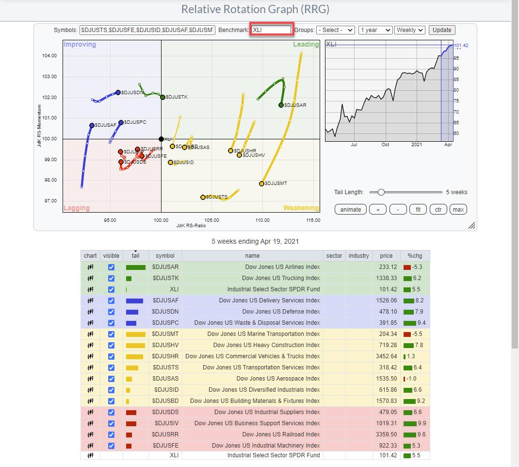
By default, it will open up the group of industry indexes, with $SPX as the benchmark. As these industry indexes are all in the Industrials sector, I prefer to switch to XLI as the benchmark, as shown in the image above.
Looking at the group of indexes, the rotations for $DJUSPC, $DJUSAF, and $DJUSDN seem promising -- particularly the first two, Delivery Services and Waste and Disposal Services, as their tails are nicely picking up relative momentum and are about to start picking up relative strength as well.
Breadth Check
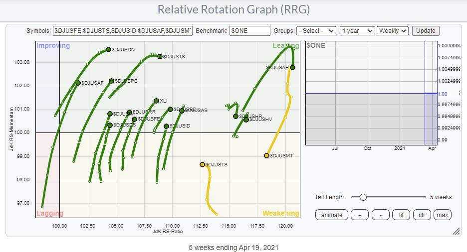
When I hosted The Final Bar on 4/8 during David Keller's holiday, I talked about using RRG as a tool to measure/visualize breadth. One way to do that is to set the benchmark to $one, as I have done in the picture above. As you can see, ALL indexes are positioned to the right (positive) and the big majority is traveling at a positive RRG-Heading. So this image confirms the positive undertone for the Industrials sector.
Waste and Disposal Services Index
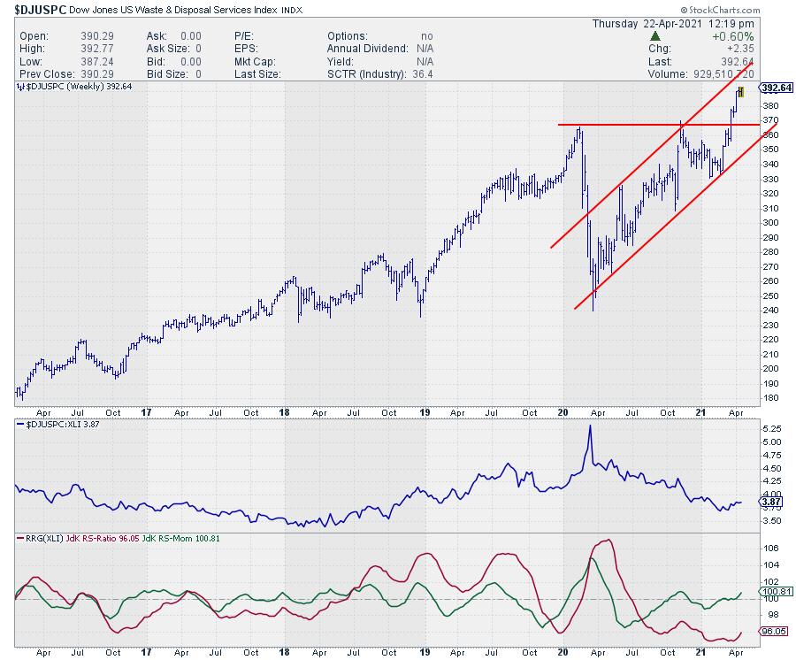
Opening up the chart for the DJ Waste & Disposable Services Index reveals the image above.
First of all, the period from early 2020 onwards is a perfect example of how relative strength can show a (strong) downtrend while the price is moving higher within the boundaries of a rising trend channel. The RRG-Lines and the resulting rotation on the RRG show very early signs of a potential reversal in the making. The pick-up of relative strength and momentum on the RRG is an early positive.
We should see a turnaround of the relative strength line for this improvement to continue in the coming weeks. The break higher on the price chart. with solid support now found around the breakout level near 370 (which is still well within the boundaries of the rising channel) will be helpful and support the improvement for this industry to continue.
In a future article, I will dive a little deeper again and show you how you can find and plot the members of these industries on a Relative Rotation Graph.
--Julius
Julius de Kempenaer
Senior Technical Analyst, StockCharts.com
Creator, Relative Rotation Graphs
Founder, RRG Research
Host of: Sector Spotlight
Please find my handles for social media channels under the Bio below.
Feedback, comments or questions are welcome at Juliusdk@stockcharts.com. I cannot promise to respond to each and every message, but I will certainly read them and, where reasonably possible, use the feedback and comments or answer questions.
To discuss RRG with me on S.C.A.N., tag me using the handle Julius_RRG.
RRG, Relative Rotation Graphs, JdK RS-Ratio, and JdK RS-Momentum are registered trademarks of RRG Research.


