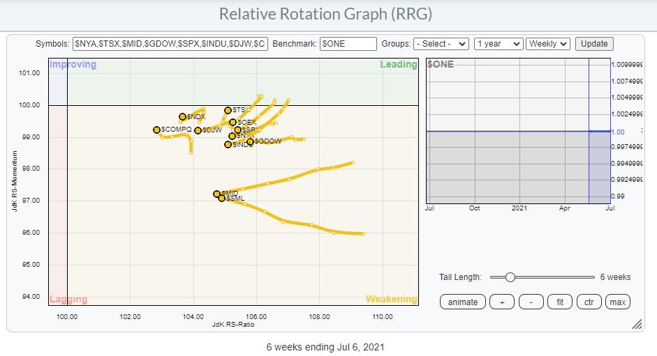
The RRG above shows the ABSOLUTE rotations for a selection of major indexes. Instead of plotting them against a global or otherwise encompassing index, I have plotted them against $ONE to get a handle on their underlying absolute trends. What is noticeable is that they are all inside the weakening quadrant and that the majority is traveling at a negative RRG-Heading. The message here is that the uptrends in the majority of these indexes are slowing down and all of them are losing momentum. You could read this as a measure of breadth for major stock market indexes and, as such, it is sending a negative message.
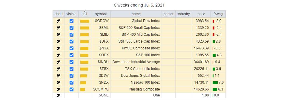
The indexes on the RRG are listed in the table below.
The only three indexes that are moving higher, and only mildly, on the RS-Momentum scale are the Nasdaq composite, the Nasdaq 100 and the Candian TSX. Only $NDX and $TSX are at a positive RRG-Heading.
The Canadian index is heavily tilted to Energy and Materials-/Commodity-related sectors, which are doing relatively well. And the $NDX, obviously, is driven by major technology stocks, which are going through a good streak at the moment.
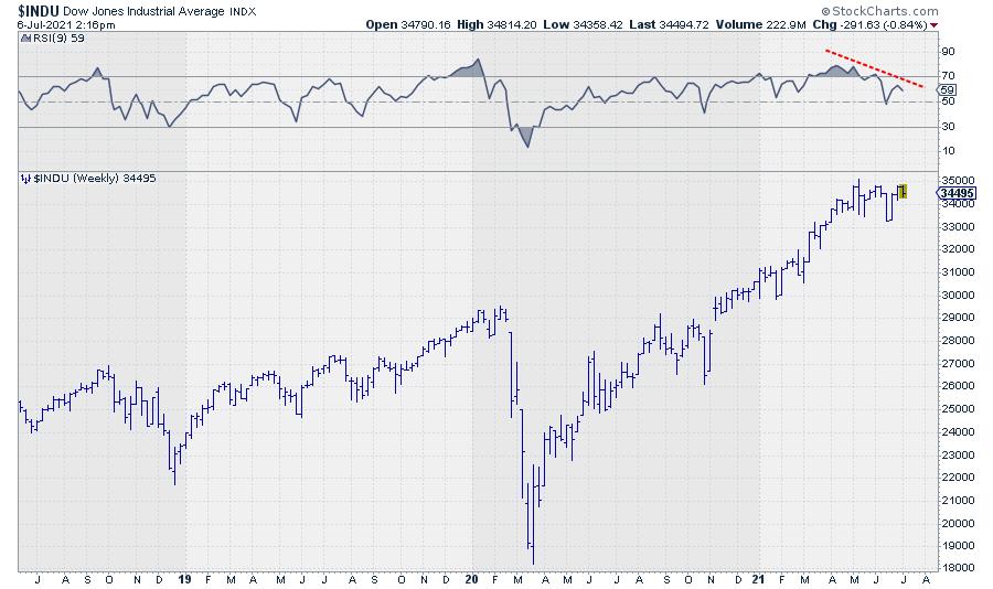
When not looking at relative strength or related forms of analytics, I like to keep things simple. Like many people, I like to use the RSI, especially to spot divergences, as they can be an early warning system for trend changes or at least a pause in the existing trend.
A lot of the indexes in this group are showing very pronounced negative divergences between price and RSI on the weekly charts. BTW, I use a 9-period RSI; I started doing that ages ago and stuck with it. I feel that it is a bit more responsive than the classic 14-day RSI and more easily reaches extreme values, which is what we need to spot divergences.
The most prominent one, IMHO, is spotted in the Dow Jones Industrials index.
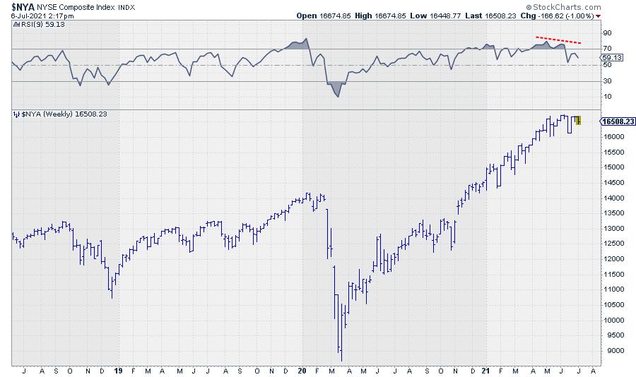
But it is also showing up in a broad index, like the NYSE Composite Index.
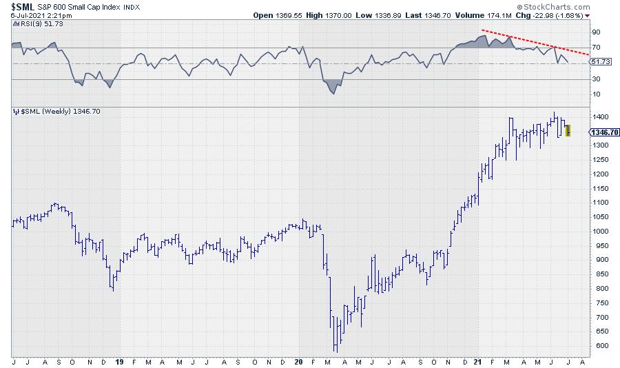
And very strongly in the Small Cap Index.
What About Sector Strength?
Running the Relative Rotation Graph for sectors against $ONE gives us the picture below.
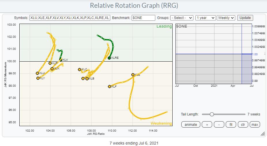
Here also, the dominant position and direction of travel is inside weakening and/or at a negative RRG-Heading.
The Energy sector is moving higher on the JdK RS-Momentum scale, but not on the RS-Ratio scale. Communication Services is marginally picking up in terms of momentum, but lacks trend strength, and the same goes for Technology.
What about Breadth?
One of the RRGs I like to consult in order to get a handle on breadth is the Relative Rotation Graph, which plots the bullish percent indexes for all sectors.
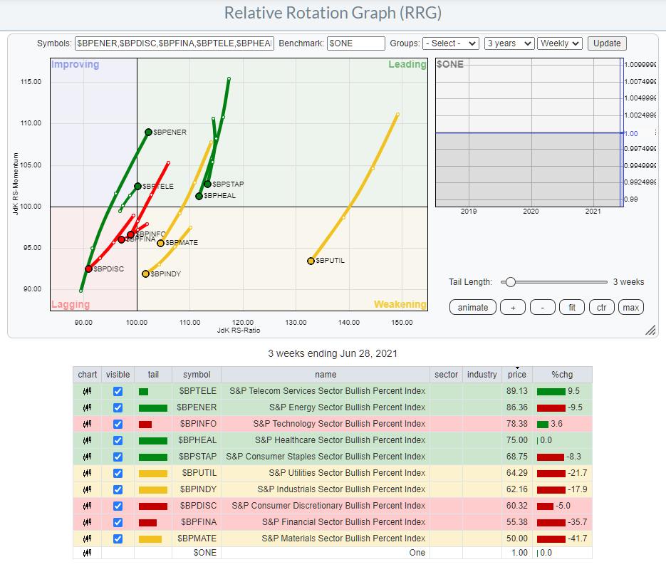
As a reminder, the bullish percent index shows the percentage of stocks in an index that are on a P&F buy signal. Here is the ChartSchool article.
On the RRG, all tails, except for Energy and Communication Services, are traveling at a negative heading. This means that the trend in the number of stocks on buy-signals has started to decline and the decline is picking up (negative) momentum. Only Energy and Communication Services are moving in the opposite direction.
The chart below shows the price of $SPX. The first chart below price is the BP index for $SPX itself. It is immediately visible that the BP for the entire S&P 500 is declining since April and is now below 70%.
The BP index charts for the sector indexes are plotted in descending order. Financials and Materials are not shown, but they are at even lower levels (55% and 50%).
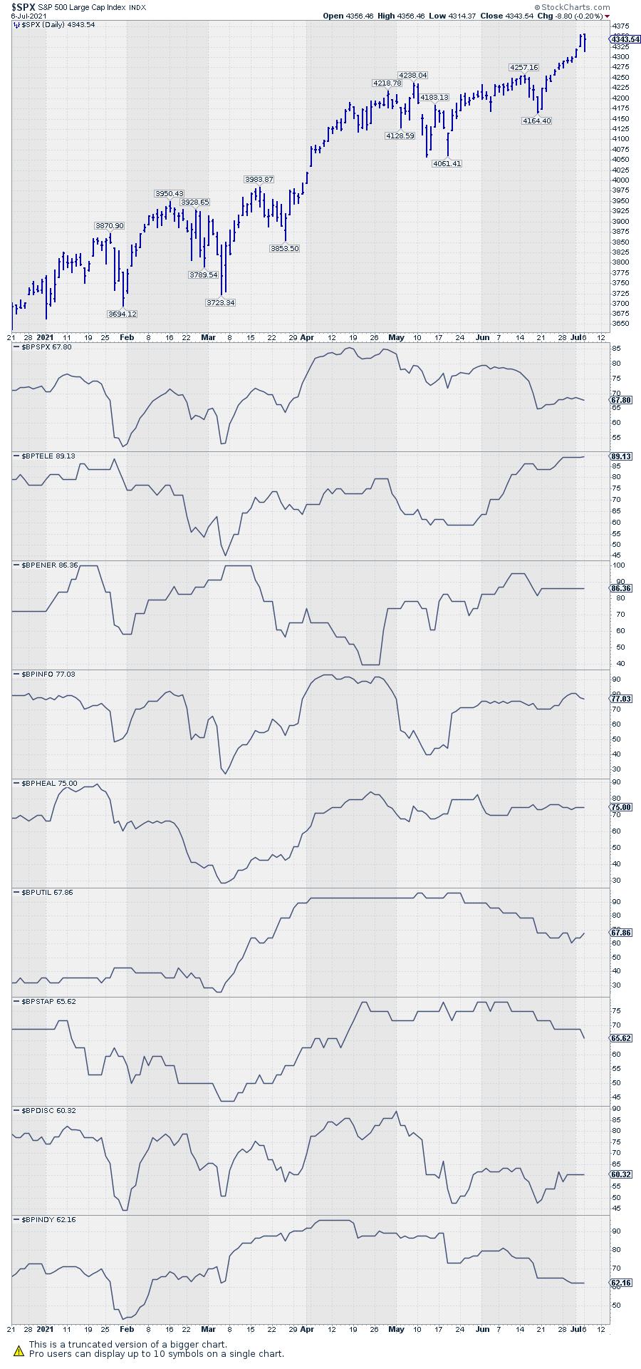
The general tendency is for the number of stocks on P&F buy signals to decline. I do see the breakouts in $SPX and $NDX but, based on all of this information, I have a hard time jumping on board right now. My interpretation is that stock markets are currently at elevated risk levels. As discussed in today's episode of Sector Spotlight, there is plenty of downside available for the S&P and the various sector indexes to decline/correct without damaging the long-term uptrends.
Please note that corrections can take place in price (decline) but also in time. That is to say, a market can digest the buying that resulted in a long and strong rally by a sharp decline, but it can also meander sideways to slightly lower over an extended period of time.
Either way, the upside potential seems limited for the time being.
#StaySafe, --Julius
Julius de Kempenaer
Senior Technical Analyst, StockCharts.com
Creator, Relative Rotation Graphs
Founder, RRG Research
Host of: Sector Spotlight
Please find my handles for social media channels under the Bio below.
Feedback, comments or questions are welcome at Juliusdk@stockcharts.com. I cannot promise to respond to each and every message, but I will certainly read them and, where reasonably possible, use the feedback and comments or answer questions.
To discuss RRG with me on S.C.A.N., tag me using the handle Julius_RRG.
RRG, Relative Rotation Graphs, JdK RS-Ratio, and JdK RS-Momentum are registered trademarks of RRG Research.


