I had planned to look at some lesser-known Relative Rotation Graphs in this week's episode of Sector Spotlight, but I used too much time on asset class and sector rotations to make that happen. So I am going to publish them here and give a brief description and interpretation.
Dow Composite
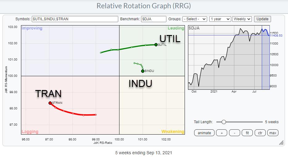
In the drop-down selection list, we have a lot more RRGs available than just the one showing the US sectors. Further down the list, below the breakdown of the sectors into individual stocks, you will find "US Markets", which holds the DJ Composite 65, DJ Industrials 30, DJ Transportation 20, DJ Utility 15.
The Composite 65 shows the three groups inside the DJ Composite: Industrials, Transport, and Utilities. Although it is a very simple RRG, it can give strong pointers.
In the RRG above, the Risk OFF rotation is very visible. Transports are already well inside lagging and Industrials are rolling over inside the leading quadrant, while Utilities are shooting off into the leading quadrant.
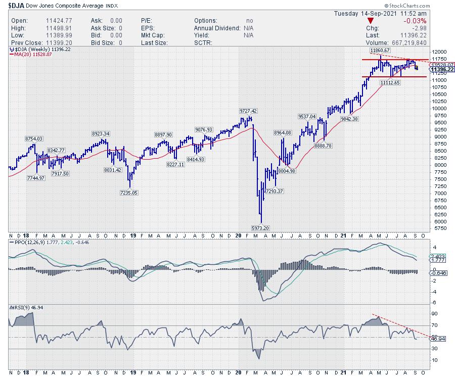
On the price chart, $DJA has just bounced off the former high of around 11,750. The support level to watch in the coming weeks, IMHO, is 11,130. If that gives way to the downside, a double-top pattern will be completed with an accompanying price target around 10,500, and possibly lower towards the former breakout level between 9,500-9,750.
The PPO and RSI indicators that are plotted below the price chart are clearly pointing lower and showing (semi-) negative divergence. The peaks on the price chart are not higher, which is what you'd ideally like to see in case of negative divergence, but at the same level while the indicators are pointing lower. They are definitely NOT confirming the highs and lows on the price chart.
Commodities
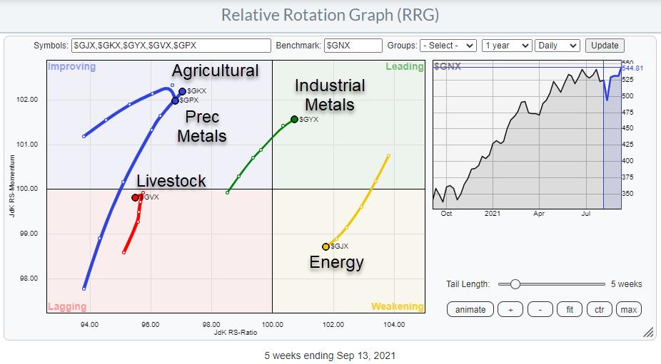
Another RRG we do not look at too often is the one showing the rotations for the Commodity sub-indexes against the S&P GSCI Commodity index.
There are five groups in this index. Industrial Metals just entered the leading quadrant at a strong RRG-heading while Energy ($GJX) rotated out of the leading quadrant into weakening over the last weeks and has now started heading towards the lagging quadrant. The rotation for Energy happened after a very strong rotation, pushing Energy prices higher since the end of last year. Given the strength of $GJX on the price chart, there is a good opportunity that this rotation represents a pause in the relative uptrend, and $GJX can curl back up before hitting the lagging quadrant.
Inside the lagging quadrant, we find the tail for Livestock which has just turned back down after moving higher on the JdK RS-Momentum scale. Measured on the JdK RS-Ratio scale, Livestocks is the weakest group in this universe.
Inside improving, Precious Metals is rolling over and starting to head lower on the RS-Momentum scale, moving back towards the lagging quadrant and picking up its relative downtrend again.
The long tail on the Agricultural sub-index shows a strong move relative to the S&P GSCI Commodity index, but is still low on the RS-Ratio scale. This means that there is still the possibility for the tail to roll over, as Precious Metals has already started doing. A quick look at the price chart for Agri reveals that a potential H&S top is in the making, which would certainly support a rollover inside improving and a renewed move back towards the lagging quadrant.
Livestock
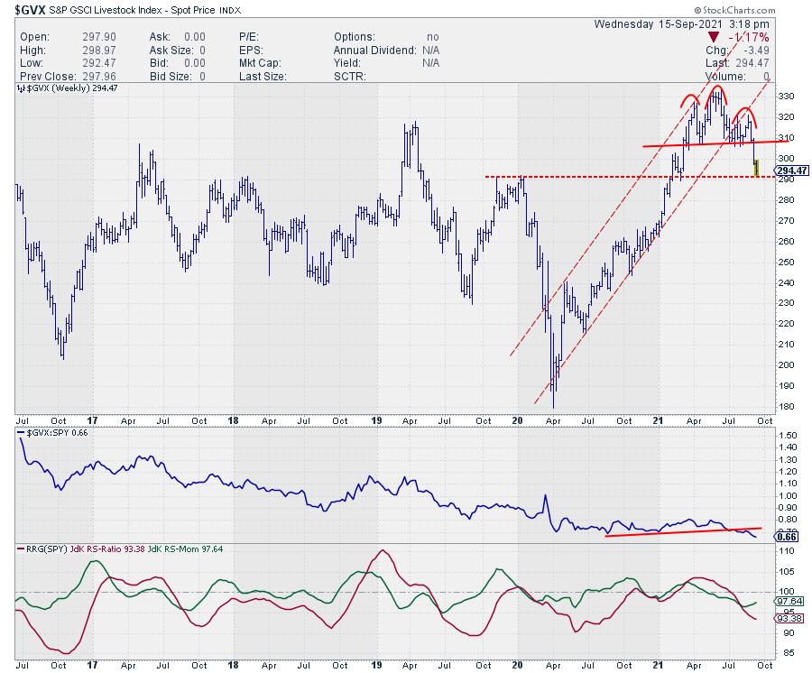
Livestock shows a completed H&S reversal, which rejected resistance in the 310-320 area (2017 and 2019 peaks). This chart leaves very little room for upside. There is some support around 290 now for Livestock, but, when that gives way, there is plenty of downside before any meaningful support will be met.
Industrial Metals
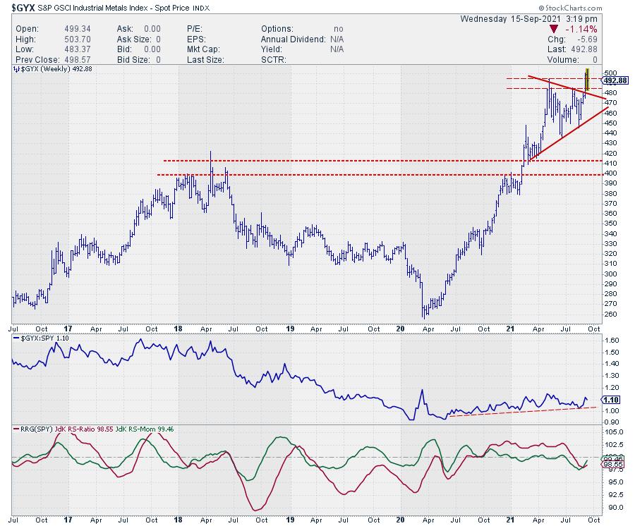
The tail on Industrial Metals has just broken out of a triangle-like consolidation. This consolidation formed after Industrial Metals broke above the 400-410 barrier at the start of the year, pushing the sub-index to its highest level in 10 years. However, the index is now pushing against a 10-15-year-old resistance level, as you can see in the monthly chart below.
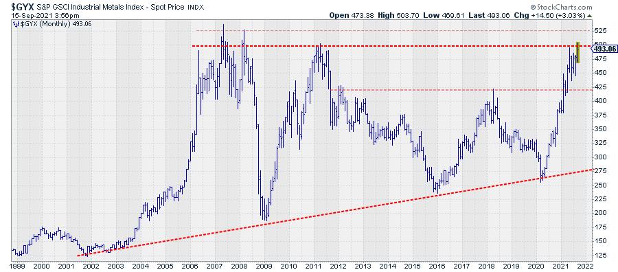
Note on the chart above how Industrial Metals are now entering the resistance zone that is offered by the peaks dating back to 2007-2008 and 2011. Breaking from the consolidation was the first positive sign. But the real deal will be a break beyond 500 and preferably 525. Such a break will very likely be the catalyst for a much further rise and relative outperformance for industrial metals.
#StaySafe, --Julius
Julius de Kempenaer
Senior Technical Analyst, StockCharts.com
Creator, Relative Rotation Graphs
Founder, RRG Research
Host of: Sector Spotlight
Please find my handles for social media channels under the Bio below.
Feedback, comments or questions are welcome at Juliusdk@stockcharts.com. I cannot promise to respond to each and every message, but I will certainly read them and, where reasonably possible, use the feedback and comments or answer questions.
To discuss RRG with me on S.C.A.N., tag me using the handle Julius_RRG.
RRG, Relative Rotation Graphs, JdK RS-Ratio, and JdK RS-Momentum are registered trademarks of RRG Research.


