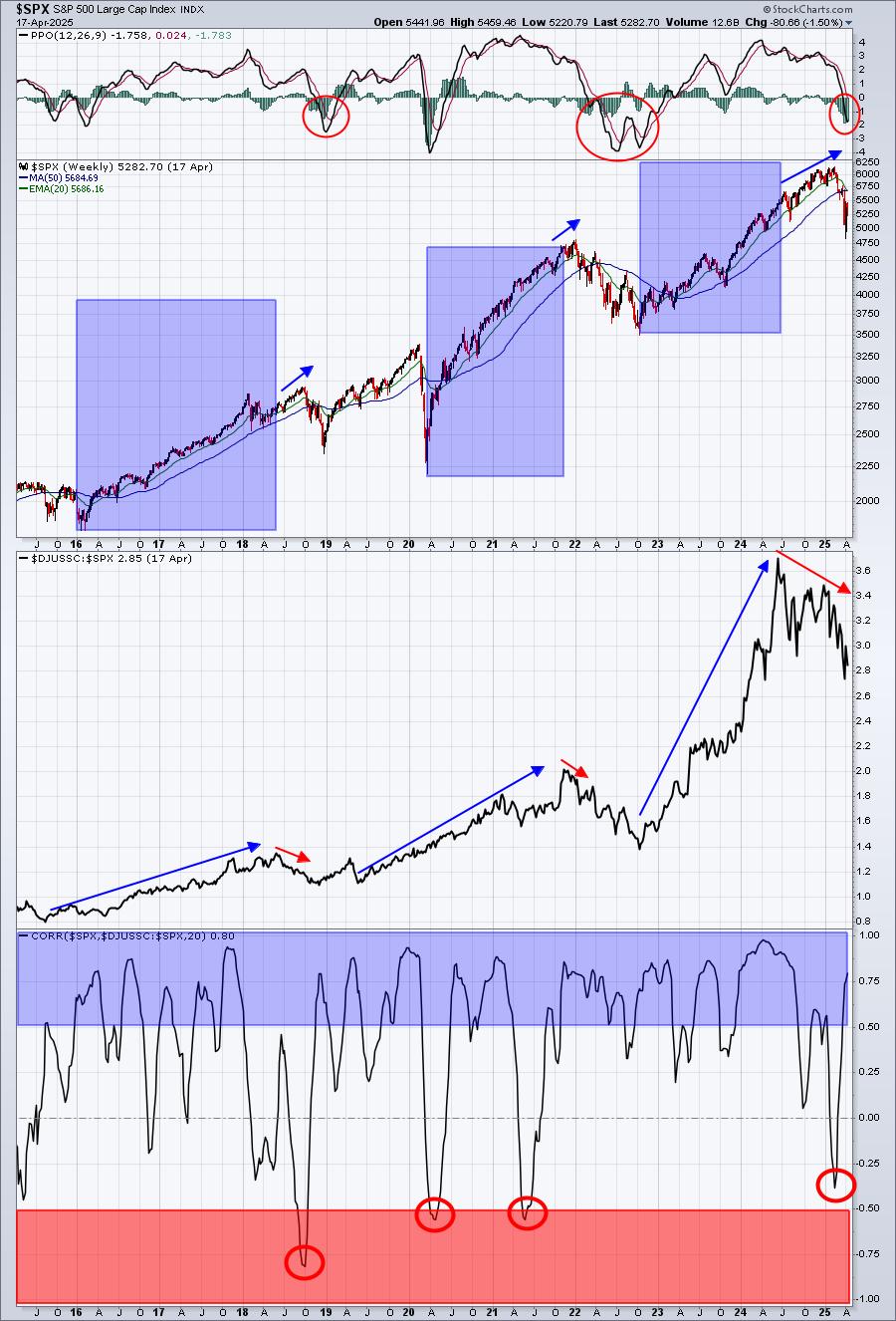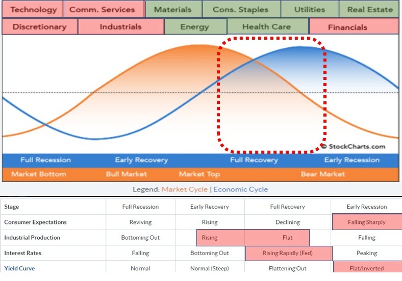
Every quarter, I try to do an update of the Sector Rotation Model. We have the framework as described by Sam Stovall here on the site. The image above shows my interpretation of the various factors that affect this model.
Across the top, you will find the eleven sectors. The orange sine-wave represents the (stock) market cycle, while the blue line represents "the economy" as they move through the various stages. Below the graph is a table that shows four macroeconomic metrics that influence the economy and the market and how they usually behave in each phase.
Sectors
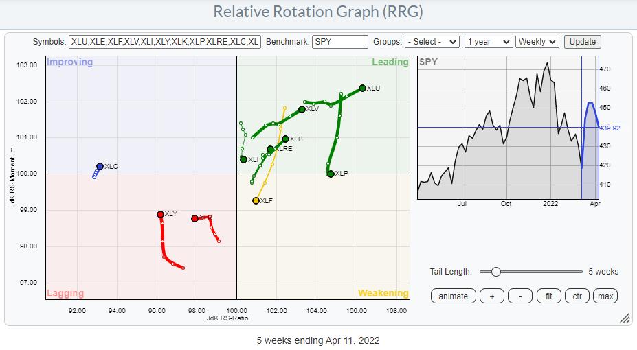
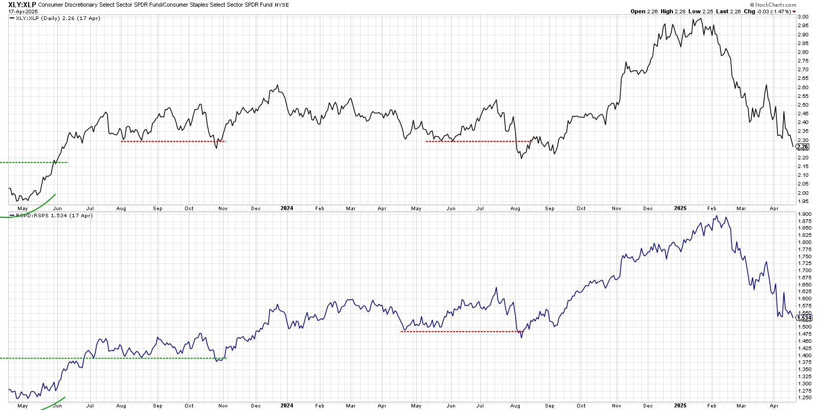
The sectors at the top of the framework indicate which sectors usually do well during which phase of the economy. I am taking the reverse approach. I am looking at which sectors are doing well at the moment and trying to detect in which phase we are from there. In order to do that, I have shaded the sectors across the top of the framework based on (my interpretation of) their current rotations. At the moment, the picture could not be more clear. Very often, the colors vary and are a bit mixed, but, at the moment, it is very clear how the red- and green-shaded sectors are aligned.
Defense rules!
Macro-Economic Factors
An important, often overlooked, part of the sector rotation model is the interpretation of the macro-economic factors that are used as gauges for the economy. I have a set of four charts in a public chartlist that I update from time to time and use to shade the areas below the framework.
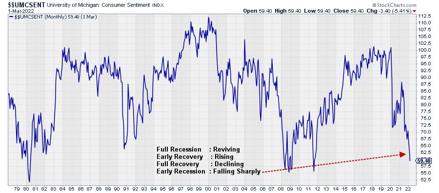
The first factor is "Consumer Expectations". Within the SC database, we have $$UMCSENT, the University of Michigan Sentiment Index, which I use as a gauge. In the text block on the chart, I have listed the four phases and the typical behavior of that indicator belonging to that phase. So here, IMHO, the index is falling sharply, which aligns with Early Recession in the framework.
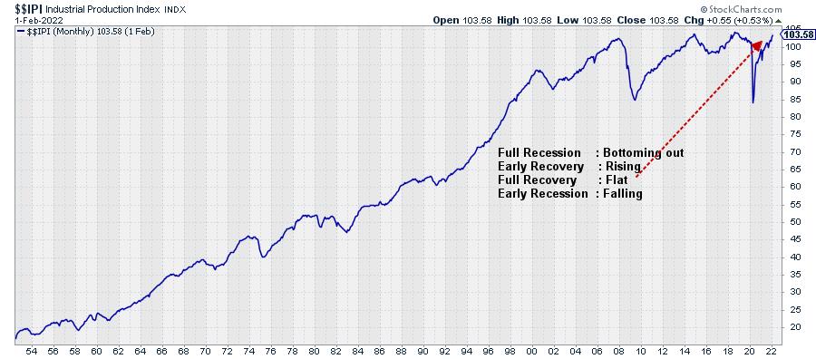
The second indicator is $$IPI, the Industrial Production Index. This index is still rising, but not as fast it used to be. So my judgement is that this aligns somewhere between Early Recovery and Full Recovery. It's definitely not falling, nor is it bottoming out.
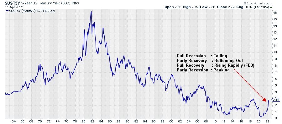
Interest rates are represented by the 5-year yield on government bonds (middle of the curve). I think this qualifies as rising rapidly, but it could well be close to peaking, as it is nearing a heavy overhead resistance level coming off the previous high. So this puts the movement in rates somewhere between Full Recovery and Early Recession.
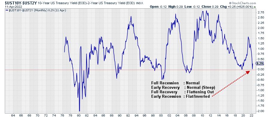
Finally, we have the yield curve, 10-year minus 2-year. This metric came down fast in the last few months and has almost reached zero. As you know, levels below zero mean that the yield curve is inverted. That has not happened yet, but, at 0.19 I feel comfortable labeling this as flat (and very close to an inversion). This aligns with the early recession phase.
The readings taken from these four charts are shaded in the table below the framework, as displayed at the top of this article.
Conclusion
Putting all this information together, the sectors that are outperforming at the moment, in combination with the readings from the four macro-economic factors, lead to the conclusion that the economy is moving from a full recovery more towards the early recession phase. At the same time, that means that the (stock) market is now beyond its top and in, or heading towards, a bear market.
There is no way to tell how long and deep that recession will be and how strong that bear market will be. But I believe there is enough reason to remain very cautious with regard to the broader stock market.
#StaySafe, --Julius
Julius de Kempenaer
Senior Technical Analyst, StockCharts.com
Creator, Relative Rotation Graphs
Founder, RRG Research
Host of: Sector Spotlight
Please find my handles for social media channels under the Bio below.
Feedback, comments or questions are welcome at Juliusdk@stockcharts.com. I cannot promise to respond to each and every message, but I will certainly read them and, where reasonably possible, use the feedback and comments or answer questions.
To discuss RRG with me on S.C.A.N., tag me using the handle Julius_RRG.
RRG, Relative Rotation Graphs, JdK RS-Ratio, and JdK RS-Momentum are registered trademarks of RRG Research.