In my previous article, as well as in Tuesday's Sector Spotlight show, I touched on using Relative Rotation Graphs for gauging market breadth, showing this combination chart.
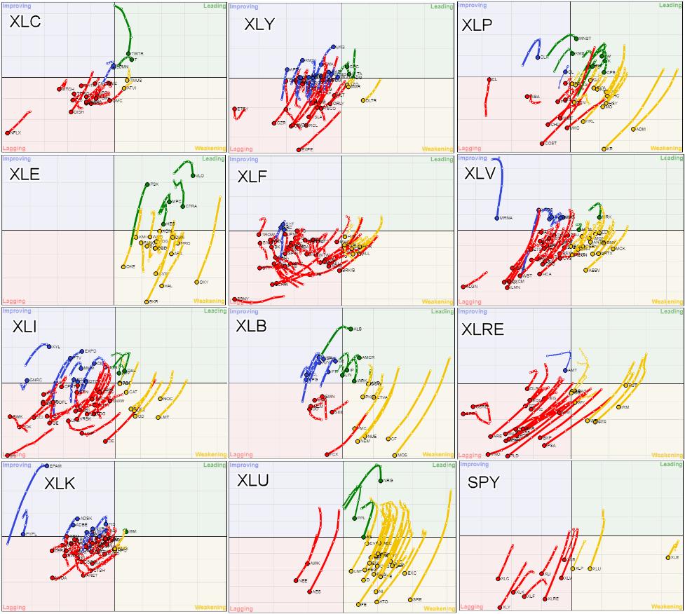
This image combines 12 Relative Rotation Graphs using $ONE as the benchmark, and it tells me, and I hope you as well, so much.
At the bottom right is the RRG for the sectors against $ONE. This chart in and of itself speaks volumes. Except for XLP, XLU and XLE, all tails are inside the lagging quadrant, meaning that these sectors are in downtrends based on price. Also, these downtrends are still getting stronger while they are dropping further on the JdK RS-Momentum scale.
The three sectors that are inside the weakening quadrant have been holding up so far, but they have started to lose momentum and are close to also rotating into the lagging quadrant. It is very obvious that, with such rotational trajectories for all sectors based on price, it will be very hard for the S&P 500 to start a new uptrend. I'm afraid that needs time, as the market will need a while to digest the current selling pressure.
Glancing over all these price-based RRGs will quickly make you realize how weak the current market environment is. There are a few tails that stand out from the bulk, but that is not even close enough to start thinking about a turnaround. Hence, the basic message remains to stay very cautious with long positions, or over-weighting stocks in your portfolio.
Information Technology
For this article, I want to zoom in and focus on the technology sector, starting with the Relative Rotation Graph of the industries inside the technology sector, visualized in the same way against $ONE.
This image clearly confirms what we already saw on the RRG for the individual stocks. The declines and the downtrends in the technology sector are broad-based, and they are still in full force. The only group that is moving higher, at least on the RS-Momentum scale, is Electrical Components and Equipment. But even that price chart is looking horrible.
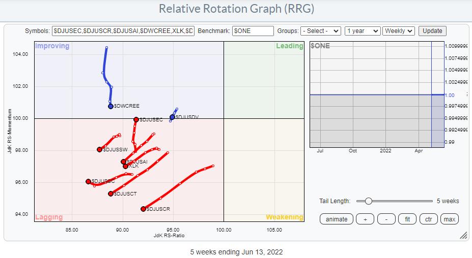
Running that same universe of groups in technology on a $ONE RRG on daily data underscores the general direction.
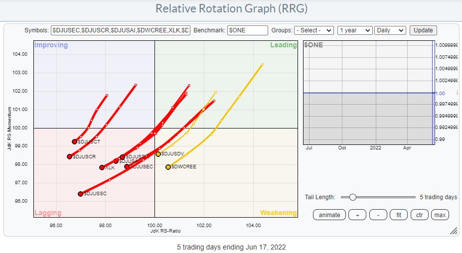
Not much to add here.
Tech Stocks Against $ONE
The RRG below is the blown-up version of the XLK chart in the grid above. It shows the individual stocks inside XLK against $ONE on a weekly basis. I have ticked off the tails for PYPL and EPAM, as they distort the image too much.
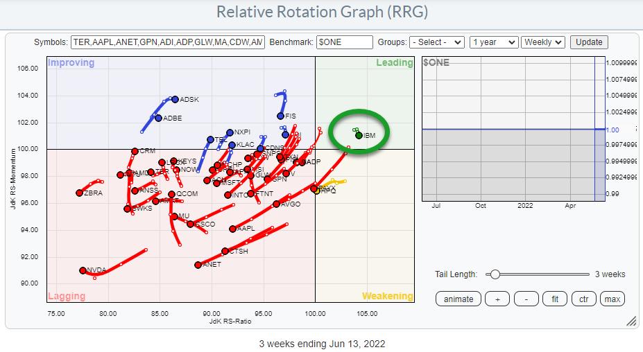
Again, in line with most other sectors, the majority of the stocks are inside the lagging quadrant, or at least on the left-hand side of the graph, and the dominant RRG-Heading is negative.
Except for one... IBM. IBM's tail is inside the leading quadrant and very short compared to the other tails on the plot. This means that:
- IBM is in an uptrend based on price (leading quadrant)
- That trend is very stable (short tail)
Reason enough to check out that chart.
IBM
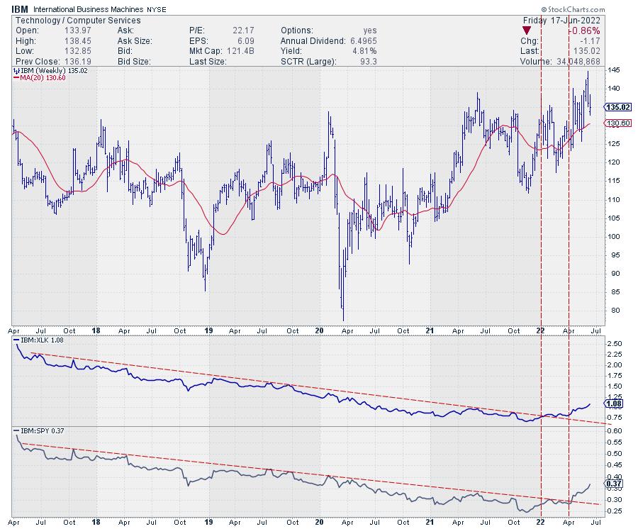
This is the chart for ticker IBM. In the first pane below the chart is relative strength against XLK, while, in the second pane, we have relative strength vs. SPY.
The turnaround in RS against the market is clearly visible. The long-term falling trendline in RS against XLK was broken at the start of this year, and the falling trendline in RS against SPY followed in April.
On the price chart, we are seeing a general tendency of higher highs and higher lows since early 2020 and a clear sequence of HHs and HLs since the start of this year. Given the declines in most stocks since the start of this year, that makes IBM an outperformer.
Adjusted vs. Unadjusted
However, there is one thing that you need to keep in mind with stocks like this. StockCharts.com's default setting is to display total return data, which means the chart gets adjusted for paid dividends.
For a high dividend-yielding stock like IBM (almost 5% at the current price), I prefer to label support and resistance on the unadjusted chart.
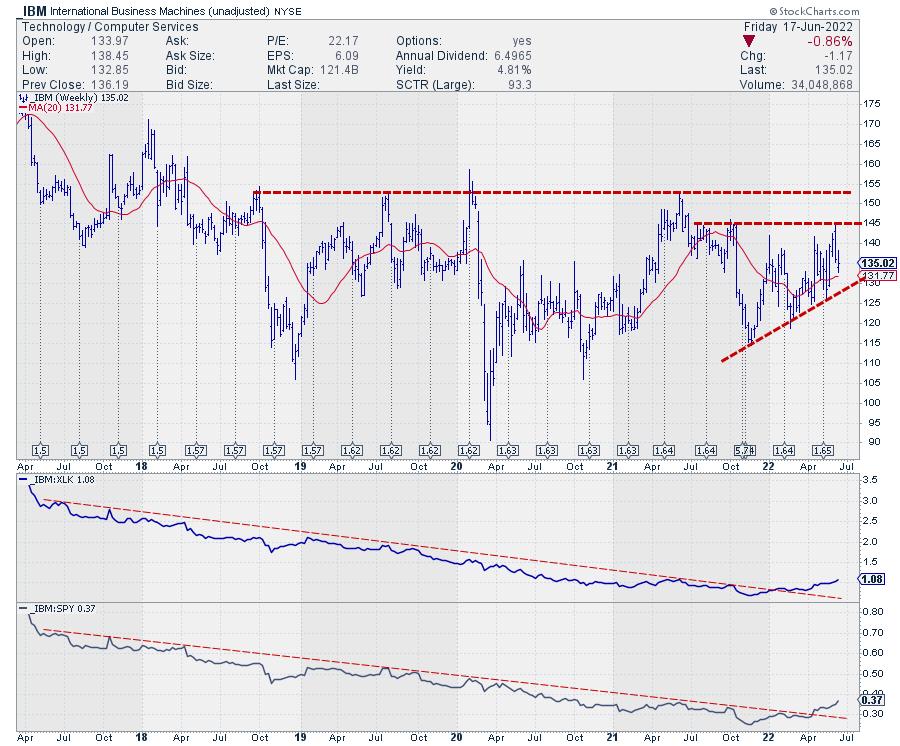
In this chart, you see the unadjusted price chart for IBM, including the dividends it has paid over the past years. The adjustments have therefore been quite big, and they change the chart significantly.
The series of higher lows is still very much visible and underscoring the current strength. Resistance is coming in around 145, followed by 152.50. In current conditions, this makes it a strong chart. IBM is well above its recent lows, above its 20-week moving average and pushing against resistance.
All in all, this makes good ole BIG BLUE an interesting stock within the technology sector.
Julius de Kempenaer
Senior Technical Analyst, StockCharts.com
Creator, Relative Rotation Graphs
Founder, RRG Research
Host of: Sector Spotlight
Please find my handles for social media channels under the Bio below.
Feedback, comments or questions are welcome at Juliusdk@stockcharts.com. I cannot promise to respond to each and every message, but I will certainly read them and, where reasonably possible, use the feedback and comments or answer questions.
To discuss RRG with me on S.C.A.N., tag me using the handle Julius_RRG.
RRG, Relative Rotation Graphs, JdK RS-Ratio, and JdK RS-Momentum are registered trademarks of RRG Research.


