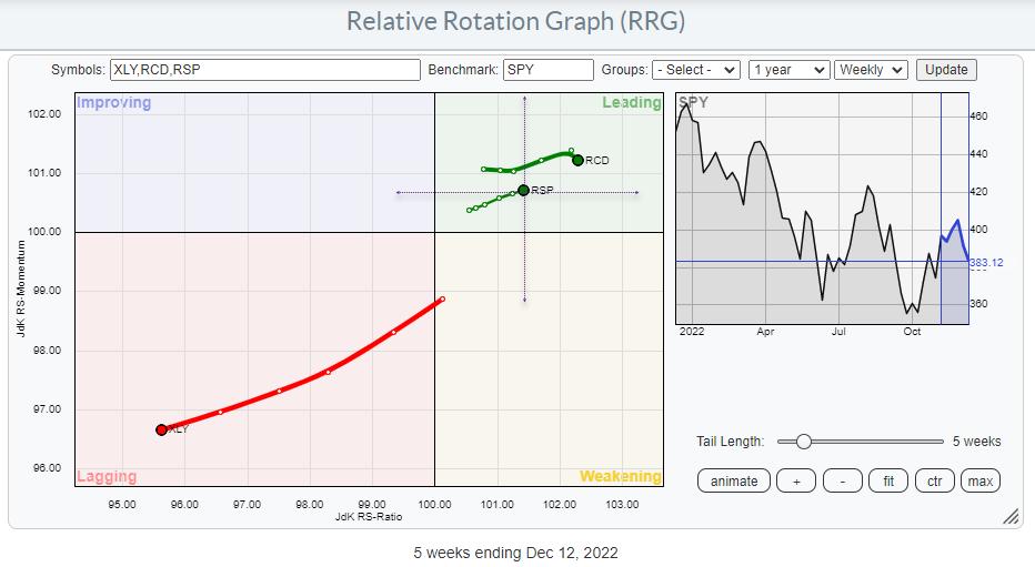
The Relative Rotation Graph above shows an intriguing picture.
Opposite Rotations
Last week in Sector Spotlight, I discussed the opposite rotations for XLY and its equal-weight counterpart RSP vs. their respective benchmarks (SPY and RSP). When you bring up the Relative Rotation Graphs for cap-weighted S&P sectors alongside the equal-weight version of that graph, you will note that most sectors are generally moving similarly on both charts. The big exception is the Consumer Discretionary sector, with XLY on the cap-weighted RRG rapidly moving deeper into the lagging quadrant, exhibiting an obvious relative downtrend vs. SPY. RCD, on the equal-weight RRG, is stable inside the leading quadrant vs. RSP.
The RRG above merges both versions of RRG. The center of the chart is SPY, so XLY is clearly moving into the lagging quadrant. RSP, the equal-weight S&P 500, is inside the leading quadrant vs. SPY. This is already an interesting observation, as it shows that the equal-weight S&P 500 is in a relative uptrend vs. the cap-weighted version.
The dotted crosshairs with RSP in the center represent the RRG for the cap-weighted universe. RCD shows up inside the leading quadrant vs. that benchmark as well. This means that the EW S&P 500 is in a relative uptrend vs. the cap-weighted S&P 500, but the EW Consumer Discretionary sector is also in the leading quadrant vs. RSP.
The difference in the rotation could not be more prominent.
Stock Rotation Inside the Sector
The explanation lies in the rotation of the individual stocks in that sector.
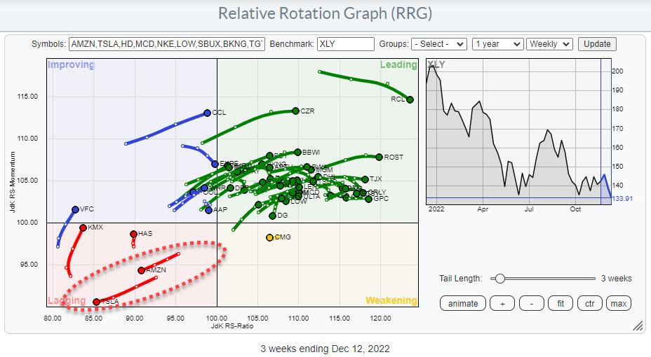
This RRG shows the rotation of the individual stocks in the sector against XLY as the benchmark. There is no question about which stocks are dragging this sector down in price and relative terms. AMZN (18.3%) and TSLA (13.5%) together comprise almost 1/3 of the Discretionary sector; the strong down moves in both stocks seriously impact the sector's performance, and even the S&P 500 (2.4% and 1.3%).
Moving to the Equal Weight Universe
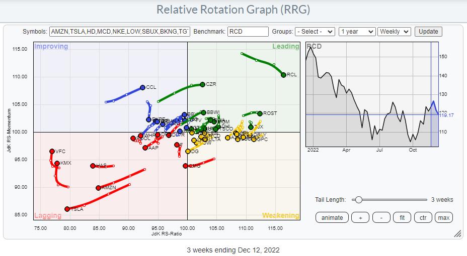
The RRG, which uses RCD (EW Consumer Discretionary sector index) as the benchmark, shows a significantly different rotational image. Still, AMZN and TSLA are deep inside the lagging quadrant and heading deeper into it. But the remaining stocks in the universe are much more evenly spread out over the RRG, providing a better picture of the underlying rotations for this sector.
Weakness Even in Price Trends
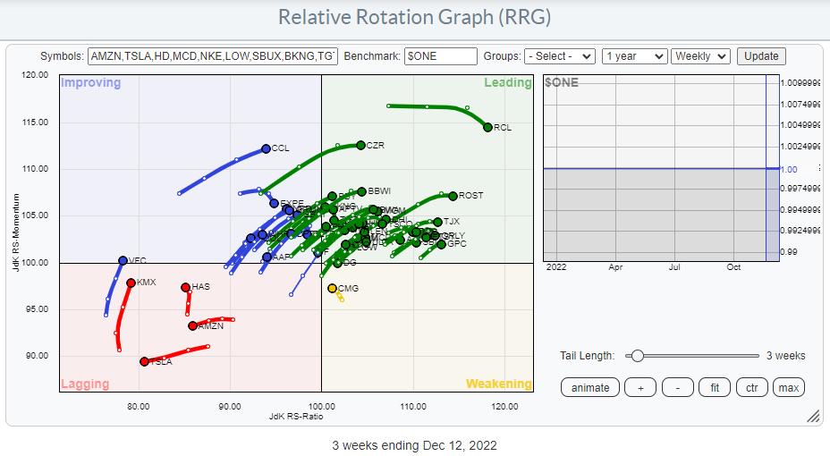
Finally, we can look at the sector breakdown against $ONE as the benchmark. And this shows that most of the stocks in this sector are showing a positive price trend. Only a handful are inside the lagging quadrant, and AMZN and TSLA are the only two still on a negative RRG-Heading.
Way To Play
The good news is that such evident discrepancies are offering investors great trading opportunities.
The base scenario here would be to create short exposure to AMZN and TSLA and long exposure to the remaining stocks in the sector to benefit from the spread in performance. When you can short stocks in your account, you could BUY XLY shares and calculate the effective number of shares of AMZN and TSLA in that XLY position and short those.
At the moment, XLY is trading at $ 134. In this price, 18.3% or $24.5 is AMZN and 13.5% or $18.1 is TSLA.
Therefore, when you BUY 100 XLY @ $134 = $13.400, you would need to short :
0.183 * $ 13.400 = $ 2.452 : $ 88 (current price AMZN) ~ 28 shares of AMZN
and
0.135 * $ 13.400 = $ 1.809 : $ 150 (current price TSLA) ~ 12 shares of TSLA
Another way to play this would be by using options. There are many different option combinations possible to create this type of exposure, but some basic approaches could be:
BUY CALLS XLY and BUY PUTS AMZN and TSLA
or
BUY CALLS XLY and SELL CALLS AMZN and TSLA
You can use the delta of the various legs in the option combinations to determine how many contracts you would need to buy or sell, and at which strikes and expirations, using the same exposure values as calculated using the direct shorting of stocks.
#StaySafe and have a great weekend, --Julius
Julius de Kempenaer
Senior Technical Analyst, StockCharts.com
Creator, Relative Rotation Graphs
Founder, RRG Research
Host of: Sector Spotlight
Please find my handles for social media channels under the Bio below.
Feedback, comments or questions are welcome at Juliusdk@stockcharts.com. I cannot promise to respond to each and every message, but I will certainly read them and, where reasonably possible, use the feedback and comments or answer questions.
To discuss RRG with me on S.C.A.N., tag me using the handle Julius_RRG.
RRG, Relative Rotation Graphs, JdK RS-Ratio, and JdK RS-Momentum are registered trademarks of RRG Research.


