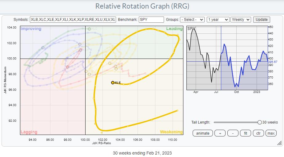
The Energy Sector Seems to be Coming Back to Life
On the Relative Rotation Graph (RRG), a long tail is visible starting in July 2022, traveling from weakening back up towards and into leading in October 2022. After another rotation through the leading quadrant, the tail for XLE crossed into weakening in January 2023. At the moment, the Energy Select Sector SPDR ETF (XLE) is still inside the weakening quadrant, but the loss of relative momentum (declining JdK RS-Momentum values) has stopped, and over the last two weeks RS-Momentum has carefully started to pick up.
Given the JdK RS-Ratio axis reading, this tail still has room to improve further and curl back towards the leading quadrant without hitting lagging. This will allow investors to embark on an(other) new up-leg within the already rising relative trend.
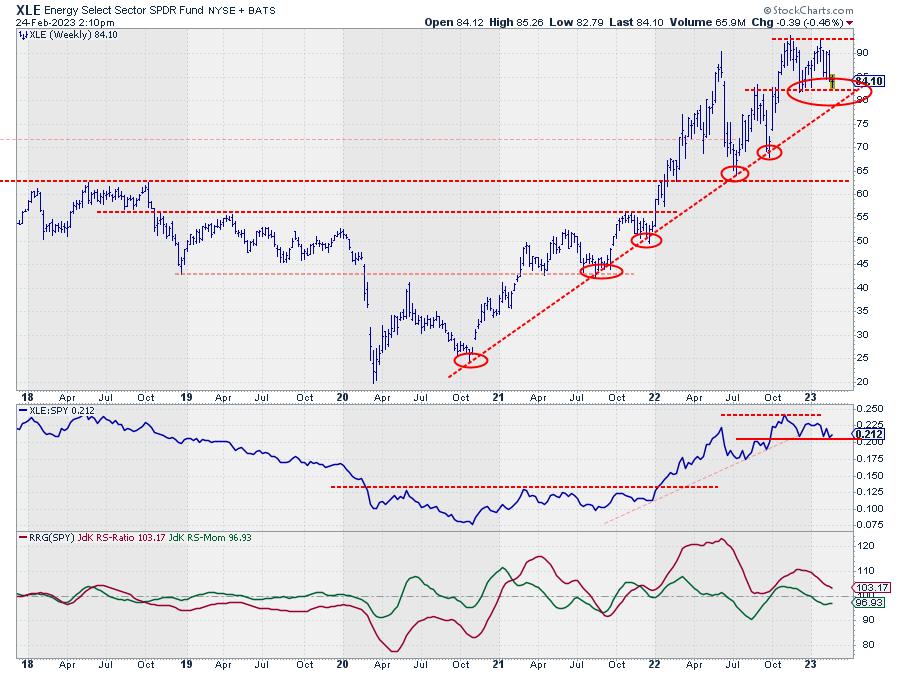
CHART 1: WEEKLY CHART OF XLE. The uptrend from 2021 is still on. Keep an eye on the support level between 80 and 82. Chart source: StockCharts.com. For illustrative purposes only.
Looking at the price chart for XLE, you can see that the uptrend that started in 2021 is still in play, with the major rising support line still intact. This trendline already has five touchpoints, making it a reliable and vital trendline. This is one to watch!
Since setting a high around 93 in November last year and testing that peak as resistance again at the end of January, the chart is at risk of a double top formation in the making. The low between these two recent peaks is near 82, while the major trendline is currently coming in around 80, but rising. This makes the area between 80–82 a very important double-support level, providing potentially low-risk entry opportunities.
The raw RS-line (second pane) has also moved sideways, close to the lower boundary of its range. The move from rising to flat relative strength has caused the RRG lines to level off, as we have seen on the RRG.
When both support levels/areas in price and relative strength can hold up, that will cause the tail to rotate back up further and push XLE into the leading quadrant.
Entry opportunities for XLE will occur in the range between 80-82, with initial stops just below the rising trendline.
Individual Stocks
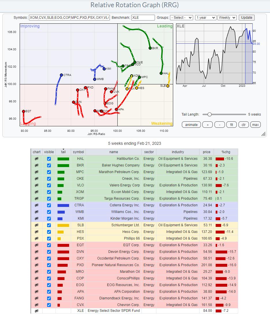
The RRG of the XLE constituents shows a relatively evenly spread-out universe with a slight tilt toward the lagging quadrant. This is because a few heavyweights in the sector, like Exxon Mobil (XOM) and Marathon Petroleum (MPC), are inside the leading quadrant and rotating at a strong heading. Only one other heavyweight, Chevron Corp. (CVX), is inside the lagging quadrant and at a negative RRG-Heading.
The RRG below highlights the most important tails.
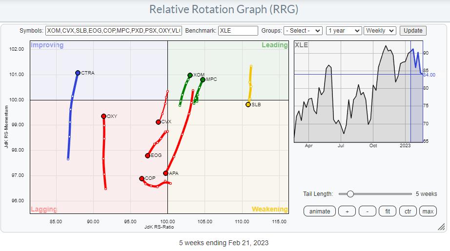
I am especially interested in XOM and MPC moving further into the leading quadrant and CVX, which has returned to lagging from improving.
Chevron Corp. (CVX)
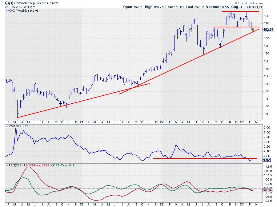
CHART 2: WEEKLY CHART OF CHEVRON CORP. (CVX) STOCK. A break below its recent low, fading upward momentum, relative strength falling below horizontal support, and lower RRG lines suggest CVX may be best to avoid for the moment. Chart source: StockCharts.com. For illustrative purposes only.
CVX has broken below its recent low, potentially completing a double-top formation (as described above for XLE). The last resort is now the support offered by the rising trendline. In any case, the recent upward momentum has faded, pulling the relative strength vs. XLE below horizontal support, pushing both RRG lines further down and into the lagging quadrant.
While XLE is holding up well so far, CVX is better to avoid.
Exxon Mobil (XOM)
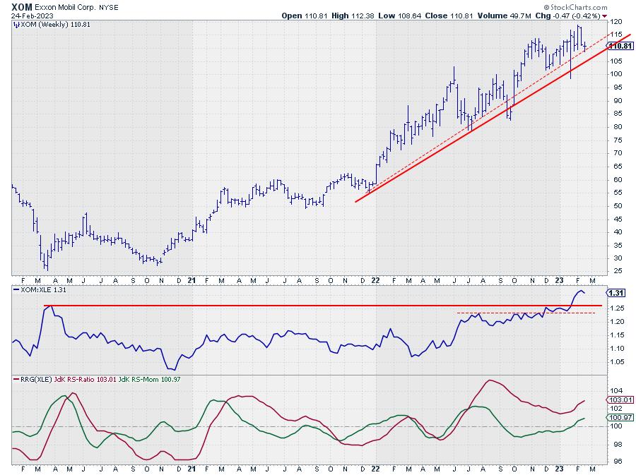
CHART 3: WEEKLY CHART OF EXXON MOBIL (XOM) STOCK. XOM is trending higher with higher highs and higher lows and is showing strong relative strength. The stock price also recently hit a new high of around $119. This makes XOM a strong stock in the energy sector. Chart source: StockCharts.com. For illustrative purposes only.
XOM is showing a different picture. Price is still trading in a rhythm of higher highs and higher lows, and recently pushed to a new high around 119.
The relative strength line vs. XLE also pushed to a new high, making XOM one of the stronger, if not the strongest, stocks in this sector. With a weight of 24%, this is a significant driver for the sector's performance as we advance.
Marathon Petroleum (MPC)
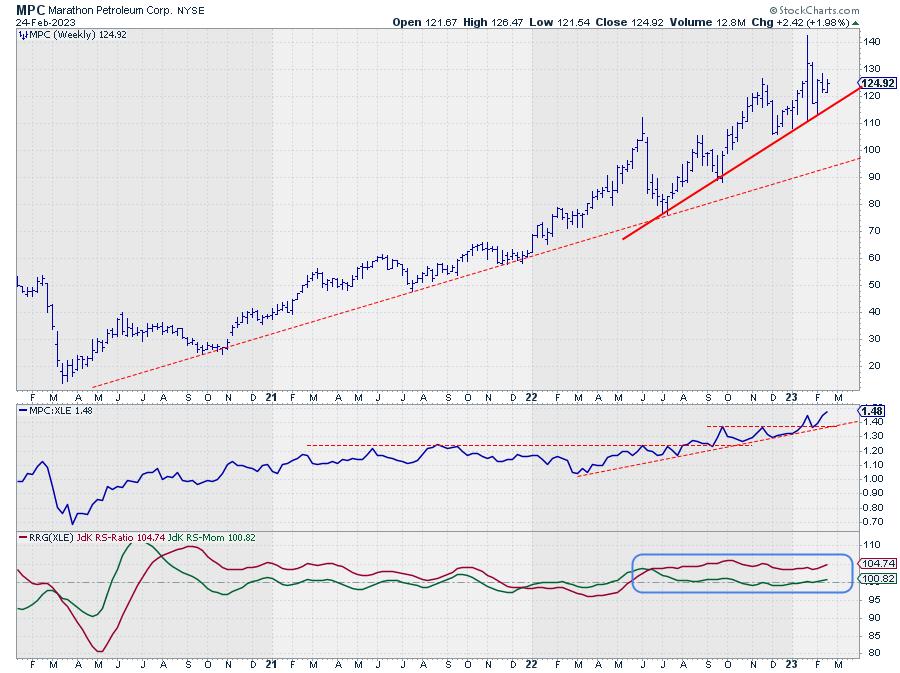
CHART 4: WEEKLY CHART OF MARATHON PETROLEUM (MPC) STOCK. MPC's stock price is in an uptrend, it recently reached a new all-time high, its relative strength is strong, and the RRG lines indicate the uptrend is stable. These factors make it a strong stock that has the potential to move higher. Chart source: StockCharts.com. For illustrative purposes only.
MPC is showing a similar picture as XOM. The uptrend is still fully intact, and price recently set a new all-time high. As they say: "This is not a characteristic of a weak stock." The accompanying relative strength line has also pushed to new highs, supporting more strength ahead for MPC.
The RRG lines show an excellent example of a stable relative trend. The JdK RS-Ratio line has moved well above the 100-level at a constant level, with an initial push higher in JdK RS-Momentum. This was needed to get RS-Ratio above 100. And then RS-Momentum leveled off and remained stable around 100, indicating a steady trend ever since.
Major Shift Underway
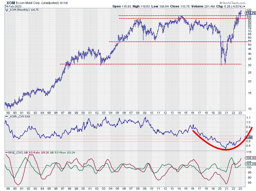
CHART 5: EXXON VS. CHEVRON. From 2009 to 2021 CVX was leading but that appears to be changing. From 2021, it looks like XOM is leading. Something to keep an eye out for if you're interested in investing or trading in the energy sector. Chart source: StockCharts.com. For illustrative purposes only.
XOM vs. CVX is the single one (pair) trade that jumps off the screen for this sector.
The chart above shows the monthly price chart of XOM, with RS- and RRG-lines against CVX. The strength and import breaks of overhead resistance in XOM are evident. But the turnaround in relative strength that is becoming more visible might be even more important. From the mid-1990s to 2003, XOM dominated the energy sector. From 2003–2009, XOM and CVX moved more or less in sync, and from 2009 to 2021, with a little hiccup in 2014–2016, CVX was the leading stock in the sector.
This relationship seems to be shifting back to XOM again. This process already started in 2021, but is now getting more and more traction.
As this is happening on a monthly time frame, this suggests that a major shift, favoring XOM over CVX, within the sector is underway.
#StayAlert, and have a great weekend, --Julius
Julius de Kempenaer
Senior Technical Analyst, StockCharts.com
Creator, Relative Rotation Graphs
Founder, RRG Research
Host of: Sector Spotlight
Please find my handles for social media channels under the Bio below.
Feedback, comments or questions are welcome at Juliusdk@stockcharts.com. I cannot promise to respond to each and every message, but I will certainly read them and, where reasonably possible, use the feedback and comments or answer questions.
To discuss RRG with me on S.C.A.N., tag me using the handle Julius_RRG.
RRG, Relative Rotation Graphs, JdK RS-Ratio, and JdK RS-Momentum are registered trademarks of RRG Research.


