I talk about it almost every week in Sector Spotlight, but I just realized that I have not written about it for quite a while.
The investment decision that has the most significant impact on your results...
Asset Allocation.
Many, especially retail investors, are so focused on the stock market and finding good stocks or sectors to invest in that they forget that other asset classes are out there. And that could be a costly mistake!
In the academic world, many studies have been written on this subject, probably kicked off by the work of Brinson, Hood, and Beebower in the '80s in their study "Determinants of Portfolio Performance". To quote;
BHB asserted that asset allocation is the primary determinant of a portfolio's return variability, with security selection and market timing (together, active management) playing minor roles. BHB's 1986 study examined the quarterly returns of 91 large U.S. pension funds over the 1974 to 1983 period, comparing the returns to those of a hypothetical fund holding the same average asset allocation in indexed investments. A linear time-series regression yielded an average R-squared of 93.6%, leading BHB to conclude that asset allocation explained 93.6% of the variation in a portfolio's quarterly returns.
Now be careful, as this 93.6% is the explanation of the variation in the portfolio's returns -- not the returns themselves.
Nevertheless, it is safe to assume that your asset allocation decisions have a significant impact. Asset allocation should be an integral part of your workflow; maybe not on a daily or even a weekly basis, but I suggest taking a look at least once a month.
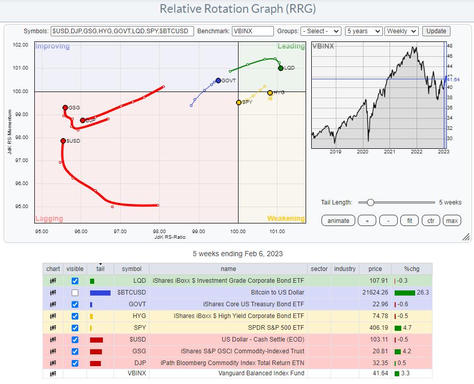
I have gotten used to a setup where I use a few ETFs to track the rotation of major asset classes. You can see that in the RRG at the top of this article. $BTCUSD is switched off as it is so far away from the benchmark that it distorts the image for the remaining asset classes.
The benchmark that I prefer to use is VBINX. That balanced index fund holds 60% in stocks and 40% in bonds, which is a typical balanced portfolio. Adding a few asset classes outside the benchmark allows an investor to find alternative investments that will enable them to "outperform" that benchmark.
The most important reason to think about and actively manage your asset allocation is to mitigate risks associated with the various investments, especially stocks. Even when you decide to stay at a high level with your investment and just buy SPY as a proxy for the stock market, your allocation to SPY will lose value when stocks go down.
Managing your asset allocation will help prevent big swings in your investment portfolio. Unless you are a high-rolling punter (pun intended), that is most likely what you are after.
Commodities and $USD Are Lagging.
Looking at the current state of Asset Class rotation, we find the tails for commodities inside the lagging quadrant, with GSG picking up relative momentum recently. The relative trend for this asset class remains down and is, therefore, less interesting for investments, as stocks and bonds (our VBINX benchmark) are doing much better now.
Also inside the lagging quadrant, we find the $USD. While it has started to pick up relative momentum over the last weeks, it is still at the lowest RS-Ratio reading in this universe. This tells me that, at least over the previous months, investment in foreign currencies would have done better than in USD, but the deterioration is getting less, and things are starting to look better for USD-based investments. This is information I would consider when I am looking for exposure to foreign markets. It is especially important to consider when investing in foreign markets using ETFs listed on US markets and quoted in USD.
Correlation
The remaining tails on the RRG show the rotations for the asset classes included in our benchmark. GOVT is an ETF that tracks the aggregated performance of US government bonds over all maturities on the Yield Curve. LQD tracks a portfolio of corporate bonds, and HYG does the same for High Yield bonds. SPY, of course, follows the asset class stocks.
Even though GOVT, LQD, and HYG are all fixed income-related asset classes, they have different risk profiles. These differences are best visualized using the correlation indicator.
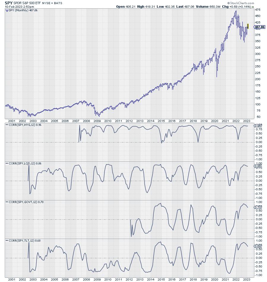
The chart above shows the monthly price chart for SPY, followed by the 12-month correlations with HYG, LQD, and GOVT. In the last pane, I added the correlation with TLT, as it has more history than GOVT. The correlation between TLT and GOVT is very high and moves around 0.90.
We can see here that HYG has the highest correlation with SPY; it is always positive and mostly above 0.75. That means that HYG will move very much in line with SPY. The correlation for LQD is less; here we see a correlation reading which is still predominantly above zero. But sometimes it dips into negative territory and generally shows much more fluctuations.
GOVT/TLT, finally, show the least constant correlation with SPY, meaning that they go through significant periods of noncorrelated performance. To mitigate the risks in one asset class, you want to look for another asset class with a low or, even better, negative correlation.
Another way to get a handle on correlations on StockCharts.com is to use the Correlation view.
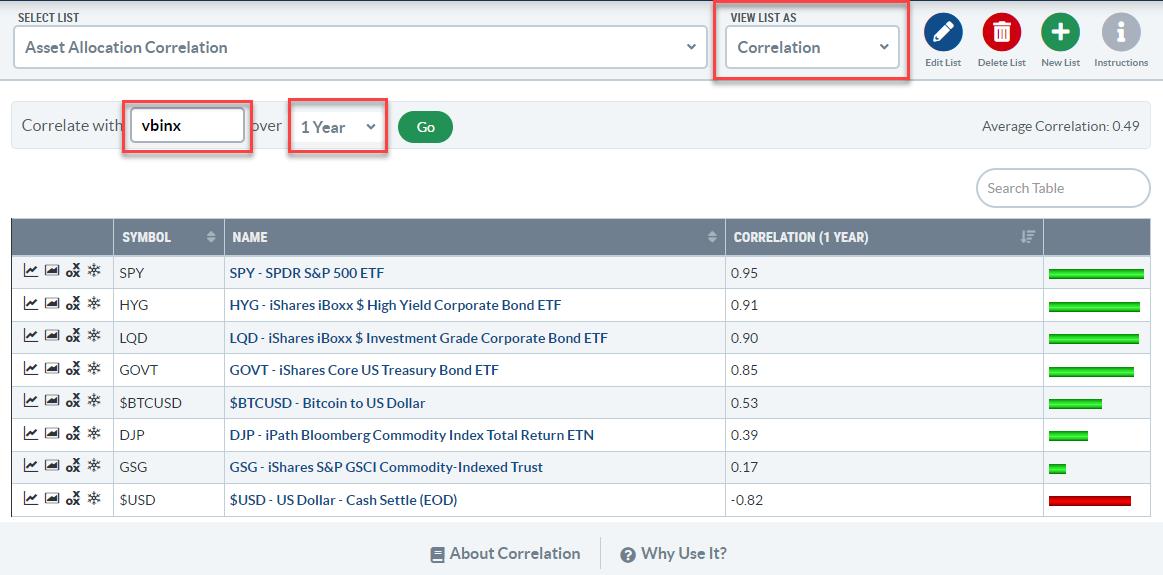
You can find the correlation view in the dropdown on your ChartLists page. The view will show you the symbols in your ChartList, and you can set the symbol you want to calculate the correlations against and the period over which you want to know the correlations.
In the example above, I have created a list with the asset classes that I use in the RRG, set the benchmark to VBINX, and the period to 1 year, matching the correlations shown in the SPY chart with the correlations against the fixed income asset classes above.
The big difference is that the charts show the change in correlations over time, while the table just provides a snapshot of the current values. The correlation charts also show that the correlations between these fixed-income ETFs and SPY have recently started to come down.
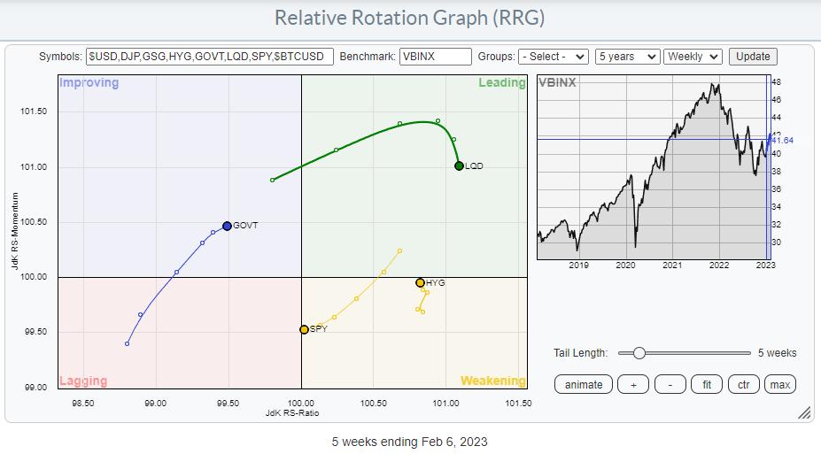
Stocks vs. Fixed Income Asset Classes
LQD and HYG show the highest readings on the RS-Ratio scale. LQD has just started to roll over, while HYG began moving in the opposite direction. This shows a preference for HYG over LQD, hence a preference for the "riskier" asset class High-Yield over the "less risky" Corporate bonds.
The BIG decision, of course, is between Stocks (SPY) and (Government) bonds (GOVT). SPY is still located to the right of GOVT, which points to a preference for Stocks over Bonds. The RRG-Heading, on the other hand, is negative for SPY and positive for GOVT. When one crosses over the other on the RS-Ratio scale, that is considered a change in trend. The wider the distance on the RS-Momentum scale, the more meaningful that trend change is. Looking at the length of the tails and RRG-Velocity (the distance between the nodes on the tail), we can see that it is shrinking, which means that the move is losing power, increasing the odds of rolling in the opposite direction. i.e., SPY curling back up and GOVT rolling over.
The 1-1 comparison between SPY and GOVT may come in helpful here.
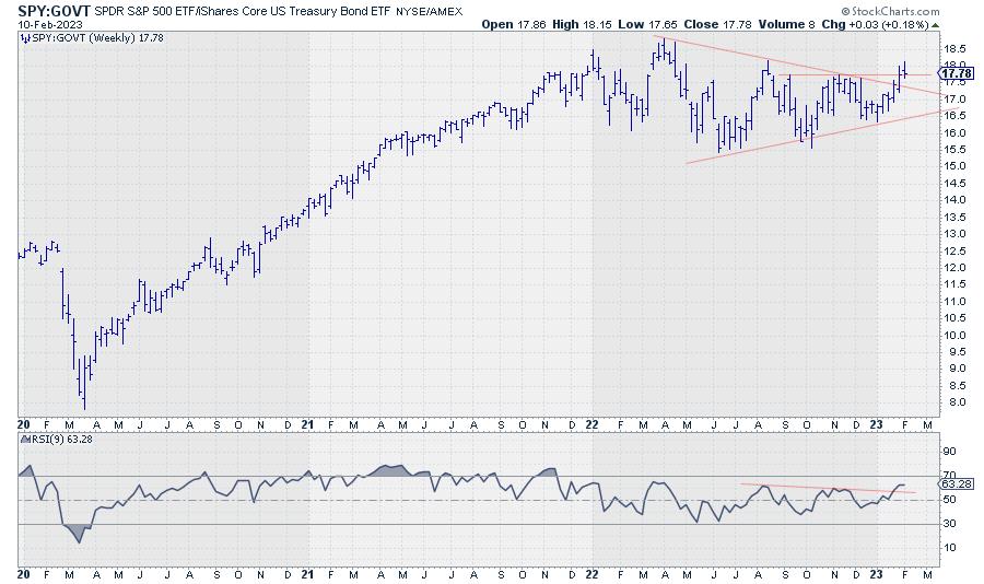
This chart shows the ratio between SPY and GOVT and how it contracted since March last year. This contraction is reflected in the tails moving closer together on the Relative Rotation Graph over the previous 6-7 weeks.
The slowdown in RRG-Velocity (distance between the nodes getting shorter) combined with the ratio trying to break out of the triangle-like consolidation and correlation between SPY and GOVT declining, leads to the belief that the market is setting up for a new, renewed, further improvement of stocks over bonds in coming weeks.
#StayAlert and have a great weekend, --Julius
Julius de Kempenaer
Senior Technical Analyst, StockCharts.com
Creator, Relative Rotation Graphs
Founder, RRG Research
Host of: Sector Spotlight
Please find my handles for social media channels under the Bio below.
Feedback, comments or questions are welcome at Juliusdk@stockcharts.com. I cannot promise to respond to each and every message, but I will certainly read them and, where reasonably possible, use the feedback and comments or answer questions.
To discuss RRG with me on S.C.A.N., tag me using the handle Julius_RRG.
RRG, Relative Rotation Graphs, JdK RS-Ratio, and JdK RS-Momentum are registered trademarks of RRG Research.


