

This journey started back in October 2022. After three years of no traveling and four years not having been to the US, it was finally possible to have an in-person event again, or at least partially.
StockCharts.com has been hosting its bi-annual conference, "ChartCon," since 2011. My first attendance was in 2014, shortly after Relative Rotation Graphs were introduced on the site. At that time, it was still a fully in-person event.
In 2016, ChartCon switched to a hybrid format, where attendees were able to attend online with a small group on-site where all presenters would also be to deliver their talks. Due to the Coronavirus Pandemic, it was not possible to have a conference in 2020, but as soon as things settled down and the world opened up again, the team at StockCharts got to work and put together ChartCon 2022.
Among the elite group of speakers was Ralph Acampora, the Godfather of Technical Analysis, who needs no further introduction. For those of you who haven't seen the documentary about Ralph's barn, please do yourself a favor and watch it here on StockCharts TV.
After two intensive days of putting together a great conference, all of us got together for drinks and a bit of dinner, and of course, a chat. I ended up in a setting with Ralph Acampora, his nephew Jay Woods (pictured above), and a few others when an engaging conversation emerged.
You have to know that Ralph and I go back more than 30 years now. The first time I met him was in 1992 at the IFTA conference in Dublin, Ireland. Ever since, it's "Hey, big guy, how are you doing?" every time we meet.
The discussion revolved around old vs. new and how computers had taken over trading and order execution. Jay was chipping in from his experience as an NYSE floor governor, and I came in from my experience with institutional investors as I was working on trading floors of investment banks. It was a bit of picking and making fun of "the old guy" in a friendly setting.
As the chat continued, the debate turned to "outperformance" and how institutional investors nowadays are ruled by benchmarks. They need to beat them, but they are not allowed to diverge too much because that means too much risk in the portfolio, and that's not allowed by the guidelines of the mandate, etc., etc.
Then Ralph began telling a story about his experience in the time he was working with Prudential Securities.
Ralph Talks
At PruSec, I not only had to deal with institutional clients, but also had to drop into the firm's local retail investor's offices. In other words, I was always interacting with clients that had completely different investment objectives. For me, personally and professionally, this was not only challenging, but a very rewarding experience.
Sometime in 1995, during a retail office visit, I presented the audience with my assessment of those sectors and stocks that were outperforming the stock market (S&P 500). And it was during dinner that two investors came up to me seeking a more detailed explanation of exactly what I meant by "performance". I then took out my pad and explained in more detail exactly what comparative relative strength is and how it is calculated.
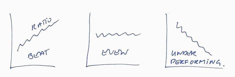
I took the current price of General Motors and divided it by the current price of the S&P 500, which was the ratio. I stated that professional portfolio managers had to "beat the market." In other words, the ideal trend of this ratio, which I sketched on the pad, should be moving up on a chart, indicating that your individual stock/sector was outperforming the market; a neutral trend in this ratio meant that the sector or stock was "even with the market." And lastly, a downward trend in this ratio meant that your stock/sector was "underperforming the market."
One of these two investors then said: "Wait a minute, if my stock is up 25% and the S&P 500 is up 30%, you would then say that this is bad news because I am not beating the market? Who cares what the S&P 500 is doing? I am making a profit. And that's what is most important to me as an individual investor."
And the second investor chimed in, saying: "I have another example that doesn't sound quite right to me. Let's say my stock is down 25% and the S&P 500 is down 30 %; you would then tell me that this is good news because I am outperforming the stock market. Are you crazy? I am losing a ton of money – who cares what the S&P 500 is doing?"
Honestly, I never looked at comparative relative strength through the eyes of an individual investor before. Now I had a problem; which set of glasses would I use when looking at comparative relative strength? It is quite obvious that institutional investors need to beat the market in order to stay in business, while individual investors seek only to make a profit.
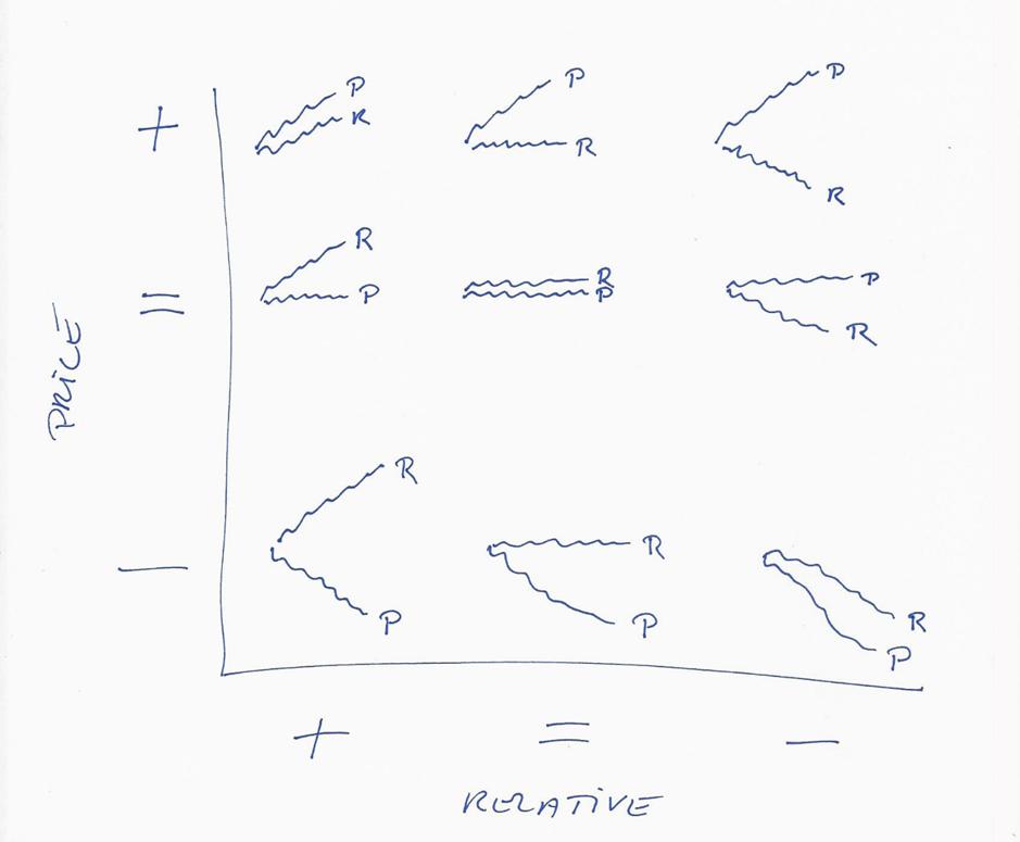
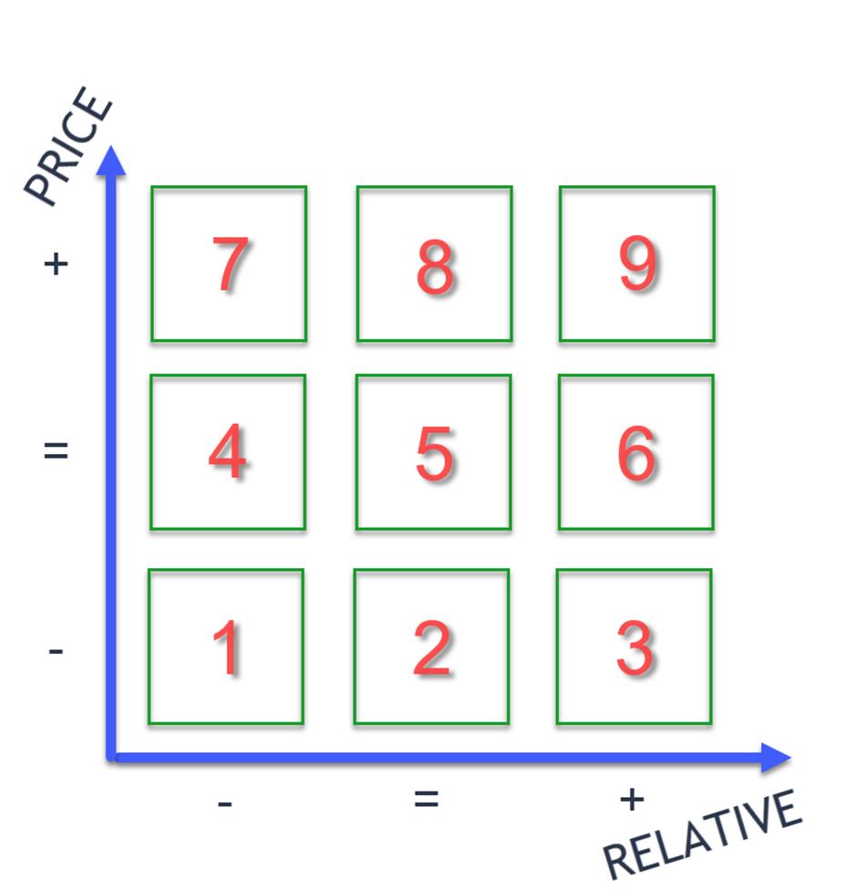
When I returned to my office in New York City, I could not get this conflict out of my mind. So, I started scribbling lines on paper in order to make sense of the true meaning of performance. It took time, but eventually, I realized that there are actually nine versions of price trends versus comparative relative strength trends. And this is what I came up with.
Explaining Something Without Pen and Paper
Then Ralph started drawing in the air, explaining how he viewed relative performance against price performance. Essentially showing the grid as we know it from the game noughts and crosses.
Over the years, I shared these nine combinations with my students and some of my institutional investors, but never wrote about it in any of my formal technical reports.
Later, I started to do a weekly review of these nine combinations for all thirty Dow Jones Industrial Average stocks. Again, I didn't publish these results, but they were very interesting, especially at turning points in the overall stock market.
Relative Strength, Grids, and Visualization
Ralph told us that he had shared his results with some of his colleagues in the industry, but none seemed too interested.
Can you believe it? Relative, strength, grids, and visualization. Clearly, that got me interested.
After Ralph finished his explanation, Jay and I started talking about how that approach could be "computerized" and made more "quantitative." Of course, we also made the odd joke that having a computer do all the work would allow Ralph to enjoy his Merlot on Sunday evening. We also needed to get a good name for this "thing"; Ralph's Nine, The Nine of Acampora, Acampora's Nine, Ralph's 9 Grid or R9G, and many more were thrown up in the air, but none really kept floating.
As the discussion and the evening drew to an end, I promised Ralph to write something about it (this article) and see if I could prototype the 9-grid so we could do more research.
After I returned to my farm near Amsterdam and Ralph to his in Minnesota, I started brainstorming this, and emails started flying. Since October 19 (nice date 😉 ), about 25 Emails have been sent, and two video calls have been held.
Eye Balling vs. Bits&Bytes
One of the first things we ran into was the fact that Ralph is/was eye-balling these trends rather than using some hard-coded formula to determine the trend. Clearly, the computer needs a few rules to determine when a trend is moving up, down, or sideways.
In modern technical analysis, there are many ways to accomplish such an assessment. To keep things simple, we opted to use the classic dual-moving average approach, with a short and a long MA, and we require the Short MA AND the Close to be above the Long MA for an Uptrend. A downtrend requires the short MA and the close to be below the long MA. Any other combination is labeled as sideways.
So far, so good.
But when I started to crank out some results and we started comparing notes. My "computerized" results were nowhere near his master's visual observations. And although I was expecting some discrepancies, this was way off.
It wasn't until I started quizzing Ralph on how he was labeling the buckets on the grid that I realized he started counting in the top-left corner of the grid and then going row by row. This meant that the X-axis, which holds the price trend, was flipped upside down... So I had to be the bearer of bad news and bring the message:
Ralph, computers don't like that 😉
Once I stylized the grid going from down, to sideways, to up on both scales, things started to make more sense.
A Sticky Name
Meanwhile, the brainstorming on a good name continued. After realizing that Ralph is way more handsome than George and definitely way smarter, we decided to ditch the movie associations, and eventually, we came up with the following acronym:
"Acampora's Relative Grid of Nine - ARGoN"
The next problem I faced was the fact that the StockCharts system does not allow (yet, we are working on it) the level of custom coding that is needed to achieve the necessary results. So, I coded up this approach in the software of our friends down under at Optuma.com and used the scatter-plot visualization to create the nine-grid. With a bit of tweaking, I managed to get the ticker symbols plotted in the various buckets (there's a limit to how many symbols can show up in the same bucket, but for now, it's enough to show the idea).
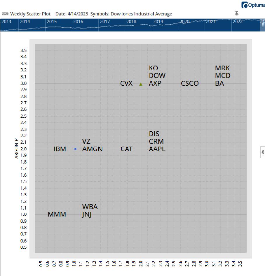
In a live implementation, it is even possible to make the symbols move through the buckets over time and see how they move as a group.
Things could have ended here, as this in itself is a very simple but very effective display of relative vs. price trends. And as Ralph does this only for the DJ Industrial stocks, he can do it within two glasses of his beloved Merlot every Sunday night.
Bigger Index = More Difficult
When you would try to do this for larger indexes like the S&P 500, this would be much more difficult, if not impossible. Ralph would need at least two bottles of Merlot every weekend, which could cause unwanted side effects...
So here comes the computer and some help from Mathew Verdouw at Optuma.com, who kindly has set up a page on https://app.optuma.com/argon, where you can see ARGON for a few larger universes like the S&P 500, Nasdaq 100, and FTSE 100, ASX 200.
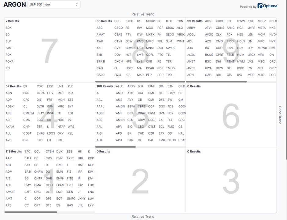
We'd like to emphasize that this is very much a showcase setup to get the idea behind ARGoN and is nowhere near a finished product. People may want to experiment with their own trend measures, their own investment horizons, etc.
A Use Case For Market Breadth
Finally, Ralph told us that he got a great sense of market breadth by looking at the distribution of the symbols on the grid. His rough estimate was that when more than 50% of the stocks, count > 15 in the case of DJI, are in the upper echelon of the market, in this case, the DJ Industrials, is in an uptrend.
Obviously, it all depends on the investment horizon and the definition of a trend that is used. Everybody can tailor that to their own liking. Longer term, shorter term, different metrics for trend measurement, etc., etc.
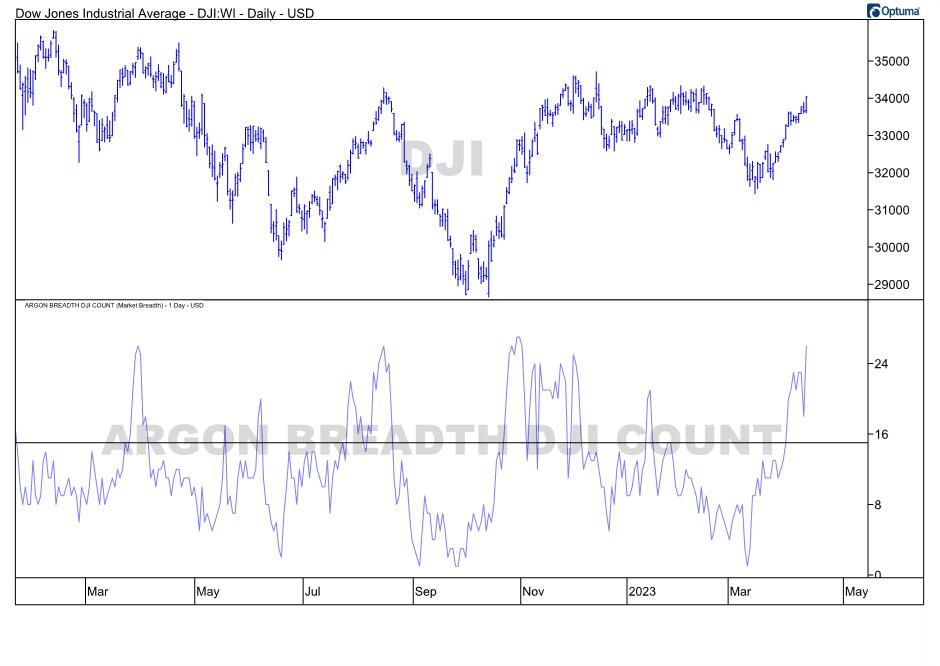
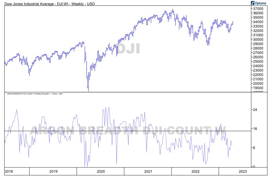
When creating a "breadth indicator," you need the historical data for all the rankings, and you need to be able to count/summarize/etc. these values over time. Optuma's custom breadth builder allows you to do that. The charts below show a few variations of ARGON breadth.
1. Daily price chart with ARGON breadth on daily data
2. Weekly price chart with ARGON breadth on weekly data
 3. Daily price chart with ARGON breadth on weekly data.
 With this, Ralph's brainchild ARGoN is now live and shared with the industry in which he has been instrumental for many analysts.
There is much more research that can be done to fine-tune the parameters and find use cases. You are encouraged to take this approach and tailor it to your own needs and ideas. The only thing we ask is to respect Ralph's idea and keep the acronym ARGoN as a reference to his work.
Julius de Kempenaer & Ralph Acampora
Julius de Kempenaer
Senior Technical Analyst, StockCharts.com
Creator, Relative Rotation Graphs
Founder, RRG Research
Host of: Sector Spotlight
Please find my handles for social media channels under the Bio below.
Feedback, comments or questions are welcome at Juliusdk@stockcharts.com. I cannot promise to respond to each and every message, but I will certainly read them and, where reasonably possible, use the feedback and comments or answer questions.
To discuss RRG with me on S.C.A.N., tag me using the handle Julius_RRG.
RRG, Relative Rotation Graphs, JdK RS-Ratio, and JdK RS-Momentum are registered trademarks of RRG Research.


