It's been a while since we discussed international stock markets.
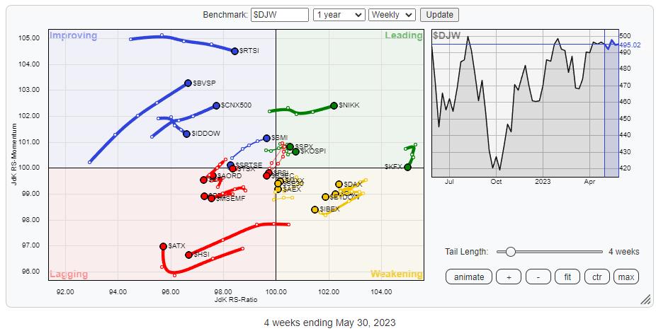
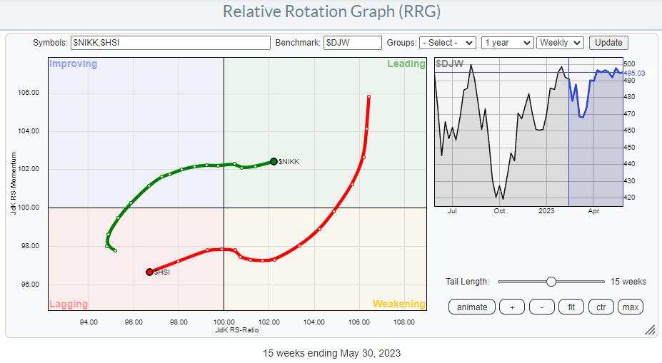
Above is the Relative Rotation Graph that shows the rotation for a group of international stock market indices against $DJW, The Dow Jones Global Index. Looking at this, chart I see two big(ger) rotations that are probably worth tracking and possibly trading.
US vs. Europe
The first one is the relationship between the US and Europe. On the chart above, the tails for $SPX and $E1DOW are a bit covered by other markets, so I highlighted them in the RRG below to better see their current rotations.
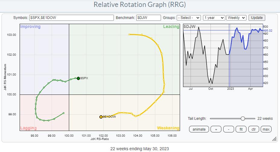
After a period of outperformance, the European market(s) have now turned down into the weakening quadrant, where the tail stabilized and started to move lower on the JdK RS-Ratio scale. The length of the tail indicates that the loss of relative momentum has been quite powerful so far.
The S&P, on the other hand, has rotated from lagging into improving and has recently crossed over into the leading quadrant again. The tail is a little shorter than for $E1DOW and is closer to the benchmark, but that is primarily because of the heavier weight of the US markets in the DJ Global index.
There is still a chance that Europe will curl back up while the US rolls over. This would essentially mean that the recent rotations have only been a pause in the outperformance of Europe over the US. However, based on the individual charts for both markets, that seems to be the less likely scenario.
USA
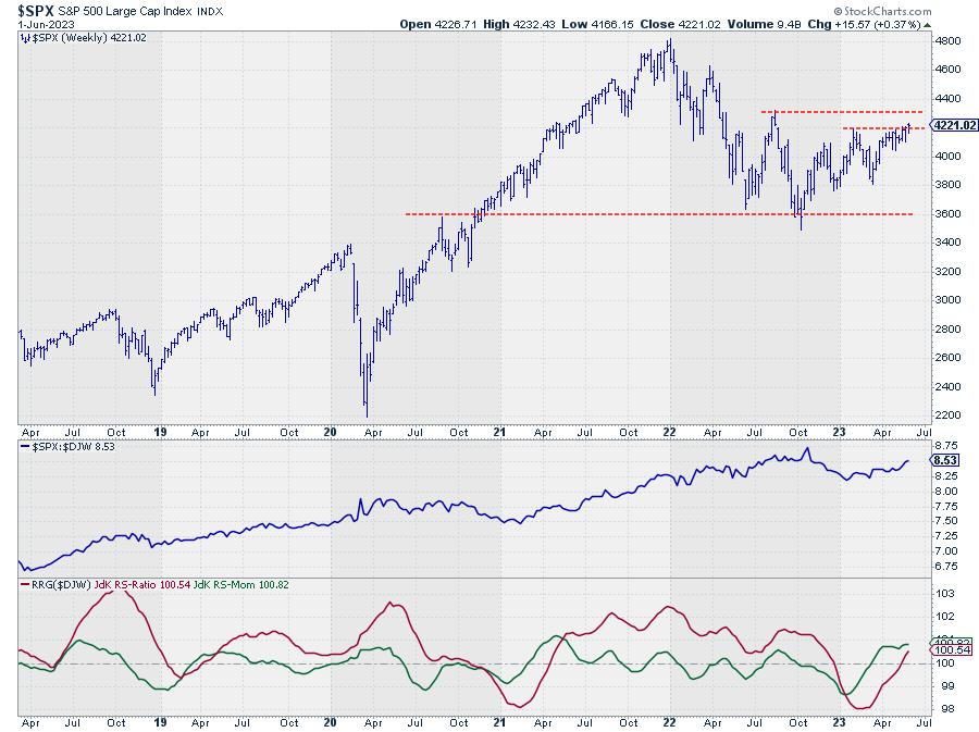
The S&P is on its way to breaking above its previous high at the moment which, in itself, is already a good sign. But more importantly, the relative strength line against The DJ Global index is solidly moving higher, indicating a relative uptrend against the world.
Europe
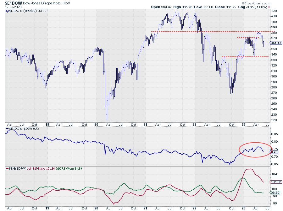
The European index, on the other hand, has just bounced off overhead resistance around 380. This has caused the RS-Line to start rolling over, which is now pushing the RRG-Lines lower.
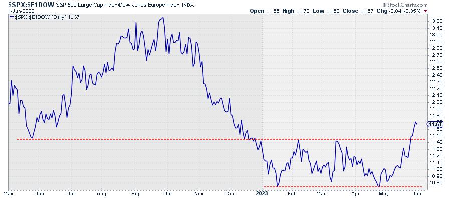
Europe is now lagging behind the US not only from a price perspective, but also in relative strength against the world. Both markets are at opposite trajectories, and these sorts of situations always provide good trading opportunities. A straight comparison between $SPX and $E1DOW on a daily chart highlights the improvement of the US over Europe in even more detail.
Japan vs. Hong Kong
The second major rotation that I see on the RRG for world indices is the one between Japan and Hong Kong. These tails are well visible on the RG at the top, as they are further away from the benchmark and the clutter of the other markets.
The RRG below zooms in on the rotation between these two Asian markets.
The opposite rotation is clearly visible, and the length of the tails indicates there is quite some power behind both moves. Over three weeks, the tails crossed over from left to right and v.v., confirming the change of trend.
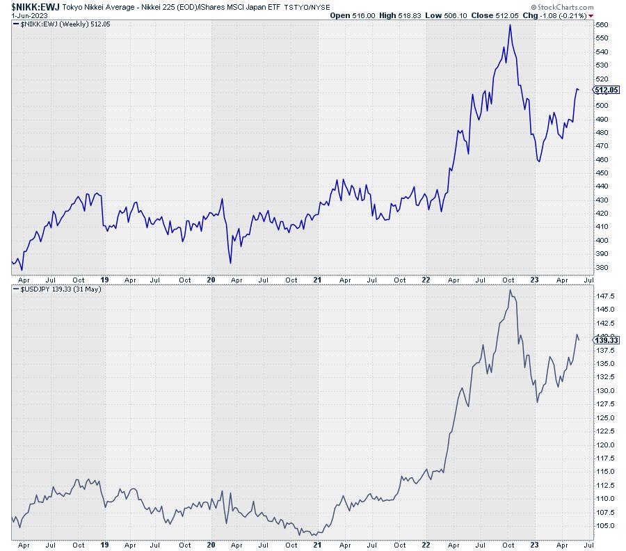
Japan
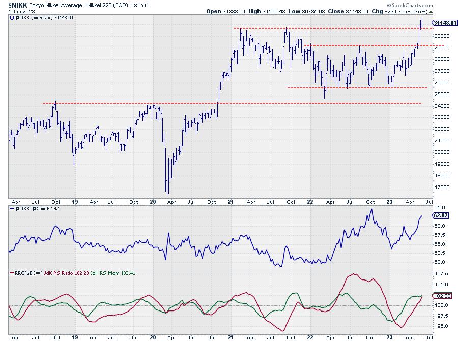
The Japanese Nikkei Index is breaking beyond a major overhead resistance level at the moment. It already looks pretty impressive on the chart above, but, when we change the chart to monthly and show more history, things are getting even more interesting.
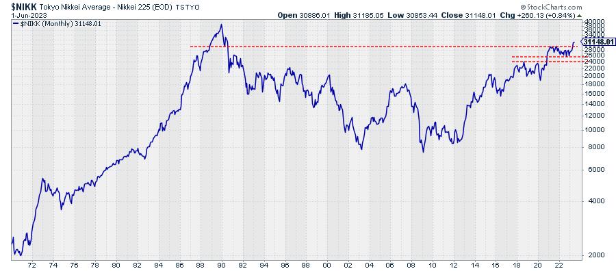
Not only are Japanese stocks pushing to the highest level in more than two years, but this break also opens up the way for a test of the all-time high for the Nikkei index. And unlike many other markets, this all-time-high was not set in the last 3-4 years, but more than two decades ago.
Also, don't be fooled by the log scale on this chart. The level of the 1990 peak is around 39.000. From current levels, that means an upside potential of around 25%. This break also, at the same time, limits the downside risk, as the previous horizontal resistance level can now be expected to return as support in case of setbacks.
Hong Kong
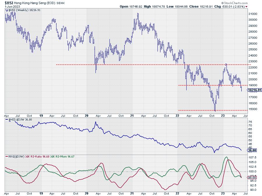
How different are things looking for the Hang-Seng index...
This market just convincingly dropped below its previous low, which opened up the way for a further decline toward the 2022 low near 15.000. From current levels, that means around 20% downside, while the upside is now capped at the breakout level near 19,000.
How To Play
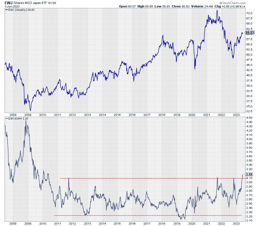
Exposure to these international stock markets can easily be created through ETFs that are quoted on US exchanges (in USD). Two widely used ETFs are EWJ for Japan and EWH for Hong Kong. As long as you realize that using an ETF quoted in USD to trade a market that is traded in another currency implies a currency risk in your portfolio, you'll be fine.
The chart below clearly shows that the price development for EWJ is quite different from $NIKK (which is what EWJ is tracking).
The top chart shows the ratio between $NIKK and EWJ. The lower chart shows the $USDJPY exchange rate. As you can see, that $USDJPY exchange rate pretty much entirely explains the difference between the $NIKK cash index in JPY and EWJ in USD.
The problem with buying EWJ is that you will also get a long position in JPY against USD, which is not a preferred position at the moment, as USD/JPY has just broken important resistance levels and seems to be underway for a further rise. So, from a portfolio management perspective, this is a force to be aware of as it has a negative effect at the moment. For EWH, the impact is negligible as the $USDHKD exchange rate is pegged and hardly fluctuates.
As the expected fluctuations in the underlying markets ($NIKK and $HSI) are pretty significant, the potential profit from the directional moves in these stock markets will likely offset the drag from the exchange rate.
Here is the chart of EWJ in the top half and the ratio EWJ:EWH in the bottom half.
#StayAlert, --Julius
Julius de Kempenaer
Senior Technical Analyst, StockCharts.com
Creator, Relative Rotation Graphs
Founder, RRG Research
Host of: Sector Spotlight
Please find my handles for social media channels under the Bio below.
Feedback, comments or questions are welcome at Juliusdk@stockcharts.com. I cannot promise to respond to each and every message, but I will certainly read them and, where reasonably possible, use the feedback and comments or answer questions.
To discuss RRG with me on S.C.A.N., tag me using the handle Julius_RRG.
RRG, Relative Rotation Graphs, JdK RS-Ratio, and JdK RS-Momentum are registered trademarks of RRG Research.


