TAKEAWAYS
- Using RRG to see Large-Cap vs Small-Cap sector rotation
- The current strength for Small-Cap stocks vs Large-Caps is evident
At the end of last year, I wrote a blog article about the relationship between Large-Cap and Equal-Weight sectors. It involved plotting the ratios of the large-cap sector ETFs against the equal-weight sector ETFs. (You can find that article here, in case you missed it.)
Today, I want to expand that approach to the large-cap vs. small-cap debate and bring the level of detail down to a direct comparison at sector level.
Large-Cap Rotation
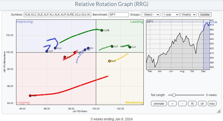
Above is the most widely used Relative Rotation Graph for US sectors.
Observations from this RRG:
- Energy is rapidly losing relative strength
- Real Estate, Financials, and Technology remain strong inside the leading quadrant, despite a slight loss of relative momentum.
- Communication Services are leveling off on JdK RS-Momentum inside the weakening quadrant and possibly aligning up for a rotation back up to leading.
- Industrials and Consumer Discretionary continue to improve, slowly, inside the improving quadrant, but they are at a positive RRG-Heading (+).
- Materials are rotating back down and crossing over into lagging.
- Consumer Staples and Utilities are turning back down toward the lagging quadrant while remaining at very low JdK RS-Ratio readings.
- Health Care is still inside the lagging quadrant, but shows a sharp hook back up. It's in its early stages, but improvement is there.
Small-Cap Rotation
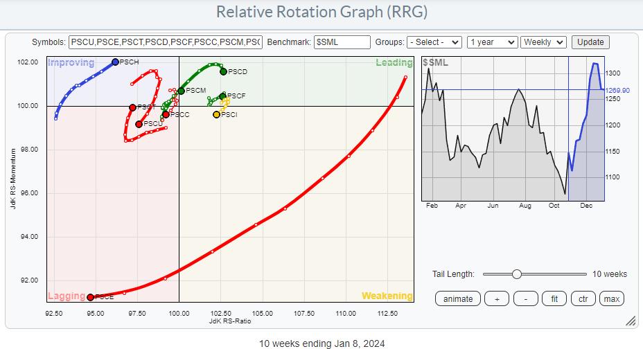
This is the small-cap equivalent RRG. Please note that Real Estate is included in the Financials small-cap ETF; PSCF and Communication Services are included in Utilities.
To get a better handle on the rotations, I have switched off the long, disconnected tail for the energy sector (PSCE) in the graph below, as it distorts the image.
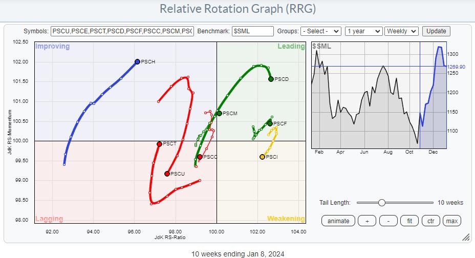
The main observations from this RRG are:
- Consumer Discretionary, Financials, and Materials are inside the leading quadrant, but only Materials is at a positive RRG-Heading. Discretionary and Financials have already started to lose relative momentum.
- The Industrials sector remains at an elevated RS-Ratio reading, but has rotated into the weakening quadrant (temporarily?).
- Utilities have exhibited a strong rotation from improving back to lagging, and are potentially the weakest (small-cap) sector.
- Technology and Consumer Staples are both inside the lagging quadrant. Technology has shown substantial improvement over the last four weeks, while Consumer Staples only hooked back up sharply last week.
- Health Care is the only sector improving, but having the highest reading on the JdK RS-Momentum scale is promising.
By comparing these two Relative Rotation Graphs, you can already understand how rotations occur in these two universes. However, both universes are plotted against their general benchmarks. Large-Cap is plotted against SPY, and the Small-Cap universe is plotted against $SML.
Large-Cap vs. Small-Cap at Sector Level
To get a more granular reading on the relative performances of each large-cap sector vis-a-vis its small-cap counterpart, I created a universe of ratios where each symbol is the ratio of the large-cap sector to the small-cap sector.
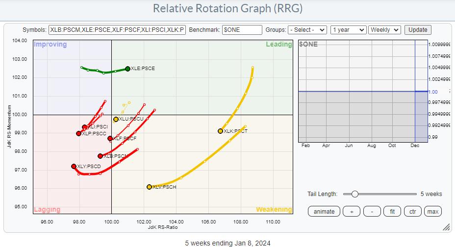 As the universe consists of ratio symbols, we need to adjust the benchmark to $ONE so the RRG will show us the absolute trends in these ratios. It is immediately obvious that most of these tails are pointing/rotating toward or already inside the lagging quadrant.
Technology and Health care are still at decent levels in the weakening quadrant, providing them with enough room to turn back up without hitting the lagging quadrant. Utilities have made a first attempt to do that. Inside the lagging quadrant, Consumer Discretionary is starting to pick up some relative momentum, but it is in its early stages.
All in all, this means that the rotation out of large-cap is taking place in almost all sectors. The only sector where investors should clearly prefer large-cap stocks is Energy, as the XLE:PSCE tail is pushing further into the leading quadrant.
#StayAlert, --Julius
Julius de Kempenaer
Senior Technical Analyst, StockCharts.com
Creator, Relative Rotation Graphs
Founder, RRG Research
Host of: Sector Spotlight
Please find my handles for social media channels under the Bio below.
Feedback, comments or questions are welcome at Juliusdk@stockcharts.com. I cannot promise to respond to each and every message, but I will certainly read them and, where reasonably possible, use the feedback and comments or answer questions.
To discuss RRG with me on S.C.A.N., tag me using the handle Julius_RRG.
RRG, Relative Rotation Graphs, JdK RS-Ratio, and JdK RS-Momentum are registered trademarks of RRG Research.


