TAKEAWAYS
- Today, we're looking at market breadth from a different perspective
- In this article, we'll plot major US stockmarket indices on a Relative Rotation Graph
- Even inside the NYFANG index, the base is narrow
There's been much chatter and mentions of weak or narrow breadth floating around these days. I plead guilty as well. But I now want to approach this from another angle using some of the major US stock indices for this article.
I usually examine the market using sectors or a growth/value/size breakdown, with the S&P and Dow Jones indices playing a major role. But there is more.
Major US Stock Market Indices
The first RRG shows the rotation of some of the major US stock market indices against the benchmark S&P 500.
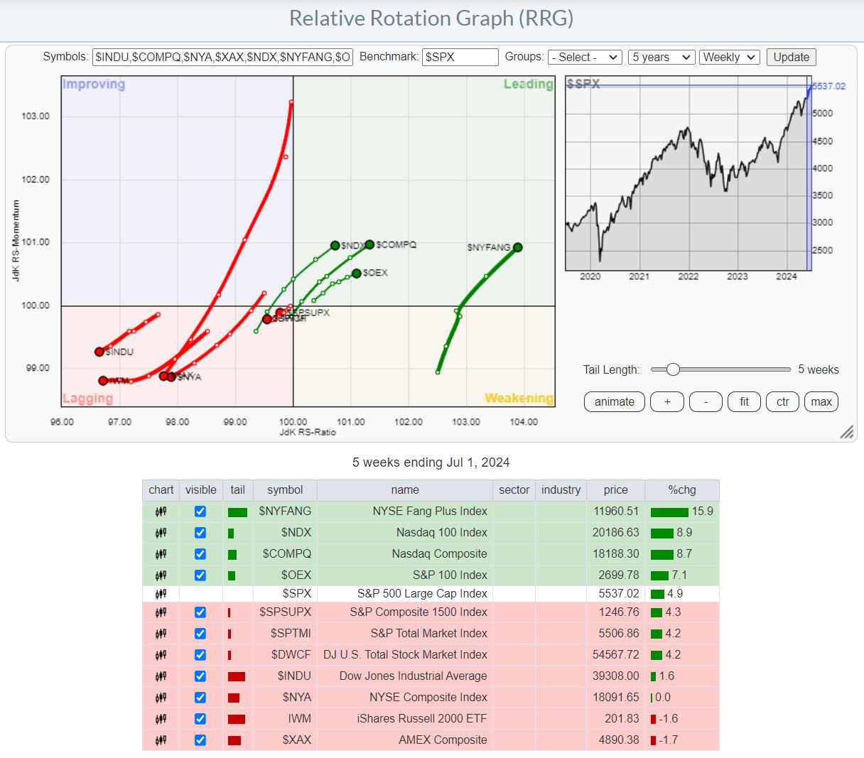
I have added the table below the graph as a legend for the symbols on the tails, as they may not be necessarily mainstream.
The tails and the accompanying performances are shown over a five-week period. All the broader indices are camping inside the lagging quadrant and traveling at a negative RRG-Heading, while the narrower-based indices are inside the leading quadrant and on a strong, 0-90 degree RRG-Heading.
There is no index inside the improving quadrant or the weakening quadrant. This indicates the clear split between these two groups.
The only exception concerning "broader" indices is the Nasdaq Composite index ($COMPQ) with 2500 stocks. However, this index is very heavily tilted toward the software & IT services, along with technology equipment stocks. The exception on the "narrower" indices is the DJ Industrials index, which has a relatively low exposure to the technology sector, also because of its price-weighted approach.
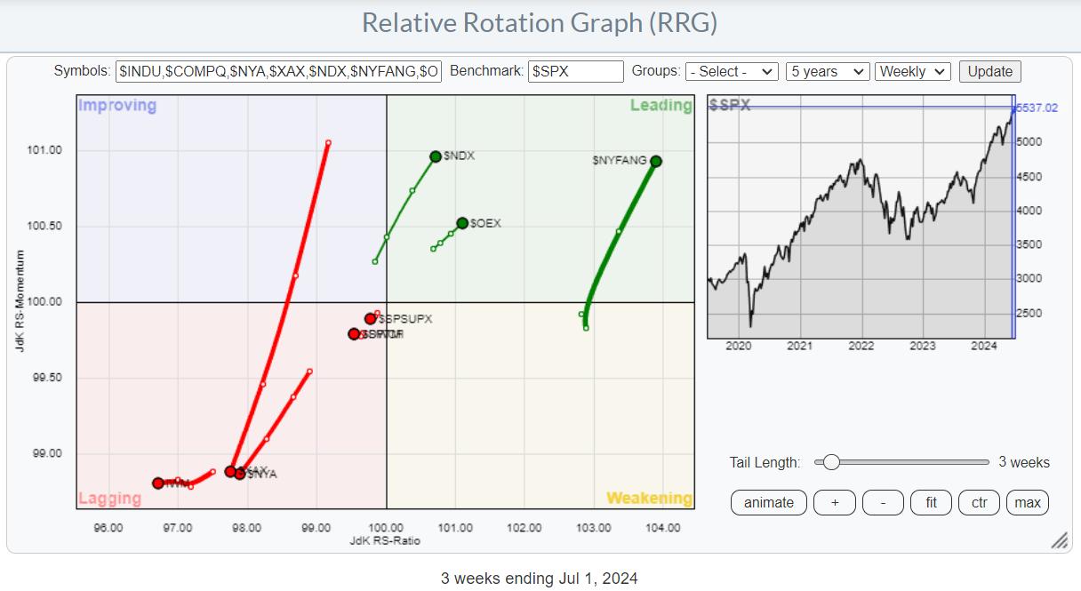
When I remove $COMPQ and $INDU and set the tail length to 3 weeks for better visibility, this is the chart that remains. I found it interesting that the further you go to the right, the smaller the index becomes in terms of stocks in the index, not necessarily in market capitalization.
NYFANG Beats All
The next step was to zoom in on the rotation of $NYFANG.
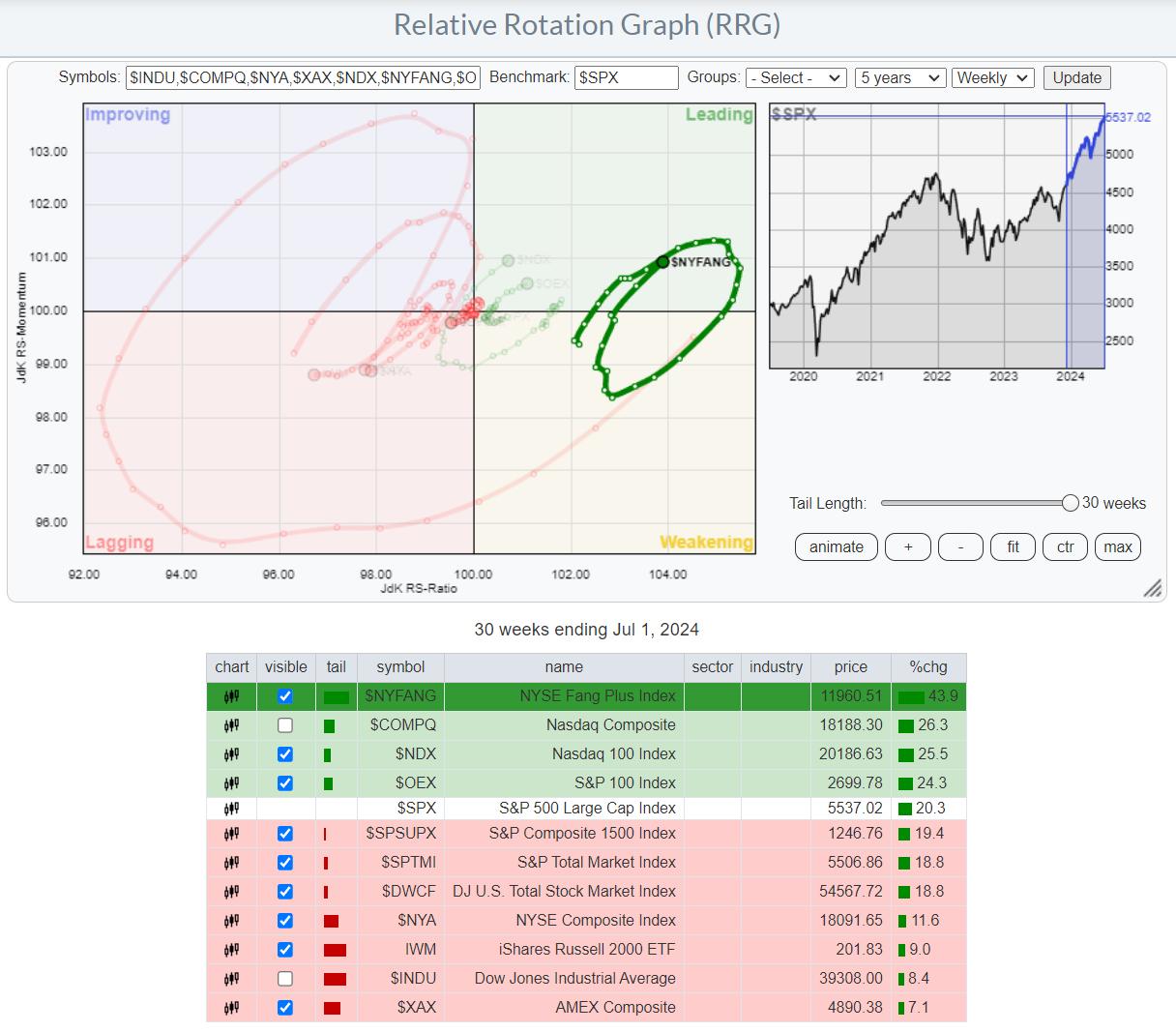
When I set the tail length to 30 weeks, the exact same indices show up on top, with $NYFANG handsomely beating all other indices in this group. When you open up this RRG live (click on the chart), you'll have to scroll back to 3/13/2023 before $NYFANG drops from the first place over a 30-week period. That's a pretty impressive period (trend).
Even Inside The NYFANG Index, The Base is Narrow
Finally, let's zoom in on the members of the NYFANG index.
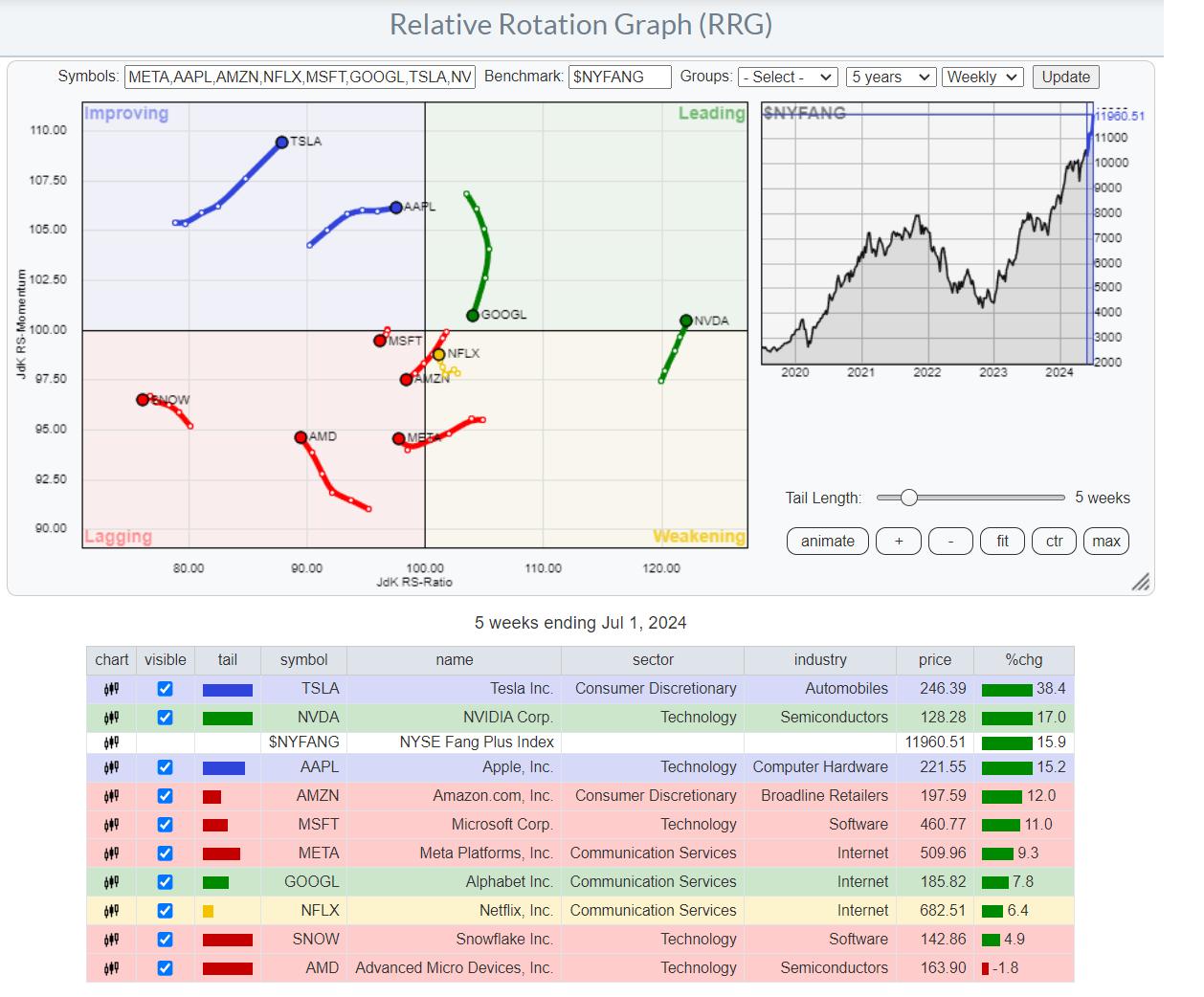
This RRG shows the rotation for the NYFANG members against $NYFANG. The first observation is a high concentration of stocks inside the lagging quadrant. Except for SNOW and AMD, they have beaten the S&P 500 over this 5-week period. But not $NYFANG -- only TWO stocks have outperformed $NYFANG over this 5-week period, those being TSLA and NVDA. Even looking back 30 weeks shows that only NVDA, META, and NFLX have beaten $NYFANG.
The big spread between the top and bottom of the list, +38.4% for TSLA and -1.8 % for AMD, also shows that the performances are very stock-specific. Even within the same sector, big differences show up. MSFT (Technology/ software) shows an 11% gain vs. SNOW in the same group, with a 4.9% gain.
The difference is even bigger in semiconductors, where we see NVDA (Technology/semiconductors) at +17%, against a loss of 1.8% for AMD in the same group.
The main takeaway from all this, IMHO, is that the foundation is indeed narrow and concentrated in large cap, offensive/growth stocks. This group of stocks can still keep the S&P 500 going up, or at least remain sideways during transition periods. This is caused by individual stocks rotating through very strong, relative trends.
As long as this situation persists, I believe it will be much more important to focus on individual stocks first, then sectors, and only then the broader market.
Happy Fourth of July, --Julius
Julius de Kempenaer
Senior Technical Analyst, StockCharts.com
Creator, Relative Rotation Graphs
Founder, RRG Research
Host of: Sector Spotlight
Please find my handles for social media channels under the Bio below.
Feedback, comments or questions are welcome at Juliusdk@stockcharts.com. I cannot promise to respond to each and every message, but I will certainly read them and, where reasonably possible, use the feedback and comments or answer questions.
To discuss RRG with me on S.C.A.N., tag me using the handle Julius_RRG.
RRG, Relative Rotation Graphs, JdK RS-Ratio, and JdK RS-Momentum are registered trademarks of RRG Research.


